Bill Scott's Portfolio (original) (raw)
Yahoo!
Ajax Evangelist/Pattern Curator
As Ajax Evangelist I have been a frequent speaker at numerous conferences, workshops and tuturials. Internally within Yahoo! I have worked with a large number of various Yahoo! sites to consult in design & engineering best practices. Projects include My Yahoo!, Yahoo! Finance, Yahoo! Tech, Yahoo! Home Page, Yahoo! Groups, Yahoo! Maps, Yahoo! News, Yahoo! Photos, Yahoo! Travel, Yahoo! Teachers as well as others. Additionally, I have worked closely with the Yahoo! User Interface Library (YUI) team on early design and review of the library.
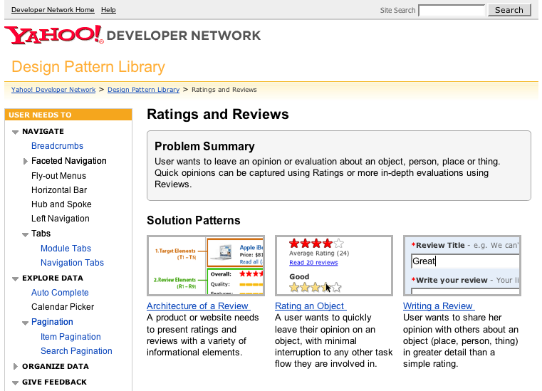
YAHOO! DESIGN PATTERN LIBRARY
Launched, edited and curated the Yahoo! Design Pattern Library in Feb, 2006. The library was the first company-sponsored interaction pattern library to go public. Received much acclaim and was recognized as a good resource for understanding rich interaction on the web.
The pattern library is based on the the work from the internal pattern library (Matt Leacock, Erin Malone, Kiersten Lammerding, Chanel Wheeler and others) with a number of new patterns I created to express the rich interaction of Ajax style applications.
The main purpose of the site is to create a vocabulary around the most common interactions, document the best practices within Yahoo! and relate the patterns to the YUI code library.
CAROUSEL COMPONENT
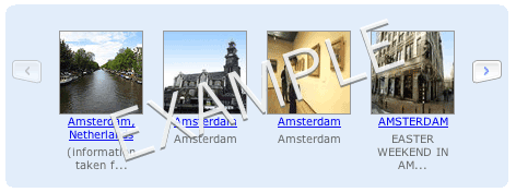
For an early version of Yahoo! Teachers I created the carousel component. This is a DHTML component based on the YUI library that generalizes managing lists of items.
YAHOO! GOBBLER
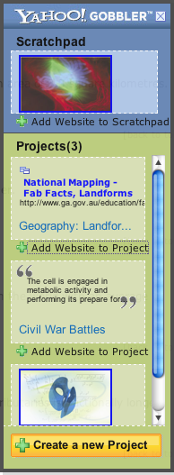
An integral part of the idea behind Yahoo! Teachers was a tool that could be used on any web site to gobble content.
Based on this original idea I created a rapid prototype of the gobbler over a weekend, refined it for a week or so and we launched it initially to the first Yahoo! Teachers of Merit workshop at the Yahoo! Sunnyvale campus.
The gobbler was a hit with the teachers.
Recently, we publicly announced the site at the NSTA (National Science Teachers Association) conference in St. Louis, MO. The feedback was overwhelmingly positive. The gobbler is now part of the upcoming Yahoo! Teachers product.
Rico - Open Source Project
SITE DESIGN AND DEVELOPMENT
Rico is an open source JavaScript library that provides rich internet utilities like: Ajax, cinematic effects, behaviors (components) and drag & drop
As an offshoot of the reusable web components at Sabre, we obtained permission to release a portion of the technology under the banner of Rico at the openrico.org site. Rico is spanish for Rich denoting rich internet support. As such we strongly disavow any relationships to Uncle Rico, RICO the racketeering act or Rico Suave the open-shirted entertainer!
I designed and developed the site to be very simple and straightforward, the spirit we tried to capture in the framework itself.
EVANGELISM AND DEMOS
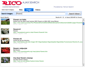
In order to sell Rico, it was necessary to create two types of demos. First, clean, simple and straightforward examples that illustrated one concept. Darren James created these with some stylistic input from me. The second set of demos needed to pull various pieces together and illustrate more of a real world solution: Weather Widget and Rico Y! Search were created by me to illustrate what can be done with rich DHTML and Ajax technologies.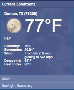
The Weather Widget illustrated using Ajax to pull in weather information from the Weather Channel's weather.com site, using cinematic effects to show the transitions and a good use of the accordian widget for showing multiple pages of information.
The Rico Search is powered by the wonderful Yahoo! Developer Services APIs. Rico Search illustrates the powerful LiveGrid concept that Darren James & Richard Cowin developed as a refactoring of the Sabre grid component. Live Grid turns an HTML table into a scrolling table that gets its data from the server just-in-time. With LiveGrid you can contine to scroll instead of paging through the data. The Rico Search demo illustrates using the LiveGrid with Yahoo! Search results.
You can check out my blogs about Rico and user experience at looksgoodworkswell.com
Sabre Airline Solutions
PRODUCT DESIGN
At Sabre, I led the User Experience Team for Airline Solutions and am involved in all aspects of product design for around 40 products. The User Experience team is responsible for looks good, works well.
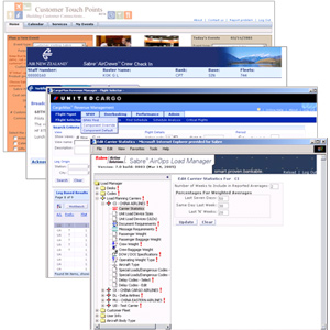
The products manage flight planning & scheduling, crew planning & scheduling, revenue optimization, fare pricing, flight dispatch, flight operations control, market data analysis, airport services, and dining & cabin services.
These products span both the desktop and the web. In the latest set of web products we have incorporated Ajax for a rich internet experience.
While the web based products do have a standard look and feel, most of the time they are styled with the specific airline's branding (as pictured here.)
PATTERN LIBRARY
One of the advantages of working with so many products is that you get to see a set of solutions repeat themselves again and again. These solutions are called Interaction Design Patterns.
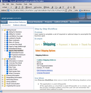
This work builds on the excellent work of Tidwell, Welie and Laakso as well as what we have learned along the way. Our internal UX Site (pictured here) hosts our pattern library.
Designers and business stakeholders can locate patterns by browsing by user needs, design principles or by a goal-oriented approach.
Some of the common patterns we use on a daily basis are: Step-by-Step Process, Overview Plus Detail, Search/Result, Information in Context and the Workbench pattern. Our pattern library is similar to the Yahoo!User Experience Team's Pattern Library
HEURISTIC EVALUATION
One of the first things I did when arriving at Sabre was to initiate a full-scale heuristic evaluation of our products. 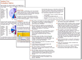 The project included training 35 evaluators, providing workshops on design principles and pouring over 3000 screens across 21 of our major products. During the height of the work I was learning a new product every 3 days!
The presentation of the evaluations was a study in user experience design. I researched various ways to visualize application structure as well as usability metrics.
I borrowed ideas for formatting the reports from Jacob Nielsen's book Homepage Usability and the book Mapping Websites.
Each report was produced in a book format. The sections covered the ground rules for the evaluation, high level visualization of the issues, business and product primer, short synopsis of the systemic issues and finally a screen-by-screen accounting of the interface. Formatting, graphics, and layout were all elements that made the reports accessible for executives, marketing and development. The reports were a major contributing factor to creating the User Experience Team and funding millions of dollars into enhancing the usability of our products.
COMMON COMPONENT DESIGN
Sabre funded a large investment project to create a suite of common desktop and web user interface components. I was the designer (as well as original technical architect for the web components) for this suite.

These are not your Father's interface controls! Rich tree, table, calendar, multi-select combo drop downs, toolbars, tab + menu controls just to name a few. Of particular note is the editable table component that features inline editing, paging, sorting and a couple of dozen additional features.
The latest, greatest cool thing we were doing with these components is making them Ajax-aware. Our table now can scroll through 100's of thousands of records with each page scroll happening in less than a hundred milliseconds! Of interest is the design changes we are discovering as web events are more fine-grained and data is sometimes a hundred times faster to work with.
A small part of this framework has being released as an Open Source project supported by Sabre called Rico. Rico provides an object-oriented JavaScript library for drag & drop, cinematic effects and Ajax enablement.
IA WIREFRAME TOOLKIT
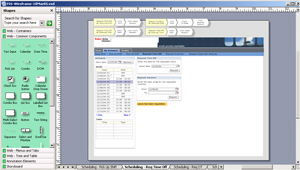
One of the frustrating things an interface designer faces is how to simulate the interface as early as possible and as realistic as possible. Over the 2004 holidays I dove into Visio and learned all about automation, scripting, layers, backgrounds, shape libraries, connections and a host of other features.
The tools include:
- smart connections
- complete set of interface controls
- storyboard stencils
- animated interaction
- code generation
- requirements generation
The result is a really cool set of tools for Microsoft Visio to simulate a web, desktop or plain wireframe interface. It's cool, fast and fun to create wireframes!
NextJet
OPERATIONS MANAGEMENT SYSTEM
At NextJet, I led the interface design for the web based Operations Management System (OMS). The application provided real-time tracking and management of same day shipping orders.
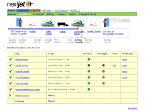
One of the fun design tasks was create a new way to visualize same-day shipping orders for the Operations Control Center. The ability to determine order status at a glance was critical due to time constraints airline schedule and courier availability volatility.
I created an order dashboard that shows the order status from courier pickup to drop off with all events in between. I then tied the dashboard to a workplan grid that had all of the steps to complete an order. The result was a one-page control panel for order management. This design was a contributing factor to UPS selecting NextJet for its service parts logistics software.
HEADS-UP DISPLAY
 Since orders had to be managed on a minute-by-minute basis, I centered the main interface into a heads-up-display concept. The result: orders are easier to manage due to real-time status display and the ability to assign or edit orders from the HUD workbench.
At Open Connect, I led the user interface design and was the development manager for the eXtreme Vista product.
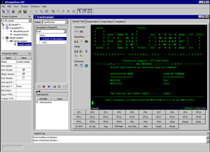
eXtremeVista is a development tool that turns mainframe applications into web-based products.
The previous version 2.2 product had a very antiquated interface. I spent a good deal of time performing a usability analysis on the product and cleaning up layout, workflow and graphical problems.
The drab gray was courtesy of Java :-)
i2 Technologies
RHYTHM SUPPLY CHAIN PLANNER
At i2, I was known as the User Interface Czar and later as the head of Common User Interface. The Supply Chain Planner (SCP) was the flagship product in the late 1990's.
One of my contributions was conceiving of a workflow based interface for SCP.

Originally, the product was designed around the internal planning model. The Visual Basic interface introduced supply chains and their factories, etc. This presented the information from a model perspective. I introduced workflow based tasks to create a workbench concept that could be tailored for each client and individual users.
DSC Communications (now Alcatel)
TCL WIDGET SET
At DSC (now Alcatel), I was a lead interface designer and developer for real time monitoring of phone switching software.

Somewhere along the way I got involved in a open source project using an object-oriented version of the tcl language known as itcl. The work involved creating a set of user interface controls for the incr Widgets project.
I designed and created the tabbed notebook, menu and toolbar components. The tabbed notebook could be configured to have a Windows, Unix motif or Borland look & feel and appear either on the left, right, top or bottom sides of the notebook.
The Tcl/TK Tools book featured a chapter on the incr Widgets and credited my work.
E-Systems (now Raytheon)
ESYVIEW, ESYBRIEF AND WARGAMING
Upon joining E-Systems I had a lucky break. Awaiting government clearance I was given the chance to build user interfaces for large-scale NATO & Naval War College wargaming.

After building the initial system for a Digital Equipment Corporation Workstation in the not so lovely VMS OS, I pitched a research project by prototyping what I thought a mapping system should be like. I used the public domain CIA world database of land boundaries, roads, railroads, lakes, etc. and built a mapping toolkit for OSF/Motif. Before long I had a team of about 10 people involved in producing two commercial products EsyView and EsyBrief. EsyView allowed you to connect a mapping display to a real-time system (like wargame simulation) and watch the war theatre animated on the map. EsyBrief allowed an offline version in which you could place a number of war-specific icons around on the map. This was around 1990 and here are the cool things it had:
- Scrollable mapping system
- Porthole/Panner controls
- Flicker-free animation
- Full complement of drawing tools to overlay on the map
- Beautifully rendered maps with shading
- Very rich mouse interaction
Sadly, I no longer have screenshots from these applications.
SPECTRUM HOLOBYTE
GATO
Shortly after the Macintosh arrived on the scene, several of us started working at the local Apple Computer store. One of the guys had become addicted to an IBM PC game, called GATO.
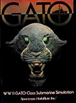
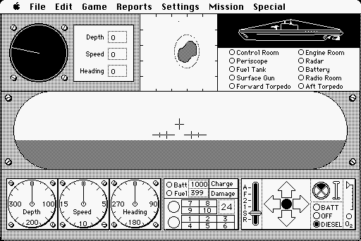
It was decided that we would design and write the game from scratch with a new completely new look for the Macintosh. Those were heady and fun days. 7 days a week, lots of fast food, programming and designing most days and nights. We were one of the first games for the Macintosh and the first simulation.
GATO was instantly successful and for a couple of months was #1 in the nation on the Softsell Mac list. It maintained a top ten status for a year.
I drew all of the screen controls with MacPaint and lots of FatBits (magnified mode.) The screws were complete with shadows. Remember that you are looking at 1985 graphics. One of the nice things that I came up with was the ability to see all the important controls at once. You could flip the small map view to a large map view and still see your periscope and guages. This was a huge improvement over the original IBM version.
Below is a screen shot from the game.
3D GRAPHICS LIBRARY
I also built a 3D graphics library to support Spectrum Holobyte's Space Shuttle simulation, Orbiter. The library was fairly primitive with limited shading but was a good study in how to design a graphics library.
Contact me at b DOT scott AT yahoo DOT com
