The Typekit Blog | Flexible typography with CSS locks (original) (raw)
In early 2012, I shared a formula for “molten leading”, or fluid line spacing. Experienced typographers know that long lines of text need more line spacing, but line spacing can be tighter for short lines of text. The problem is that on the web, our texts are flexible. So our line spacing needs to flex, too:
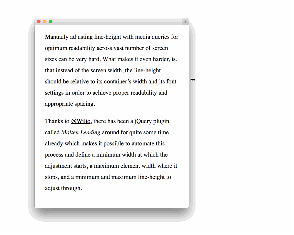
Thanks to Viljami Salminen for the gif.
A few people read about my formula and made it happen in JavaScript (Mat Marquis, Jim Jeffers, Viljami Salminen), and then last year Mike Riethmuller showed us how to do it in CSS with calc and viewport units. But interestingly, the focus of Mike’s article was font size:
You can have perfect smooth scaling between any 2 font sizes over any viewport range. The font will start scaling and stop scaling exactly where you want.
That got me thinking. This formula is about more than line-height or font-size. This formula is a way of dynamically calculating any value between two extremes, relative to another set of extreme values — independent from media query breakpoints.
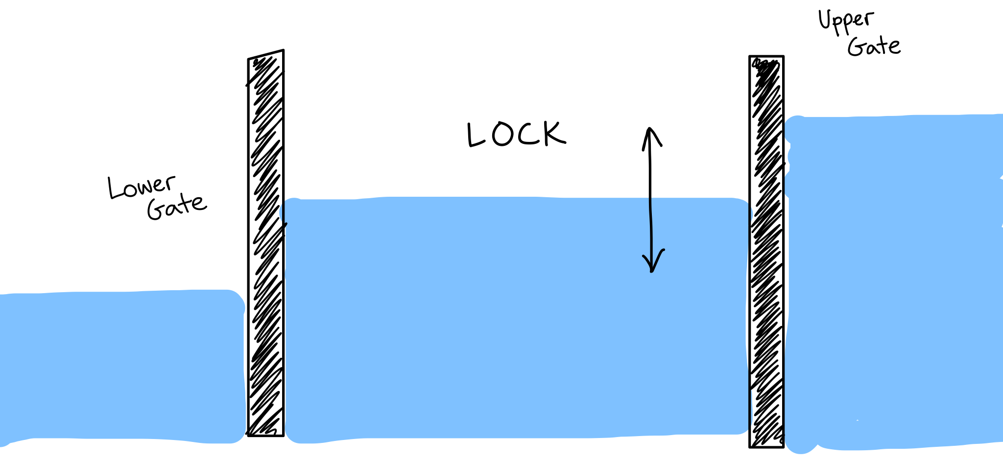
Diagram of a waterway lock.
In canal and river navigation, a lock is a device used for raising and lowering vessels between stretches of water that are at different levels. That’s exactly what our formula accomplishes. Our formula is a CSS calc “lock”.
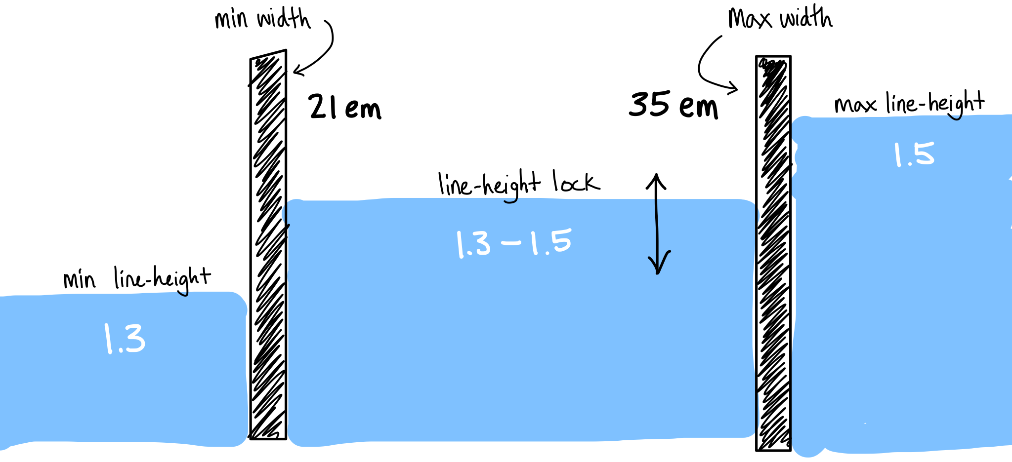
“Molten leading” as a CSS lock.
Take molten leading as an example. The gates are our paragraph’s minimum and maximum widths, and the water level is our line-height. Below the bottom gate, our line-height is a static 1.3. Above the top gate, our line-height is a static 1.5. The magic happens in between — as our paragraph’s width flexes, our line-height flexes dynamically to maintain an appropriate value. Here it is on CodePen:
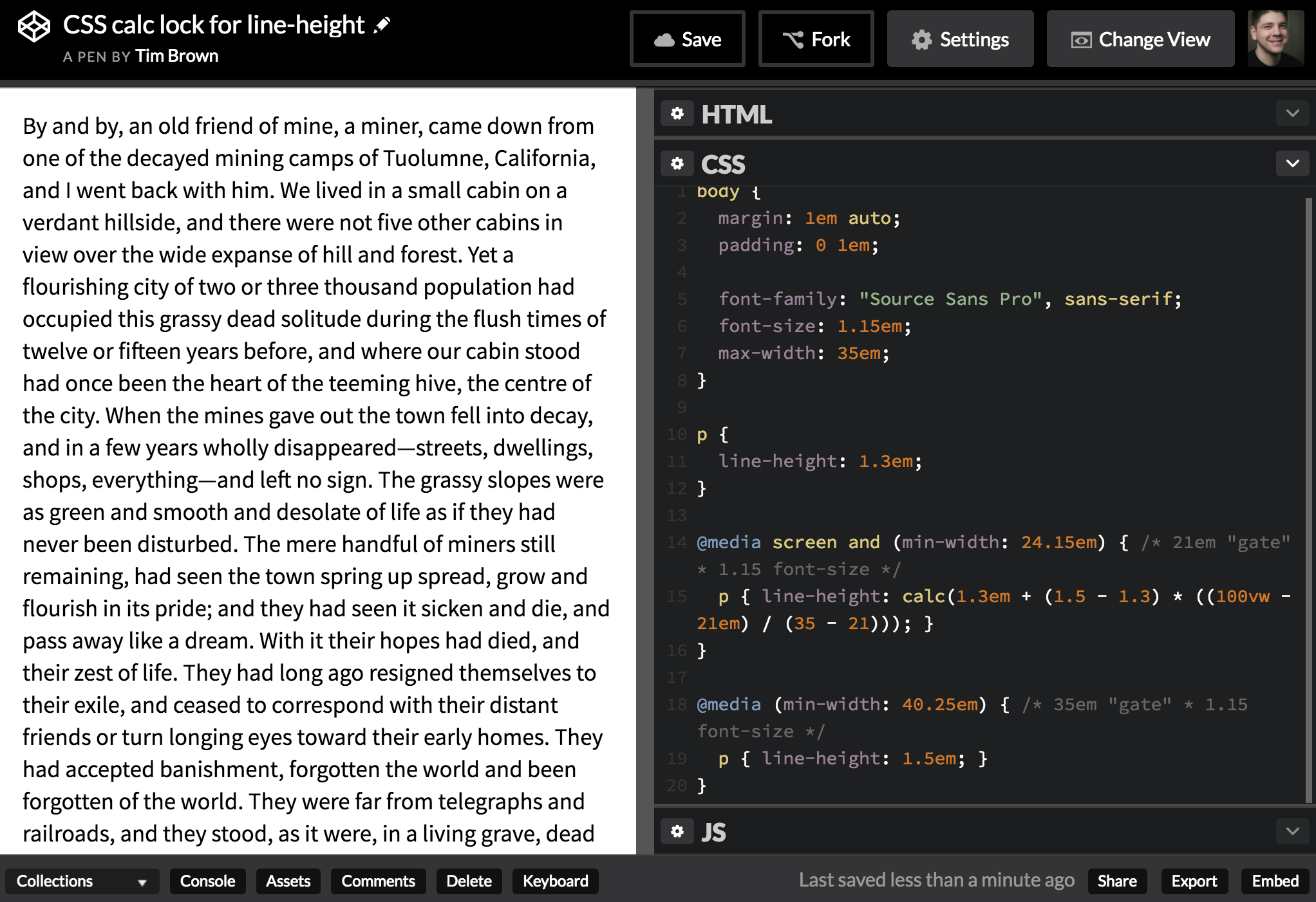
And here’s what a CSS lock looks like in code:
line-height: calc(1.3em + (1.5 - 1.3) * ((100vw - 21em)/(35 - 21)));
To understand how the formula works within calc(), we’re going to work through it backwards.
- See the very last part? 35–21. That gives us the full range of our paragraph’s width. It resolves to 14, because 14em is the difference between our paragraph’s width at its most narrow and most wide.
- To the left of that, we’ve got 100vw–21em. Because of the way CSS calc works, this resolves to an em-based value — and gives us a numerator to place above the 14em we already figured out. So, for example, let’s say the viewport width (100vw) is equivalent to 34em. 34em–21em = 13em. Note that the viewport unit in this step is our secret sauce. The fact that this value can change dynamically with browser window width is what makes a dynamic line-height value possible.
- So the whole expression to the right of the multiplication sign gets distilled down to this: 13em / 14em, or 0.928571429em. Think of this as how close we are to the “upper gate” of our lock. If it’s near zero, we’re close to the lower gate. If it’s near one, we’re close to the upper gate.
- Moving to the left of the multiplication sign, we compute the difference between our maximum and minimum line heights. 1.5–1.3 = 0.2. This gives us the full range of our fluid line height.
- Now we multiply the full range of our fluid line height (step 4) by how far along we are toward the upper gate of our lock (step 3):
0.2 * 0.928571429em = 0.185714286em. - Add this to the minimum line-height, and we end up with a dynamic, fluid line-height value: 1.3em + 0.185714286em = 1.485714286em. Hey look, it’s pretty close to our maximum line-height of 1.5 — about as close as our value from step 3 was to our maximum paragraph width.
- Enclosing all of this logic in a width-based media query lets us disable it by default (use our minimum line-height of 1.3), enable it when the viewport is wider than our lower gate (use a line-height lock above 21em) and disable it above our upper gate (use our maximum line-height of 1.5 above 35em). Because em-based media queries refer to the default font-size of 100%, I multiplied mine by the root font-size I chose for the typeface I’m using (1.15em). See the CSS code on CodePen.
Let me know if that didn’t make sense, or if there’s something I can clarify. One thing bothering me is that I couldn’t get this lock’s result to be unitless. I generally prefer to use unitless line-height values. I also wonder how the math might be different with container or element queries…
This concept of a CSS lock might be useful in many ways.
Consider Cyrus Highsmith’s idea of text block “tempo”. Not only line-height, but letter-spacing, word-spacing, and margins, could all flex relative to a text block’s width, loosening to slow the tempo, and tightening to speed it up.
Or, consider our future with variable fonts. Type’s x-height could flex relative to the font-size at which the type is set. Smaller type needs a taller x-height, while larger type looks better with a shorter x-height.
If these sound like nerdy details, that’s because they are. But so too, they are some of the reasons why the best printed typesetting often feels better than the same text on screens in a web browser. Typographers have traditionally paid close attention to these very nerdy details.
And CSS locks are useful for more than just typography. Use them wherever you need specific fluid behavior, contained within certain boundaries. “CSS locks” is a name I’m using for a specific kind of value calculation. I hope it’ll make communication easier and this concept more useful. But it begs the question: for what other formulae would it help to have names?