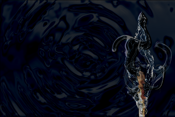
creating a liquid flame using filters, hue-and-saturation and blending modes (original) (raw)

Software: Photoshop CS3, though it is manageable with older Photoshop versions.
Aspects:
[x] filters
[x] blending modes
[x] shortcuts
[x] tweaking and saving default brushes
Difficulty: intermediate. Basic knowledge of Photoshop would come in handy.
Notes:
- All you might need for this tutorial is an image of a match, which you can cut from the original image and insert into your canvas. Though you can, of course, make the match yourself.
- By following this tutorial, you will most certainly end up with many layers. To save some time it might help to name some of them. I’ll drop a note on which, though you can name wherever you think it’s necessary.
- I’ll mostly be working with shortcuts today.
- There will hardly be any specific settings given in this tutorial, simply because the methods used here call for different settings each time. No two shapes will be the same in form or size, and thus the settings for each will consequentially be up to the maker.
- This graphic takes time to make, so you might like to bring some along.
- If you start the tutorial and don’t have time to finish it, save it as .psd file so you can work on it again another time without losing any of your layers.
1: Starting off
Open a new canvas – 600x400 – with a transparent background.
Reset your fore- and background colors. (d)
Hit (alt + backspace) to fill your background with the foreground color, which would be black now.
Insert your match, then resize and position it to your liking using free transform. (ctrl + t)
Name this layer match.
2: Creating the flames
Create a new layer (ctrl + shift + n) and, using the pen tool (p), draw a random outline around the match which – at least slightly – resembles a flame.
Then open the paths window and click on the ‘load path as selection’ button.
[ 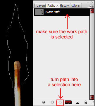 ]
]
Hit (ctrl + backspace) to fill the selection with the background color (white).
Hit (alt + backspace to fill with the foreground color.
Then go to select -> modify -> contract and type in 1 pixel.
Hit (alt + backspace) to fill it with the foreground color (black).
Repeat this several times using random pixel-settings varying from 1 to 7 (or less) pixels until you are satisfied with the overall look.
[ ]
]
Then go to filter -> distort -> glass. Set distortion and smoothness to something above 3. They don’t both have to have the same setting, but the difference between the two shouldn’t vary all too much either.
The texture should be ‘frosted’ and you can apply any setting you like for the scaling.
Once you’re done, you duplicate your layer and set the top one to color burn.
Hold down the shift key, and select both the flame layers.
Right click on one of them in the layers window and merge them - or press (ctrl + e).
[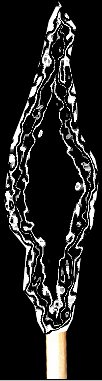 ]
]
Hit (ctrl + u) to open the hue and saturation window, check the colorize button and apply a color to your flame. I chose something bluish.
Call this layer ‘flame’ then hit (ctrl + j) to duplicate, and then open the liquefy filter window (shift + ctrl + x).
Here you can go crazy and create various shapes.
Zoom in (z) to about 200% for a more detailed view.
You can start with the bloat tool (b) and then tear the flame up a little by using the twirl clockwise tool (c) and shifting the mouse back and forth on one spot.
Use the pucker tool (s) to ‘squish’ the pixels together randomly. This tool might come in handy if you have bloated a selection a little too much (e.g. a branch of the flame you like) but don’t want to use the reconstruction tool (r) on it.
The reconstruction tool is a tool I seriously don’t like much in this case. It uses up a lot of MB RAM, and it can ‘ruin’ a part that was just about right, but not quite perfect.
You can, of course, also use the push left tool (o), the mirror tool (m) and the turbulence tool (t), to create a shape.
Liquefy your flame several times, each liquefied flame being on a new layer.
You can both duplicate your original flame layer and work on that, or you can simply duplicate a liquefied layer and continue manipulating that. All in all, it makes little difference.
Please read on to the next step after having liquefied your first layer.
Here is an image of the various shapes I created using this method:
[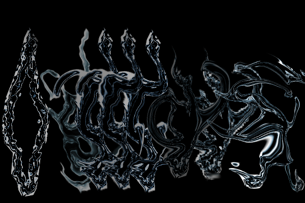 ]
]
Your shapes will certainly look different, and the colors will also be brighter in yours. That is because several different filters have already been applied here, which you have yet to apply.
3: More filters, blending modes and opacity
Each time you create a new liquefied layer, you might like to directly apply a different blending mode.
To create the effects in this graphic, I used the blending modes difference, pin light, exclusion, linear burn, linear dodge and overlay.
Feel free to tweak the opacity as well before you duplicate for the next liquefied layer.
You might also like to apply multiple filters to each (or more than one) of your flame layers.
I recommend the following filters:
1. Distort:
diffuse glow (no or hardly any graininess), glass, ocean ripple and ripple. (For the ripple filter you’ll have to move canvas in the window and choose a percentage and setting that suites the style of your individual flame layer.) Click for screenshot
2. Sketch:
bass relief, plaster and chrome.
Other filter you might like to take a look at:
Artistic: plastic wrap.
Brush strokes: accented edges and ink outlines.
Stylize: glowing edges.
You might also like to re-colorize (ctrl + u) your individual flame layers before duplicating.
Note on shortcuts:
(ctrl + f) will re-apply the last filter you have just used.
(ctrl + alt + f) will re-open the last filter-menu you have used.
I found these shortcuts very helpful while making this graphic.
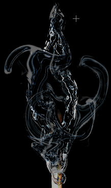
Now duplicate your ‘match’ layer twice and make them your topmost layers.
Set the second layer from the top to ‘color’ and reduce the opacity to your liking.
Only reduce the opacity of the topmost ‘match’ layer after applying the ‘ripple’ filter to it; filter -> distort -> ripple; size=large; amount=100%
Erase (e) those parts of the match that are not covered by any of your liquid flames
Your result could look something like this once you’re done:
[ ]
]
Again, your flames will most likely still be brighter in hue.
4: Altering a default brush to create spray
You can either create the brush yourself by following the next steps, or you can download it here if you’d like to save time. (This tutorial is long enough as it is, ne?)
You can always look at the settings of the brush there if you like.
Create a new layer (ctrl + shift + n)
Choose a soft round brush (b) between 15 and 20 pixels and then open the brushes menu (from the top right-hand corner of your screen - workspace).
Here is an example of the settings I used:
You can either select the ‘scatter’ option, or leave the box unchecked, depending on your taste.
Once you have applied the settings to your liking, it would come in handy to save the brush for future use.
Right-click on your canvas to open the brush-list and then click on the little arrow to open the menu. From there, you open the preset manager.
In the preset manager window, hit (ctrl + a) to select all brushes, then, while holding down the shift key, click on the brush you’d like to keep.
Then click on the delete button.
Click on done and then right-click on your canvas again to open the brush-list yet another time.
If your window is empty now, click on the arrow again and select ‘new brush preset.’ A window will open with your brush in it. Name it and hit enter.
Click on the arrow yet another time and then click on ‘save brushes.’
Give them a name, hit enter and you’re done.
5: Creating the spray
On the new layer you have created draw a white curve with your splatter-brush, arching away from the center of the flame.
Now. Either you can create multiple layers so you can place the layer sequence for a better effect, or you can make all of your splatters on one layer to save time.
Then go back to step #2 and work your way through to #3 (and a half).
This should not take as long as it did. By now, you will most likely be fairly well acquainted with the filters, blending modes and colorization-option.
Once the spray layer is ready, drag it down in the layers menu. I recommend placing it between your ‘match’ layer and background layer.
Unless, of course, you have created multiple spray layers. This gives you more creative freedom, so you can align them whichever way works best for your graphic.
6: Creating the background ripple
Reset your fore- and background colors again (d).
Create a new layer (ctrl + shift + n)
Go to filter -> render -> clouds. [clouds]
Go to filter -> blur -> radial blur; amount ~45, spin, best [radial blur]
Go to filter -> blur -> Gaussian blur; ~1,3 [gausian blur]
Go to filter -> sketch -> bas relief; a lot of detail, smoothness above 5, light -> top. [bas relief]
Got to filter -> sketch -> chrome; apply settings to your liking.
Drag it down in the layers window and place it on top of your background layer.
Set it to hard light. [chrome]
Colorize it again (ctrl + u).
[ ]
]
7: Final touches
Select your topmost layer and create a new layer (ctrl + shift + n).
Hit (g) to select the gradient tool.
Select the radial gradient option and choose ‘foreground to transparent.’
Enter the colors of your choice into both of the color-boxes.
[gradient options1
gradient options2 ]
Create a ‘blob’ that isn’t all too large, then transform it (ctrl + t) and drag it into an oval-ish shape. This will be your flame’s glow, and thus, the dark center should create the core of the flame.
Reduce the opacity of your layer and then set it to linear light (or whatever works best for your graphic.)
(You can ‘ripple’ this layer as well, if you like.)
Add some text if you want to.
Maybe you’d even like to give it a 3D+ripple effect.
For that, apply the layer styles inner shadow, outer glow, inner glow and bevel and emboss to your text (with colors and settings of your own choice).
Then go to filter -> distort -> ripple (again, using whichever settings work best.)
Save as .psd (ctrl + s) file in case you might like to edit your graphic another day.
After that, you can merge all your visible layers (ctrl + shift + e) and then hit (ctrl + l) to open the levels window. Adjust your settings till your graphic has the colorization you like. Or you can hit ‘auto’ and let Photoshop do the job for you.
Then save your graphic (ctrl + shift + alt + s) in the format of your choice.
You are done at long last.
[]
This tutorial took a lot of time, but I hope that some of you found it worthwhile and enjoyable.
I’d be very happy to see your results!
Should you have any questions concerning the features in this tutorial, feel free to drop a comment here and ask.
Thank you very much for reading!