Building Review: The Modern Wing (original) (raw)
Feature Wed Jun 10 2009
In a small two city blocks, two architectural giants expressed their sensibility into two masterworks of building. Gehry utilized technology to create a new, overtly dynamic form, appropriate for the extroverted performing arts. Across the street to the south, Renzo Piano has created an antonymous response of transparent spaces that inspire self-awareness. Even in the smallest of galleries, a view of the city always seems to creep in, reminding one of its presence, even in the most otherworldly of exhibits. Unlike Gehry's explosive sculpture or Anish Kapoor's mirrored blob-like form, Piano relies firmly on a theory of spacial organization that is highly legible, if not outright familiar to the Gothic era.
Immediately upon entering into the lobby, notions of a Gothic nave are difficult to ignore. The simultaneous play of a horizontal axis and great vertical momentum forces a reading of the building as a Gothic cathedral for art in a Modern interpretation.
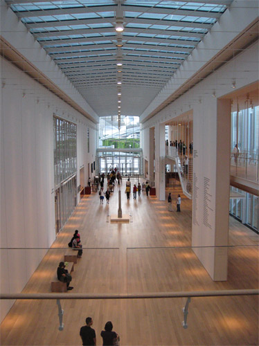
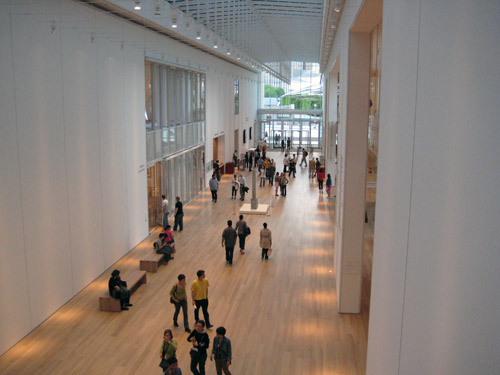
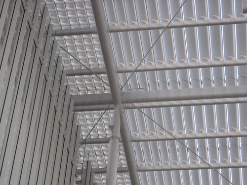
Like those works, the dominant theme for the entire building is "lightness." Whether it be the mass-like qualities of a "light" structure or the illumination of spaces, Piano clearly sought to create a departure from the dark, heavy Art Institute building. The vaulting, in this case, is a series of steel cabled modules that exaggerates the longitudinal perspective, immediately framing views of the mezzanine or Lurie Gardens. Adjoining the main lobby are windowed aisles that, more than coincidentally, exist as a type of clearstory, bathing the buff wood flooring in a soft, evenly dispersed light. Intersecting the lobby at the north end are two transept-like corridors that lead to conference rooms and non-display related spaces. To access the galleries, suspended staircases descend from the ceiling and rise between lobby and a wall of windows looking out onto a courtyard. Perhaps responding to the shape of the site, the main gallery space feels slightly like an appendage when compared to the grandness of the main lobby. This is certainly not an uncommon result with the rigidity that is art gallery space. (See theMilwaukee Art Museum by Santiago Calatrava.)
Continuing with a strict reading of the Gothic form applied to the Modern Wing would set the galleries apart as apsidioles, added as an accessory the the principal function of the building. However, Piano's effort in shaping the galleries themselves is remarkable. Surrounded by two layers of glazing and nifty skylights and clearstory windows, the exhibits will probably never be displayed in a more comfortably lit space. The top level galleries illuminated in a manner that makes even the most reluctant of art observers feel as though they are in a natural, open setting, not a stuffy, reclusive institution. The rigidity of the enclosure is further dissolved through Piano's effective use of layering.
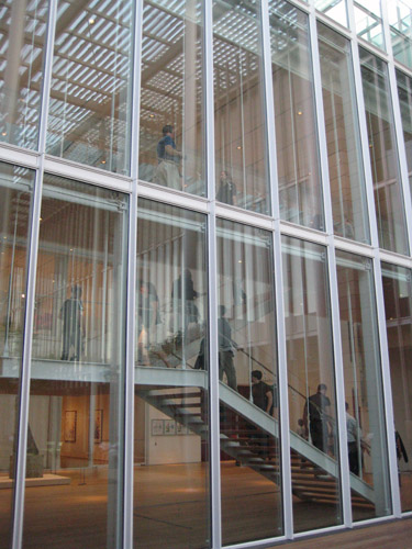
The double-layer curtain wall was previously mentioned but the numerous vertical mullions emphasize the screened airiness of the structure. The string-like steel supports from which the stairway hangs accentuates the vertical ascendancy of the occupant. Opening the museum with Cy Twombly's was a fantastic decision. While the artists layered compositions compliment Piano's tectonic structure, Twombly's paintings frenetically contrast the logical construction of the space.
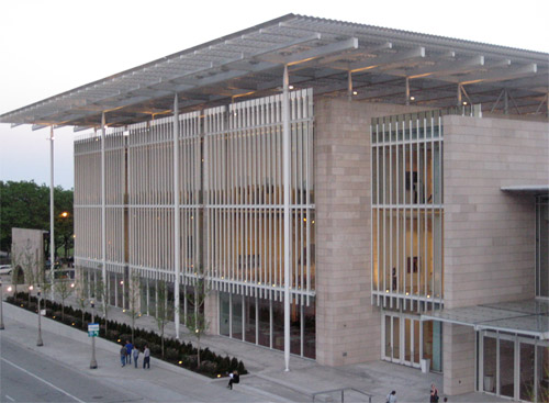
From the exterior the sensations experienced on the inside reveal their secrets. Most striking is the contrast when viewing the Modern Wing from the Lurie Gardens. The building exudes every bit of the technology that allows it to be a light airy structure that it is. Standing out from the heavy, hewn stone of the gardens the horizontal line of the roof extends impossibly thin over the gallery portion of the building. The slender white columns thin at their ends as though the roof could unhinge from the pins holding it down and truly fly away as a "magic carpet." One detail that is lost from most vantage points is noticeable from the Nichols Bridge. In order to open the third level gallery space to artist friendly diffused light while still protecting from harmful direct sun, the roof is constructed of a series of slats turn up towards the northern sky allowing sunlight from the south to bounce in and achieve the intended effect.
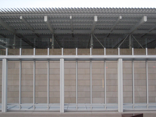
Returning once again to the Gothic lexicon, the only use of heavy limestone of the original Art Institute building is to separate the volumes of space into a harmonic facade. The gallery wing, perhaps secondary on the interior, is set prominently forward and dominates the elevation along Monroe Avenue. Another volume that emerges is the escalator stack that leads to the Nichols Bridge. Perhaps by virtue of its location, running parallel to Michigan Avenue, Piano's bridge successfully serves dual functions as a destination and a connection. Even the experience of walking across the bridge and feeling slight deflections in the steel reinforces the impossible lightness the Modern Wing possesses.
The notion that the referencing of Gothic principles would make Piano's Modern Wing feel like an old fashion model in new clothes, the result is hardly a redressing of forms. Just as the Gothic era was driven by experimentation and reflection to perfect building, the Modern Wing displays a remarkable attention to detail and quality of space that could only be learned through a lifetime of designing, studying and rethinking architecture.
About the Author
Carl Giometti is a Gapers Block staffer who spends his days as an urban theorist disguised as an architect. He tries to professionally and socially associate with anyone else who can enthusiastically talk about public transportation. His wife, as evidence of her fervor for urban planning, is currently asleep with their two cats as he writes this.
