3 maps that explain gentrification in Philadelphia (original) (raw)
“Gentrification” is a word that gets tossed around a lot, especially in Philadelphia, a city where some neighborhoods are experiencing rapid demographic shifts. (See our series here) The changes mean different things to different people but a common set of facts can help ground conversations.
A recent analysis from the real estate website RENTCafe has made the rounds locally with the news that two Philadelphia zip codes — 19123 and 19146 — rank among the top 10 most gentrified in the nation. The Rentcafe wonks calculated a “gentrification coefficient” using three indicators of change: median home values, median household incomes, and levels of higher education, comparing 2000 and 2016 American Community Survey data.
The 19123 area — spanning Northern Liberties, West Poplar, and Callowhill — experienced a 203 percent jump in home values, 95 percent growth in household income and a 230 percent rise in college-educated residents. The 19146 zip that encompasses Southwest Center City, Point Breeze, and Graduate Hospital, home prices soared 404 percent, household incomes increased 51 percent, and college degrees rose 106 percent. But while the analysis illuminates the demographic shifts sweeping across neighborhoods bordering Center City to the north and southwest, earlier research by Pew Charitable Trust and others drill into citywide trends measuring changes by census tracts, which span smaller geographic areas and offer more defined boundaries.
Here are four census-tract level maps that have helped us understand the g-word’s impact on Philadelphia.
The Basic Map
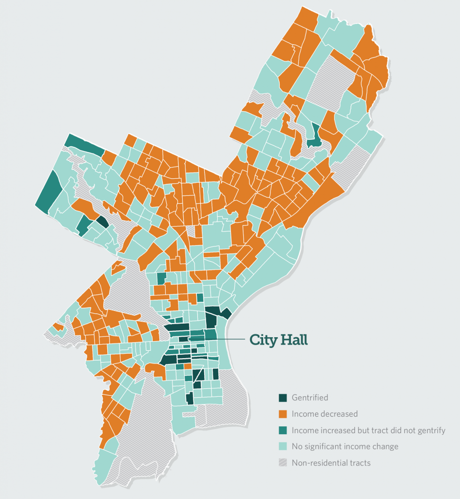
An oldie but a goodie, this 2016 Pew Charitable Trusts map tracks gentrification across the city between the years 2000 and 2014. The think tank defined a gentrified areas as one that shifted from a predominantly low-income population to a significantly higher-income one, using 2000 and 2014 census data on household median income data to track change. The map shows gentrification clustered in census tracts close to Center City including Graduate Hospital, the East Passyunk section of South Philadelphia and Northern Liberties while showing that many more neighborhoods across the city experienced “statistically significant drops in income” in the 14 years studied. Those areas where incomes declined are colored orange on the map. Those that gentrified are dark blue.
In total, only 15 out of the city’s 372 residential census tract gentrified, according to Pew. Meanwhile, more than 10 times the number —164— saw a loss of income. Of the remaining 171 residential tracts, a number of them, shaded green, experienced some changes associated with gentrification such as an increase in college-educated residents, rising real estate prices, shifting racial and ethnic compositions and a modest income bump, but did not meet the bar for significant income gain to be considered gentrified. Many others — colored turquoise — recorded no significant income change.

Income Change in Philadelphia Census Tracts, 2000-2014 (Pew Charitable Trusts)
Pew also found that most of the gentrified neighborhoods not only become wealthier but grew in population, with added residents mostly identifying as white but in some cases, Hispanic and Asian. The authors linked the population surge to Center City revitalization efforts in the 1990s. With Center City a safer, cleaner and a more attractive place to be, people began to migrate to areas nearby in the early 2000s.
Mapping housing losses
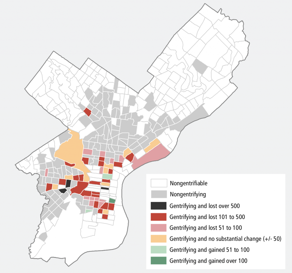
This 2016 map from the Federal Reserve Bank of Philadelphia shows that low-cost rental units have vanished from gentrifying neighborhoods at nearly five times the rate of non-gentrifying areas. Areas classified as gentrifying must have had a median household income below the city median in 2000 and seen income levels and education levels both rise above citywide averages between 2000 and 2013.

Changes in Low-Cost Rental Units in Gentrifying Philadelphia Census Tracts, 2000-2014 (Philadelphia Reserve Bank)
Only two gentrifying census tracts had gained over 50 affordable units in 14 years: Pennsport/Dickinson Narrows in South Philadelphia and Chinatown.
Neighborhoods who lost the most affordable units included Graduate Hospital, Passyunk Square, University City and parts of Kensington.
The Fed notes in its analysis that more than 2,300 of the city’s federally subsidized rental units were in these gentrifying neighborhoods. “At the community level, the loss of affordable units contributes to residents being segregated by income and socioeconomic status,” researchers wrote.
Beyond Gentrification
In this interactive map from Next City, author Tom Ferrick does not explicitly define gentrification but creates his own metric called the “progress index” based on crime rate, household income, population, poverty and home prices. The map shows dense pockets of “great advances” and “great challenges.” From Fishtown down to South Philadelphia across a central belt surrounding Center City, diminishing crime, increasing population and rising home prices create a constellation of advancement, visualized in black and a dark purple hue. The findings reflect earlier reports on gentrification’s spread.
“At the top of that list is Southwest Center City, where the decline in crime and poverty, and the increase in population and wealth far exceeded the city itself. Others are Point Breeze, Gray’s Ferry and Fairmount/ Spring Garden and Northern Liberties/ Fishtown,” Ferrick wrote.
To the South, West and North, however, there are stark boundaries between neighborhoods. Nicetown, for example, is classified as “advancing” thanks to decreasing poverty, crime reductions and other gains while many nearby areas qualify as “falling behind,” or “facing the greatest challenges” due to declines in income, population and housing values. Those areas lagging behind are colored in shades of orange.
Of the 55 neighborhoods measured, 16 reflected citywide averages on the five “progress indicators” measured. These “average” neighborhoods are light purple.
—
This article is part of a series, “Gentrified: stories of rapidly changing Philadelphia.” The series is a collaboration of PlanPhilly, Keystone Crossroads, and WHYY News, supported by a grant from the John S. and James L. Knight Foundation.
WHYY is your source for fact-based, in-depth journalism and information. As a nonprofit organization, we rely on financial support from readers like you. Please give today.