Poor Yorick Entertainment (original) (raw)

Okay, so I haven’t really posted any new art in three years, and I even failed at posting this BEFORE the actual event, but I have just returned from the 2024 David Foster Wallace Conference (my fourth overall) and had an amazing time. A life-affirming experience, as always.
I was happy to be asked to create the logo for the conference again this year, but I will admit that I didn’t have any fresh ideas, having done this a few times now. Conference organizer Matt Bucher suggested the Whataburger connection, since it’s a Texas institution (some might say cult), and I loved that concept. I actually love Whataburger’s branding a lot more than its food.
Wallace had a junk food diet and love for fast food, which must have inspired him to name the Whataburger Southwest Junior Invitational after this regional fast food chain. I assume the he would have encountered it in Tucson, when he was doing his postgraduate work at the University of Arizona. It’s not hard to imagine him playing a few tennis matches at the Randolph Tennis Center (the site of the tournament) and then grabbing a bite to eat at the local Whataburger.
It’s possible to read Infinite Jest, and depending on where you live, not realize that Whataburger is a real brand. There are about 20 Whataburger locations in Austin, TX alone, which makes sense, considering its proximity to the Whataburger HQ in San Antonio. They operate 1,000 locations across the southwest and have a history going back to 1950.
I can’t tell if there is any deeper meaning in DFW’s selection of this brand. The young tennis players take qualifying for the Whataburger tournament very seriously, some, including Hal Incandenza, pushing themsleves to the physical, psychological, and pharmacological limit to get there. This seriousness is undercut by a ridiculous sounding sponsor for the tournament, which turns out to be a very real American brand of fast food.
While I’ve mostly used this blog to feature my own Infinite Jest-inspired art, from time to time I will come across something worth sharing.
Infinite Zest is 100% Albarino, the creation of Matthew Landry, in collaboration with Stag’s Hollow Winery in Okanagan Falls, British Columbia. It’s a limited run of 50 cases and is only available in the BC region of the Convexity. (Or Concavity, depending on your POV).
As a recent transplant to the Canada, I was able to pick up a couple of bottles at Legacy Liquor Store in Vancouver.
I appreciate the attention to detail with the design. As for the wine, I haven’t opened it yet, but will add my review soon.

Print available here: https://www.etsy.com/listing/888098240/baby-pictures-of-famous-dictators-movie
Continuing my mission to redesign some of my earlier work for this project… This is actually my third attempt at designing this poster. The first design leaned heavily into the visuals of the Eschaton wargame, but I revisited that idea for another piece, an Eschaton infographic, so for the redesign I took a different approach.
The yachting cap is a nod to Michael Pemulis, of course, but also evokes the imagery of a military dictatorship. I loved the reflection of the ball on the wet court. Is it raining on the map or the territory?
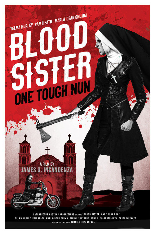
Print for sale here: https://www.etsy.com/listing/901496927/blood-sister-one-tough-nun-movie-poster
Blood Sister: One Tough Nun - Year of the Tucks Medicated Pad. Latrodectus Mactans Productions. Telma Hurley, Pam Heath, Marla-Dean Chumm, Dianne Saltoone, Soma Richardson-Levy, Cosgrove Watt; 35 mm; 90 minutes; color; sound. Parody of revenge/recidivism action genre, a formerly delinquent nun’s (Hurley’s) failure to reform a juvenile delinquent (Chumm) leads to a rampage of recidivist revenge. INTERLACE TELENT PULSE-DISSEMINATION 21 JULY Y.T.M.P., CARTRIDGE #357-87-04
Look - I’m aware that I have a pretty bad case of George Lucas Syndrome. That is, the tendency to hate your old work and want to redo it. When I started Poor Yorick Entertainment back in 2011, the original intent was to design the movie posters of James O. Incandenza’s filmography. It quickly grew beyond that scope, and I think my work got better as it went on. The poster for Blood Sister: One Tough Nun that I designed in 2011 was one of the first movie posters I ever created, and as such, my skills weren’t that good. I’m mostly embarrassed by this design, but unlike George Lucas, I’m letting it remain publicly available for the sake of posterity.
What a difference nine years makes.
It’s a testament to Infinite Jest that I still want to engage with it creatively, nearly a decade after reading it for the first time.

Back in 2015 there was a contest to design the cover for the 20th anniversary edition of Infinite Jest. I jumped at the chance. I also tracked down as many submissions from other artists as I could find and featured them on this blog.
You can see my submission from 2015 here. Needless to say, I didn’t win. I liked the concept I came up with, but I was maybe pushing myself a little too much because photography isn’t my strong suit. But I envisioned hundreds of tennis balls receding back into infinity. They felt like the book’s characters - despite being in this massive group, each one of them is lonely and distanced from each other. I was able to get my hands on loads of actual tennis balls and did a photoshoot at my neighborhood park in Phoenix, AZ, where the temperature was about 110º that day and I almost passed out from dehydration.
So, anyway, five years later I’m looking at this piece and wondering if I could have executed it better. I still liked the concept, but wanted to approach it in a different way. This new version is a shift in perspective, and I think I like it way better now.
My new design is now available as a poster print on Etsy.
https://www.etsy.com/listing/874252144/infinite-jest-poster-alternative-book
It occurred to me recently that David Foster Wallace is one of the greats at creating memorable character names. Who can ever forget Mildred Bonk or Calvin Thrust?

I was originally planning to debut my design for Millennial Fizzy, the fictional soda from Infinite Jest, at the 2020 David Foster Wallace Conference in Austin, TX, but, sadly it was canceled due to the global COVID-19 pandemic. The plan was to produce a few of these and sell a limited quantity at my merch table. Currently, only this prototype exists, but I thought I would share it anyway.
Millennial Fizzy is mentioned ten times in the novel, sometimes abbreviated M. Fizzy or simply, Fizzy. It’s not described in any detail, other than to mention that there is a “caffeine-free” variety, and that consuming three of them along with a package or Oreos creates a “"jittery amphetaminic buzz,” which I suppose fits in nicely with the theme of drug abuse in the novel. Food is, after all, a drug.
I was inspired by the neon blue of the Jones Soda Blue Bubblegum variety and how it matched the color of the 10th Anniversary edition of Infinite Jest. So I took some liberties with a blue and yellow color combination to match the book cover. I even included my own O.N.A.N. logo on the back of the label.
I find the term “millennial” here to be interesting because it seems like a term that has only recently become popular, although it was first coined in 1987 by William Strauss and Neil Howe to describe the generation who would become adults at the turn of the millennium. It brings to mind Pepsi’s 1984 “Choice of a New Generation” marketing campaign.

I got my first opportunity to design the logo for the David Foster Wallace Conference in 2014 and it’s been a great relationship over the years. The 2020 conference is being put on by the The International David Foster Wallace Society and held in Austin, TX, June 4-6 of next year.
With the venue change, I wanted to break out of the old circle motif and try something new. The new logo is inspired by the cloud imagery that appears on the cover of a few editions of Infinite Jest. The circles are still present, but as overlapping shapes that mirror the plot structure of Infinite Jest - sort of a Venn diagram of characters and scenes.
Keep up with the conference here: https://www.dfwsociety.org/dfw2020/


It’s been awhile since I’ve created any new Infinite Jest artwork, but I am rereading the book and was inspired.

BUY PRINT HERE: https://www.redbubble.com/people/cwayers/works/36958373-infinite-jest-newspaper-david-foster-wallace?asc=u&p=art-print
When I first published this design piece back in 2011, it didn’t take long for someone to point out that I had correctly spelled Antitoi Entertainment on the outside of the store when it is clearly stated in Infinite Jest that the sign is incorrectly spelled as Antitoi Entertainent. It’s the first time I’ve been chastised for spelling something right, but here I am 8 years later, and I have decided to fix the “mistake.”
Some thoughts on this piece: It was meant to combine a lot of disparate elements of Infinite Jest that I was having trouble adapting into individual pieces. I created the layout from scratch in the style of what the Boston Globe would have been like in the 90s.

The Whataburger Invitational poster is now available on my shop.
———
The Whataburger Southwest Junior Invitational is a major event on the junior tennis tour. For the top players at Enfield Tennis Academy, “The Whataburger” is quite a source of anticipation. The event is held annually in Tucson, AZ.
Whataburger is a regional, real world brand, although I had never heard of it until I moved to Phoenix, AZ. It has a charming, distinctive and old fashioned logo. Whataburger operates fast food restaurants mostly in the southern parts of the United States. There are currently six Whataburger locations in the Tucson area, where parts of the novel take place. On a personal note, as fast food goes, I find Whataburger to be well below average, with their stale buns and wimpy fries, although they are open 24 hours and there is one within walking distance of my house, which probably explains my repeated patronage.
In the real world I can’t find any evidence that Whataburger has ever sponsored a junior tennis event, although I did find that in 2004 they sponsored a college track meet in San Antonio, TX.
The location for the Whataburger Southwest Junior Tennis Invitational, The Randolph Tennis Center, is mentioned early in the novel, during Hal’s interview at the University of Arizona. This is a real location, which can be viewed here.

In trying to upload artwork to my online store, I realized that I had lost the hi-res original artwork that I had created for this in 2011, so I took it as an opportunity for an update. It’s been slightly redesigned, but if you’d like to compare it to the old version, it’s still available to see here: http://pooryorickentertainment.tumblr.com/post/6494048800
——
One of the stranger things about Infinite Jest is the wild shift in tone between describing the personal and the political. Wallace’s descriptions of his characters’ personal lives are heart-wrenchingly sad, beautiful and genuine; his take on the political world that these people inhabit is highly satirical and absurd.
The logo for the NAFTA-esque Organization of North American Nations (O.N.A.N.) is described as “a snarling full-front eagle with a broom and a can of disinfectant in one claw and a Maple Leaf in the other and wearing a sombrero”.
The maple leaf and sombrero refer to Canada and Mexico of course; the broom and disinfectant a reference to germaphobe President Johnny Gentle and his Clean U.S. Party (C.U.S.P.), and their pro-hygiene and cleanliness platform.
The acronym O.N.A.N. is likely a reference to the biblical Onan, whose name has become synonymous with masturbation (onanism). Perhaps Wallace is trying to say that the United States is trying to remake Canada and Mexico in its image - a country that is wasteful and only concerned with self-pleasuring.