Interview: Phil Martin (original) (raw)

Born in Dallas, Texas in 1923 and a bombardier in World War II, Phil Martin spent a number of years as a cartoonist before moving into commercial art and lettering. He also spent some time as a radio comedian.
In 1969, Martin founded Alphabet Innovations and, in 1974, TypeSpectra. These companies designed and produced over 400 film fonts for use in the VGC Photo Typositor, a machine for setting headline type. Later, some of these typefaces were licensed for use with text setting machines, and many of them are seeing new life as digital fonts through the efforts of Steve Jackaman of Red Rooster and others (including me).
Martin, now eighty-one, lives in Florida where he runs an eclectic personal website, publishes an electronic newsletter, and sometimes performs as a lounge singer. He recently started writing an autobiography, the current draft of which can be found on his website.
I first learned about Phil Martin’s work when I was in high school in the early seventies. A friend of my father’s was the in-house commercial artist at the company in which they both worked. My father’s friend knew of my interest in the graphic arts. One of the things he gave me was a specimen booklet for Alphabet Innovations. It made a big impression on me and is one of the things that got me interested in type design.

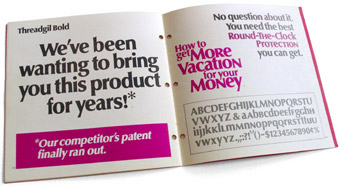
Alphabet Innovations specimen booklet (1972)
Over the years I learned more about AI. In my first job as a graphic designer, my boss had a complete collection of Alphabet Innovations and TypeSpectra sample books. At the time, I was only dimly aware of the person behind the faces. I became aware of Phil himself from his regular column in The Typographer, the now-defunct journal of the TIA (Typographers International Association).
A few years ago, I discovered that Phil was alive and well and had an internet account. He started to pop up regularly on the Typo-L mailing list. Recently, I agreed to digitize some of Phil’s old fonts, including his most recent—a redesign of Century Schoolbook called Grad he did for Re:Language, a newsletter he published in the early 1990s.
Mark Simonson: What made you want to become a type designer?
Phil Martin: By age 45 I had developed a love affair with language. My top art client was Fleming & Sons in Dallas, my home town, a manufacturer of egg cartons. I painted mock-ups to show their clients what the egg carton design would look like. So I painted with a brush almost every type style existing at that time. My constantly sore thumb and two fingers that held the brush fed a love of letterforms up my right arm and into my heart. Oh God, what a dream! Not only to love the language, but to create the shapes which allow the reading of it.
MS: So, you were working as a lettering artist? How long had you been doing that?
PM: In my general services as a commercial artist, I had developed a reputation for what we called hand-lettering at that time. You also reminded me that when I came out of WW II, I worked at two art studios before opening my own. First there was Whaley Studios with Earl Routsong as the lettering man, next Bud Biggs Studio with Lou Snell as lettering man. The fact that I can call their names today reminds me that I admired their work. Not at all in their class was I. Only at this moment do I realized Earl and Lou must have been the sparks that determined my future. Earl was a native Dallasite; Lou was from Ohio.
MS: How did Alphabet Innovations start?
PM: Always searching for a substitute for talent, I bought a Photo Typositor made by Visual Graphics and taught myself how to put my own letters on film strips. When I had a new face ready, I would set copy to show it off, make 35 photostats and mail them to potential clients, saying this look is available only from Martin Studios in Dallas. When I had a dozen faces ready, a Dallas typesetting company asked for a franchise. That night at home I gave myself 15 minutes to decide on the name that would replace Martin Studios.
MS: Who else was involved in AI and what were their roles?
PM: My secretary was Barbara Jameson. I averaged a new secretary every two years. My last one was Debbie Nugent. Then there was Wilson Jones who did the font opaquing. Film Strips of that time had pin-holes, requiring a little opaque to be painted on. Then there was George Brian who came as a beginner designer. When he left eight years later, I had become his student. He did more work than I on my most successful face — Souvenir Gothic — and my biggest flop — Scenario. More than half of those franchised typographers paying me royalty of 25 to 30 cents for every word set included copies of all their settings with their monthly royalty reports. Just imagine how this let me know what was selling and what was not. Upon George Brian’s leaving, George Thomas came to work for me. A technical genius in my view. He made my studio the branch office of Merganthaler. When type director Mike Parker quit Merg to found Bitstream and hire away all Merg’s type-knowledgable people, Steve Byers had no way to keep Merg in production except for what George and I did for him. And Ed Kelton worked for me a short time doing “this and that.” Those are all of the personnel of AI and TS that there ever were. I got kidded that you had to have a first name for your last name, if you wanted to work for me. George Brian, George Thomas, my webmaster today is Don Thomas, my favorite cab driver today is Karl David Henry.
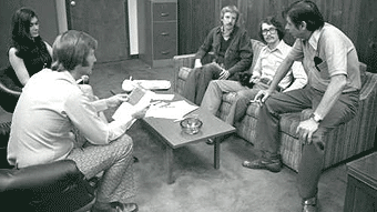
AI staff meeting, c. 1975. Phil Martin at right.
MS: How did TypeSpectra come about? It seems to have replaced or displaced AI.
PM: Toughest question I will ever get. Even today I don’t know if forming the second company was a good decision. When my Chicago franchisee failed to take one of my offerings, thereby blocking me out of that important market, I decided my franchisees perhaps had too much exclusivity, too much power, and I would find a way around those who chose to not to stay with my guidance.
MS: How were your fonts distributed?
PM: In little boxes of rolled film by U.S. mail.
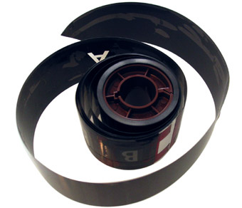
An AI master 2-inch film font: Fortura Biform Demibold (note opaquing and ruby masking tape).
MS: What I mean is, who were your customers and what kind of business arrangement did you have with them?
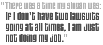
PM: My “customers” were my franchised typesetting companies, each of whom held exclusive rights to his (all but Betty in Seattle was a “his”) territory. They paid a licensing fee of around $20 a font plus royalty. I supplied the display booklets at my cost. Size of territories? One of my first franchisees Irving Hoffman in Boston held all the New England states. Ohio was broken into four territories. Distributor Manfred Leyhausen of West Germany supplied a German Postal Map to determine territories for the several German franchisees. Etcetera! No matter where the fonts were, they were licensed by me to be there, but I retained ownership of every one. There was a time my slogan was, “If I don’t have two lawsuits going at all times, I am just not doing my job. I fought quite a few lawyers, one in Toronto was the only one who ever beat me. United Bank of Illinois thought they could take the fonts of my bankrupt Rockford franchisee. I read them a letter I had in pencil that was to be typed that night. They turned my fonts over to my just-appointed Rockford agent immediately, to avoid receiving that letter.
Font: Semi-Stark
MS: What was in the letter you were going to send to the bank in Rockford?
PM: Let me back up and tell you how Toronto and Rockford had a connection. Monolino Typesetting the largest typesetting in Canada and my Toronto franchisee went bankrupt. Typically in a matter like this I would declare the fonts to be my property and order them shipped to whomever I selected to be the new franchisee. But in this case the estate hired a gunslinger (legal term) to come after me. He said, my client considers your franchise for the entire province of Ontario to be quite valuable. Place it with another company without paying my client and I will advise my client to sue that company. I knew he had me, so we worked out peaceful terms. I also realized this was legal terrorism. Anyone I might choose to try to do business with was marked for a lawsuit by my very approach to such a person. It was only 30 days later that my franchisee in Rockford Ill went bankrupt. During this period I had spies everywhere, because everywhere I had a franchisee, there was a competing typesetting company hoping somehow to become my franchisee. So when my wannabe Rockford company explained to me what had happened to my real franchisee and where United Bank of Illinois had all the equipment including my fonts stored, I got a guy from United on the phone. He said they would place everything with somebody who wanted to learn typesetting. The letter in pencil form that I read to him over the phone stated as follows. “So you are going to supply my fonts to a beginner, despite my worldwide reputation for quality. And he will be using my U.S. Registered Trademarks? Let me inform you the trademark statute provides treble damages, and to merely confuse the public amounts to damage in this case. As soon as I learn the name and location of the beginner you have chosen, I will sue him in Federal Court under the Trademark Statute and likely in other courts as well, depending upon other charges my attorneys may deem appropriate.” The fonts were delivered to my new franchisee before the sun went down. A bank holding company dead in the water, without a single word having to be keyboarded on a typewriter.
MS: Who did you consider to be your rivals and/or competitors?
PM: Please keep in mind that all designers knew I received a royalty per headline-word set. Therefore, if they chose any face of mine, they knew the bill would be higher. Well, that was true of Headliners and Lettergraphics franchises too. But they were no competition, because only I had my faces on film strips that allowed the typographer to make money from the jobs. The closest I had to competition was ITC. Nevertheless, enough type users worldwide were willing to pay extra for anything of mine, I hardly felt ITC’s breath. I consider typefaces to be a fashion business. In my view I had the hottest rags over a 20-year period. In changing styles, previous looks return to vogue. Pardon me while I sing two choruses of “Everything Old Is New Again” and did you know composer Irving Berlin wrote all of his songs in F-Sharp, the only key he could play his piano in?
MS: AI had a different business model from ITC. ITC licensed their faces to typesetter manufacturers whereas AI supplied fonts directly to type shops in exclusive arrangements. Could you comment on the relative merits of these strategies?
PM: Not sure I can comment with a clean mouth, but will give it a try. The ITC model did not work and ITC damn well knew it. They would sign a pirate company knowing full well they were signing a pirate company. The pirate would wait for Visual Graphics Corporation in Florida, manufacturer of the Photo Typositor, the machine that began the typographic revolution; they would wait for VGC to produce their outstanding film strips (almost as good as mine) and just make film copies of VGC’s work for their product.
MS: I have the impression that there was more money in the font business before the switch to digital type and selling fonts to designers rather than typesetting houses, but that it was a much smaller industry and harder to break into. Do you think this is true?
PM: Yes, I do. However, after I got many of my faces into text, royalty income from Merganthaler alone, not including their German subsidiary that eventually took them over, peaked at $40,000 a quarter, indicating my attractive garments had broken through with no problem at all.
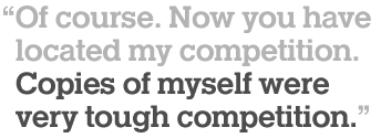
MS: I know you had some trouble with others pirating your faces. Can you comment on that?
PM: Of course. Now you have located my competition. Copies of myself were very tough competition.
Font: Helserif Medium
MS: I’ve read that this was one of the big problems with the film font business, that the strips were very easy to duplicate which made piracy easy. Looking through old type specimen books, I see a copies of most of your fonts listed — “Happy Sid (S/A Jolly Roger)” for example. Did you ever take legal action? If so, were you successful?
PM: The complete answer to your question is in the Heldustry PDF,
the last chapter of my book. The company I sued twice is the one that called my Jolly Roger, Happy Sid. Another pirate called Jolly Roger, Jolly Martin, to try to confuse the art studios and ad agencies as to which was the legitimate product. I had better success with this guy. I persuaded him to turn honest. Let me mention here that Jolly Roger and Introspect were my two most original designs.
MS: When you were doing AI and TS, did you know any other type designers? Did you have any favorites? What type designers influenced you?
PM: I did not, still do not know other designers. Designers of the past I familiarized myself with to get ideas. Architect Bertram Grosvenor Goodhue had his Cheltenham design taken to a new wave of popularity, when I chose it as the first tall ascenders face to get a higher x-height. Would you believe I can’t remember who I worked from to develop Martin Gothic? Are you aware Red Rooster only recently got their site open? Two days before it opened people from England found a way to break in and buy all eight of my Martin Gothic fonts. Forever on the Rooster record will be that first sale their site made.
MS: What was the typical process of creating a font at AI and TS?
PM: Quite often, just looking through a magazine, let an ad grab my eye, and take the challenge to try to get a new look from what I had seen.
MS: Could you briefly explain the process from a technical point of view? For instance, how was the original artwork prepared and how large were the letters drawn?
PM: In the beginning, pen and ink, cap letters around three inches high. Eventually shapes cut out of rubylith, cap letters down to about two and a half inches high. The larger the letters originally were, the less was the alignment error on the film strip. When my Phoenix franchisee Paul Morneau proclaimed my film fonts the best in the world, we cut down the original size a little.
MS: I understand that you did cartooning at one time. Did this have any influence on your type designs or the way you drew them?
PM: My all-caps lettering of the dialogue in the comic strip balloons was my first typeface, actually. Look at the comic strips in your local newspaper. Those are all little all-caps typefaces, each different from the next. Only Gasoline Alley does caps and lc.
MS: Looking over the output of AI and TS, I notice that, although you did many original designs, you also did a lot based on existing foundry faces. How were you able to base a design on an existing typeface?
PM: I think I have already answered this. Take the challenge to get a different look out of it. And remember my royalty per word on headline faces. No matter what earlier face I based my version on, users paying more to get my version made my version a respectable new skirt or trousers. And working from another face, there are always little refinements, ones the original designer would have included, had he or she had the feel of it clearly enough,
MS: I guess what I’m getting at is, many of these designs originated at foundries like Linotype or ATF. Did you (or did you need to) get permission from any of them to do derivative designs? I’m not trying to single you out here, obviously other outfits like Headliners were doing this also.
PM: I am happy to be singled out. No, I asked permission of no one. Nor would I do it differently today. If the type user is willing to pay more for my version, let Linotype and/or ATF find out what the marketplace is telling them.
MS: None of them came after you for selling versions of their type designs or even for using the names? This seems hard to believe, but maybe times have changed. Or maybe their lawyers have gotten smarter.
PM: The judgment capabilities of sharp CEOs has not changed, nor have lawyers become less dumb. Give me the soul of the design world once more, and you will see the CEOs keeping their legal people silent, lest the corporations come off looking like the enemy of the design world. House lawyers typically fear looking out of a window for fear they will see rain. Mike Parker at Merg taught me this management philosophy. He may be gone now, but I ain’t.
Martin’s mutations of existing designs.
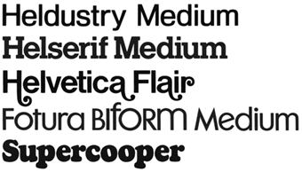
MS: In some cases, you expanded on an existing design by creating bolder weights (such as the Adweight series). In other cases you modified an existing design creatively for instance by adding swash characters or biform characters (such as Goudy Flair, Fotura Biform). Yet others were hybrids based on existing designs, such as adding serifs (Helserif), taking them away (Souvenir Gothic), or blending two different faces (Heldustry). Any comments?
PM: Yes. Thanks for your careful examination and explanation.
MS: Do you have stories about any of these? For instance, how did the idea for Heldustry come about?
PM: Eurostyle, also known as Microgramma, had a little popularity. Almost square letters. 75% Helvetica, 25% Eurostyle was the design plan for Heldustry.
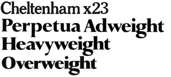
Martin’s expansions of existing designs.
MS: What’s the story behind Cheltenham X23 (1969)?
PM: I designed Cheltenham X23, so named because I had raised its x-height 23%. I screwed up and didn’t make the “x” lowercase in the name. On my customized film machine, it took me one hour to create the master font of x23, and I was taking phone calls during the process. My idea and my one hour provided four, or more, years of work for International Typeface Corporation, as they upped the x height of every old design they could locate throughout the history of printed language.

Helvetica Flair
MS: Did you really design Helvetica Flair?
PM: Not the Helvetica, only Flair. The font also had what I called commoncase characters.
MS: Let me rephrase this. Helvetica was the epitome of the Swiss school of typography — very cool and modern, almost antiseptically clean. The commoncase addition makes sense, being a modern innovation. But swashes are a very nineteenth-century kind of thing. Putting swashes on Helvetica is almost sacrilegious. It’s subversive, in a way, and seems almost like a typographic joke. My question is: What possessed you to put swashes on Helvetica?
PM: Ha! So you are a purist. I was accused of typographic incest before my first year of innovations was over. (‘Inzest’ in German, according to my translator Herr Kramm.) The angry typographers who missed out on getting my franchise called Alphabet Innovations, Alphabet Imitations. If you don’t like my Helvetica Flair, just term me the Marquis de Sade of letterforms.
MS: Oh, I didn’t say I didn’t like it. It’s just such a crazy idea and I wondered how you thought of it.
PM: The hell you didn’t! Clearly you expressed the belief that Helvetica and the Swiss are sacrosanct. Just being neutral in every war does not gain a sacred status.
MS: I think you misunderstand me (or maybe I was unclear in the way I framed the question)… I wasn’t expressing my personal opinion of Helvetica — I think it’s a fine typeface, but I don’t worship it, and I’ve never been a devotee of the Swiss school. I meant that, in the sixties it was a sort of sacred cow, and that adding swashes to it was a rather bold and audacious thing to do (and I’m all for doing bold and audacious things to type). I was just wondering, what gave you the idea to do it?
PM: I can’t imagine what you are seeking. To try to refresh my memory I looked the face up. One of a dozen efforts that comprised AI Volume One, copyright 1969, meaning anything in there may have been done as early as 1967. Now that I see and really examine what you are talking about, I judge it as just plain amateurish rather than audacious. However, the copy in it reading, “It’s too Hot to cook” is as nice a design as I have ever done. It was an ad I did for Dallas Power & Light.
Oh, what memories. Every time I had a new face ready, it would become the look of my next DP&L ad. It gave Martin Studios a city-wide showing of a look you could get only by hiring Martin Studios.
I’m glad you kept haranguing me, Mark. You gave me somebody else to thank for helping me become a type designer: Ray Ward, the DP&L company spokesman and ad man, gave me free range to give the ads any look I chose. AI Volume One shows ten DP&L graphics!
MS: You got pretty playful with some of your funny names, and I think this is one of the distinctive things about your fonts. A few examples: Dominance Overbearing (a shadowed style), Dominance Diffident (an outline style), Stark, Stark Naked (an outline style), Stark Raving, Baskerville Hound, Endowed Jones, Eightball/Cueball/Highball, Jolly Roger Raised, Franklin Minted, Son of Windsor, etc. Could you comment on this?
PM: Indeed! I was begging for attention. Endowed Jones was a form of Times Roman with flairs the end of which were phallic shaped. Endowed is a male sexual compliment. Available Jones was a popular character in the Al Capp Li’l Abner comic strip. Available would do anything for money. And of course the term is a play on the famous Dow Jones Averages.
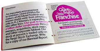
Quint and Frizbo
MS: I became aware of your work back in the seventies through the specimen booklets that were produced for AI and TS. Who wrote and designed the booklets? And what’s the story behind Quint & Frizbo?
PM: Your obedient servant is who. Q&F is just another one of my comic strips in a different artform from those in your local newspaper.
MS: What kind of comic strips did you do? Did you just draw them, or did you also do the writing?
PM: I was ghost artist on nationally syndicated Ella Cinders and Jane Arden comic strips, no writing. I wrote and drew Swing Sisson the battling bandleader for Feature Comics magazine at age 18. I wrote and drew Hap Holiday for Globe Syndicate who was not successful in getting newspapers to take it. Also wrote and drew Gail Friday that the New York Herald-Tribune turned down at the last moment. Those were the days when the execs called their secretaries their Gal Friday. Finally I decided to form my own syndicate which I named, American Advertising Syndicate. Using commission salesmen contacted by advertising in Opportunity magazine, I sold comic features to be sponsored by newspaper advertisers. Among my features I remember: Cartoon Quiz, Daffy-nitions, Crusty’s Wise Replies, and Linda Hand, Registered Nurse. I signed different names to my cartoons, so no one would realize it was a one-man show.
MS: What’s the “4KD kerning system” you sometimes refer to?
PM: It was developed to kern my Grad typeface on the XyWrite word processor if the user has a printer that can read negative figures. XyWrite said it could not be done, that I was fooling their machine somehow, that I would never be able to set justified type. When I proved them wrong, they studied my product, and made it run faster and quietly. My original version ran with so much noise, you needed ear plugs.
MS: Do you think typography is better or worse in the computer age?
PM: Far worse, but maybe better in the future. At least, let’s hope.
I will bring up something that has not been mentioned. I am sometimes told I bring a lot of ego to the table. As a long time student of business history, it is my claim the majority of major corporations are run, correction, the majority is run, oh how a prepositional phrase between subject and verb can lead you into a plural verb despite your subject being singular, by someone with ego barely under control. And with public money used for PR firms, ad agencies, plus various forms of self-aggrandizement. I don’t have any public money to run my show. But to promote my product in this competitive world, I even invent imaginary characters like Carelton Smith to interview me when I have a new face ready. Carleton played a strong part in making my Criterion series successful. You gotta show the goods in the window before the gals will come in and try on the new duds. My newest gown is named Grad, Mark. You are its digitizer, soon to be its marketer. Time now to thank you for having been its Carelton Smith, to boot.
© 2004, Mark Simonson
Headline illustration by Norman Hathaway with Martin’s Helserif and Polonaise
[**Update:** Unfortunately, Phil Martin’s website went offline a few months after his death. There is an archive.org cache of his site, but some of the following links are no longer available. — SJC]
See also: Credit overdue.
Mark Simonson of Saint Paul, Minnesota, is a former art director and graphic designer who now makes his living designing typefaces — several of which are Typographica selections.