The Thesis Project | LucasFonts (original) (raw)
Published May 29, 2018. Last updated Jun 28, 2022.
The Thesis superfamily was first published in 1994 as part of the FontFont collection, and became part of the LucasFonts type library in 2000. The family was conceived as a versatile typographic system of ambitious scope. It grew out of a dissatisfaction with the limited range of good typefaces available for corporate identity projects. Thesis aims to fill that gap by providing the user with three compatible styles – TheSans, TheMix and TheSerif – in an optically harmonious range of eight weights, including real italics for each weight.
Thesis pioneered the concept of the all-purpose type system or superfamily which has since become such an important tool for the discerning typographer.
Three widths: TheSans, TheSans SemiCondensed and TheSans Condensed, all presented here in the ExtraBold weight.
The Thesis family has been expanded over the years. TheSans and TheMix are now available in three widths: Normal, Condensed and SemiCondensed. In addition, three ultra-narrow widths for TheSans are available on demand.

Judith Rakers presents the daily in the redesigned Tagesschau studio that went live in April 2017. © NDR/Thorsten Jander. The smaller line of text is set in TheSerif, with the rest of the text in TheSans.
TheSans offers several sub-families for specialized uses:
- TheSans Mono A monospaced series for computer coding and similar uses.
- TheSans Hair A carefully balanced series of seven hairline weights for ultralight magazine and advertising headlines.
- TheSans Typewriter A set of four typewriter-like fonts.
- TheSans Arabic The Arabic-speaking version of TheSans.

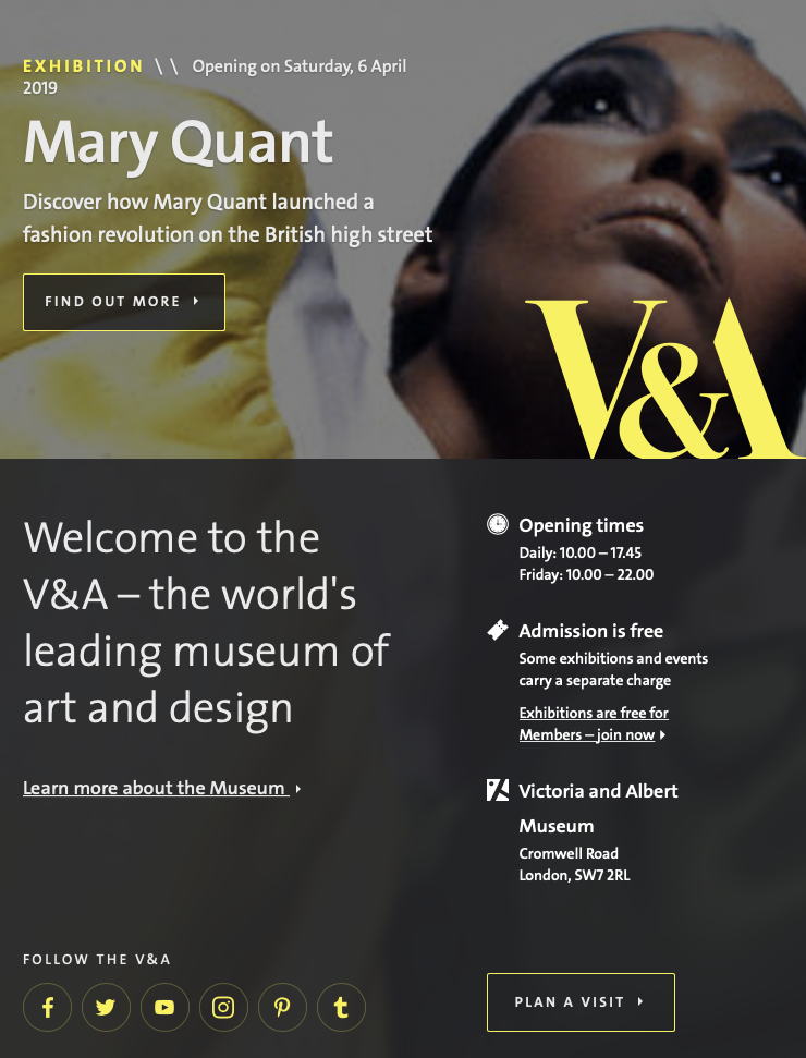
The Victoria & Albert Museum has been using a custom version of TheSans since 2002. Since their website’s 2016 redesign, all of its text has been set with TheSans, too.
Languages
- Arabic
- Central and Eastern European
- Cyrillic (including Bulgarian Cyrilic)
- Greek
- Latin Extended (including Vietnamese)

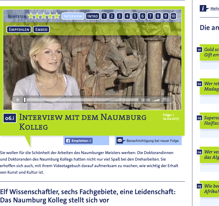
The Volkswagen Foundations’s ScienceMovies website combined fonts from TheSans and TheSerif.

A campaign celebrating Maastricht University’s 40th Anniversary relied entirely on TheSans, and color!

