The 50 greatest album covers of all time (original) (raw)
Intro
What makes an album cover great? These days, the whole concept of album artwork - arguably even the album itself - is a moot point. Today's teenagers have iPods full of music but many have never bought a compact disc, while vinyl is increasingly the preserve of bearded collectors as even club DJs move towards digital mixing solutions.
That said, we've yet to see a major artist release an album without some sort of artwork to accompany it, and while we can laugh long and hard at the worst offenders, it's time to celebrate the finest album artwork ever to grace record shops, CD collections, t-shirts and bedroom walls across the globe.
Click onwards to see the 50 greatest album covers of all time, as voted for by you...

Dire Straits - Brothers In Arms
The cover to Brothers In Arms is possibly the most iconic shot of a National Style O Resonator guitar ever.
The desirable series was discontinued in 1941 so its appearance on the cover of Dire Straits’ album is a pretty tantalising example of guitar porn. Even fans unfamiliar with the make and model of the guitar can lust after its curved and glistening body. Is that doing it for you?
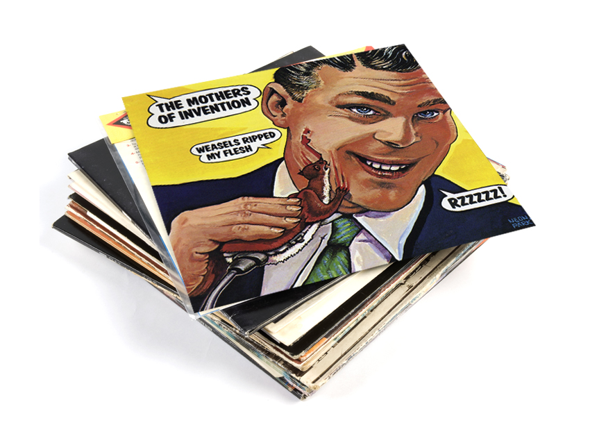
Frank Zappa And The Mothers Of Invention - Weasels Ripped My Flesh
One of the many great things about Frank Zappa is his reliable weirdness. He’s a mine of the strange and hilarious and the Weasels Ripped My Flesh cover is just one such gem. Zappa briefed artist Neon Park to create something based on a men’s adventure magazine bearing the cover line “Weasels Ripped My Flesh”.
Park created his bum-clenchingly painful cover by parodying a Schtick electric razor advert. Despite objections from the label, the printer and the printer’s assistant, the cover came out unchanged.
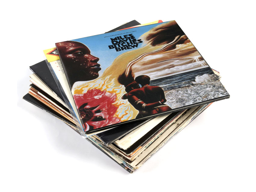
Miles Davis - Bitches Brew
The gatefold cover to Bitches Brew is as much a visual journey as much Davis’ album is a musical one. The trippy design is by surrealist painter Mati Klarwein, who also designed the cover for Davis’ Live Evil album and collaborated with many other musicians.
Bonus trivia: The whereabouts of the original painting are unknown.
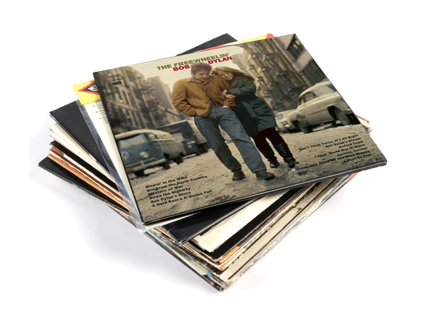
Bob Dylan - The Freewheelin' Bob Dylan
The cover to the Freewheelin’ Bob Dylan underlines Dylan’s desire to be candid and spontaneous. It’s a self-conscious departure from the meticulously constructed album covers of his contemporaries and shows him in his natural habitat.
The photograph was taken by CBS photographer Don Hunstein and shows Dylan walking with his girlfriend and muse Suze Rotolo near to the apartment they shared in New York - what could be more spontaneous, honest and compelling?
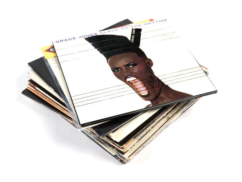
Grace Jones - Slave To The Rhythm
Sometimes you can judge an album by its cover - we’d like to think that the cover to Slave to the Rhythm tells you everything you need to know about Grace Jones before you start listening.
Powerful, warped and scary - yes scary.
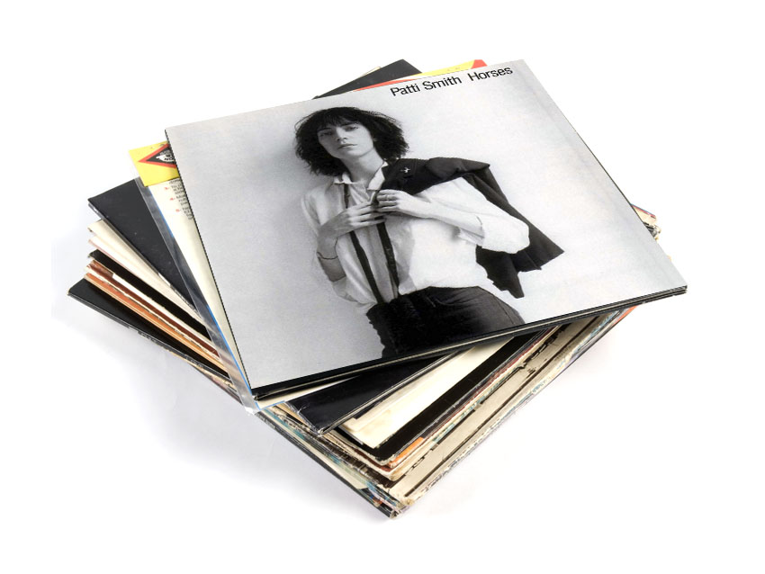
Patti Smith - Horses
With attitude in abundance, this steely portrait shows why Patti Smith is known the Godmother of punk.
The shot was taken by her friend, the photographer Robert Mapplethorpe, with whom she lived in the smallest room in New York’s Chelsea hotel before they both made it.
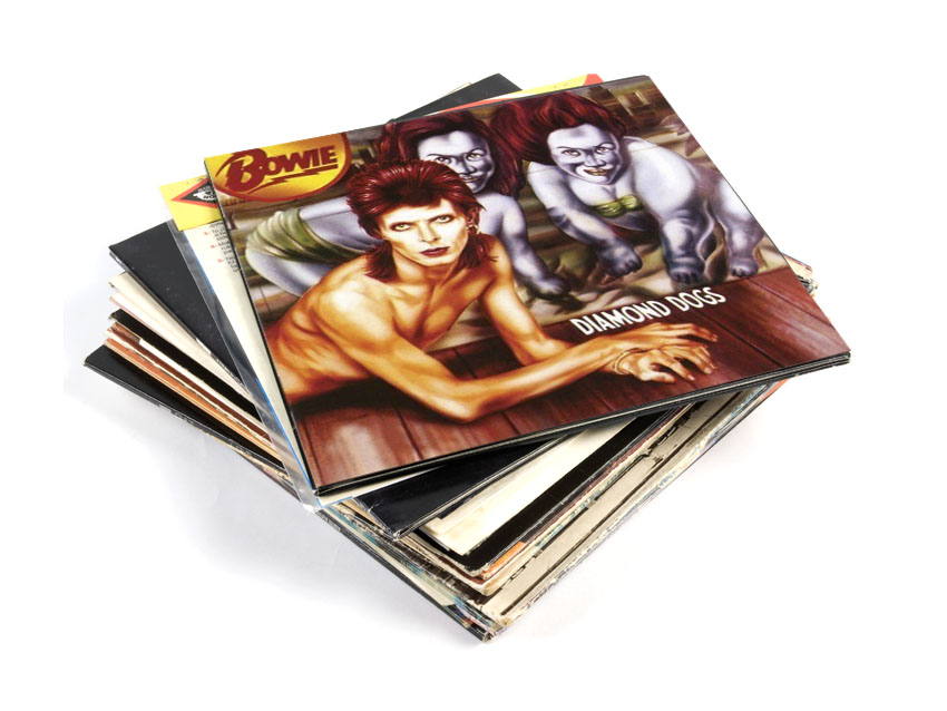
David Bowie - Diamond Dogs
The illustration for the cover to Diamond Dogs shows David Bowie as a bizarre half-man half-dog creature.
The illustration by Belgian artist Guy Peellaert and caused a stir initially as on the reverse of the album, Bowie’s (admittedly part canine) genitalia were on full display. The original was promptly removed from sale and replaced with a less confusing airbrushed version.
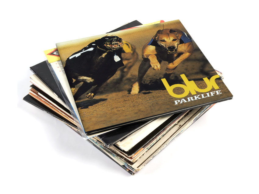
Blur - Parklife
Parklife is an album about class tourism. Blur might have been the posh boys of Britpop, but their breakthrough album was a study on working class life in London.
The dynamic and powerful image of the greyhounds on the cover, designed by long-term Blur collaborator Chris Thomson, reflects both their fascination with geezer culture and (accidentally?) a band at the breakthrough of their career.
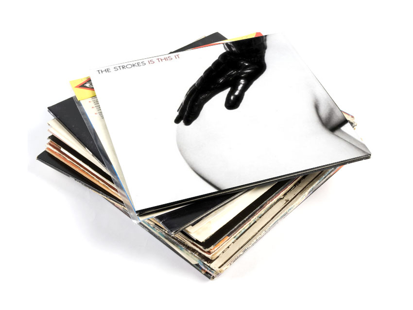
The Strokes - Is This It
The greatest thing about this album cover is that it looks like something that even Spinal Tap would reject. The bare flesh, the leather glove, the visual representation of the band’s name, every rock cliché is being squeezed for all its worth and the result is - perhaps surprisingly - a very stylish, sexy design that heralded the arrival of one of the most exciting albums of the decade.
Bonus trivia: The bare flesh was abandoned for the American version of Is This It, in favour of a close-up particle collision. Boring!
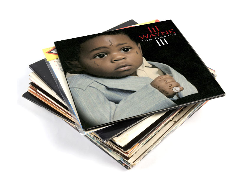
Lil Wayne - Tha Carter III
Building on a tried and tested hip-hop tradition, Lil Wayne follows in the footsteps of Biggie Smalls and Nas by using one of his baby pictures on his album cover.
Typical of his ‘is-this-too-much’ attitude, however, Weezy goes a step further than his predecessors and has a few of his very grown-up tattoosPhotoshopped onto his younger self. The result? A two-year-old with prison tats. Genius.
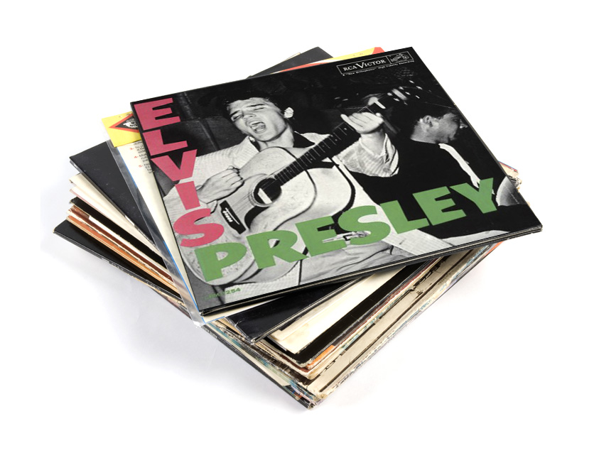
Elvis Presley - Elvis Presley
Released in 1956, Elvis Presley was The King’s debut studio album and year zero for a whole generation of rock 'n' rollers. The shot on the cover was taken at the Fort Homer Hesterly Armory in Tampa, Florida.
While this presents Elvis as the original ‘50s rock ‘n’ roll star, the cover is now equally recognisable as the inspiration for the cover of The Clash’s 1979 album London Calling, which provided an update on what it meant to be rock ‘n’ roll.
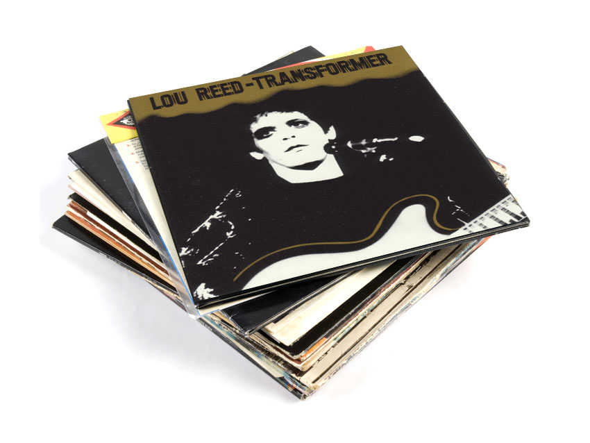
Lou Reed - Transformer
Transformer was Lou Reed’s second solo studio album and cemented his position as an icon. Just as the music on Transformer remains some his best known, the cover provides a defining image of Reed for posterity.
With blackened eyes and an almost featureless face, Reed looks every inch the glamorous tortured artist. The photograph was taken by Mick Rock, who was also responsible for creating album covers for The Stooges, Queen and The Ramones.
Bonus trivia: Ernie Thormalen, pictured on the back of the cover art, caused a controversy because he appears to have stuffed a cucumber down his trousers.
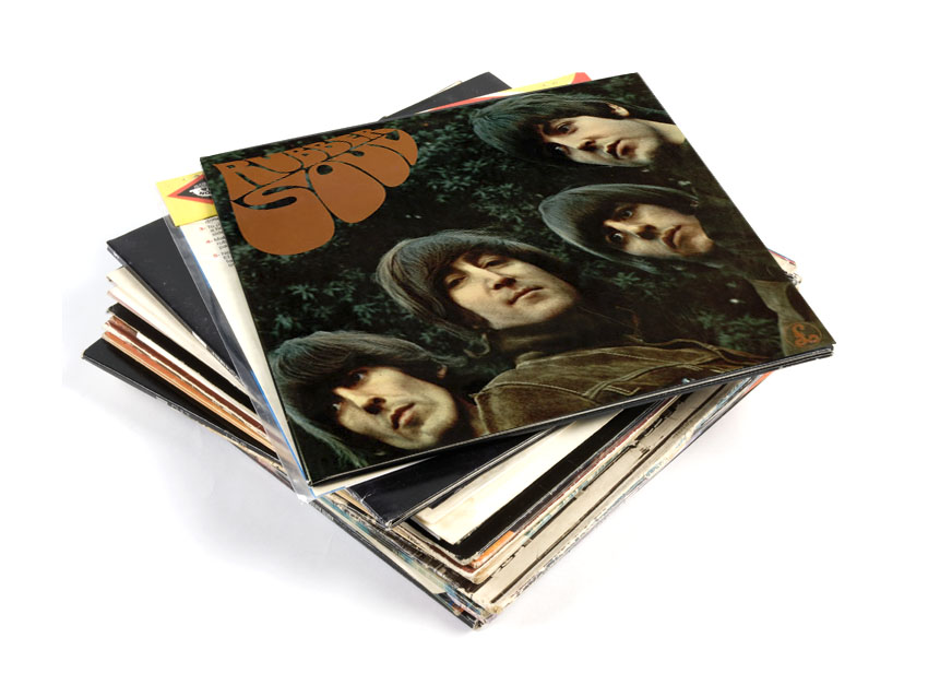
The Beatles - Rubber Soul
At the dawn of the age of psychedelia, the cover for Rubber Soul by The Beatles shows how powerful a light touch can be.
The slightly distorted cover image is trippy without being totally cosmic - reflecting the gradual shift towards studio experimentation that can be heard in the music contained within. The portrait was taken by photographer Bob Freeman and the stretched version was born when the card that Freeman was projecting potential cover shots onto slipped, creating an effect that was an immediate hit with the band.
Bonus trivia: Rubber Soul was the first Beatles album not to feature the band's name on the cover. Although this wasn't a pop first, it was certainly uncommon in 1965.
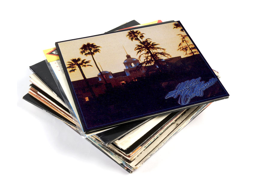
The Eagles - Hotel California
One of many album covers that has inadvertently created a landmark, Hotel California has turned the Beverly Hills Hotel on Sunset Boulevard into a Mecca for Eagles fans over the years.
The image, taken by David Alexander, shows the hotel at dusk and fits the album perfectly, conveying what Don Henley expresses as: “Faded loss of innocence and decadence.”
Bonus trivia: The ‘real’ Hotel California where The Eagles used to hang out is supposed to be somewhere in Mexico.
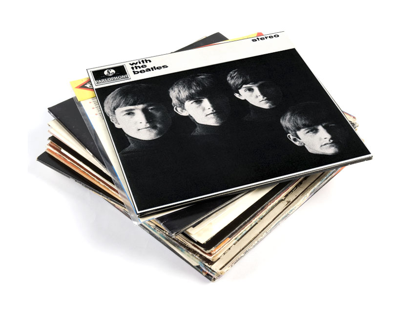
The Beatles - With The Beatles
The portrait of The Beatles on the cover of With The Beatles is stylish and moody, imbuing the band with a weight of intellectualism that belies their tender years.
What’s also special about the cover is it captures the fresh-faced Beatles in late 1963, their eyes burning with ambition just weeks before Beatlemania would capture the imagination of the world.
Bonus trivia: The Australian release featured a caricature of The Beatles as EMI Australia didn’t receive the cover art in time.
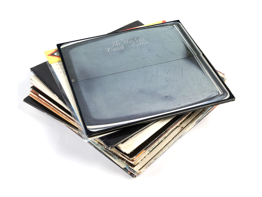
The Wailers - Catch A Fire
The first major label release for The Wailers was designed to make an impact. The sleeve was conceived by graphic artists Rob Dyer and Bob Weiner to look and behave like a Zippo lighter, opening at a side hinge to reveal the record - or the ‘fire’.
However, this proved quite expensive to produce so after 20,000 copies it was replaced with something almost as clever - a picture of Bob Marley smoking a fat joint.
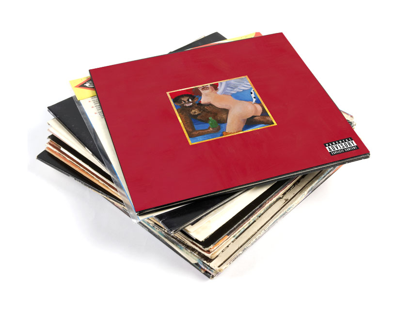
Kanye West - My Beautiful Dark Twisted Fantasy
MBDTF is the album that sees Kanye West most convincingly graduate from rapper to artist. Despite the standard talk of money, women and success, it’s riddled with neurosis and self doubt and delivered with humbling honesty.
At the fault line between Kanye’s artistic aspirations and man-on-the-edge lunacy is the front cover. The artistic credentials are all here as the portrait (we’re talking about the original Phoenix one) is by acclaimed painter George Condo.
However the madness is here too. The portrait shows Kanye West holding a beer and ‘getting jiggy’ with a paraplegic Phoenix (magical bird/woman thing). The portrait challenges hip-hop conventions while using them; it represents a very dark fantasy and is a succinct expression of Kanye’s vision for the album.
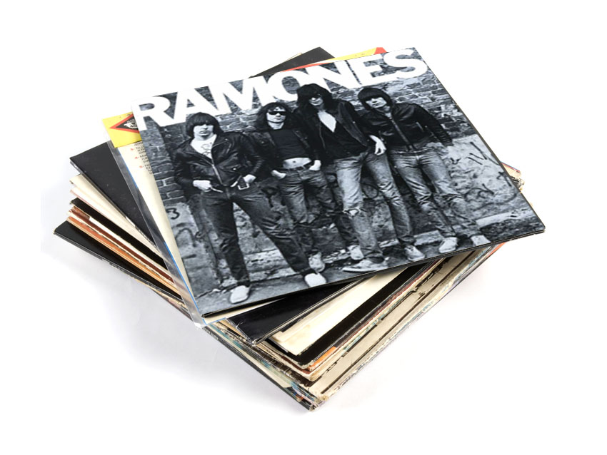
The Ramones - Ramones
Blazing onto the scene with their debut album, The Ramones reveal everything you need to know in one picture.
Looking every inch the gang of delinquents, the cover image of the group is a blueprint for Ramones fans who want to know what garage punk is about. It’s all here: how to style your hair, what constitutes an acceptable jacket, whether or not you should do your maths homework…
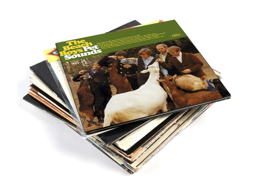
The Beach Boys - Pet Sounds
Because it’s consistently recognised as one of the most - if the not the most - important pop music records ever, it’s easy to dismiss the telltale signs of madness in Pet Sounds.
The name itself is a little off-kilter, and even weirder when you know it was Brian Wilson’s attempt to pay homage to Phil Spector by using his initials - thanks Brian…
Then there’s the cover image. The Beach Boys - American heart-throbs and cultural icons - awkwardly feeding assorted goats in what looks more like a snap from the family album than the cover to Brian Wilson’s greatest work. Sometimes though, as the music proves, genius and insanity occupy the same space. Pet Sounds is easily the most memorable Beach Boys album cover.
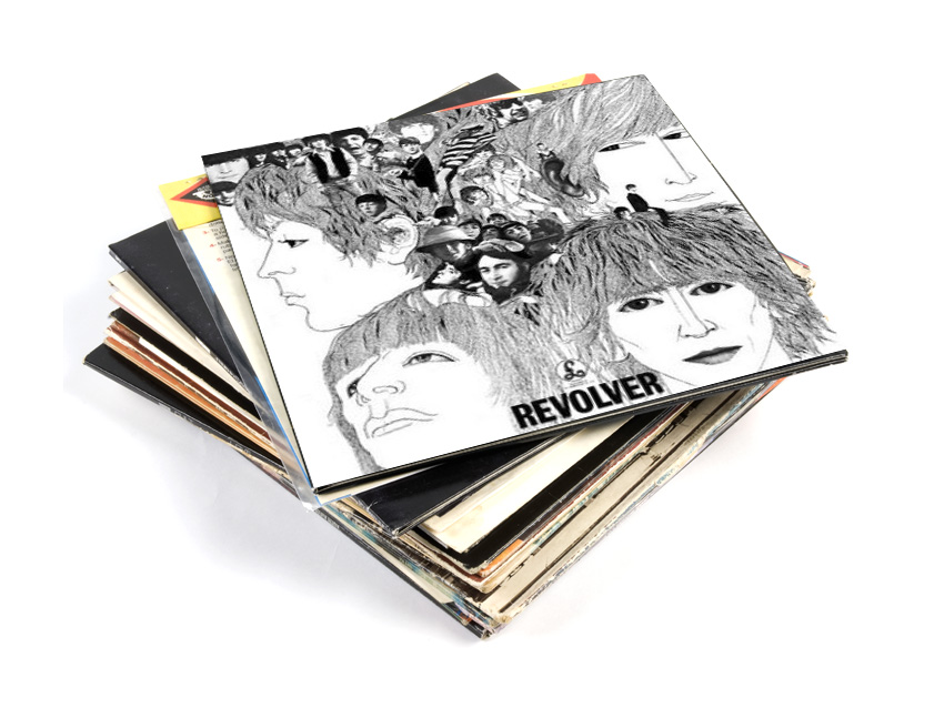
The Beatles - Revolver
If Rubber Soul's woozy distorted cover portrait looks like the result of a few cheeky joints then Revolver is the start of a full-blown acid trip, foreshadowing the technicolor psychedelia of Sgt Pepper a year later.
Part line-drawing, part collage, the illustration on the cover is the work of German artist and record producer Klaus Voorman. Voorman has leant his talents to a mélange of acts over the decades including Wet Wet Wet, The Bee Gees and Jimi Hendrix.
Bonus trivia: Revolver was originally titled Abracadabra until the Beatles discovered another band had used that title. Phew.
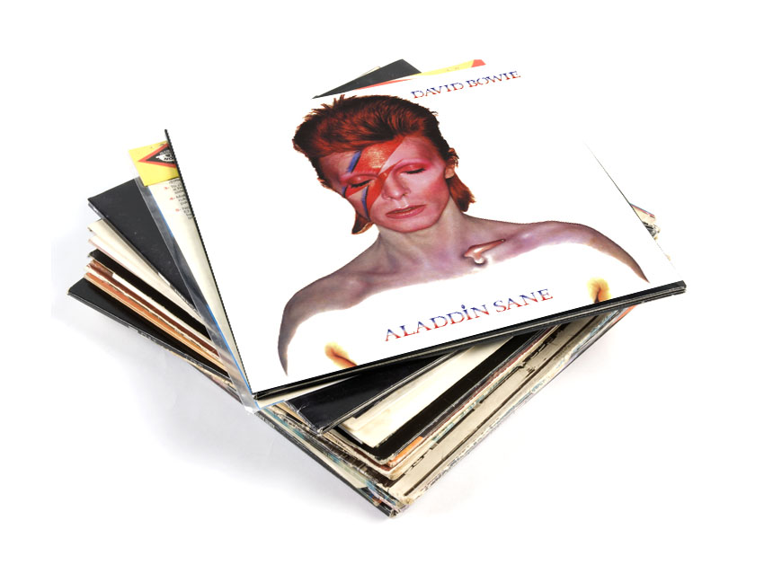
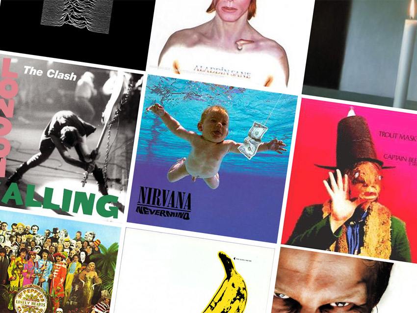
David Bowie - Aladdin Sane
Hot on the heels of Ziggy Stardust, Aladdin Sane was Bowie’s first album as a fully-fledged rock star.
The stripped-back portrait on the cover - by fashion photographer Brian Duffy - is a confident expression of Bowie’s new persona and one of the most identifiable images we have of pop's greatest chameleon.
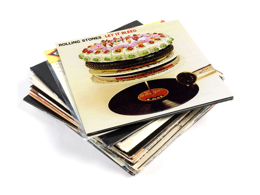
The Rolling Stones - Let It Bleed
In the late ‘60s even The Stones - usually relied on to provide throbbing sex appeal - went a bit surreal.
This album cover was the work of off-centre graphic designer Robert Brownjohn and shows the record being played while cakes and pizzas queue on the record spike. This makes more sense when you know that the original title for the album was Automatic Changer.
Bonus trivia: The cakes on the album cover were made by the then-unknown cookery writer Delia Smith.
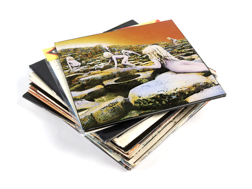
Led Zeppelin - Houses Of The Holy
The eerie image of inhuman children climbing an alien landscape was inspired by the Arthur C Clark novel Childhood’s End. It has all of the key ingredients for a classic heavy rock album cover - mysticism, fantasy, darkness and what must have been mind-bending visual effects for the ‘70s audience.
It was shot on Giants Causeway in Ireland over four days and masterminded by Aubrey Powell of ‘70s psychedelic go-to crew Hipgnosis.
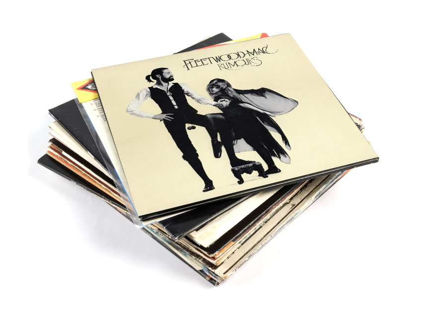
Fleetwood Mac - Rumours
The recently reinvented Fleetwood Mac were the biggest band in the world when they released Rumours. However, all was not well as inter-band relationships disintegrated during recording.
Rumours is a tangled web of neuroses as it is, but the cover, which features Mick Fleetwood and Stevie Nicks (who were not yet lovers) engaging in something resembling old-fashioned courtship, seems designed to stretch relationships to breaking point (of course the world feels different when you’re in the grip of a crippling coke habit).
Whether the cover was designed to stick it to Lindsay Buckingham or portents of Mick and Stevie’s affair is unclear but the fact remains this is an enchanting, elegant and gracefully seductive album cover that deserves to be remembered.
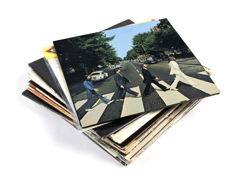
The Beatles - Abbey Road
The first UK Beatles album cover to feature neither the band name nor the album title, the oft-pastiched Abbey Road has become an iconic image representing an era as much as it does an album or a band.
The most brilliant thing about the cover though is that it fuelled the paranoid rumours that Paul McCartney was in fact dead. In all there are 12 ‘clues’ on Abbey Road’s cover that conspiracy theorists believe ‘prove’ that Paul died in a car accident in 1966 and was being played by an actor; a Faul, if you will.
It was the end of the ‘60s and we can only assume that prolonged substance abuse had addled the minds of some of the most obsessive Beatles fans. For more on this (belly-shaking) conspiracy theory, go here.
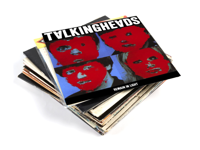
Talking Heads - Remain In Light
A lingering, creepy image, each of the band members’ faces has been blocked out in red to impose anonymity.
The original intention had been to superimpose producer Brian Eno’s face on each band member after he (possibly somewhat arrogantly) stated that he wanted to be on the cover of the album. He ultimately dropped this idea leaving the band with red faces.
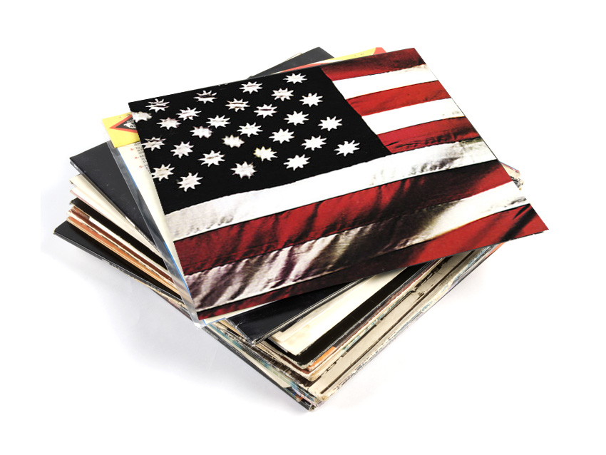
Sly And The Family Stone - There's A Riot Going On
Having finally achieved mass success, Sly and the Family Stone took the bold decision to produce an album cover without their name on it. Or indeed the title of the album. Or any identifying factors whatsoever. And it worked!
This brave reworking of the American flag is packed with symbolism and was Sly’s attempt to design a more universally appropriate flag for his nation.
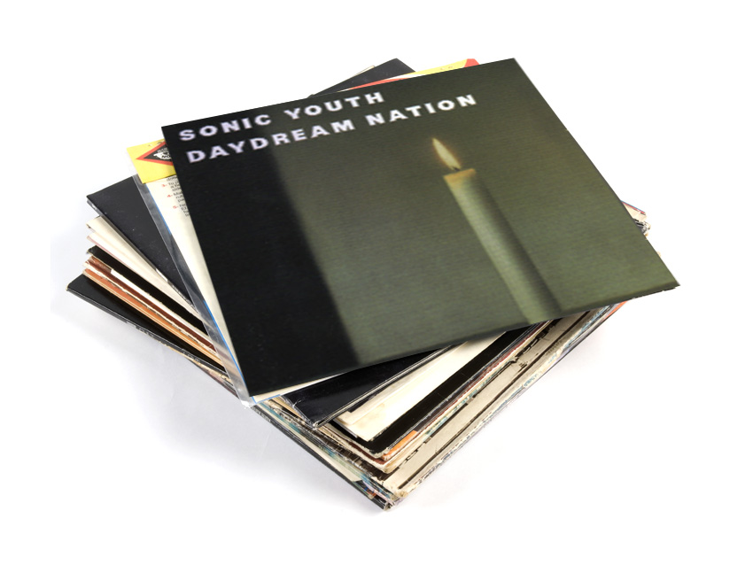
Sonic Youth - Daydream Nation
Everything about Daydream Nation shows Sonic Youth at the peak of maturity and artistic candour, taking art-rock to the masses and paving the way for a major label record deal.
The cover is the Gerhard Richter painting, Kerze (Candle), and is one of several references to high art on an album which features lyrics borrowing from Warhol, Harry Crews and Dennis Johnson.
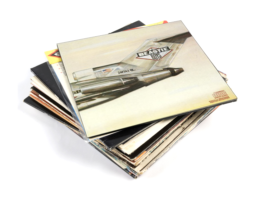
Beastie Boys - Licensed To Ill
Beastie Boys’ debut album cover is packed with the juvenile pith and vinegar that characterised their music in 1986. The Boeing 737 is tagged with the Def Jam logo and bears the legend 3MTA3, which spells Eat Me when viewed in a mirror - a mere six years after The Shining brought us ‘Redrum’.
The real punchline however is on the back cover, where the image is continued, revealing the plane has actually smashed into a mountain - this ‘pull-back and reveal’ visual joke demonstrates how hard the Beastie Boys party (hard enough to crash a jet) and gives an indication that they’re not entirely serious.
Bonus trivia: Licensed to Ill was illustrated by Steve Bryam, co-founder of Screwgum Records. Nowadays his work looks more like this.
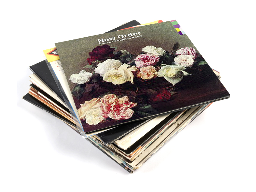
New Order - Power, Corruption & Lies
Carefully designed to twin the classically romantic with stark modernity, the cover for Power, Corruption & Lies was designed by regular New Order collaborator Peter Saville. The image is A Basket of Roses by French artist Henri Fantin-Latour. The UK release (the proper release) had no text on the cover. Instead a bold grid of colours could be decoded by referring to the key on the back of the album to spell out the band name and album title.
The colour code was invented by Saville for New Order and appears on singles Blue Monday and Confusion.

Spiritualized - Ladies And Gentlemen We Are Floating In Space
Spiritualized frontman Jason Pierce worked with iconic designer and ex-Factory Records man Mark Farrow to create this clever cover. Designed to look like packaging for prescription medication, the artwork was even complete with dosage advice - one tablet, 70 mins.
A special edition of the album came in a cardboard box containing each track on its own three-inch CD inside a large blister pack. Totally unnecessary, slightly awkward and 100 percent desirable.
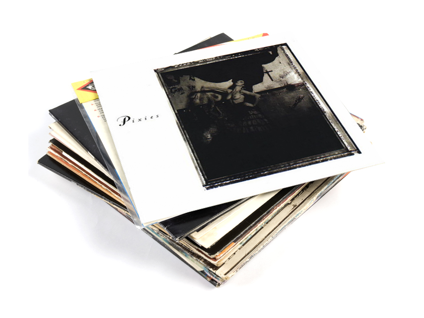
Pixies - Surfer Rosa And Come On Pilgrim
A friend of a friend of the Pixies poses topless dressed as a Flamenco dancer against a wall displaying a torn poster and a crucifix. The cover to Surfer Rosa is at once erotic and religiously charged.
According to Simon Larbalestier, who contributed pictures to all of the Pixies albums, the concept was Black Francis’s because he wrote the songs in his father’s "topless Spanish bar". He concludes: “I hope people find it tasteful.” Well we do Simon. Is it wrong that we find it sexy too?

Battles - Mirrored
This equipment setup is a shot taken by New York photographer and director Timothy Saccenti on set for the video to Battles’ first single Atlas - which Saccenti also directed.
The video uses mirrors to create infinities of instruments, reflecting Battles’ own penchant for repetition and their ability to build something fleeting and complex from the most robust starting point.
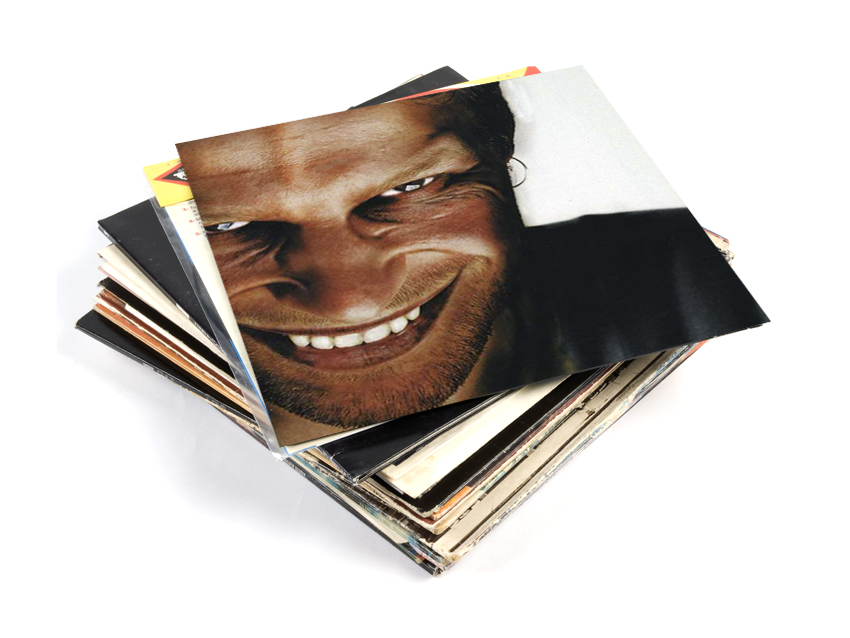
Aphex Twin - Richard D James Album
Continuing the fascination with his own face, Aphex Twin’s fourth album cover is a close up portrait of himself in typically demonic spirits.
His face is also painted on the cover of I Care Because You Do and grossly distorted versions are superimposed onto other people’s bodies in the video for Windowlicker. He even embeds his face as a steganogram towards the end of Windowlicker.
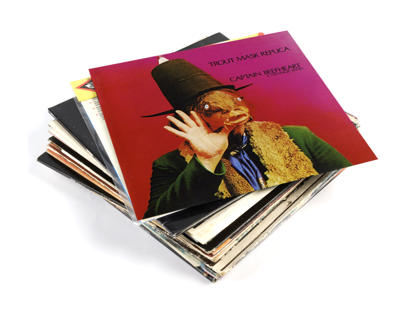
Captain Beefheart - Trout Mask Replica
In case you saw the album title in print and wondered what he meant, good ol’ Beefheart shows you what a Trout Mask Replica is on the front cover.
It’s undoubtedly weird and the image will stick in your subconscious forever.
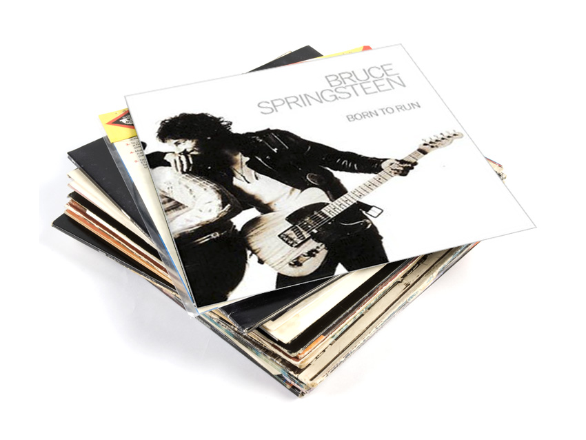
Bruce Springsteen - Born To Run
This rock classic shows Bruce Springsteen holding his guitar and leaning on saxophonist Clarence Clemons (we think you’ll find The Boss can lean where he likes).
It was one of 900 images taken by photographer Eric Meola in a three-hour session, and apparently it was the obvious choice for the cover. Meola explains: “Other things happened, but when we saw the contact sheets, that one just sort of popped. Instantly, we knew that was the shot."
Bonus trivia: The shoot nearly didn’t happen as The Boss continually missed his appointments with Meola.
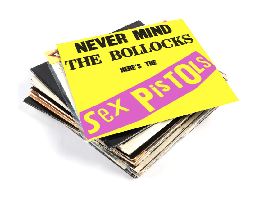
The Sex Pistols - Nevermind The Bollocks Here's The Sex Pistols
This seminal album cemented the musical blueprint for punk but the cover also worked as a template for punk design. It was designed by Jamie Reid, a college friend of Malcom McLaren and regular art director for the Sex Pistols.
The design may look simple - even thoughtless - but Reid asserts it has roots in bigger ideas than pop music. “It wasn't the pop phenomenon that interested me," says Reid. "I saw punk as part of an art movement that's gone over the last hundred years, with roots in Russian agitprop, surrealism, dada and situationism."
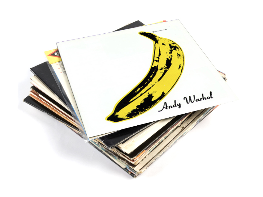
The Velvet Underground - The Velvet Underground & Nico
Andy Warhol proves there’s no point being a pop artist if you can’t make your mark on pop music. Incredibly - and uniquely - this image now has a cultural dual ownership, being synonymous with both the Velvet Underground and Warhol himself.
Warhol can always be relied upon for a bit of humour. Peeling back the banana skin on the original cover revealed a flesh-colored ‘banana’ underneath. This is a trick that was reimagined for The Rolling Stones' Sticky Fingers.
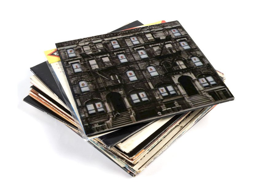
Led Zeppelin - Physical Graffiti
Led Zeppelin spent weeks walking around New York with album designer Peter Corriston trying to find the perfect tenement building for their album cover. They eventually found it at 96 and 98 St. Mark's Place.
Sleeve designer Mike Doud then set to work executing the concept of an outer sleeve featuring cut-out windows that would expose a collection of inner sleeves, creating different scenarios in each apartment.
Bonus trivia: The tenement on the cover to Physical Graffiti is the same building that Mick Jagger and Keith Richards were filmed in front of for the Rolling Stones promo for Waiting for a Friend.
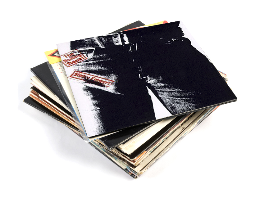
The Rolling Stones - Sticky Fingers
The first Stones album of the ‘70s and the first to appear on their label Rolling Stones Records, the cover to Sticky Fingers had to grab attention - and what better way to do that than with a massive wang?
It was conceived by Andy Warhol and shot by Billy Name. The original cover had an askew zipper which could be zipped to reveal the legend "THIS PHOTOGRAPH MAY NOT BE-ETC.”
Bonus trivia: Contrary to popular myth, this is not Mick Jagger’s crotch. The most likely candidate is artist Corey Tippin, although those in the know remain tight-lipped (or are now dead).
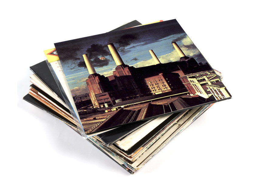
Pink Floyd - Animals
This cover was designed by Pink Floyd’s Roger Waters and produced by regular Floyd cohorts Hipgnosis. Waters commissioned an enormous inflatable pig, which was positioned between the chimneys of Battersea power station for the album cover.
However, despite three days of photography, none of the images were considered good enough so ultimately Hipgnosis reconstructed the image for the cover.
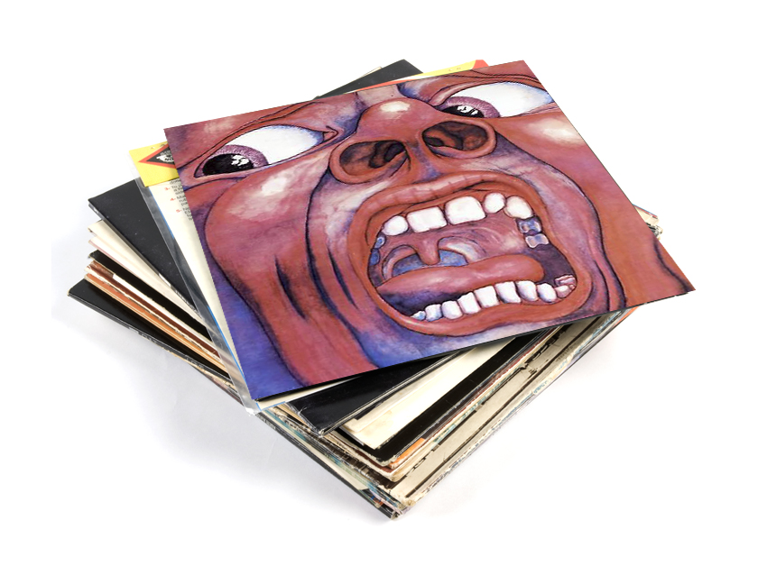
King Crimson - In The Court Of The Crimson King
The Schizoid Man on the cover to In The Court of the Crimson King perfectly reflects the shock and awe of the music that the band creates. Troubling and unsettling but compelling and identifiable, the cover undoubtedly boosted sales of this prog breakthrough album.
Bonus trivia: This was the only painting ever produced by computer programmer Barry Godber, who was specially commissioned by King Crimson lyricist Peter Sinfield.
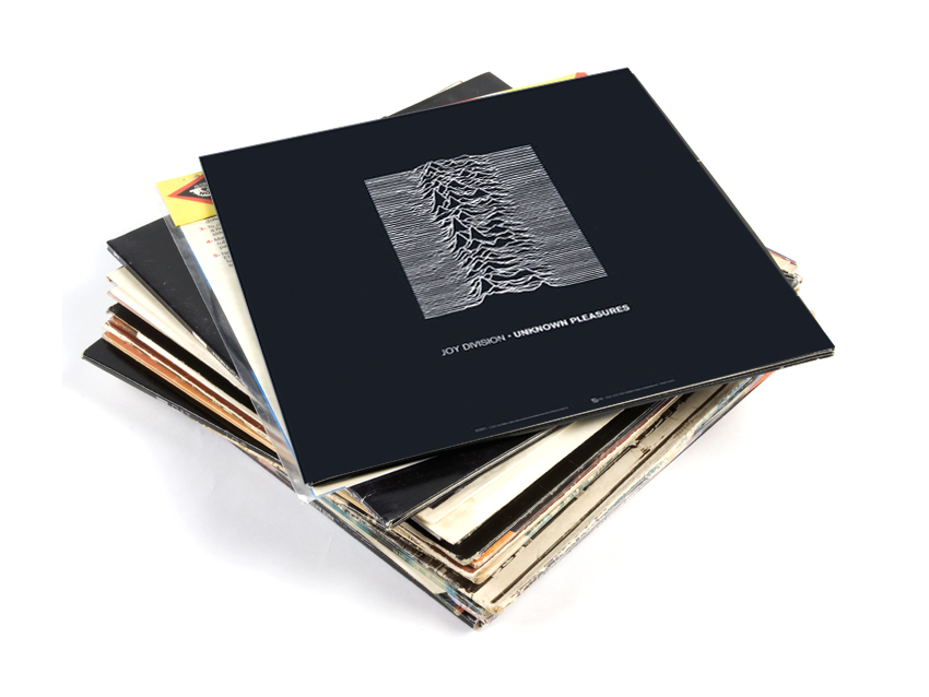
Joy Division - Unknown Pleasures
This is a spectacularly confident cover design. Not only is there no text (on a debut album) but there’s no clue as to what the wiggly lines represent. Is it a cluster of sine waves? Is it the sea? Or perhaps a mountain range? No, it’s actually 100 successive pulses from the first pulsar ever discovered, PSR B1919+21 of course!
The cover was designed by Peter Saville, Factory Records’ in-house design guru and its dark enigmatic nature perfectly positioned Joy Division for an audience of sulky, self-involved teens.
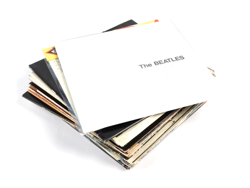
The Beatles - The Beatles (aka The White Album)
The White Album is the original anti-cover. Indeed it’s only known as The White Album due to an absence of anything on the cover other than the band's name in embossed lettering and - on the original vinyl version - a stamped serial number.
The contrast to the kaleidoscope of colour on 1967's Sgt Pepper couldn't be more marked. Stark, original, confident, and much-imitated in the years since.
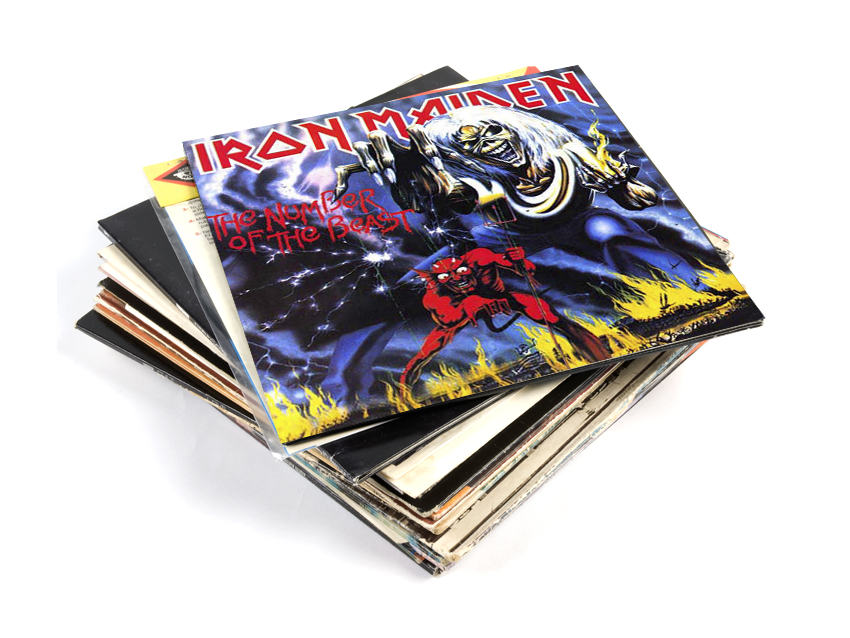
Iron Maiden - The Number Of The Beast
Like most of Iron Maiden’s artwork, the cover for The Number of the Beast was designed by Derek Riggs and features Eddie, their ‘mascot’ (for want of a more satanic word).
It was originally presented to the band as the artwork for the single Purgatory but it was rejected on the grounds that it was too good to be used for a single.
Bonus trivia: The 1982 edition of the album cover features a blue sky, but this was a printer’s error. It went unrectified until the 1998 remastered version, when the sky was restored to an unholy black.
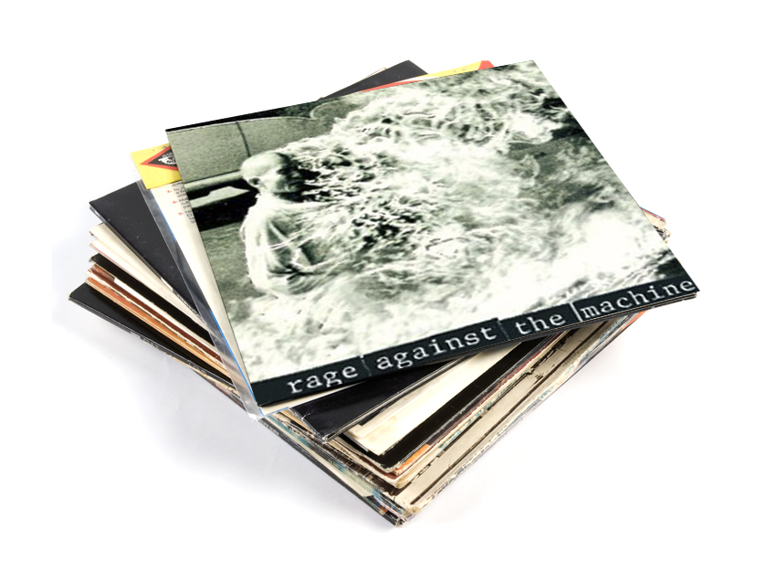
Rage Against The Machine - Rage Against The Machine
The cover to Rage Against The Machine’s debut shows a photo of Thích Quảng Đức, a Vietnamese Buddhist monk, burning himself to death in Saigon in 1963. This act of protest resulted in the Americans withdrawing their support for the Vietnamese government. Although he was just one man, Thích Quảng Đức’s extreme act changed the political landscape of the time.
This story and this image fit Rage Against The Machine’s politicised musical aesthetic and their leftist stance in 1992. Extreme, difficult, attention-grabbing and bent on reform, Rage Against The Machine might never have gone the whole hog and actually burned themselves to death, but they would get pretty damn close within the realm of music. They would also teach a generation what to scream in the face of authority - "FUCK YOU, I WON’T DO WHAT YOU TELL ME."
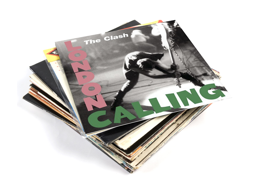
The Clash - London Calling
Summing up what it’s like to be in a rock ‘n’ roll band in one shot is tricky, but this image does a remarkably good job.
Paul Simonon, lost in the moment at a 1979 gig at the Palladium in New York, is smashing his Fender Precision Bass on the stage - and he doesn’t care. It’s rebellious, angsty and most importantly utterly free of pretension. What more do you need?
Bonus trivia: The guitar being smashed by Paul Simonon was exhibited on display at the Cleveland Rock and Roll Hall of Fame as of May 2000.
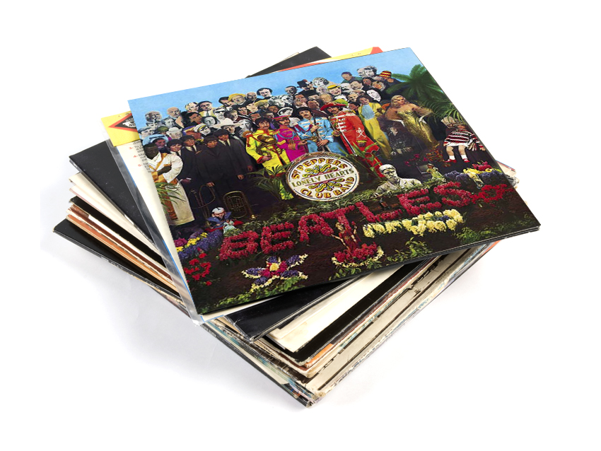
The Beatles - Sgt Pepper's Lonely Hearts Club Band
Adorned in the typically British high camp of day-glo marching band costumes, The Beatles play a teasing game of guess who, posing in front of a collage of more than 70 celebrities. They are also accompanied by affectations from their homes, giving fans an information overload.
The cover was art directed by Robert Fraser, a London art dealer, trend setter and swinger (in the ‘60s sense). He dissuaded the Beatles from using a psychedelic artwork by contemporary cosmic collective, The Fool, and suggested they get involved with pop artist Peter Blake instead. Without disrespecting (or pitying) The Fool, this was a much better idea.
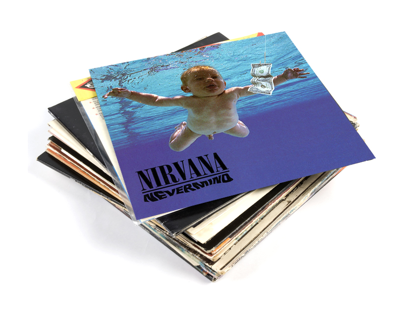
Nirvana - Nevermind
One of the most enduring album covers of all time and one that, these days, we Google search with a vague sense of caution. However, the powerful image of a baby swimming after a dollar bill on a fishing hook is a wonderfully wry metaphor.
Few would have predicted that a band of provincial outsiders with strong punk sensibilities would release a major label debut that would redefine the landscape of mainstream American rock music and topple Michael Jackson from the summit of the Billboard album chart.
The swimming baby is now in his 20s. His name is Spencer Elden and his parents were paid just $200 for the photograph. There are perks though. He told MTV about his chat up line: “You want to see my penis… again?” Smooth Spencer, very smooth.
Bonus trivia: For reasons unknown Spencer decided to recreate the Nevermind cover as an adult (but wearing pants this time). Check it out here.
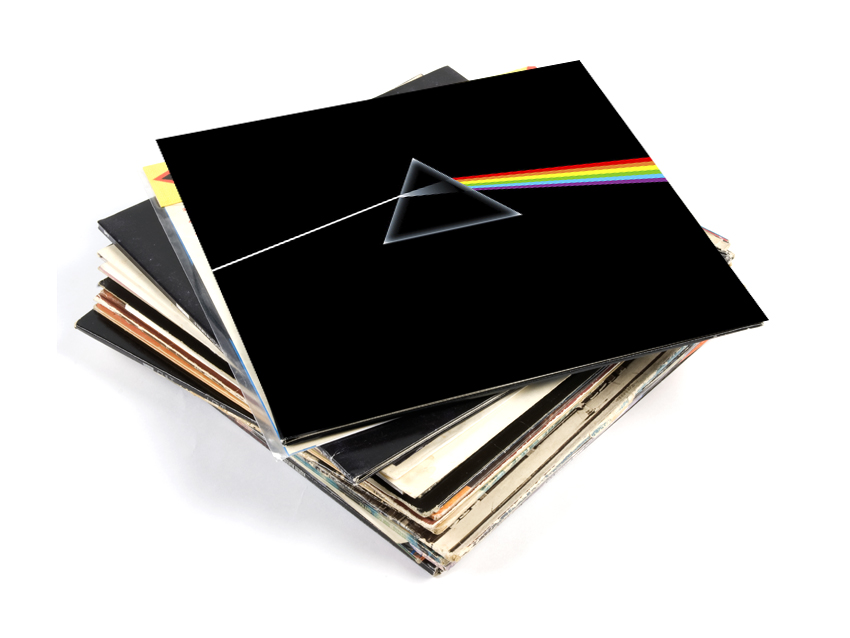
Pink Floyd - The Dark Side Of The Moon
Bold, iconic and symbolic, the cover to Pink Floyd’s eighth studio album fulfilled every aspect of Richard Wright’s brief to be: “smarter, neater - more classy” than previous Pink Floyd covers.
Designed by longterm Floyd associates and masters of spaced out imagery, Hipgnosis and George Hardie, the dispersing prism references the lyrical content of the album and Pink Floyd’s extravagant light shows.
The prism image was the centrepoint of some fairly lavish packaging, which included two posters and stickers of the pyramids - take that Radiohead!
A worthy winner? Let us know what you think...
Bonus trivia: The prism of light on The Dark Side Of The Moon misses out indigo from the spectrum.
Liked this? Now see the worst album covers of all time... ever!
Connect with MusicRadar: via Twitter, Facebook and YouTube
Get MusicRadar straight to your inbox: Sign up for the free weekly newsletter