Do Maps Show High Crime Rates Where Democrats Vote? (original) (raw)
Claim:
Maps shows that areas with high democratic populations also have high crime rates.
Rating:
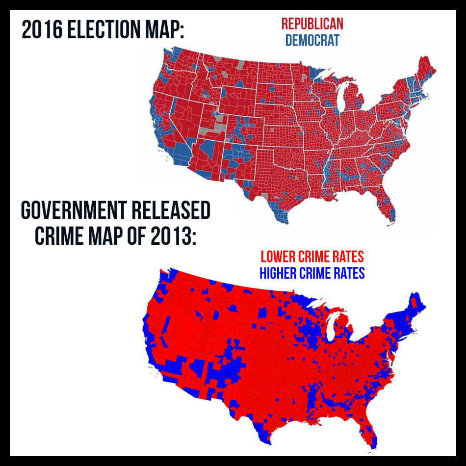
On 11 November 2016, the Facebook page "Subject Politics" published two maps purportedly comparing the results of the 2016 U.S. presidential election with the 2013 crime rate in in the U.S.:
Google it if you don't believe us. This is not a coincidence.
Although Subject Politics deleted their post after learning that the map was inaccurate, this image continued to circulate on social media.
The above-displayed maps have been mislabeled and do not show an accurate comparison between the 2016 electoral map and a government released crime map of 2013. The map pictured on the bottom actually shows a 2012 electoral map that was created by Mark Newman from the Department of Physics and Center for the Study of Complex Systems at the University of Michigan, and not a government-produced crime rate map. The top map appears to be real but also incomplete.
If the above-displayed maps were properly labeled, they would state that an incomplete electoral map from 2016 was similar to a completed electoral map from 2012. Neither of those maps is related to the crime rate.
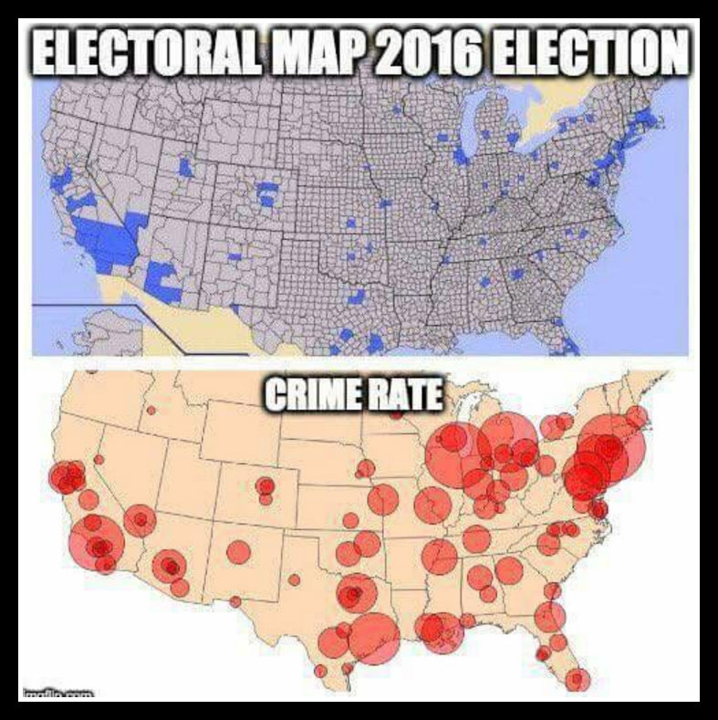
Another series of maps were circulated after the 2016 presidential election with a similar claim:
Again, there are fundamental problems with this comparison.
The top map in the image above does not show the "electoral map 2016 election." This map was created by Business Insider in 2013 and shows the 146 counties that contain half of the United State's population:
Using Census data, we've figured out that half of the United States population is clustered in just the 146 biggest counties out of over 3000.
Here's the map, with said counties shaded in. Below the map is the list of all the counties, so you can see if you live in one of them.
The map on the bottom of this graphic also doesn't chart the "crime rate." This map was created with U.S. Census data from 2009 and shows the "murder rate in major cities." As both maps deal with large population centers in the United States, it isn't surprising that they highlight the same geographic areas. However, neither of these maps represents voting patterns or the results of the 2016 presidential election.
While neither of the above-displayed graphics accurately compares the 2016 electoral map to the crime rate in the United States, there is at least a morsel of truth to the claim that areas with high Democratic turnout have a higher crime rate. That phenomenon, however, has more to do with population density than it does with politics.
Sources
Mcardle, Megan. "Density and Crime."The Atlantic. 16 May 2011.
Desliver, Drew. "The Growing Democratic Domination of Nation’s Largest Counties."PEW Research Center. 21 July 2016.
Becker, Kyle. "13 Charts Put America's Gun Violence in Perspective."Independent Journal Review. September 2015.
Walter, Hickey. "Half of the United States Lives in These Counties."Business Insider. 4 September 2013.
By Dan Evon
Dan Evon is a former writer for Snopes.


