GD Logo (original) (raw)
in 1969
©
How it came to be
In 1969 the Dead were renting a warehouse in Novato, California. I was sound man for the band at the time, and lived in Oakland. Bob Thomas, an old friend of mine had just moved from LA to the Bay area and needed a place to stay, and we needed someone to look after the warehouse, which had had a problem with break-ins.
Bob was a superb graphic artist whose work is now familiar to most Deadheads in the form of the Live Dead album cover and the Bear's Choice cover, on which the popular Dancing Bears appeared.
The Dead in those days had to play in a lot of festival style shows where the equipment would all wind up at the back of the stage in a muddle. Since every band used pretty much the same type of gear it all looked alike. We would spend a fair amount of time moving the pieces around so that we could read the name on the boxes. I decided that we needed some sort of marking that we could identify from a distance.
I was in the habit of driving from Oakland to Novato in a little MGTF which had plastic side curtains, which were not very transparent, due to aging of the plastic. One day in the rain, I looked out the side and saw a sign along the freeway which was a circle with a white bar across it, the top of the circle was orange and the bottom blue. I couldn't read the name of the firm, and so was just looking at the shape. A thought occurred to me: if the orange were red and the bar across were a lightning bolt cutting across at an angle, then we would have a very nice, unique and highly identifiable mark to put on the equipment.
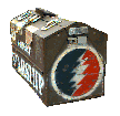
At the warehouse I told Bob the idea that I had, and he made a quick sketch. A mutual friend, Ernie Fischbach, who was visiting with Bob, said "Give it to me, I'll show you an easy way to put it on the boxes."  Whereupon he proceeded to cut holes in a couple of pieces of stencil paper. One was a circular hole, about 5 1/2 inches in diameter, and the other was a part of a circle 5 inches in diameter. But it was a half circle with a jagged edge. Then he held the stencil to an amp and sprayed a circle of white paint. Then with one side up, the red half circle went on top of the dried white paint and after wiping off the red and turning the stencil over, the blue was applied. This was the first version, and we put it on to all our gear. It helped make it easier to find our stuff in the crunch. I still have an old toolbox with one of the stencils on it.
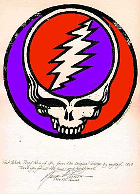
A few days later I was talking to Bob and suggested that perhaps the words "Grateful dead" could be placed under the circle, using a style of lettering that would appear to be a skull if you saw it from a distance (I guess I was influenced by too many posters of the time). Any way a few hours later he came down from the loft with the design we know and love.

In 1992, Bob decided to produce hand-pulled prints of the logo as a hardwood block engraving, but first he cut a test block in pine, to see how the design looked as a woodcut. He liked the test block so well that he decided to pull 50 prints, signed, numbered and hand coloured them. He gave the last of the prints to me (a few months before he died) to help sell them. Most have now been sold. Please write if you are interested in getting one of the ones left, the money goes to his family. This was one of the last pieces he did. Here is a scan (trimmed down a little). The print is on heavy, off-white watercolour paper 14" by 17".

Another logo that he designed at around the same time was the one for Alembic Guitar Co. in Santa Rosa, which began in that same warehouse to design and make more modern instruments for the band than were at that time available.