Websites (original) (raw)
Yale has developed a set of web guidelines that permits considerable design flexibility while preserving key interface and institutional branding elements that complement Yale’s visual identity. These user-oriented interface elements create a minimal but consistent set of conventions across all university websites.
Logos
The Yale logo is “Yale” set in a modified version of the Yale typeface, and standard practice includes it in the footer of all web pages. The signature “Yale University” is normally included in the top-left corner of the header region on web pages. The site title is usually below the signature set in the YaleNew Roman typeface.

Example of Yale University signature and site title
The standard colors for the Yale logo and signature are Yale Blue set against a white or light gray background or reversed white set against Yale Blue. The logo and signature may also be black or dark gray when the page design requires it.
It is recommended that the footer of all web pages include the Yale logo in the lower left corner. The footer should also have a copyright statement with year, and a link to the Yale University Privacy Policy. Websites may also include a contact e-mail link, social media buttons, and additional information. Footer content is generally placed near the Yale logo but must not crowd it; breathing space should always be left around the logo.

Example of website footer on white background

Example of website footer on blue background
The Yale logo should never be combined with other designs to form a new or hybrid logo. The logo and signature should be linked to the main Yale website.
In addition, Yale College and other organizations may have their own wordmarks. For schools and administrative divisions, special wordmarks are available from the University Printer.
Typefaces
Yale’s own typeface is the preferred serif font for Yale websites and may be used throughout for titles, headings, and menu items. The standard sans-serif font for Yale sites is Mallory, which is recommended for body text and may also be used for menus and headings.
Recommended styles

The Yale typeface, heading 1 page title

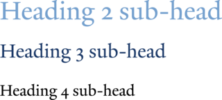
The Yale typeface, headings 2–4 sub-headers

Mallory Small Caps, heading 5 sub-header

Mallory body text
If additional web fonts are used, care should be taken to select fonts that are highly legible and harmonize with the recommended typefaces. Unusual and “quirky” typeface styles should be avoided.
Mallory web fonts are available as part of the YaleSites offering.
Colors
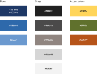
Yale Blue is the university’s identifying color, and has the hex value #00356b. The standard range of blue tints is shown in the primary color palette below along with the standard range of grays and three accent colors. Additional colors may be used as long as they complement, rather than clash with, the colors in the primary color palette.
Primary color palette

White space & layout
The Yale web design standards make use of generous sizes for type, photos, and other design elements with plenty of white space between them. Every section and component of the design avoids being small and cramped. The layout grid offers large gutter spaces between columns and there is extra line-space between major divisions on a page.
Web page layouts should always be handled via a responsive grid system. Older fixed-width grids and layout methods should no longer be used since they do not display well across various screen sizes and devices.
Icons
Small icons representing Yale simply show the “Y” from the Yale logo, centered in a square format. These are the standard web shortcut icon, or “favicon,” social media icons, and home screen and application icons for mobile devices. The Yale favicon may only be used on websites having the Yale.edu web domain.
“Y” size specifications:
Icon for social media - 48x48
Favicon for web shortcut - 16x16