pandas.DataFrame.plot.bar — pandas 0.24.0rc1 documentation (original) (raw)
DataFrame.plot. bar(x=None, y=None, **kwds)[source]
Vertical bar plot.
A bar plot is a plot that presents categorical data with rectangular bars with lengths proportional to the values that they represent. A bar plot shows comparisons among discrete categories. One axis of the plot shows the specific categories being compared, and the other axis represents a measured value.
| Parameters: | x : label or position, optional Allows plotting of one column versus another. If not specified, the index of the DataFrame is used. y : label or position, optional Allows plotting of one column versus another. If not specified, all numerical columns are used. **kwds Additional keyword arguments are documented inpandas.DataFrame.plot(). |
|---|---|
| Returns: | axes : matplotlib.axes.Axes or np.ndarray of them An ndarray is returned with one matplotlib.axes.Axesper column when subplots=True. |
Examples
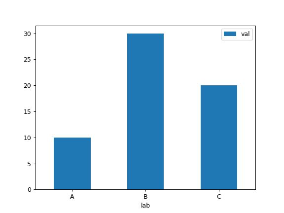
Basic plot.
df = pd.DataFrame({'lab':['A', 'B', 'C'], 'val':[10, 30, 20]}) ax = df.plot.bar(x='lab', y='val', rot=0)
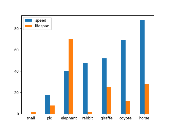
Plot a whole dataframe to a bar plot. Each column is assigned a distinct color, and each row is nested in a group along the horizontal axis.
speed = [0.1, 17.5, 40, 48, 52, 69, 88] lifespan = [2, 8, 70, 1.5, 25, 12, 28] index = ['snail', 'pig', 'elephant', ... 'rabbit', 'giraffe', 'coyote', 'horse'] df = pd.DataFrame({'speed': speed, ... 'lifespan': lifespan}, index=index) ax = df.plot.bar(rot=0)
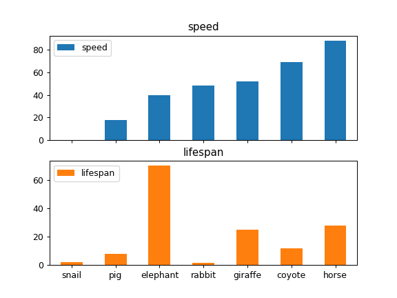
Instead of nesting, the figure can be split by column withsubplots=True. In this case, a numpy.ndarray ofmatplotlib.axes.Axes are returned.
axes = df.plot.bar(rot=0, subplots=True) axes[1].legend(loc=2) # doctest: +SKIP
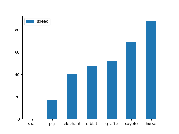
Plot a single column.
ax = df.plot.bar(y='speed', rot=0)
Plot only selected categories for the DataFrame.
ax = df.plot.bar(x='lifespan', rot=0)
