RocCurveDisplay (original) (raw)
class sklearn.metrics.RocCurveDisplay(*, fpr, tpr, roc_auc=None, name=None, pos_label=None, estimator_name='deprecated')[source]#
ROC Curve visualization.
It is recommended to usefrom_estimator orfrom_predictions orfrom_cv_results to create a RocCurveDisplay. All parameters are stored as attributes.
For general information regarding scikit-learn visualization tools, see the Visualization Guide. For guidance on interpreting these plots, refer to the Model Evaluation Guide.
Parameters:
fprndarray or list of ndarrays
False positive rates. Each ndarray should contain values for a single curve. If plotting multiple curves, list should be of same length as tpr.
Changed in version 1.7: Now accepts a list for plotting multiple curves.
tprndarray or list of ndarrays
True positive rates. Each ndarray should contain values for a single curve. If plotting multiple curves, list should be of same length as fpr.
Changed in version 1.7: Now accepts a list for plotting multiple curves.
roc_aucfloat or list of floats, default=None
Area under ROC curve, used for labeling each curve in the legend. If plotting multiple curves, should be a list of the same length as fprand tpr. If None, ROC AUC scores are not shown in the legend.
Changed in version 1.7: Now accepts a list for plotting multiple curves.
namestr or list of str, default=None
Name for labeling legend entries. The number of legend entries is determined by the curve_kwargs passed to plot. To label each curve, provide a list of strings. To avoid labeling individual curves that have the same appearance, this cannot be used in conjunction with curve_kwargs being a dictionary or None. If a string is provided, it will be used to either label the single legend entry or if there are multiple legend entries, label each individual curve with the same name. If None, set to name provided at RocCurveDisplayinitialization. If still None, no name is shown in the legend.
Added in version 1.7.
pos_labelint, float, bool or str, default=None
The class considered as the positive class when computing the roc auc metrics. By default, estimators.classes_[1] is considered as the positive class.
Added in version 0.24.
estimator_namestr, default=None
Name of estimator. If None, the estimator name is not shown.
Deprecated since version 1.7: estimator_name is deprecated and will be removed in 1.9. Use nameinstead.
Attributes:
**line_**matplotlib Artist or list of matplotlib Artists
ROC Curves.
Changed in version 1.7: This attribute can now be a list of Artists, for when multiple curves are plotted.
**chance_level_**matplotlib Artist or None
The chance level line. It is None if the chance level is not plotted.
Added in version 1.3.
**ax_**matplotlib Axes
Axes with ROC Curve.
**figure_**matplotlib Figure
Figure containing the curve.
See also
Compute Receiver operating characteristic (ROC) curve.
RocCurveDisplay.from_estimator
Plot Receiver Operating Characteristic (ROC) curve given an estimator and some data.
RocCurveDisplay.from_predictions
Plot Receiver Operating Characteristic (ROC) curve given the true and predicted values.
Compute the area under the ROC curve.
Examples
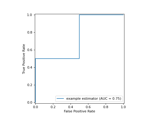
import matplotlib.pyplot as plt import numpy as np from sklearn import metrics y_true = np.array([0, 0, 1, 1]) y_score = np.array([0.1, 0.4, 0.35, 0.8]) fpr, tpr, thresholds = metrics.roc_curve(y_true, y_score) roc_auc = metrics.auc(fpr, tpr) display = metrics.RocCurveDisplay(fpr=fpr, tpr=tpr, roc_auc=roc_auc, ... name='example estimator') display.plot() <...> plt.show()
classmethod from_cv_results(cv_results, X, y, *, sample_weight=None, drop_intermediate=True, response_method='auto', pos_label=None, ax=None, name=None, curve_kwargs=None, plot_chance_level=False, chance_level_kwargs=None, despine=False)[source]#
Create a multi-fold ROC curve display given cross-validation results.
Added in version 1.7.
Parameters:
cv_resultsdict
Dictionary as returned by cross_validateusing return_estimator=True and return_indices=True (i.e., dictionary should contain the keys “estimator” and “indices”).
X{array-like, sparse matrix} of shape (n_samples, n_features)
Input values.
yarray-like of shape (n_samples,)
Target values.
sample_weightarray-like of shape (n_samples,), default=None
Sample weights.
drop_intermediatebool, default=True
Whether to drop some suboptimal thresholds which would not appear on a plotted ROC curve. This is useful in order to create lighter ROC curves.
response_method{‘predict_proba’, ‘decision_function’, ‘auto’} default=’auto’
Specifies whether to use predict_proba ordecision_function as the target response. If set to ‘auto’,predict_proba is tried first and if it does not existdecision_function is tried next.
pos_labelint, float, bool or str, default=None
The class considered as the positive class when computing the ROC AUC metrics. By default, estimators.classes_[1] is considered as the positive class.
axmatplotlib axes, default=None
Axes object to plot on. If None, a new figure and axes is created.
namestr or list of str, default=None
Name for labeling legend entries. The number of legend entries is determined by curve_kwargs. To label each curve, provide a list of strings. To avoid labeling individual curves that have the same appearance, this cannot be used in conjunction with curve_kwargs being a dictionary or None. If a string is provided, it will be used to either label the single legend entry or if there are multiple legend entries, label each individual curve with the same name. If None, no name is shown in the legend.
curve_kwargsdict or list of dict, default=None
Keywords arguments to be passed to matplotlib’s plot function to draw individual ROC curves. If a list is provided the parameters are applied to the ROC curves of each CV fold sequentially and a legend entry is added for each curve. If a single dictionary is provided, the same parameters are applied to all ROC curves and a single legend entry for all curves is added, labeled with the mean ROC AUC score.
plot_chance_levelbool, default=False
Whether to plot the chance level.
chance_level_kwargsdict, default=None
Keyword arguments to be passed to matplotlib’s plot for rendering the chance level line.
despinebool, default=False
Whether to remove the top and right spines from the plot.
Returns:
displayRocCurveDisplay
The multi-fold ROC curve display.
See also
Compute Receiver operating characteristic (ROC) curve.
RocCurveDisplay.from_estimator
ROC Curve visualization given an estimator and some data.
RocCurveDisplay.from_predictions
ROC Curve visualization given the probabilities of scores of a classifier.
Compute the area under the ROC curve.
Examples
import matplotlib.pyplot as plt from sklearn.datasets import make_classification from sklearn.metrics import RocCurveDisplay from sklearn.model_selection import cross_validate from sklearn.svm import SVC X, y = make_classification(random_state=0) clf = SVC(random_state=0) cv_results = cross_validate( ... clf, X, y, cv=3, return_estimator=True, return_indices=True) RocCurveDisplay.from_cv_results(cv_results, X, y) <...> plt.show()
classmethod from_estimator(estimator, X, y, *, sample_weight=None, drop_intermediate=True, response_method='auto', pos_label=None, name=None, ax=None, curve_kwargs=None, plot_chance_level=False, chance_level_kw=None, despine=False, **kwargs)[source]#
Create a ROC Curve display from an estimator.
For general information regarding scikit-learn visualization tools, see the Visualization Guide. For guidance on interpreting these plots, refer to the Model Evaluation Guide.
Parameters:
estimatorestimator instance
Fitted classifier or a fitted Pipelinein which the last estimator is a classifier.
X{array-like, sparse matrix} of shape (n_samples, n_features)
Input values.
yarray-like of shape (n_samples,)
Target values.
sample_weightarray-like of shape (n_samples,), default=None
Sample weights.
drop_intermediatebool, default=True
Whether to drop thresholds where the resulting point is collinear with its neighbors in ROC space. This has no effect on the ROC AUC or visual shape of the curve, but reduces the number of plotted points.
response_method{‘predict_proba’, ‘decision_function’, ‘auto’} default=’auto’
Specifies whether to use predict_proba ordecision_function as the target response. If set to ‘auto’,predict_proba is tried first and if it does not existdecision_function is tried next.
pos_labelint, float, bool or str, default=None
The class considered as the positive class when computing the ROC AUC. By default, estimators.classes_[1] is considered as the positive class.
namestr, default=None
Name of ROC Curve for labeling. If None, use the name of the estimator.
axmatplotlib axes, default=None
Axes object to plot on. If None, a new figure and axes is created.
curve_kwargsdict, default=None
Keywords arguments to be passed to matplotlib’s plot function.
Added in version 1.7.
plot_chance_levelbool, default=False
Whether to plot the chance level.
Added in version 1.3.
chance_level_kwdict, default=None
Keyword arguments to be passed to matplotlib’s plot for rendering the chance level line.
Added in version 1.3.
despinebool, default=False
Whether to remove the top and right spines from the plot.
Added in version 1.6.
**kwargsdict
Keyword arguments to be passed to matplotlib’s plot.
Deprecated since version 1.7: kwargs is deprecated and will be removed in 1.9. Pass matplotlib arguments to curve_kwargs as a dictionary instead.
Returns:
displayRocCurveDisplay
The ROC Curve display.
See also
Compute Receiver operating characteristic (ROC) curve.
RocCurveDisplay.from_predictions
ROC Curve visualization given the probabilities of scores of a classifier.
Compute the area under the ROC curve.
Examples
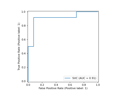
import matplotlib.pyplot as plt from sklearn.datasets import make_classification from sklearn.metrics import RocCurveDisplay from sklearn.model_selection import train_test_split from sklearn.svm import SVC X, y = make_classification(random_state=0) X_train, X_test, y_train, y_test = train_test_split( ... X, y, random_state=0) clf = SVC(random_state=0).fit(X_train, y_train) RocCurveDisplay.from_estimator( ... clf, X_test, y_test) <...> plt.show()

classmethod from_predictions(y_true, y_score=None, *, sample_weight=None, drop_intermediate=True, pos_label=None, name=None, ax=None, curve_kwargs=None, plot_chance_level=False, chance_level_kw=None, despine=False, y_pred='deprecated', **kwargs)[source]#
Plot ROC curve given the true and predicted values.
For general information regarding scikit-learn visualization tools, see the Visualization Guide. For guidance on interpreting these plots, refer to the Model Evaluation Guide.
Added in version 1.0.
Parameters:
y_truearray-like of shape (n_samples,)
True labels.
y_scorearray-like of shape (n_samples,)
Target scores, can either be probability estimates of the positive class, confidence values, or non-thresholded measure of decisions (as returned by “decision_function” on some classifiers).
Added in version 1.7: y_pred has been renamed to y_score.
sample_weightarray-like of shape (n_samples,), default=None
Sample weights.
drop_intermediatebool, default=True
Whether to drop thresholds where the resulting point is collinear with its neighbors in ROC space. This has no effect on the ROC AUC or visual shape of the curve, but reduces the number of plotted points.
pos_labelint, float, bool or str, default=None
The label of the positive class when computing the ROC AUC. When pos_label=None, if y_true is in {-1, 1} or {0, 1}, pos_labelis set to 1, otherwise an error will be raised.
namestr, default=None
Name of ROC curve for legend labeling. If None, name will be set to"Classifier".
axmatplotlib axes, default=None
Axes object to plot on. If None, a new figure and axes is created.
curve_kwargsdict, default=None
Keywords arguments to be passed to matplotlib’s plot function.
Added in version 1.7.
plot_chance_levelbool, default=False
Whether to plot the chance level.
Added in version 1.3.
chance_level_kwdict, default=None
Keyword arguments to be passed to matplotlib’s plot for rendering the chance level line.
Added in version 1.3.
despinebool, default=False
Whether to remove the top and right spines from the plot.
Added in version 1.6.
y_predarray-like of shape (n_samples,)
Target scores, can either be probability estimates of the positive class, confidence values, or non-thresholded measure of decisions (as returned by “decision_function” on some classifiers).
Deprecated since version 1.7: y_pred is deprecated and will be removed in 1.9. Usey_score instead.
**kwargsdict
Additional keywords arguments passed to matplotlib plot function.
Deprecated since version 1.7: kwargs is deprecated and will be removed in 1.9. Pass matplotlib arguments to curve_kwargs as a dictionary instead.
Returns:
displayRocCurveDisplay
Object that stores computed values.
See also
Compute Receiver operating characteristic (ROC) curve.
RocCurveDisplay.from_estimator
ROC Curve visualization given an estimator and some data.
Compute the area under the ROC curve.
Examples
import matplotlib.pyplot as plt from sklearn.datasets import make_classification from sklearn.metrics import RocCurveDisplay from sklearn.model_selection import train_test_split from sklearn.svm import SVC X, y = make_classification(random_state=0) X_train, X_test, y_train, y_test = train_test_split( ... X, y, random_state=0) clf = SVC(random_state=0).fit(X_train, y_train) y_score = clf.decision_function(X_test) RocCurveDisplay.from_predictions(y_test, y_score) <...> plt.show()

plot(ax=None, *, name=None, curve_kwargs=None, plot_chance_level=False, chance_level_kw=None, despine=False, **kwargs)[source]#
Plot visualization.
Parameters:
axmatplotlib axes, default=None
Axes object to plot on. If None, a new figure and axes is created.
namestr or list of str, default=None
Name for labeling legend entries. The number of legend entries is determined by curve_kwargs. To label each curve, provide a list of strings. To avoid labeling individual curves that have the same appearance, this cannot be used in conjunction with curve_kwargs being a dictionary or None. If a string is provided, it will be used to either label the single legend entry or if there are multiple legend entries, label each individual curve with the same name. If None, set to name provided at RocCurveDisplayinitialization. If still None, no name is shown in the legend.
Added in version 1.7.
curve_kwargsdict or list of dict, default=None
Keywords arguments to be passed to matplotlib’s plot function to draw individual ROC curves. For single curve plotting, should be a dictionary. For multi-curve plotting, if a list is provided the parameters are applied to the ROC curves of each CV fold sequentially and a legend entry is added for each curve. If a single dictionary is provided, the same parameters are applied to all ROC curves and a single legend entry for all curves is added, labeled with the mean ROC AUC score.
Added in version 1.7.
plot_chance_levelbool, default=False
Whether to plot the chance level.
Added in version 1.3.
chance_level_kwdict, default=None
Keyword arguments to be passed to matplotlib’s plot for rendering the chance level line.
Added in version 1.3.
despinebool, default=False
Whether to remove the top and right spines from the plot.
Added in version 1.6.
**kwargsdict
Keyword arguments to be passed to matplotlib’s plot.
Deprecated since version 1.7: kwargs is deprecated and will be removed in 1.9. Pass matplotlib arguments to curve_kwargs as a dictionary instead.
Returns:
displayRocCurveDisplay
Object that stores computed values.