Portuguese Television Companies (original) (raw)

This page is part of © FOTW Flags Of The World website
Last modified: 2015-01-11 by klaus-michael schneider
Keywords: television | rtp | antenna | aerial | [casa do pessoal da rtp](keywordc.html#casa do pessoal da rtp) | sic | tvi | sporttv |
Links: FOTW homepage |search | disclaimer and copyright | write us | mirrors
RTP
Radio e Televisão de Portugal

image by António Martins-Tuválkin, 06 May 2004
This company suffered a deep reshuffling in April 2004: It has a new name, Radio e Televisão de Portugal (formerly Radiotelevisão Portuguesa: old acronym thus kept), a new HQ building, it now incorporates the former state owned radio station R.D.P., and it has yet a new logo and flag. The flag is flown daily at the company HQ in Lisbon (along the national and European flags, and, unlike previously, also the municipal flag).
António Martins-Tuválkin, 06 May 2004
Design
At noticias.rtp.pt/web/rtp_nova_imagem/intro.htmthe logo is presented and there are multiple versions for download at noticias.rtp.pt/web/rtp_nova_imagem/holding/logotipos.htm. A detalied on line document in PDF format gives further details but it lacks any mention of the flag.
António Martins-Tuválkin, 06 May 2004
The image above is therefore a reconstruction. The logo details are accurate, but its position and size, as well as the ratio of the flag, are just my guess. A white flag with the company logo on it, anyway. Colors are defined for PMS, CMYK and RGB:
 ≅B−− ≅B−− |
PMS 2915 | CMYK:65-10-0-0 | RGB:50-180-255 |
|---|---|---|---|
 ≅B+ ≅B+ |
PMS 2935 | CMYK:100-60-0-0 | RGB:0-70-175 |
 ≅B+++ ≅B+++ |
PMS 288 | CMYK:100-85-0-30 | RGB:0-30-100 |
The geometric construction is not given, but it is pretty obvious, set within an orthogonal grid defining rectangles and half circles.
António Martins-Tuválkin, 06 May 2004
This new logo, like the previous one, is based on the original logo, a stylized antenna.
António Martins-Tuválkin, 06 May 2004
I had always thought it was a stylized armillary sphere…
João Madureira, 06 May 2004
Well, it is possible that the armillary sphere was a factor the designer of the original RTP logo had into account when doing his job, but that’s only a possility. What’s certainis that it represented an antenna.
Jorge Candeias, 07 May 2004
Supporting this, I’ve found the following at the Meios & Publicidade Magazine website (in portuguese): «_Modernizámos a antena_» («We modernized the antenna») says R.T.P. official Maria João Vasconcelos; the logo was created by the advertisement agency Brandia.
João Madureira, 07 May 2004
Traditional logo (modernized)

image by António Martins-Tuválkin, 22 Oct 2002
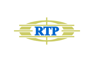
White 2:3 with the traditional modernized logo (blue typewriter style lettering on golden antenna). As said, the traditional logo had no fixed colors (necessarily black and white before 1982).
António Martins-Tuválkin, 22 Oct 2002
Only shortly in public use
I used to work right across the street from RTP’s HQ, where the traditional logo is proeminently shown — never saw any flag there, though…
António Martins-Tuválkin, 03 Feb 2002
some time later, not much, I was again working right across the street from RTP’s HQ and I could see their flag poles from a vantage point. Right after the new Government announced massive investment cut in state-owned TV there was some commotion among the workers there, and from then on (up till today) flags are hoisted every day — not only in Sundays, as previously, and not only the national flag and the European Union flag, but also the flag of RTP TV station itself.
During the said demonstrations in early 2002, when the very future of the state-owned TV station was questioned by the new government, small paper handwavers were gave away to bystanders, and at least two large cloth flags were used by the rallying protesters — these in 2:3 white background with the logo. The protesters also used one flag with the modernized traditional logo, so there is no “political” connotation in using one or the other).
António Martins-Tuválkin, 22 Oct 2002
199X-2004 logo on unofficial flag
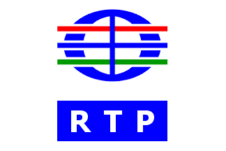
Oblong version

image by António Martins-Tuválkin, 22 Oct 2002
The new logo (adopted in the late ’90ies) apparently is not official enough to be in the company flag: the flag hoisted daily at the RTP’s HQ is white 2:3 with the traditional modernized logo.
António Martins-Tuválkin, 22 Oct 2002
During the said demonstrations in early 2002, when the very future of the state-owned TV station was questioned by the new government, small paper handwavers were gave away to bystanders, and at least two large cloth flags were used by the rallying protesters — these in 2:3 white background with the new logo.
António Martins-Tuválkin, 22 Oct 2002
The new logo has recently become old, though, as the company suffered a deep reshuffling in April 2004, and it got yet a new logo and flag.
António Martins-Tuválkin, 06 May 2004
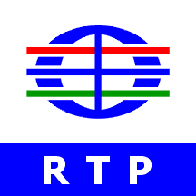
Square version

image by António Martins-Tuválkin, 22 Oct 2002
I also saw flags with this new logo, and many times. It’s a square flag (or squarish), horizontally divided white over blue in proportions about 4:1 or 3:1. In the white field, there’s the new sigla-less logo in blue. In the blue field, there’s the sigla, in white…
Jorge Candeias, 04 Feb 2002
This is some sort of “Banner of the Logo”, it extending to the edges of the flag, slightly adapted to its format.
António Martins-Tuválkin, 22 Oct 2002
The same design with ad hoc logos
Another flag that was also seen in the same situation (Volta a Portugal, a country-round cycling competition of which RTP has exclusive rights) was a close relative: the lower part was identical, but the upper part featured a multicoloured logo they developped for the volta, a sort of stylized bicycle, occupying more than the field. Not a bad flag, even if too coloured.
Jorge Candeias, 03 Feb 2002
Staff association
Casa do Pessoal da RTP
I just caught a glimpse of the Casa do Pessoal da RTP (a sort of club-union of the staff of the state television RTP) flag in a bullfight they hold annually whilst zapping between channels. The flag is white, has a green (or grey?) rounded rectangle emblem, outlined in black ?, and with a drawing inside consisting of two stylized human figures holding hands and an old-fashioned aerial reception antenna in the middle, also in black (?). Above the logo is "CASA DO PESSOAL" then in a second line in a smaller font "DA" and below the emblem "RTP" back in the larger font.
João Madureira, 10 Jul 2004
SIC
Sociedade Independente de Comunicação

image by Jorge Candeias, 21 May 2005 and António Martins-Tuválkin, 19 Apr 2010
I think I saw once a flag of SIC (can’t be sure): its multicoloured logo on black.
Jorge Candeias, 31 Jan 2002
I’m very sure: this was massively given out to by-passers in the form of paper hand-wave flags, back in 1992 when SIC started broadcasting. The logo has not changed since then.
António Martins-Tuválkin, 02 Aug 2004
TVI
Televisão Independente
T.V.I. changed their logo (and corporate visual identity) three times in the last ten years — though the most recent incarnation is so well designed and graphically integrated that it just may include a flag design.
António Martins-Tuválkin, 03 Feb 2002
Might. The logo is indeed quite “vexy”, despite the 3-D effect it includes, and wouldn’t look bad on a flag, even a simple white one. But I never saw any hint of its existence…
Jorge Candeias, 03 Feb 2002
SportTV
Sport TV is a portuguese cable TV channel specialized, as you may guess pretty easily, in sports.
Jorge Candeias, 21 May 2005
Golf variant of the previous flag

image by Jorge Candeias, 21 May 2005
The Sport TV flag in a photo used in advertisement to the Corporate Golf Challenge published i.a. in Golfe Executivo (supplement of Público newspaper) is different from what would have been the contemporary counterpart, and I suspect that it’s adapted to the sport in question: it shows a golf ball, and if my memory serves me right, the logo of the network had a sort of globe framework, like the current logo but with a different design.
Jorge Candeias, 21 May 2005
Anything below this line was not added by the editor of this page.