Container class - widgets library (original) (raw)
A convenience widget that combines common painting, positioning, and sizing widgets.
A container first surrounds the child with padding (inflated by any borders present in the decoration) and then applies additionalconstraints to the padded extent (incorporating the width and heightas constraints, if either is non-null). The container is then surrounded by additional empty space described from the margin.
During painting, the container first applies the given transform, then paints the decoration to fill the padded extent, then it paints the child, and finally paints the foregroundDecoration, also filling the padded extent.
Containers with no children try to be as big as possible unless the incoming constraints are unbounded, in which case they try to be as small as possible. Containers with children size themselves to their children. Thewidth, height, and constraints arguments to the constructor override this.
By default, containers return false for all hit tests. If the colorproperty is specified, the hit testing is handled by ColoredBox, which always returns true. If the decoration or foregroundDecoration properties are specified, hit testing is handled by Decoration.hitTest.
Layout behavior
See BoxConstraints for an introduction to box layout models.
Since Container combines a number of other widgets each with their own layout behavior, Container's layout behavior is somewhat complicated.
Summary: Container tries, in order: to honor alignment, to size itself to the child, to honor the width, height, and constraints, to expand to fit the parent, to be as small as possible.
More specifically:
If the widget has no child, no height, no width, no constraints, and the parent provides unbounded constraints, then Container tries to size as small as possible.
If the widget has no child and no alignment, but a height, width, orconstraints are provided, then the Container tries to be as small as possible given the combination of those constraints and the parent's constraints.
If the widget has no child, no height, no width, no constraints, and no alignment, but the parent provides bounded constraints, thenContainer expands to fit the constraints provided by the parent.
If the widget has an alignment, and the parent provides unbounded constraints, then the Container tries to size itself around the child.
If the widget has an alignment, and the parent provides bounded constraints, then the Container tries to expand to fit the parent, and then positions the child within itself as per the alignment.
Otherwise, the widget has a child but no height, no width, noconstraints, and no alignment, and the Container passes the constraints from the parent to the child and sizes itself to match the child.
The margin and padding properties also affect the layout, as described in the documentation for those properties. (Their effects merely augment the rules described above.) The decoration can implicitly increase thepadding (e.g. borders in a BoxDecoration contribute to the padding); see Decoration.padding.
Example
This example shows a 48x48 amber square (placed inside a Center widget in case the parent widget has its own opinions regarding the size that theContainer should take), with a margin so that it stays away from neighboring widgets:

Center(
  child: Container(
    margin: const EdgeInsets.all(10.0),
    color: Colors.amber[600],
    width: 48.0,
    height: 48.0,
  ),
)
This example shows how to use many of the features of Container at once. The constraints are set to fit the font size plus ample headroom vertically, while expanding horizontally to fit the parent. The padding is used to make sure there is space between the contents and the text. Thecolor makes the box blue. The alignment causes the child to be centered in the box. Finally, the transform applies a slight rotation to the entire contraption to complete the effect.
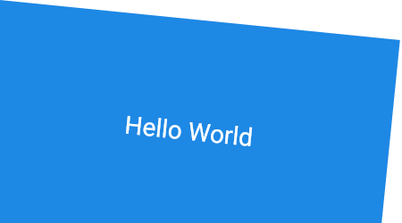
Container(
  constraints: BoxConstraints.expand(
    height: Theme.of(context).textTheme.headlineMedium!.fontSize! * 1.1 + 200.0,
  ),
  padding: const EdgeInsets.all(8.0),
  color: Colors.blue[600],
  alignment: Alignment.center,
  transform: Matrix4.rotationZ(0.1),
  child: Text('Hello World',
    style: Theme.of(context)
        .textTheme
        .headlineMedium!
        .copyWith(color: Colors.white)),
)
See also:
- AnimatedContainer, a variant that smoothly animates the properties when they change.
- Border, which has a sample which uses Container heavily.
- Ink, which paints a Decoration on a Material, allowingInkResponse and InkWell splashes to paint over them.
- Cookbook: Animate the properties of a container
- The catalog of layout widgets.
Inheritance
- Object
- DiagnosticableTree
- Widget
- StatelessWidget
- Container
Constructors
Container({Key? key, AlignmentGeometry? alignment, EdgeInsetsGeometry? padding, Color? color, Decoration? decoration, Decoration? foregroundDecoration, double? width, double? height, BoxConstraints? constraints, EdgeInsetsGeometry? margin, Matrix4? transform, AlignmentGeometry? transformAlignment, Widget? child, Clip clipBehavior = Clip.none})
Creates a widget that combines common painting, positioning, and sizing widgets.
Properties
alignment → AlignmentGeometry?
Align the child within the container.
final
The child contained by the container.
final
The clip behavior when Container.decoration is not null.
final
The color to paint behind the child.
final
Additional constraints to apply to the child.
final
The decoration to paint behind the child.
final
foregroundDecoration → Decoration?
The decoration to paint in front of the child.
final
The hash code for this object.
no setterinherited
Controls how one widget replaces another widget in the tree.
finalinherited
Empty space to surround the decoration and child.
final
Empty space to inscribe inside the decoration. The child, if any, is placed inside this padding.
final
A representation of the runtime type of the object.
no setterinherited
The transformation matrix to apply before painting the container.
final
transformAlignment → AlignmentGeometry?
The alignment of the origin, relative to the size of the container, if transform is specified.
final
Methods
build(BuildContext context)→ Widget
Describes the part of the user interface represented by this widget.
override
createElement()→ StatelessElement
Creates a StatelessElement to manage this widget's location in the tree.
inherited
debugDescribeChildren()→ List<DiagnosticsNode>
Returns a list of DiagnosticsNode objects describing this node's children.
inherited
debugFillProperties(DiagnosticPropertiesBuilder properties)→ void
Add additional properties associated with the node.
override
noSuchMethod(Invocation invocation)→ dynamic
Invoked when a nonexistent method or property is accessed.
inherited
toDiagnosticsNode({String? name, DiagnosticsTreeStyle? style})→ DiagnosticsNode
Returns a debug representation of the object that is used by debugging tools and by DiagnosticsNode.toStringDeep.
inherited
toString({DiagnosticLevel minLevel = DiagnosticLevel.info})→ String
A string representation of this object.
inherited
toStringDeep({String prefixLineOne = '', String? prefixOtherLines, DiagnosticLevel minLevel = DiagnosticLevel.debug, int wrapWidth = 65})→ String
Returns a string representation of this node and its descendants.
inherited
toStringShallow({String joiner = ', ', DiagnosticLevel minLevel = DiagnosticLevel.debug})→ String
Returns a one-line detailed description of the object.
inherited
A short, textual description of this widget.
inherited
Operators
operator ==(Object other)→ bool
The equality operator.
inherited