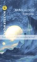
If you live in the UK by now you may have seen the new cover design for Gollancz's relaunched SF Masterworks series. Yes, they're garish, perhaps a little too garish. They clearly want the covers to stand out, or perhaps literally leap off the bookshelves into your sweaty palms. A Gollancz rep, speaking on condition of anonymity at Eastercon yesterday, also told me the covers are loaded with microchips that shout "Buy me!" while subliminally commanding you to reach into your pocket to fish out the requisite £9.99.Last weekend at Eastercon I had a good half-hour chat with Chris Moore, who's done his fair share of SF Masterworks covers. He reckons some of these new cover designs work better than others: while selecting some of the older titles to relaunch the series they used the same illustrations and solarized them, adjusting the colour balance to give them a completely new feel. Personally I think some just look ridiculous and yesterday Rog Peyton, convention bookseller of repute, inevitably berated the Gollancz reps for their crap cover design in much the same way he did for their relaunch of Greg Egan's titles a couple of years ago: Egan's covers are indeed possibly the ugliest cover designs I've ever seen on a series of SF books, but if Gollancz do push the boundaries a little too far at times I actually like it when art directors of big publishers get all radical and don't go for the safe option when choosing designs.On display at the art show Chris had a new airbrush painting of a guy holding a notebook with two moons in the sky: I recognised this immediately as being Delany's Dhalgren, and it's the cover illustration for a new SF Masterworks edition. The painting itself has a natural colour balance, but when rendered on the cover it's gone all yellow. The guy who modelled for the illustration is one of Chris's sons, and Chris very kindly offered to send me a full size print, for free.Here are three new editions being added to the Masterworks list: Chris Priest's Inverted World in May, Samuel R. Delany's Dhalgren in July and Brian Aldiss's complete Helliconia trilogy in August (1,088 pages!).   |
|


 Via Journey Around My Skull