Monitor health, resource utilization, and jobs (original) (raw)
As a BigQuery administrator, you can monitor your organization's health, slots use, and jobs performance over time with operational health and resource utilization charts. BigQuery provides configurable charts to help you with the following:
- **Monitor operational health of BigQuery.**BigQuery real-time operational health monitoring is a centralized monitoring system that lets you observe BigQuery usage across the organization in multiple locations.
- **View BigQuery resource utilization.**Use historical data to perform root-cause analysis, plan capacity, and diagnose performance changes.
Before you begin
- To view operational health, you must usereservations that you can access with an administration project. This isn't a requirement for viewing resource utilization charts.
Required roles
To get the permissions that you need to view all data in the operational health and resource utilization charts, ask your administrator to grant you the following IAM roles on your organization:
- BigQuery Resource Viewer (
roles/bigquery.resourceViewer) - BigQuery Metadata Viewer (
roles/bigquery.metadataViewer)
For more information about granting roles, see Manage access to projects, folders, and organizations.
These predefined roles contain the permissions required to view all data in the operational health and resource utilization charts. To see the exact permissions that are required, expand the Required permissions section:
Required permissions
The following permissions are required to view all data in the operational health and resource utilization charts:
- To view all data in the operational health and resource utilization charts for an organization:
bigquery.jobs.listExecutionMetadata or bigquery.jobs.listAllon the organizationbigquery.reservationAssignments.liston the administration project used to create the reservationsbigquery.capacityCommitments.liston the administration project used to create the reservations
- As an on-demand user, to view all data in the resource utilization charts for an organization:
bigquery.jobs.listExecutionMetadata or bigquery.jobs.listAllon the organization - To view operational health summary data for BigQuery table storage:
bigquery.tables.get or bigquery.tables.liston the organization - To view operational health and resource utilization charts at the reservation level:
bigquery.reservations.liston the administration project used to create the reservationsbigquery.reservationAssignments.liston the administration project used to create the reservations
- To view resource utilization charts at the project level:
bigquery.jobs.listAllon the project
You might also be able to get these permissions with custom roles or other predefined roles.
Monitor operational health across an organization
The operational health dashboard displays key metrics for your organization and its reservations in all the locations where you have reservations. You can use this dashboard to monitor the following metrics:
- Slot usage
- Shuffle usage
- Job concurrency
- Errors
- Job duration
- Bytes processed
- Total storage
View operational health charts
To view information about the operational health of your organization, follow these steps:
- In the Google Cloud console, go to the BigQuery Monitoringpage.
Go to Monitoring - Select the administration project that you used to purchase slots and create reservations.
- In the Monitoring page, go to the Operational health tab to view a summary of your organization's key metrics for all locations and reservations.
- Optional: To view real-time metrics, where queries run on fresh data every five minutes, click the Live data toggle. By default, this setting is turned off and the maximum staleness of the data is about an hour.
- To filter the metrics, configure the following fields:
- In the Select location list, select a region to monitor.
- In the Select reservation list, select the reservation.
- In the Select project list, select the project.
- In the Time range list, select a time range.
- Optional: To view more details about operational health with a resource utilization chart or jobs explorer, click Explore more.
BigQuery gathers the metrics by querying the followingINFORMATION_SCHEMA views:
- INFORMATION_SCHEMA.JOBS
- INFORMATION_SCHEMA.JOBS_TIMELINE
- INFORMATION_SCHEMA.RESERVATIONS
- INFORMATION_SCHEMA.TABLE_STORAGE
Views
The Operational health tab displays the following summary and detailed views.
Summary view
The summary view shows you the health of your organization's subsystems, including reservations and regions, in the last 30 minutes.
To view the summary view, do the following:
- In the Operational health tab, in the Select location list, selectAll locations.
Detailed view
The detailed view shows detailed timeline charts of different metrics at a location or a reservation level.
To view the detailed view, do the following:
- In the Operational health tab, in the Select location list, select the region or edition.
You can refine the data displayed in the detailed view using the following optional filters:
- In the Select reservation list, select the reservation name.
- In the Select project list, select the project.
Charts
BigQuery provides the following table and chart options, which let you explore your operational health metrics in detail.
Summary table
The summary tables display the following metrics:
- Slot usage. The average slot utilization. The total slot capacity equals baseline capacity and autoscaled max capacity.
- Shuffle usage. The maximum of all average reservation shuffle usage ratios.
- Concurrency. The maximum number of jobs running simultaneously.
- Bytes processed. The total bytes processed by completed jobs.
- Job duration. The average runtime of the jobs completed, calculated from the time when the job was created until the time when the job ended.
- Total storage. The total active logical bytes at the last updated time.
There are two summary tables presented in the view: Location summary andReservation summary. Each table row represents usage for one location or one reservation.
The tables display metrics for the 30 minutes prior to the last update. IfLive data is enabled, the queried data refreshes every five minutes. IfLive data is disabled, then the maximum data staleness is approximately one hour.
The table cell is color coded if the metric is greater than the predefined threshold and if there are an increased number of performance insights for repeated jobs:
- If the metric value over the 30 minutes prior to the last update is greater than the P99 value of the last week's usage for the same day, the table cell is marked with a dark blue background.
- If the metric value over the 30 minutes is between the P95 - P99 value of the last week's usage for the same day, the table cell is marked with a light blue background.
All thresholds are predefined and can't be customized. You can check a threshold by clicking info Info.

Filter data
You can filter data in charts based on the following values:

- Location. Regions where the organization has had activity within the past 30 days are available. The summary view presents a table summarizing usage in all active regions.
- Reservation. This field is available only in the detailed view. All reservations owned by the administration project are available. You can only choose one reservation.
- Project. This field is available only in the detailed view. All projects that have traffic in the organization are available. You can select only one project.
- Time range. This field is available only in the detailed view. It affects the Metrics timeline charts and the Error donut chart in the detailed view. The data scale in theMetrics timeline charts is adjusted automatically according to the selected time range.
Top active queries chart
This chart shows the top ten jobs with active resources that are sorted in descending order. In the drop-down menu, you can select a sorting option based on slot usage or job duration. The job ID and relevant resource usage number are presented in the bar chart. Select Explore more or the job ID in the top active queries chart to view more details in the jobs explorer. To learn more about the execution details and diagnose performance issues for your BigQuery jobs, seeGet query performance insights.
Error donut chart
This chart shows the proportion of the top causes of failure in the selected time period. In the summary view, it defaults to cover the last 30 minutes. In the detailed view, the time range selector controls its coverage. You can group the errors by type, owner project, or reservation. The count of failed jobs is presented in the donut chart.

Metric timeline charts
The charts display an overview of supported metrics over a maximum of 30 days. The default time period is one hour. As the selected time period changes, the granularity of each data point in the chart is scaled automatically.
These charts display an aggregated value over a region or a reservation. Displaying data for multiple regions or multiple reservations is not supported.

The Metric timeline charts support the following metrics:
- Slot usage. The average slot usage in the selected time period. It displays the overall slot usage from all jobs and failed jobs separately.
- Job concurrency. The maximum number of jobs running simultaneously in the selected time period. It displays the count of running jobs and pending jobs separately and is shown as a stacked bar chart.
- Bytes scanned. The total bytes processed by completed jobs in the selected time period.
- Shuffle. The maximum of all reservation average shuffle usage ratios in the selected time period.
- Job duration. The average runtime of jobs completed in the selected time period, calculated from job creation time to job end time.
- Error by type. The Error donut chart shows the proportion of different causes of failure in the selected time period.
Besides the metric trends, the charts display reference lines of the P95 and P99 metrics values of the last week's usage for the same day. The Job concurrency chart shows the threshold for the sum of pending and running jobs. Those referenced values are used as the color coding thresholds in thesummary table.
To learn more about the chart, click Explore more. You are redirected to the**Resource utilization** tab.
Insights table
This table aggregates quota errors, access denied errors, and performance insights gathered during job executions within the selected time period. Insights are aggregated at reservation level. Each row provides information about the insight type, location, reservation, insight detail, and sample job IDs. Click job IDs to view more job details in the jobs explorer. In the summary view, the default observation timeframe covers the last 30 minutes. In the detailed view, the time range selector controls the specific time period for which observation data is displayed.

Monitor operational health for a single project
The project operational health dashboard is the default view you get if you don't have access to the entire organization, or your project doesn't own any reservation. This view can help project analysts monitor system health for their projects, much like the operational health dashboard at the organizational level, but it shows only project-level data in its charts and filters.
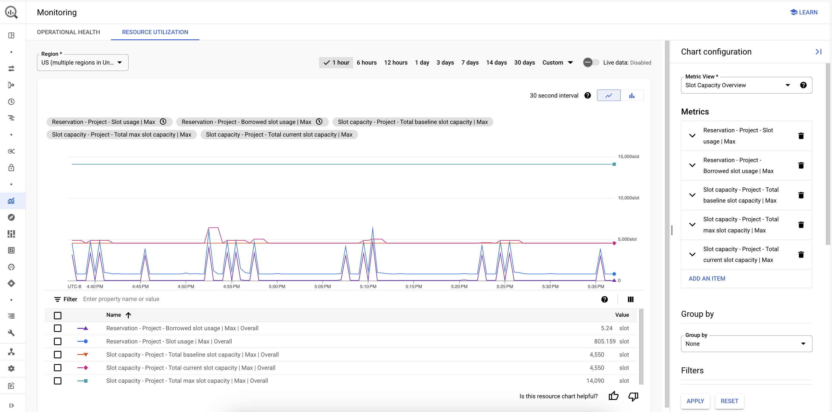
View BigQuery resource utilization
BigQuery resource charts help you track past resource use to plan for future needs and troubleshoot performance.
The charts gather metrics by querying the followingINFORMATION_SCHEMA views:
The data can be updated in real time, going back a maximum of 30 days.
When you view resource utilization, you can configure the following:
- The event timeline chart shows an overview of data over a maximum of 30 days. The default is 6 hours.
- The main chart shows chosen metrics, such as slot usage or bytes processed, over time for your organization or administration project. A legend for the chart gives more details about the data shown.
- The Chart configuration pane lets you select predefined views of your metrics or customize your own metrics for the views.
The resource utilization chart has the following elements:
- In the resource utilization tab, hold the pointer over the status chip at the top of the chart to display more information about a metric.
- The status chips also shows you the following:
- If the metric is still loading, a loading icon is presented.
- If the metric uses stale data, a clock icon is presented.
- If the metric can't be loaded due to unsupported page-level filters, the metric is crossed out.
- If the metric fails to load, the status chip is highlighted.
View and configure resource utilization charts
To view and configure resource utilization charts, follow these steps:
- In the Google Cloud console, go to the BigQuery Monitoringpage.
Go to Monitoring - Select the project. As an administrator monitoring reservation resource use, choose the administration project used to buy slots and create reservations. As a data analyst monitoring job resource use, choose the corresponding project.
- In the Monitoring page, go to the Resource utilization tab to view a summary of the resource usage, broken down by location.
- Choose a time period for the metrics in this view, such as 1 day. To view real-time metrics, where queries run on fresh data, click the Live data toggle. This setting is turned off by default to improve performance, and the maximum staleness of the data is about an hour.
- In the Chart configuration pane, configure the following fields:
- In the Metric view field, select one of the views.
- In the Metrics field, select a metric to view. You can add or edit a metric.
- In the Group by field, select how to group the data.
- In the Filters field, select how to filter the data.
- To save the changes you've made to the chart configuration, click Apply.
Metric view
BigQuery provides pre-configured views of resource utilization metrics. The following sections describe the metrics that you can configure in those views.
Reservation slot usage
This view shows you metrics about the slot usage breakdown for the reservations in the administrative project. Each metric has the following default settings, which you can edit in the Chart configuration pane by clicking the metric's name:
- The default usage data is from the reservation resources.
- The default scope is the project.
- The default aggregation is by the average usage in the selected time period.
| Metric name | Description |
|---|---|
| Reservation - Slot usage | Monitors total slot usage for the selected time period. |
| Reservation - Idle slot usage | Monitors slot usage in excess of the reservation's capacity in the selected time period. This metric lets you monitor the idle slots borrowed from other reservations and commitments, or the rounding imprecisions in the usage data. The latter may cause this metric to be a non-zero value, even if idle slots sharing is disabled. The idle slots usage is an approximate value and is computed based onSlot Usage, Committed Slots, and Autoscaled Slots. If the slot usage value exceeds the Commitment Capacity andAutoscaled Slots, then the chart groups the remaining as idle slots. |
| Reservation - Baseline used slots | Monitors slots used from the reservation baseline. |
| Reservation - Autoscaled used slots | Monitors slots used from reservation autoscaled slots. |
Edition utilization overview
This view shows you metrics about slot usage and capacity for edition resources in the administrative project. Each metric has the following default settings, which you can edit in the Chart configuration pane by clicking the metric's name:
- The default usage data is from the reservation resource and the capacity data is from the edition resource.
- The default scope is the project.
| Metric name | Description |
|---|---|
| Reservation - Slot usage | Monitors slot usage for the selected time period. The default aggregation is by the p99 slot usage in the selected time period. |
| Reservation - Idle slot usage | Monitors slot usage in excess of the reservation's capacity in the selected time period. This metric lets you monitor the idle slots borrowed from other reservations and commitments, or the rounding imprecisions in the usage data. The latter can cause this metric to have a non-zero value, even if idle slot sharing is disabled. The idle slot usage is an approximate value and is computed based onSlot Usage, Committed Slots, and Autoscaled Slots. If the slot usage value exceeds the Commitment Capacity andAutoscaled Slots, then the chart groups the remaining as idle slots. The default aggregation is by the p99 resource usage in the selected time period. |
| Edition - Baseline capacity | Monitors the baseline size of reservations in this administration project. |
| Edition - Maximum capacity | Monitors the maximum number of slots available in the selected time period. The metric is the sum of commitment capacity, baseline capacity, and autoscaled capacity. The default aggregation is by the maximum resource usage in the selected time period. |
| Edition - Assigned capacity | Monitors the actual number of slots assigned to your edition resources in the selected time period. The default aggregation is by the maximum resource usage in the selected time period. |
Current project overview
This view shows you metrics about job resources in the project where you run queries. Each metric has the following default settings, which you can edit in the Chart configuration pane by clicking the metric's name:
- The default resource is the job resource.
- The default scope is the project.
| Metric name | Description |
|---|---|
| Job - Project - Slot usage | Monitors slot usage for the selected time period. The default aggregation is by the maximum resource usage in the selected time period. |
| Job - Project - Bytes processed | Monitors the total bytes processed by completed jobs in the selected time period. The default aggregation is by the sum of bytes processed in the selected time period. |
| Job - Project - Job concurrency | Monitors the number of jobs running simultaneously in the selected time period. The default aggregation is by the maximum resource usage in the selected time period. |
| Job - Project - Job duration | Monitors the runtime of completed jobs in the selected time period. Runtime measures the time between job creation to job completion. The default aggregation is by the average runtime in the selected time period. |
Owned reservation overview
This view shows you metrics about job activity with reservation resources in the administrative project. Each metric has the following default settings, which you can edit in the Chart configuration pane by clicking the metric's name:
- The default resource is the reservation resource.
- The default scope is the project.
| Metric name | Description |
|---|---|
| Reservation - Slot usage | Monitors slot usage for the selected time period. The default aggregation is by the maximum resource usage in the selected time period. |
| Reservation - Bytes processed | Monitors the total bytes processed by completed jobs in the selected time period. The default aggregation is by the sum of bytes processed in the selected time period. |
| Reservation - Job concurrency | Monitors the number of jobs running simultaneously in the selected time period. The default aggregation is by the maximum resource usage in the selected time period. |
| Reservation - Job duration | Monitors the runtime of completed jobs in the selected time period. Runtime measures the time between job creation to job completion. It includes queueing and retries. The default aggregation is by the average runtime in the selected time period. |
| Reservation - Shuffle usage | Monitors the shuffle usage ratio in the selected time period. The default aggregation is by the average usage in the selected time period. |
Custom view
To create a custom metric view, you can add metrics from scratch, or start with one of the predefined metric views (for example, the Reservation overview metric view) and customize the metrics in it.
Metrics
When you configure a chart, you can add, edit, or delete the resource utilization metrics it monitors.
To configure resource utilization chart metrics, follow these steps:
- In the Google Cloud console, view the BigQuery resource utilization charts.
- In the Chart configuration pane, configure the Metrics field:
- Click Add an item > Select a metric.
- In the Select a metric dialog, choose the following:
- The type of resource to monitor: Job, Reservation, orEdition.
- The scope to monitor. For example, to monitor job metrics in the current project, select the Project scope.
- Choose a metric to monitor. For example, to monitor the job slot usage, choose Slot usage.
- Click Apply.
- In the New item dialog, choose the aggregation. For example, to monitor the maximum slot usage in excess of the reservation's capacity in the selected time period, choose Max.
- Save the metric by clicking Done.
- Optional: To change an existing metric, click the metrics name and edit its settings or delete it.
Supported resource types and scopes for metrics
Resource utilization metrics are categorized by resource type and scope.
Resource types
You can monitor the following resource types:
| Resource | Description |
|---|---|
| Job | Metrics about BigQuery job details for a given scope and time period. |
| Reservation | Metrics about BigQuery reservation usage for a given scope and time period. These metrics aggregate job details by reservation. If you have only partial data access at the reservation level, aggregated reservation usage metrics are available, without access to job-level details. |
| Edition | Metrics about BigQuery edition capacity for a given scope and time period. |
Scope types
After you select a resource for a metric, you select a scope.
- The reservation and edition resources default to a project-level scope.
- The job resource can be set to project-, folder-, or organization-level scopes. Greater scopes require additional permissions.
Group by
To group data in your resource utilization chart, follow these steps:
- In the Google Cloud console, view the BigQuery resource utilization charts.
- In the Chart configuration pane, configure the Group by field by selecting one of the following options:
- None: This option gives you a high-level overview of the chosen metrics, over time, across the entire organization.
- Project: This option groups chosen metrics by project. If more than 50 projects are available, only the top 50 projects with the highest slot usage are shown.
- All other group-by options: These options are similar to the project view, with data grouped by the respective dimension. If a group-by option isn't supported for all chosen metrics, the option can't be selected.
Filter
When you configure your resource utilization chart, you can apply filters to your data, such as displaying resource usage for Enterprise edition resources, or by a resource ID.
To filter the chart data, apply filters in the filter pane. You can only select a filter if it's supported for the metrics you selected. To view the required permissions, click the Filter menu.
View project-level resource utilization data
You can analyze project-level resource utilization using the same configuration steps as you would for viewing organization-level data. Charts only display project-level data and configuration options (organizational-level options are greyed out). This project-level scope shows the overall resource utilization, regardless of billing mode within the contextual project.
Resource utilization chart limitations
- The chart and table in the middle of the page display metrics that are relevant to the time period and granularity selected.
- Metrics with the same unit share the same scale. The chart supports up to two different scales.
Switch to the old UI
By default, you have access to Edition resource charts when navigating from the reservation administration project. You can toggle between the on-demand resource charts and the Edition resource charts from the reservation administration project (Preview).
To view resource charts, follow these steps:
- Go to the BigQuery page.
Go to BigQuery - In the project menu, select the administration project that you used to purchase slots and create reservations.
- In the navigation menu, click Monitoring.
- In the Chart options > Scope section, you can select the billing model from the list, which includes three types of Editions and on-demand. By default, the billing model is set to the Enterprise edition.
- In the Chart options > Chart Configurations section, do the following:
- From the Chart list, select the chart type. For information about different chart options, see Chart options.
- From the Metrics list, select the available metrics type.
- From the Group by list, select the dimension by which you want to group the data in the chart. For information about different dimensions, see Group by options.
- From the Filters list, select the available filter options. For information about different filters, see Filters and search.
- Set the timeframe for which you want to view the data in the chart.
Chart configurations
You can adjust the view of your resource charts by changing the following chart configuration options.
Chart options
BigQuery provides the following metric types to display in the charts:
- Slot Usage. Average slot usage. If the Group by option is set toOverall, or if Filters are either None or a single reservation, then capacity and borrowed slot usage metrics are also displayed.
- Total Usage. Average slot usage in the selected time period.
- Borrowed Slot Usage. Average usage in excess of the reservation's capacity. This is usually idle slots borrowed from other reservations and commitments, or rounding imprecision in usage data. Additional idle slots appear in the resource utilization chart, even if idle slots sharing is disabled. The idle slots usage is an approximate value and is computed based onSlot Usage, Committed Slots, and Autoscaled Slots. If the slot usage value exceeds the Commitment Capacity, then the chart groups them as idle slots.
- Commitment Capacity. The edition commitment size.
- Baseline Capacity. The reservation baseline size.
- Autoscale Capacity. The autoscaled slot size.
- Maximum Capacity. The maximum number of slots the user can access.
- Job Concurrency. Maximum number of jobs running simultaneously in the selected time period.
- Job Performance. Average job runtime of completed jobs, calculated from job creation time to job end time.
- Failed Jobs. Average slot usage in the selected time period from jobs that failed.
- Bytes Processed. Total bytes processed by completed jobs in the selected time period.
- Shuffle Usage. Average shuffle usage ratio in the selected time period (preview).
Table component
The table displays metrics that are relevant to the time period and dimension that you selected in the resource chart.
The Slot Usage chart displays the Average slot usage for all of the jobs running during the selected time period. Jobs that didn't finish within the selected time period include only slots used within the time period.
For the Job Performance chart, the table component displays the following metrics:
- Number of jobs. The number of completed jobs ran or partially ran within the selected time period.
- Average job duration. The average job duration for completed jobs that at least partially ran within the selected time period.
- Median job duration. The median job duration for completed jobs that at least partially ran within the selected time period.
- Min job duration. The minimum job duration for completed jobs that at least partially ran within the selected time period. This column is hidden by default, but you can enable it inColumn display options.
- Max job duration. The maximum job duration for completed jobs that at least partially ran within the selected time period. This column is hidden by default, but you can enable it inColumn display options.
For the Failed Jobs chart, the table component displays the following data:
- Average slot usage. Same as the Slot Usage chart, but only for failed jobs.
- Total failed jobs. The number of jobs that failed within the selected time period.
Group by options
Based on the type of chart, you can group data in the chart view by several dimensions:
- Overall. The overall view is a high-level overview of the selected metric, over time, across the entire organization. For slot usage, capacity and usage are shown on the same chart to give an idea of overall slot utilization over time.
- Project. The project view shows the selected metric grouped by project. If an organization has more than 10 projects, then only the top 10 projects with the highest slot usage, job concurrency, job duration, or failed jobs in the selected time period are shown. For slot usage, all other projects are grouped into the Other category at the bottom of the chart for easier comparison to overall capacity.
- All other group-by views are similar to the project view, with data grouped by the respective dimension.
Timeframe option
You can modify the time period in the following ways:
- Select and drag the time period into the event timeline chart.
- Select and drag the time period into the main chart.
The alignment period updates automatically as the selected timeframe changes. The smaller the alignment period, the more detailed the view. To better view resources that change frequently, for example the Slot Usage option, reduce the alignment period.
Filter and search
To narrow the chart data, apply filters in the filter panel. Some filters are only available for certain charts. The Reservations,Folders, Projects, and Users filters are populated with the respective resources that have consumed slots in the selected timeframe. For example, if a project hasn't been used in the last 30 days, it does not appear in the project filter list.
The chart refreshes after you apply filters to show data within the selected parameters.
Troubleshoot slot contention
Slot contention can happen when there aren't enough slots to run all of your jobs, causing performance issues. To troubleshoot slot contention issues, see the following steps and best practices.
If you have tried these best practices but are still experiencing job performance issues, you can request support.
Job concurrency spikes
Use the Detailed view to check for sudden surge in job runs where there are simultaneous slot usage spikes. This can indicate that there are too many jobs contending for slots limited by your reservation limit.
- Best practice: Consider optimizing resource-intensive queries or your reservation's slot capacity. For more information about optimizing query performance, see Optimize query computation.
High slot usage
Use the Detailed view to check for increased job durations, especially if there are jobs that exceed your reservation's maximum capacity. Consistently high slot usage can indicate ongoing slot contention.
- Best practice: Check queries using the jobs explorer's slot contention filter to identify those consuming the most slots and optimize them.
Lengthy job durations
If jobs are taking significantly longer to complete, check theDetailed view. High job concurrency and slot usage spikes can indicate slot contention.
- Best practice: Isolate critical jobs by temporarily pausing less important jobs or reducing your overall job submission rate.
Slot contention messages
The insights table can display messages such as There were NUMBER jobs detected with slot_contention in the reservation. that indicate slot contention issues. Check the jobs explorer to review details about the specific jobs flagged in these messages.
- Best practice: Optimize the identified queries or adjust your reservation's slot allocation.
What's next
- Learn about reservations.
- Learn about purchasing slots.
- Learn how to estimate slot capacity requirements.
- Learn how to view slot recommendations and insight.