Monocle 3 (original) (raw)
Differential expression analysis
Differential gene expression analysis is a common task in RNA-Seq experiments. Monocle can help you find genes that are differentially expressed between groups of cells and assesses the statistical signficance of those changes. Monocle 3 includes a powerful system for finding genes that vary across cells of different types, were collected at different developmental time points, or that have been perturbed in different ways.
There are two approaches for differential analysis in Monocle:
- Regression analysis: using
fit_models(), you can evaluate whether each gene depends on variables such as time, treatments, etc. - Graph-autocorrelation analysis: using
graph_test(), you can find genes that vary over a trajectory or between clusters.
Monocle also comes with specialized functions for finding co-regulated modules of differentially expressed genes. Monocle also allows you to interactively interrogate specific clusters or regions of a trajectory (e.g. branch points) for genes that vary within them.
Let's examine these tools in turn.
Regression analysis
In this section, we'll explore how to use Monocle to find genes that are differentially expressed according to several different criteria. Performing differential expression analysis on all genes in a cell_data_set object can take anywhere from minutes to hours, depending on how complex the analysis is. To keep the vignette simple and fast, we'll be working with small sets of genes. Rest assured, however, that Monocle can analyze several thousands of genes even in large experiments, making it useful for discovering dynamically regulated genes during the biological process you're studying.
Let's begin with a small set of genes that we know are important in ciliated neurons to demonstrate Monocle's capabilities:
ciliated_genes <- c("che-1",
                    "hlh-17",
                    "nhr-6",
                    "dmd-6",
                    "ceh-36",
                    "ham-1")
cds_subset <- cds[rowData(cds)$gene_short_name %in% ciliated_genes,]
The differential analysis tools in Monocle are extremely flexible. Monocle works by fitting a regression model to each gene. You can specify this model to account for various factors in your experiment (time, treatment, and so on). For example, In the embryo data, the cells were collected at different time points. We can test whether any of the genes above change over time in their expression by first fitting a generalized linear model to each one:
\begin{equation} log(y_i) = \beta_0 + \beta_t x_t \end{equation}
where yiy_iyi is a random variable corresponding to the expression values of gene iii, xtx_txt is the time each cell was collected (in minutes), and the betat\beta_tbetat capture the effect of time on expression, and beta0\beta_0beta0 is an intercept term. We can identify genes that vary over time by fitting this model to each one, and then testing whether its betat\beta_tbetat is significantly different from zero. To do so, we first call the fit_models() function:
gene_fits <- fit_models(cds_subset, model_formula_str = "~embryo.time")gene_fits is a tibble that contains a row for each gene. The model column contains generalized linear model objects, each of which aims to explain the expression of a gene across the cells using the equation above. The parameter model_formula_str should be a string specifying the model formula. The model formulae you use in your tests can include any term that exists as a column in the colData table, including those columns that are added by Monocle in other analysis steps. For example, if you use [cluster_cells](/monocle3/docs/clustering/#group-cells), you can test for genes that differ between clusters and partitions by using ~cluster or ~partition (respectively) as your model formula. You can also include multiple variables, for example ~embryo.time + batch, which can be very helpful for subtracting unwanted effects.
Now let's see which of these genes have time-dependent expression. First, we extract a table of coefficients from each model using the coefficient_table() function:
fit_coefs <- coefficient_table(gene_fits)fit_coefs looks like this:
| id | gene_short_name | num_cells_expressed | status | term | estimate | std_err | test_val | p_value | normalized_effect | model_component | q_value |
|---|---|---|---|---|---|---|---|---|---|---|---|
| WBGene00001820 | ham-1 | 1618 | OK | (Intercept) | 1.09 | 0.0665 | 16.4 | 4.58e-59 | 0 | count | 1.83e-58 |
| WBGene00001820 | ham-1 | 1618 | OK | embryo.time | -0.00388 | 0.000211 | -18.4 | 9.18e-74 | -0.00558 | count | 4.59e-73 |
| WBGene00007058 | dmd-6 | 873 | OK | (Intercept) | -5.07 | 0.123 | -41.3 | 0 | 0 | count | 0 |
| WBGene00007058 | dmd-6 | 873 | OK | embryo.time | 0.0075 | 0.000209 | 35.9 | 3.39e-256 | 0.00418 | count | 2.03e-255 |
| WBGene00001961 | hlh-17 | 51 | OK | (Intercept) | -6.04 | 0.501 | -12.1 | 4.26e-33 | 0 | count | 8.52e-33 |
| WBGene00001961 | hlh-17 | 51 | OK | embryo.time | 0.00334 | 0.00103 | 3.23 | 0.00123 | 0.00093 | count | 0.00247 |
| WBGene00003605 | nhr-6 | 133 | OK | (Intercept) | -6.09 | 0.287 | -21.2 | 2.35e-96 | 0 | count | 1.17e-95 |
| WBGene00003605 | nhr-6 | 133 | OK | embryo.time | 0.00579 | 0.000523 | 11.1 | 2.8e-28 | 0.00155 | count | 8.41e-28 |
| WBGene00000457 | ceh-36 | 1123 | OK | (Intercept) | -1.63 | 0.105 | -15.5 | 3.02e-53 | 0 | count | 9.05e-53 |
| WBGene00000457 | ceh-36 | 1123 | OK | embryo.time | 0.00279 | 0.000224 | 12.5 | 3.62e-35 | 0.00382 | count | 1.45e-34 |
| WBGene00000483 | che-1 | 292 | OK | (Intercept) | -1.56 | 0.185 | -8.43 | 4.27e-17 | 0 | count | 4.27e-17 |
| WBGene00000483 | che-1 | 292 | OK | embryo.time | -0.000419 | 0.000481 | -0.871 | 0.384 | -0.000577 | count | 0.384 |
Note that the table includes one row for each term of each gene's model. We generally don't care about the intercept term beta_0\beta_0beta_0, so we can easily just extract the time terms:
emb_time_terms <- fit_coefs %>% filter(term == "embryo.time") Now, let's pull out the genes that have a significant time component. coefficient_table() tests whether each coefficient differs significantly from zero under the Wald test. By default, coefficient_table() adjusts these p-values for <code<>multiple hypothesis testing using the method of Benjamini and Hochberg. These adjusted values can be found in the q_value column. We can filter the results and control the false discovery rate as follows: </code<>
emb_time_terms %>% filter (q_value < 0.05) %>%
select(gene_short_name, term, q_value, estimate)| gene_short_name | term | q_value | estimate |
|---|---|---|---|
| ham-1 | embryo.time | 4.59e-73 | -0.00388 |
| dmd-6 | embryo.time | 2.03e-255 | 0.0075 |
| hlh-17 | embryo.time | 0.00247 | 0.00334 |
| nhr-6 | embryo.time | 8.41e-28 | 0.00579 |
| ceh-36 | embryo.time | 1.45e-34 | 0.00279 |
We can see that five of the six genes significantly vary as a function of time.
Monocle also provides some easy ways to plot the expression of a small set of genes grouped by the factors you use during differential analysis. This helps you visualize the differences revealed by the tests above. One type of plot is a "violin" plot.
plot_genes_violin(cds_subset, group_cells_by="embryo.time.bin", ncol=2) +
      theme(axis.text.x=element_text(angle=45, hjust=1))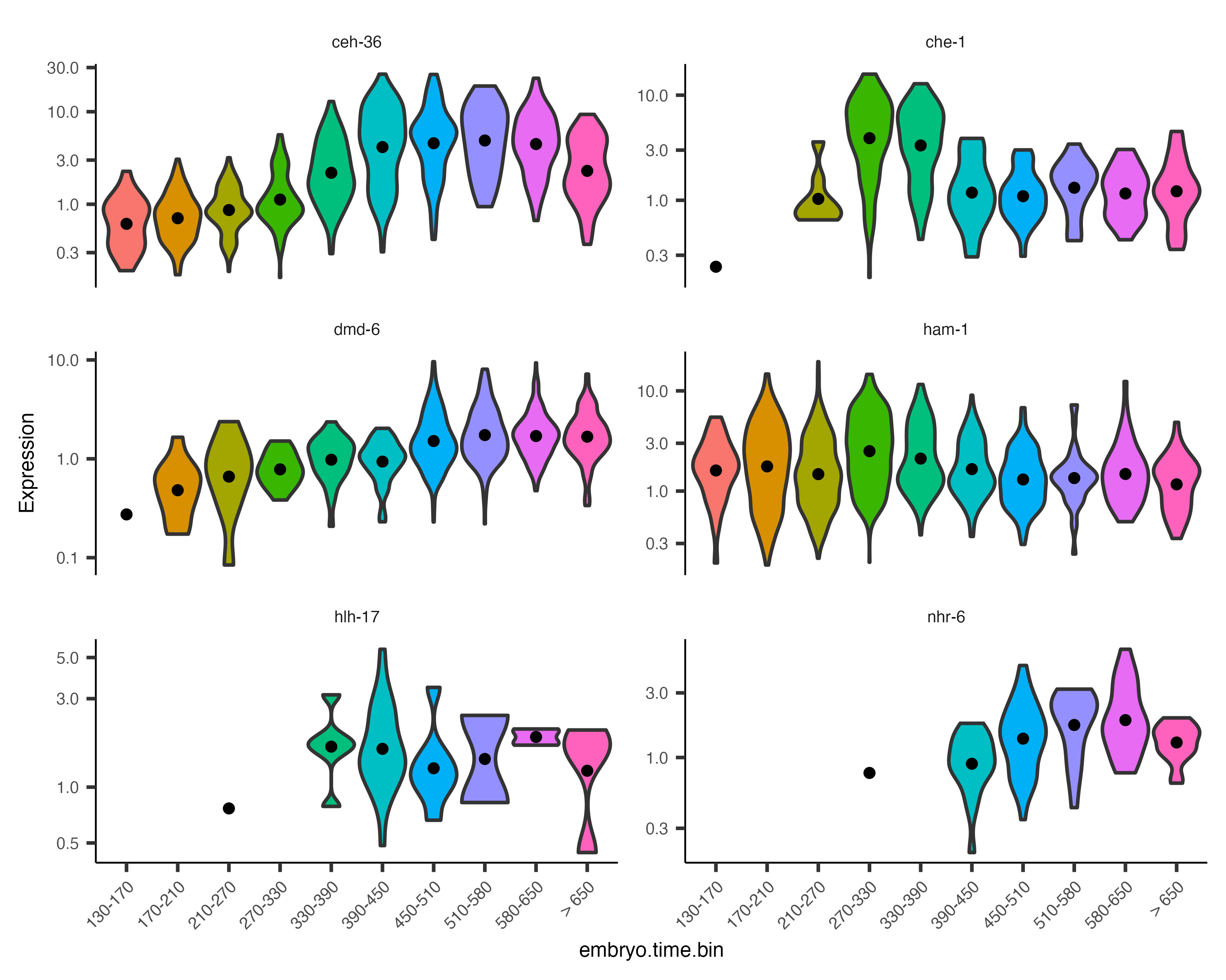
By default, the violin plot log-scales the expression, which drops cells with zero expression, resulting in potentially misleading figures. The Monocle3 develop branch has a hybrid plot where cells appear as red dots in a Sina plot and the cell distribution appears as a histogram with green bars and a blue median_qi interval.
plot_genes_hybrid(cds_subset, group_cells_by="embryo.time.bin", ncol=2) +
      theme(axis.text.x=element_text(angle=45, hjust=1))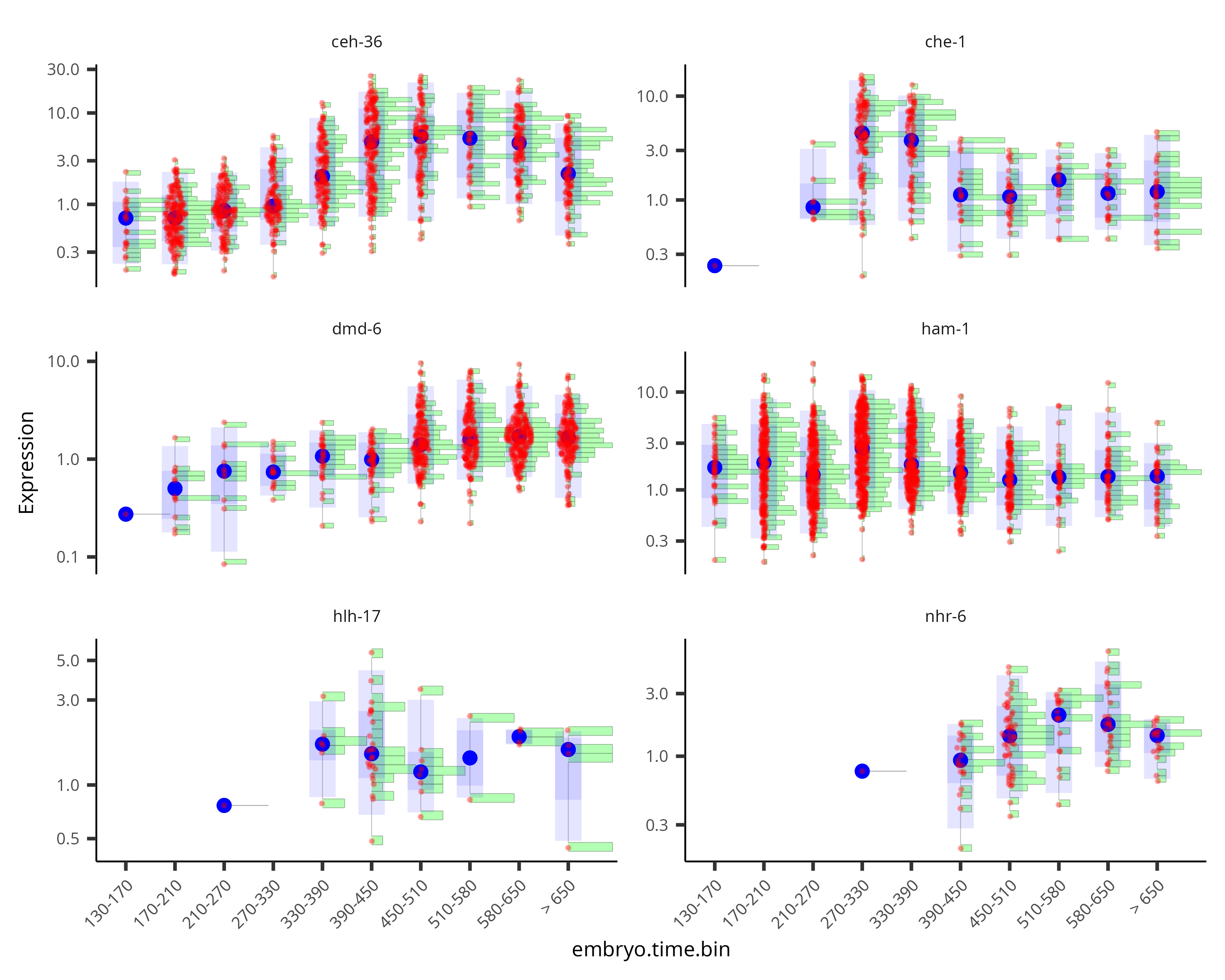
Controlling for batch effects and other factors
gene_fits <- fit_models(cds_subset, model_formula_str = "~embryo.time + batch")
fit_coefs <- coefficient_table(gene_fits)
fit_coefs %>% filter(term != "(Intercept)") %>%
select(gene_short_name, term, q_value, estimate)| gene_short_name | term | q_value | estimate |
|---|---|---|---|
| ham-1 | embryo.time | 3.65e-27 | -0.00276 |
| ham-1 | batchWaterston_400_minutes | 0.00228 | 0.212 |
| ham-1 | batchWaterston_500_minutes_batch_1 | 0.00535 | -0.357 |
| ham-1 | batchWaterston_500_minutes_batch_2 | 4.24e-09 | -1.4 |
| ham-1 | batchMurray_r17 | 0.702 | 0.0932 |
| ham-1 | batchMurray_b01 | 0.234 | -0.187 |
| ham-1 | batchMurray_b02 | 0.168 | -0.451 |
| dmd-6 | embryo.time | 2.61e-150 | 0.00713 |
| dmd-6 | batchWaterston_400_minutes | 1.08e-06 | 2.18 |
| dmd-6 | batchWaterston_500_minutes_batch_1 | 3.28e-12 | 3 |
| dmd-6 | batchWaterston_500_minutes_batch_2 | 5.86e-06 | 2.06 |
| dmd-6 | batchMurray_r17 | 0.00108 | 1.65 |
| dmd-6 | batchMurray_b01 | 2.64e-05 | 1.96 |
| dmd-6 | batchMurray_b02 | 1.46e-05 | 2.12 |
| hlh-17 | embryo.time | 0.262 | -0.00155 |
| hlh-17 | batchWaterston_400_minutes | 1 | 16 |
| hlh-17 | batchWaterston_500_minutes_batch_1 | 0.987 | 18.3 |
| hlh-17 | batchWaterston_500_minutes_batch_2 | 0.986 | 18.7 |
| hlh-17 | batchMurray_r17 | 0.988 | 16.1 |
| hlh-17 | batchMurray_b01 | 1 | 17.3 |
| hlh-17 | batchMurray_b02 | 1 | 1.13 |
| nhr-6 | embryo.time | 2.97e-13 | 0.00532 |
| nhr-6 | batchWaterston_400_minutes | 0.0458 | 3.01 |
| nhr-6 | batchWaterston_500_minutes_batch_1 | 0.0152 | 3.49 |
| nhr-6 | batchWaterston_500_minutes_batch_2 | 0.0974 | 2.7 |
| nhr-6 | batchMurray_r17 | 0.264 | 2.38 |
| nhr-6 | batchMurray_b01 | 0.262 | 2.19 |
| nhr-6 | batchMurray_b02 | 0.128 | 2.94 |
| ceh-36 | embryo.time | 7.22e-13 | 0.00222 |
| ceh-36 | batchWaterston_400_minutes | 0.00087 | 0.523 |
| ceh-36 | batchWaterston_500_minutes_batch_1 | 2.32e-13 | 1.14 |
| ceh-36 | batchWaterston_500_minutes_batch_2 | 0.132 | 0.341 |
| ceh-36 | batchMurray_r17 | 0.702 | 0.21 |
| ceh-36 | batchMurray_b01 | 1 | 0.0985 |
| ceh-36 | batchMurray_b02 | 1 | -0.227 |
| che-1 | embryo.time | 0.0449 | 0.00143 |
| che-1 | batchWaterston_400_minutes | 1 | 0.0917 |
| che-1 | batchWaterston_500_minutes_batch_1 | 0.0152 | -0.752 |
| che-1 | batchWaterston_500_minutes_batch_2 | 0.000384 | -1.63 |
| che-1 | batchMurray_r17 | 0.000266 | -1.91 |
| che-1 | batchMurray_b01 | 0.0291 | -0.831 |
| che-1 | batchMurray_b02 | 0.168 | -2.48 |
Evaluating models of gene expression
How good are these models at "explaining" gene expression? We can evaluate the fits of each model using the evaluate_fits() function:
evaluate_fits(gene_fits)| id | gene_short_name | num_cells_expressed | status | null_deviance | df.null | logLik | AIC | BIC | deviance | df_residual |
|---|---|---|---|---|---|---|---|---|---|---|
| WBGene00001820 | ham-1 | 1618 | OK | 2.1e+04 | 6187 | NA | NA | NA | 1.45e+04 | 6180 |
| WBGene00007058 | dmd-6 | 873 | OK | 6.37e+03 | 6187 | NA | NA | NA | 4.1e+03 | 6180 |
| WBGene00001961 | hlh-17 | 51 | OK | 642 | 6187 | NA | NA | NA | 600 | 6180 |
| WBGene00003605 | nhr-6 | 133 | OK | 1.66e+03 | 6187 | NA | NA | NA | 1.44e+03 | 6180 |
| WBGene00000457 | ceh-36 | 1123 | OK | 1.8e+04 | 6187 | NA | NA | NA | 1.56e+04 | 6180 |
| WBGene00000483 | che-1 | 292 | OK | 8.85e+03 | 6187 | NA | NA | NA | 7.91e+03 | 6180 |
Should we include the batch term in our model of gene expression or not? Monocle provides a function compare_models() that can help you decide. Compare models takes two models and returns the result of a likelihood ratio test between them. Any time you add terms to a model, it will improve the fit. But we should always to use the simplest model we can to explain our data. The likelihood ratio test helps us decide whether the improvement in fit is large enough to justify the complexity our extra terms introduce. You run compare_models() like this:
time_batch_models <- fit_models(cds_subset,
                                model_formula_str = "~embryo.time + batch",
                                expression_family="negbinomial")
time_models <- fit_models(cds_subset,
                          model_formula_str = "~embryo.time",
                          expression_family="negbinomial")
compare_models(time_batch_models, time_models) %>% select(gene_short_name, q_value)
The first of the two models is called the full model. This model is essentially a way of predicting the expression value of each gene in a given cell knowing both what time it was collected and which batch of cells it came from. The second model, called the reduced model, does the same thing, but it only knows about the time each cell was collected. Because the full model has more information about each cell, it will do a better job of predicting the expression of the gene in each cell. The question Monocle must answer for each gene is how much better the full model's prediction is than the reduced model's. The greater the improvement that comes from knowing the batch of each cell, the more significant the result of the likelihood ratio test.
As we can see, all of the genes' likelihood ratio tests are significant, indicating that there are substantial batch effects in the data. We are therefore justified in adding the batch term to our model.
| gene_short_name | p_value |
|---|---|
| ham-1 | 4.46e-18 |
| dmd-6 | 8.46e-50 |
| hlh-17 | 2.48e-06 |
| nhr-6 | 7.09e-05 |
| ceh-36 | 3.84e-11 |
| che-1 | 2.97e-06 |
Choosing a distribution for modeling gene expression
Monocle uses generalized linear models to capture how a gene's expression depends on each variable in the experiment. These models require you to specify a distribution that describes gene expression values. Most studies that use this approach to analyze their gene expression data use the negative binomial distribution, which is often appropriate for sequencing read or UMI count data. The negative binomial is at the core of many packages for RNA-seq analysis, such as DESeq2.
Monocle's fit_models() supports the negative binomial distribution and several others listed in the table below. The default is the "quasipoisson", which is very similar to the negative binomial. Quasipoisson is a a bit less accurate than the negative binomial but much faster to fit, making it well suited to datasets with thousands of cells.
There are several allowed values for expression_family:
| expression_family | Distribution | Accuracy | Speed | Notes |
|---|---|---|---|---|
| quasipoisson | Quasi-poisson | ++ | ++ | Default for fit_models(). Recommended for most users. |
| negbinomial | Negative binomial | +++ | + | Recommended for users with small datasets (fewer than 1,000 cells). |
| poisson | Poisson | - | +++ | Not recommended. For debugging and testing only. |
| binomial | Binomial | ++ | ++ | Recommended for single-cell ATAC-seq |
Likelihood based analysis and quasipoisson
The quasi-poisson distribution doesn't have a real likelihood function, so some of Monocle's methods won't work with it. Several of the columns in results tables from evaluate_fits() and compare_models() will be NA.
Graph-autocorrelation analysis for comparing clusters
In the L2 worm data, we identified a number of clusters that were very distinct as neurons:
# reload and reprocess the data as described in the 'Clustering and classifying your cells' section
expression_matrix <- readRDS(url("https://depts.washington.edu:/trapnell-lab/software/monocle3/celegans/data/cao_l2_expression.rds"))
cell_metadata <- readRDS(url("https://depts.washington.edu:/trapnell-lab/software/monocle3/celegans/data/cao_l2_colData.rds"))
gene_annotation <- readRDS(url("https://depts.washington.edu:/trapnell-lab/software/monocle3/celegans/data/cao_l2_rowData.rds"))

# Make the CDS object
cds <- new_cell_data_set(expression_matrix,
                         cell_metadata = cell_metadata,
                         gene_metadata = gene_annotation)
cds <- preprocess_cds(cds, num_dim = 100)
cds <- reduce_dimension(cds)
cds <- cluster_cells(cds, resolution=1e-5)

colData(cds)$assigned_cell_type <- as.character(partitions(cds))
colData(cds)$assigned_cell_type <- dplyr::recode(colData(cds)$assigned_cell_type,
                                                 "1"="Body wall muscle",
                                                 "2"="Germline",
                                                 "3"="Motor neurons",
                                                 "4"="Seam cells",
                                                 "5"="Sex myoblasts",
                                                 "6"="Socket cells",
                                                 "7"="Marginal_cell",
                                                 "8"="Coelomocyte",
                                                 "9"="Am/PH sheath cells",
                                                 "10"="Ciliated neurons",
                                                 "11"="Intestinal/rectal muscle",
                                                 "12"="Excretory gland",
                                                 "13"="Chemosensory neurons",
                                                 "14"="Interneurons",
                                                 "15"="Unclassified eurons",
                                                 "16"="Ciliated neurons",
                                                 "17"="Pharyngeal gland cells",
                                                 "18"="Unclassified neurons",
                                                 "19"="Chemosensory neurons",
                                                 "20"="Ciliated neurons",
                                                 "21"="Ciliated neurons",
                                                 "22"="Inner labial neuron",
                                                 "23"="Ciliated neurons",
                                                 "24"="Ciliated neurons",
                                                 "25"="Ciliated neurons",
                                                 "26"="Hypodermal cells",
                                                 "27"="Mesodermal cells",
                                                 "28"="Motor neurons",
                                                 "29"="Pharyngeal gland cells",
                                                 "30"="Ciliated neurons",
                                                 "31"="Excretory cells",
                                                 "32"="Amphid neuron",
                                                 "33"="Pharyngeal muscle")
Subset just the neurons:
neurons_cds <- cds[,grepl("neurons", colData(cds)$assigned_cell_type, ignore.case=TRUE)]
plot_cells(neurons_cds, color_cells_by="partition")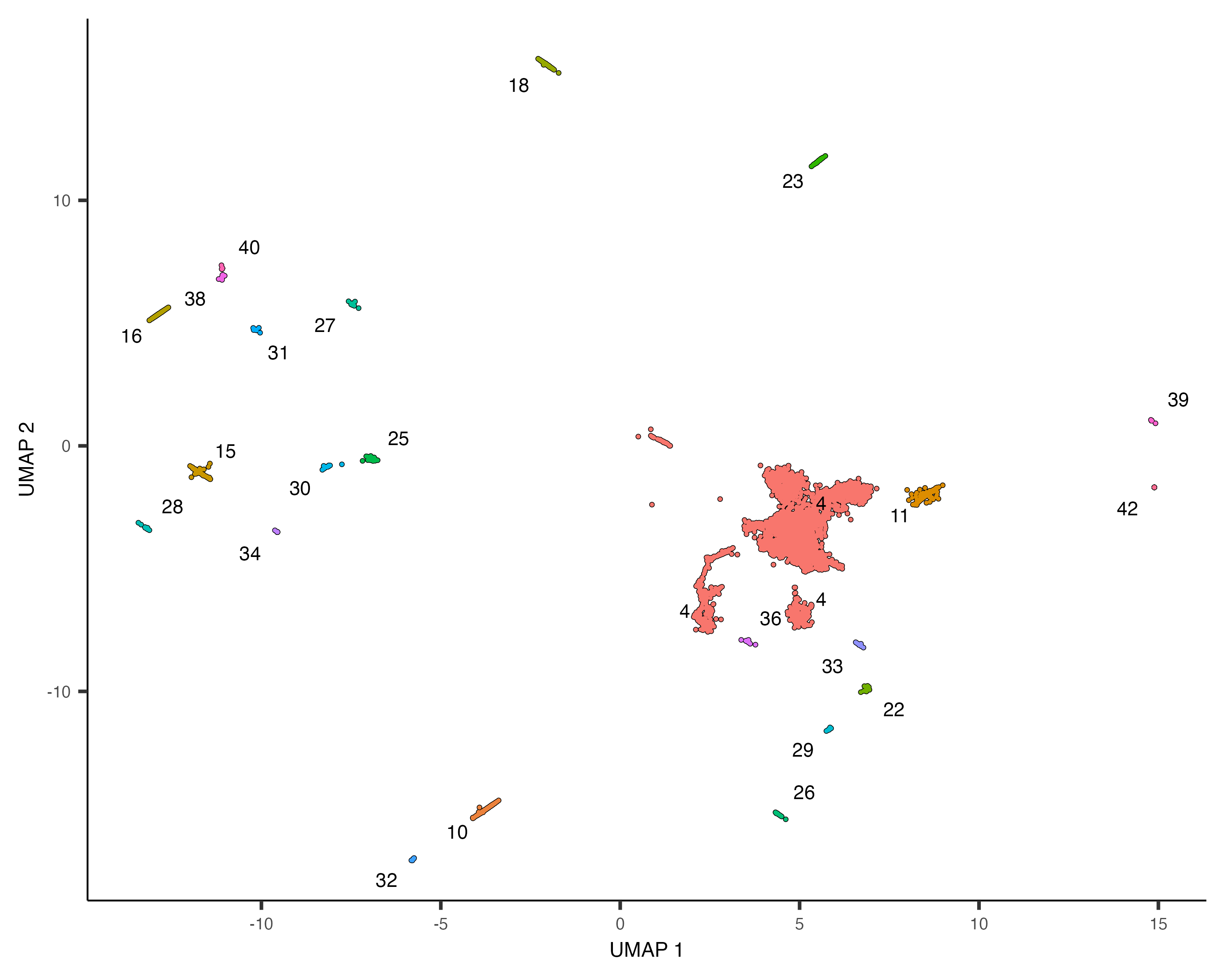
There are many subtypes of neurons, so perhaps the different neuron clusters correspond to different subtypes. To investigate which genes are expressed differentially across the clusters, we could use the regression analysis tools discussed above. However, Monocle provides an alternative way of finding genes that vary between groups of cells in UMAP space. The function graph_test() uses a statistic from spatial autocorrelation analysis called Moran's I, which Cao & Spielmann et al showed to be effective in finding genes that vary in single-cell RNA-seq datasets.
You can run graph_test() like this:
pr_graph_test_res <- graph_test(neurons_cds, neighbor_graph="knn", cores=8)
pr_deg_ids <- row.names(subset(pr_graph_test_res, q_value < 0.05))
The data frame pr_graph_test_res has the Moran's I test results for each gene in the cell_data_set. If you'd like to rank the genes by effect size, sort this table by the morans_Icolumn, which ranges from -1 to +1. A value of 0 indicates no effect, while +1 indicates perfect positive autocorrelation and suggests that nearby cells have very similar values of a gene's expression. Significant values much less than zero are generally rare.
Positive values indicate a gene is expressed in a focal region of the UMAP space (e.g. specific to one or more clusters). But how do we associate genes with clusters? The next section explains how to collect genes into modules that have similar patterns of expression and associate them with clusters.
Finding modules of co-regulated genes
Once you have a set of genes that vary in some interesting way across the clusters, Monocle provides a means of grouping them into modules. You can call find_gene_modules(), which essentially runs UMAP on the genes (as opposed to the cells) and then groups them into modules using Louvain community analysis:
gene_module_df <- find_gene_modules(neurons_cds[pr_deg_ids,], resolution=1e-2) The data frame gene_module_df contains a row for each gene and identifies the module it belongs to. To see which modules are expressed in which clusters or partitions you can use two different approaches for visualization. The first is just to make a simple table that shows the aggregate expression of all genes in each module across all the clusters. Monocle provides a simple utility function called aggregate_gene_expression for this purpose:
cell_group_df <- tibble::tibble(cell=row.names(colData(neurons_cds)),
                                cell_group=partitions(cds)[colnames(neurons_cds)])
agg_mat <- aggregate_gene_expression(neurons_cds, gene_module_df, cell_group_df)
row.names(agg_mat) <- stringr::str_c("Module ", row.names(agg_mat))
colnames(agg_mat) <- stringr::str_c("Partition ", colnames(agg_mat))

pheatmap::pheatmap(agg_mat, cluster_rows=TRUE, cluster_cols=TRUE,
                   scale="column", clustering_method="ward.D2",
                   fontsize=6)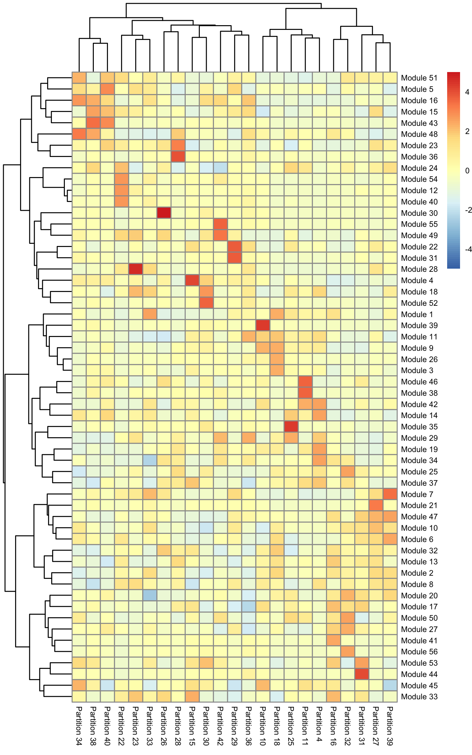
Some modules are highly specific to certain partitions of cells, while others are shared across multiple partitions. Note that aggregate_gene_expression can work with arbitrary groupings of cells and genes. You're not limited to looking at modules from find_gene_modules(), clusters(), and partitions().
The second way of looking at modules and their expression is to pass gene_module_df directly to plot_cells(). If there are many modules, it can be hard to see where each one is expressed, so we'll just look at a subset of them:
plot_cells(neurons_cds,
           genes=gene_module_df %>% filter(module %in% c(8, 28, 33, 37)),
           group_cells_by="partition",
           color_cells_by="partition",
           show_trajectory_graph=FALSE)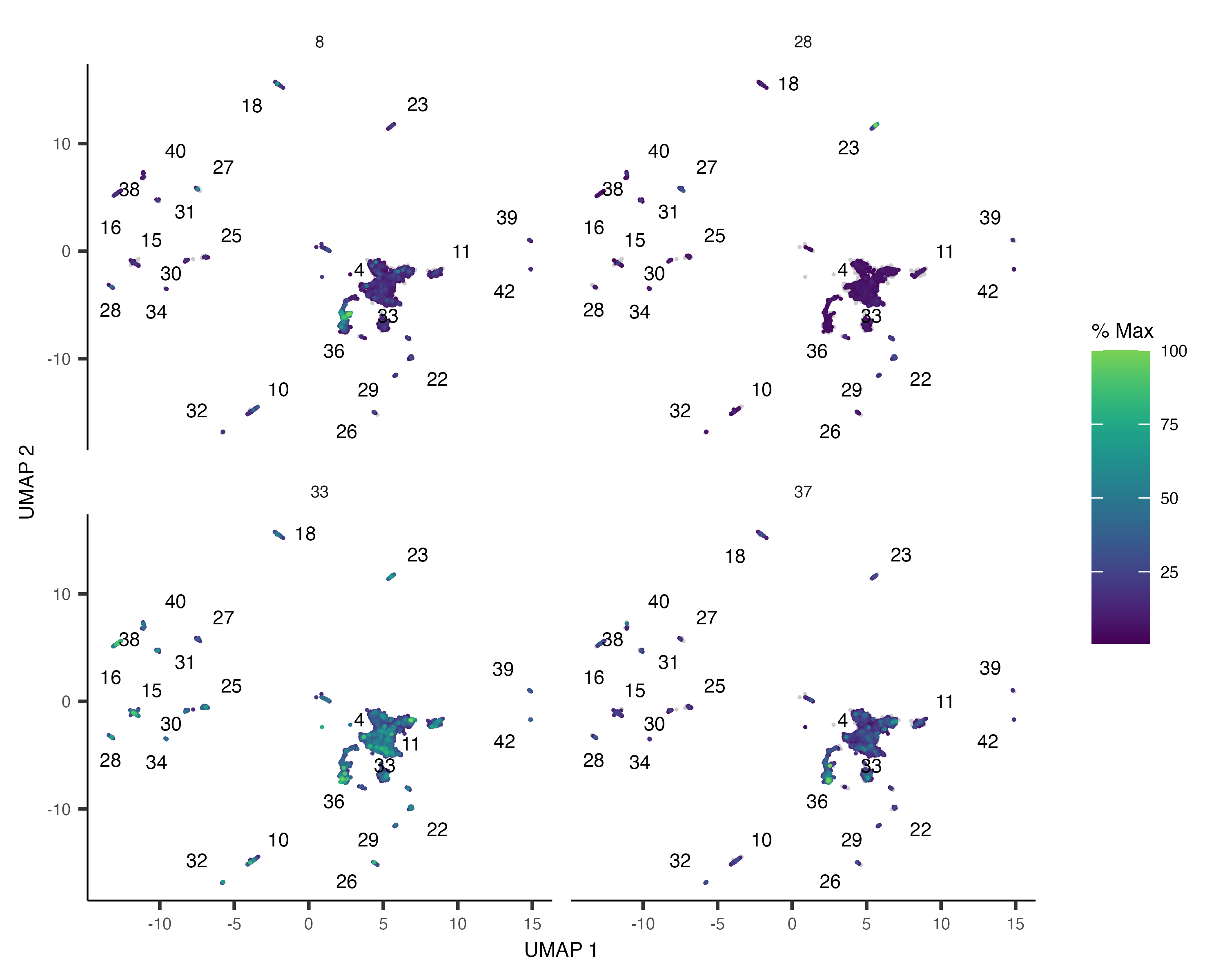
Finding genes that change as a function of pseudotime
Identifying the genes that change as cells progress along a trajectory is a core objective of this type of analysis. Knowing the order in which genes go on and off can inform new models of development. For example, Sharon and Chawla et al recently analyzed pseudotime-dependent genes to arrive at a whole new model of how islets form in the pancreas.
Let's return to the embryo data, which we processed using the commands
expression_matrix <- readRDS(url("https://depts.washington.edu:/trapnell-lab/software/monocle3/celegans/data/packer_embryo_expression.rds"))
cell_metadata <- readRDS(url("https://depts.washington.edu:/trapnell-lab/software/monocle3/celegans/data/packer_embryo_colData.rds"))
gene_annotation <- readRDS(url("https://depts.washington.edu:/trapnell-lab/software/monocle3/celegans/data/packer_embryo_rowData.rds"))
cds <- new_cell_data_set(expression_matrix,
                         cell_metadata = cell_metadata,
                         gene_metadata = gene_annotation)
cds <- preprocess_cds(cds, num_dim = 50)
cds <- align_cds(cds, alignment_group = "batch", residual_model_formula_str = "~ bg.300.loading + bg.400.loading + bg.500.1.loading + bg.500.2.loading + bg.r17.loading + bg.b01.loading + bg.b02.loading")
cds <- reduce_dimension(cds)
cds <- cluster_cells(cds)
cds <- learn_graph(cds)
cds <- order_cells(cds)
plot_cells(cds,
           color_cells_by = "cell.type",
           label_groups_by_cluster=FALSE,
           label_leaves=FALSE,
           label_branch_points=FALSE)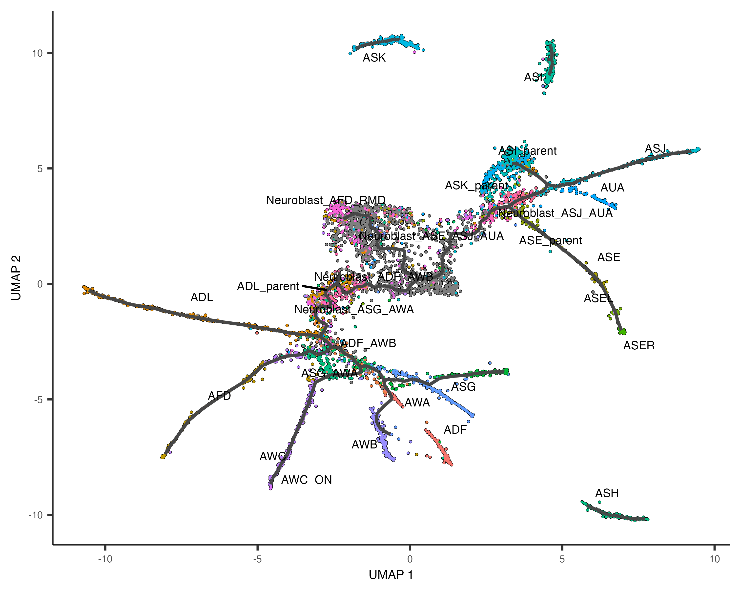
How do we find the genes that are differentially expressed on the different paths through the trajectory? How do we find the ones that are restricted to the beginning of the trajectory? Or excluded from it?
Once again, we turn to graph_test(), this time passing it neighbor_graph="principal_graph", which tells it to test whether cells at similar positions on the trajectory have correlated expression:
ciliated_cds_pr_test_res <- graph_test(cds, neighbor_graph="principal_graph", cores=4)
pr_deg_ids <- row.names(subset(ciliated_cds_pr_test_res, q_value < 0.05))
Here are a couple of interesting genes that score as highly significant according to graph_test():
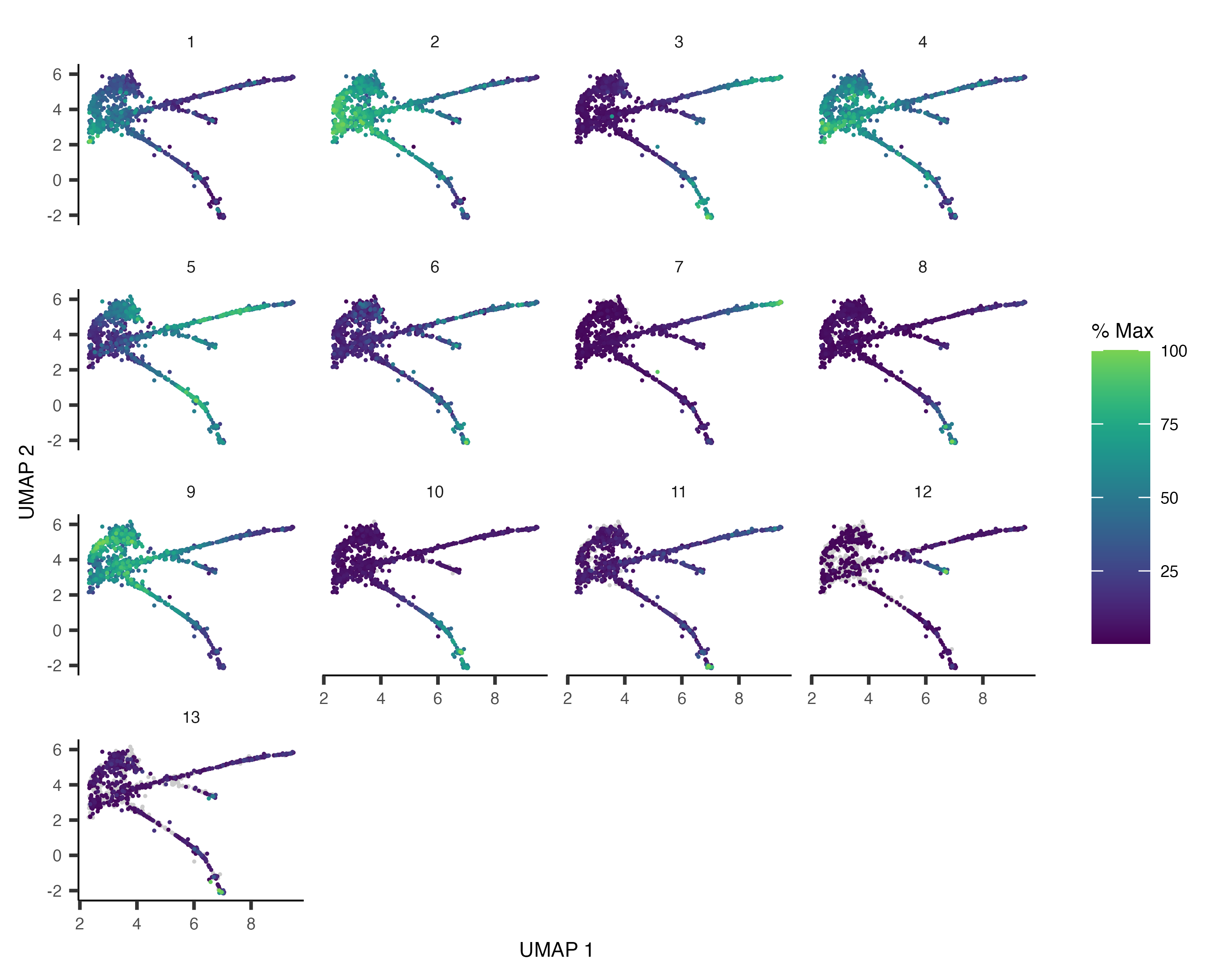
plot_cells(cds, genes=c("hlh-4", "gcy-8", "dac-1", "oig-8"),
           show_trajectory_graph=FALSE,
           label_cell_groups=FALSE,
           label_leaves=FALSE)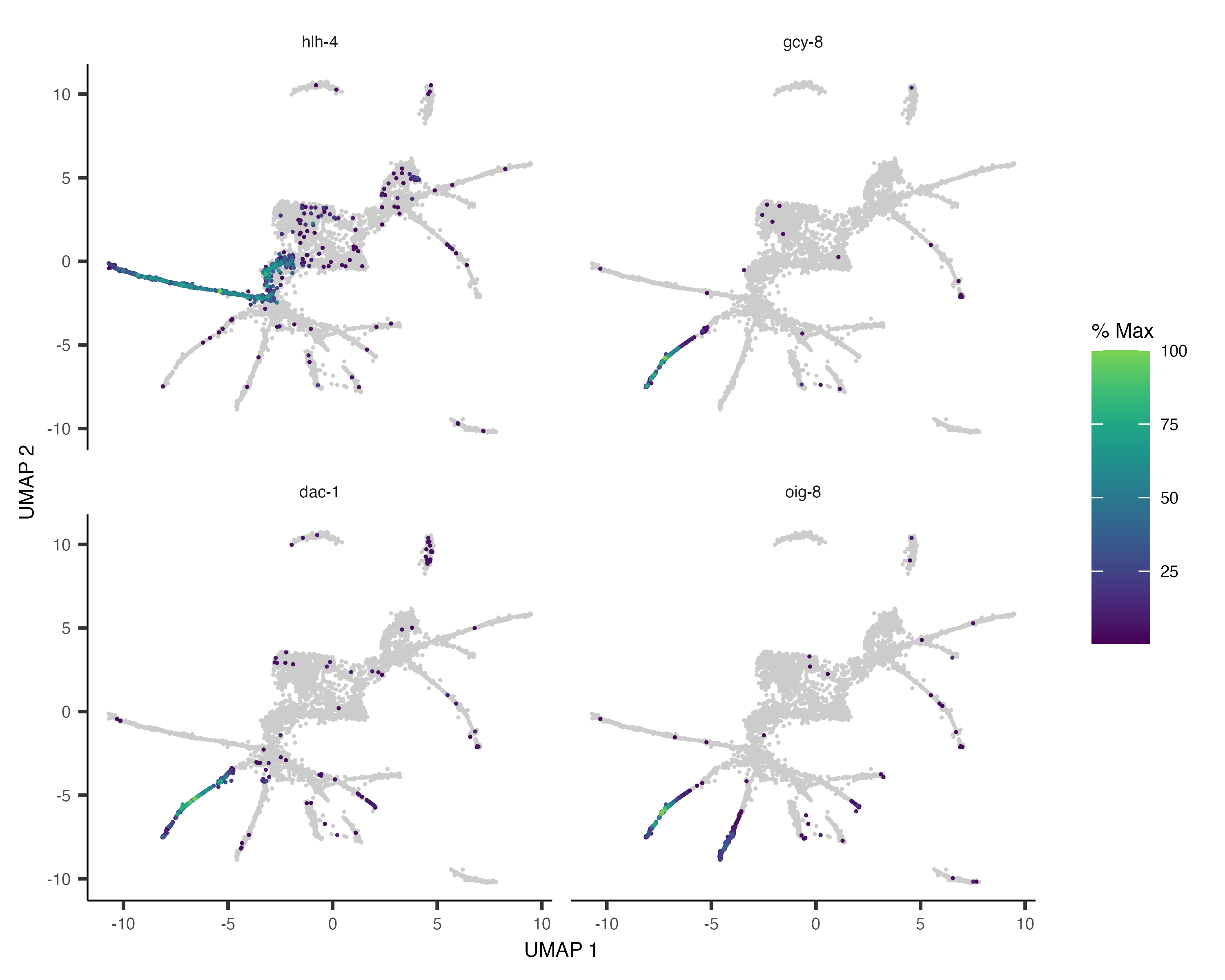
As before, we can collect the trajectory-variable genes into modules:
gene_module_df <- find_gene_modules(cds[pr_deg_ids,], resolution=c(10^seq(-6,-1)))Here we plot the aggregate module scores within each group of cell types as annotated by Packer & Zhu et al:
cell_group_df <- tibble::tibble(cell=row.names(colData(cds)),
                                cell_group=colData(cds)$cell.type)
agg_mat <- aggregate_gene_expression(cds, gene_module_df, cell_group_df)
row.names(agg_mat) <- stringr::str_c("Module ", row.names(agg_mat))
pheatmap::pheatmap(agg_mat,
                   scale="column", clustering_method="ward.D2")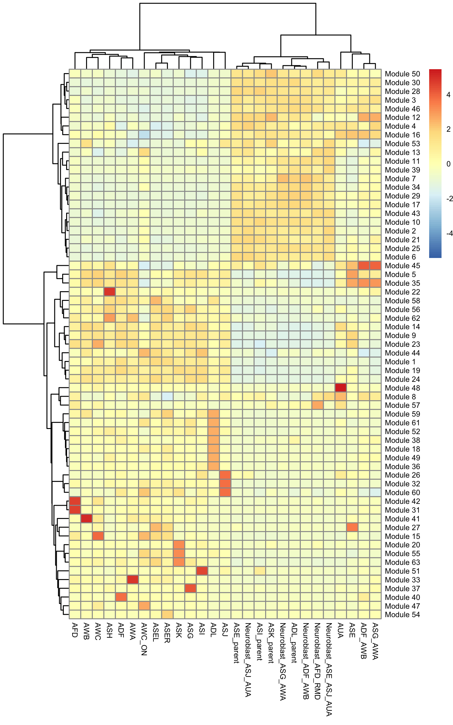
We can also pass gene_module_df to plot_cells() as we did when we compared clusters in the L2 data above.
plot_cells(cds,
           genes=gene_module_df %>% filter(module %in% c(27, 10, 7, 30)),
           label_cell_groups=FALSE,
           show_trajectory_graph=FALSE)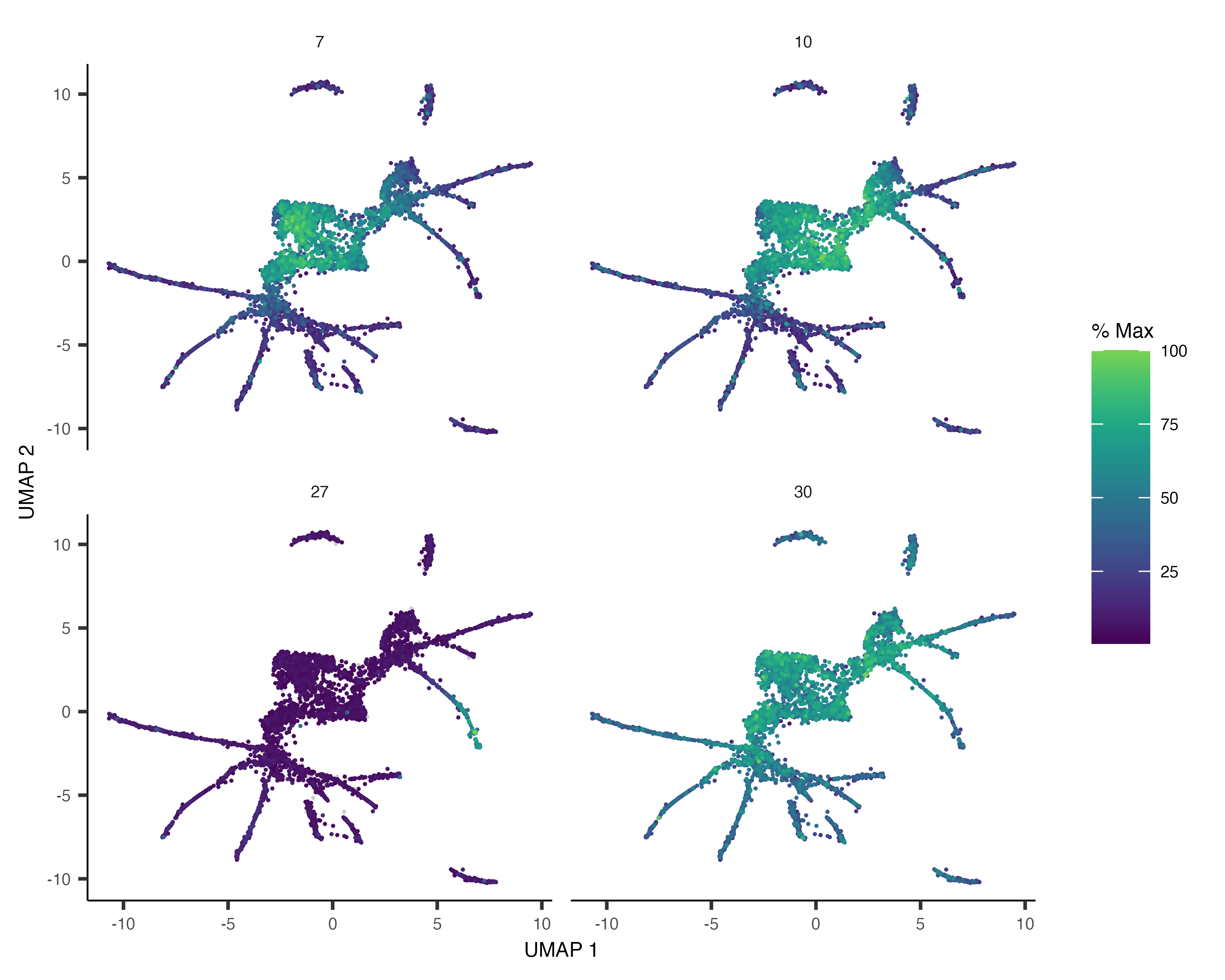
Monocle offers another plotting function that can sometimes give a clearer view of a gene's dynamics along a single path. You can select a path with choose_cells() or by subsetting the cell data set by cluster, cell type, or other annotation that's restricted to the path. Let's pick one such path, the AFD cells:
AFD_genes <- c("gcy-8", "dac-1", "oig-8")
AFD_lineage_cds <- cds[rowData(cds)$gene_short_name %in% AFD_genes,
                       colData(cds)$cell.type %in% c("AFD")]
AFD_lineage_cds <- order_cells(AFD_lineage_cds)
The function plot_genes_in_pseudotime() takes a small set of genes and shows you their dynamics as a function of pseudotime:
plot_genes_in_pseudotime(AFD_lineage_cds,
                         color_cells_by="embryo.time.bin",
                         min_expr=0.5)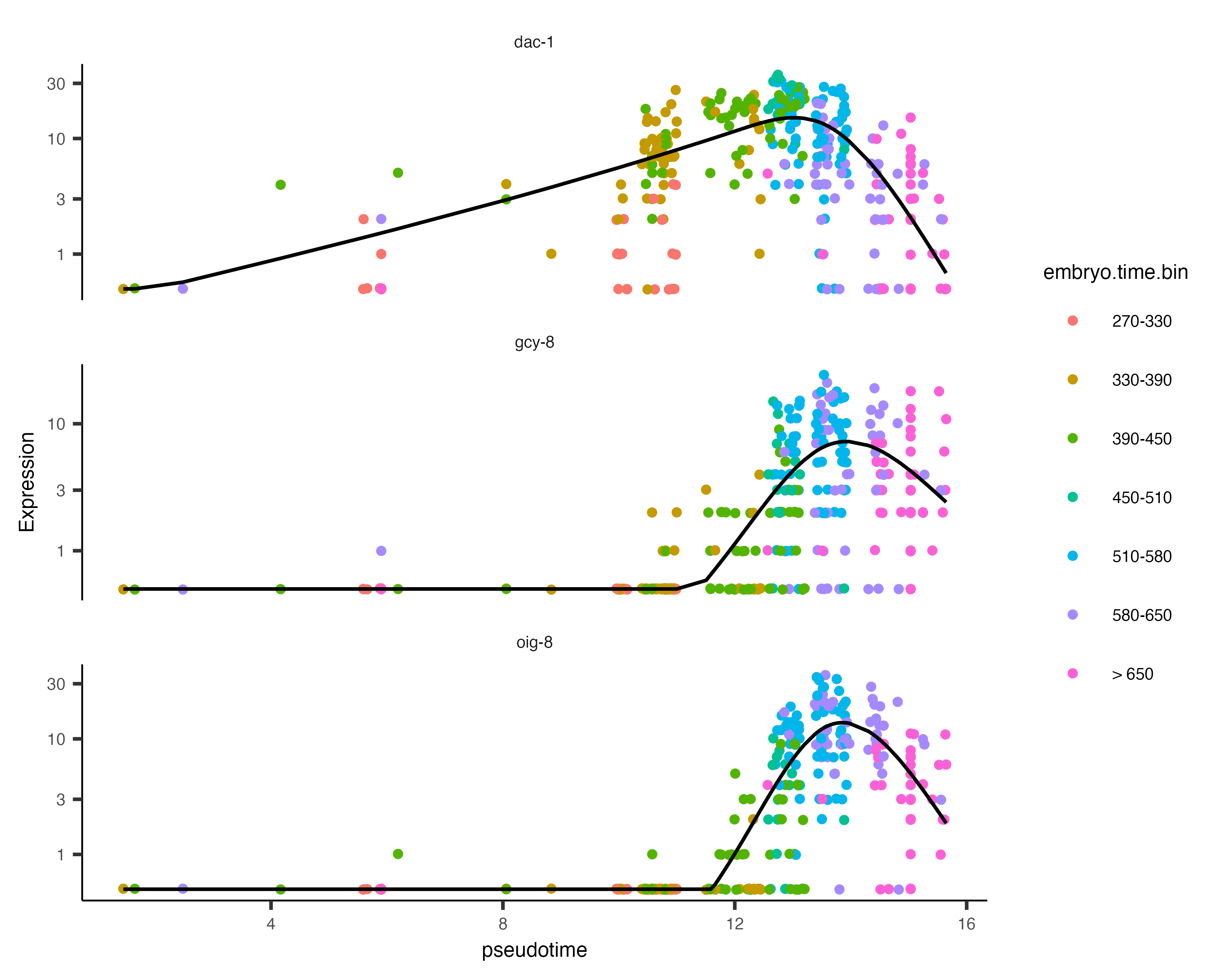
You can see that dac-1 is activated before the other two genes.
Analyzing branches in single-cell trajectories
Analyzing the genes that are regulated around trajectory branch points often provides insights into the genetic circuits that control cell fate decisions. Monocle can help you drill into a branch point that corresponds to a fate decision in your system. Doing so is as simple as selecting the cells (and branch point) of interest with choose_cells():
cds_subset <- choose_cells(cds)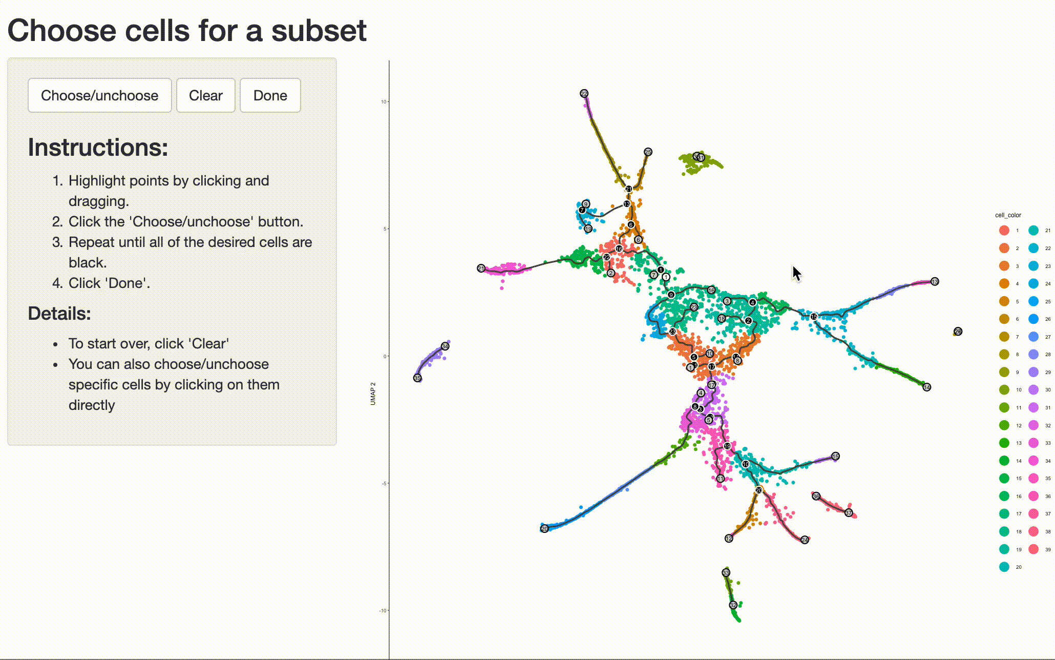
And then calling graph_test() on the subset. This will identify genes with interesting patterns of expression that fall only within the region of the trajectory you selected, giving you a more refined and relevant set of genes.
subset_pr_test_res <- graph_test(cds_subset, neighbor_graph="principal_graph", cores=4)
pr_deg_ids <- row.names(subset(subset_pr_test_res, q_value < 0.05))
Grouping these genes into modules can reveal fate specific genes or those that are activate immediate prior to or following the branch point:
gene_module_df <- find_gene_modules(cds_subset[pr_deg_ids,], resolution=0.001) We will organize the modules by their similarity (using hclust) over the trajectory so it's a little easier to see which ones come on before others:
agg_mat <- aggregate_gene_expression(cds_subset, gene_module_df)
module_dendro <- hclust(dist(agg_mat))
gene_module_df$module <- factor(gene_module_df$module,
                                levels = row.names(agg_mat)[module_dendro$order])

plot_cells(cds_subset,
           genes=gene_module_df,
           label_cell_groups=FALSE,
           show_trajectory_graph=FALSE)