Tutorials | Pixie 101 | Service Performance (original) (raw)
Unreliable or slow services can lead to a poor user experience for your customers. With Pixie, you can get immediate visibility into the health of your services, without the need for manual instrumentation.
Pixie automatically captures all network traffic in your cluster using eBPF, a low-level Linux tracing technology. Messages of a supported protocol type, such as HTTP2/gRPC, are parsed and paired with their responses, making latency, error, and throughput information immediately available after installing Pixie.
This tutorial will demonstrate how to use Pixie to see:
- The flow of HTTP traffic between the services in your cluster.
- Latency per service.
- Latency per service endpoint.
- A sample of the slowest requests for an individual service.
If you're interested in troubleshooting HTTP errors, check out the Request Tracing tutorial.
Prerequisites
- You will need a Kubernetes cluster with Pixie installed. If you do not have a cluster, you can create a minikube cluster and install Pixie using one of our install guides.
- You will need to install the demo microservices application, using Pixie's CLI:
- Install the Pixie CLI.
- Run
px demo deploy px-sock-shopto install Weavework's Sock Shop demo app.- Run
kubectl get pods -n px-sock-shopto make sure all pods are ready before proceeding. The demo app can take up to 5 minutes to deploy.
Service Graph
When debugging issues with microservices, it helps to start at a high-level view, like a service map, and then drill down into the problem service(s).
For a global view of the services in your cluster, we'll use the px/cluster script:
- Open the Live UI and select
px/clusterfrom thescriptdrop-down menu at the top.
This script shows a graph of the HTTP traffic between the services in your cluster, along with latency, error, and throughput rate per service.
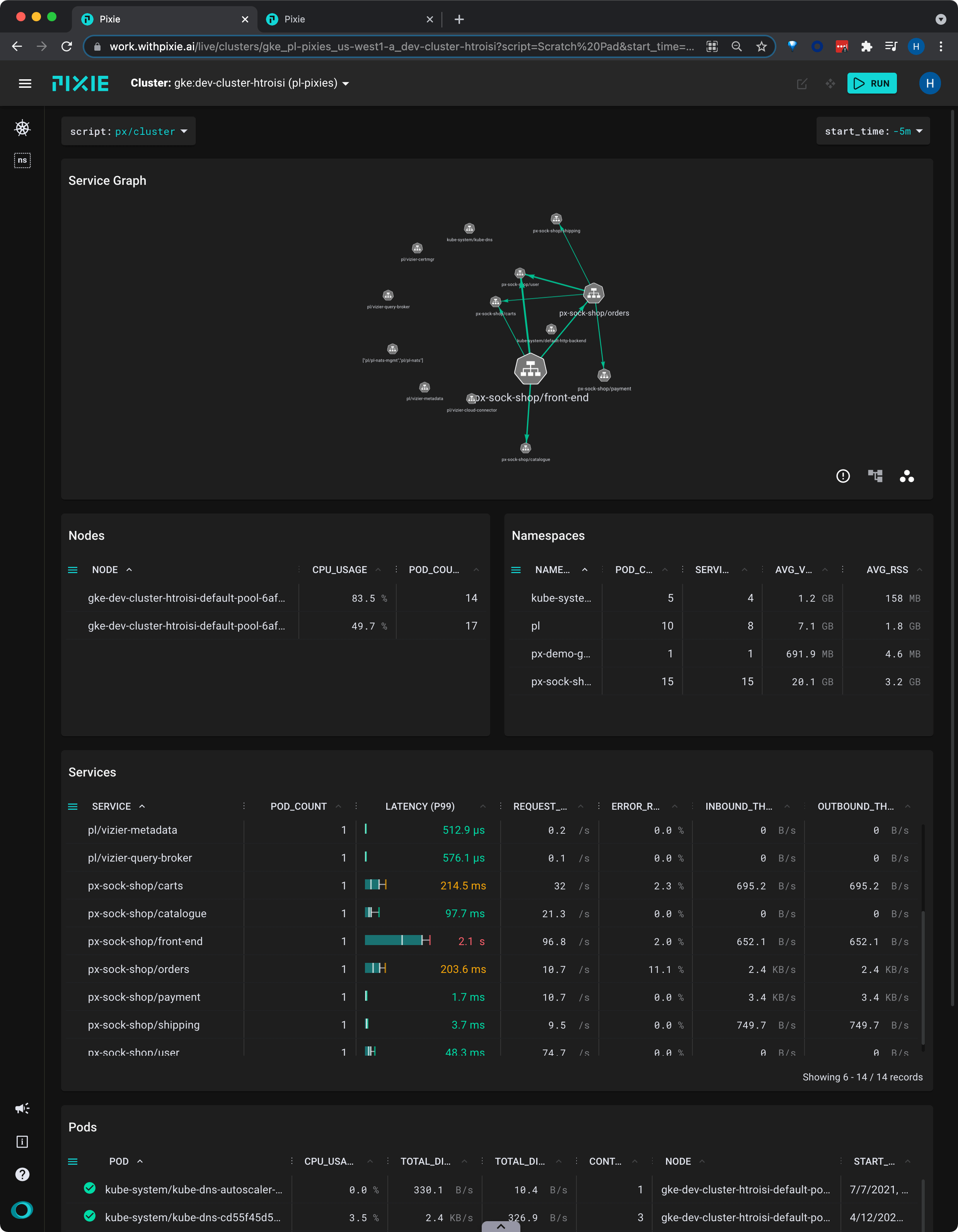
- Scroll down to the Services table.
This table contains latency, error and throughput rate for all HTTP traffic. The
INBOUND_THROUGHPUTandOUTBOUND_THROUGHPUTcolumns reflect all traced network traffic (not just HTTP) for the service.
Let's figure out which service is the slowest.
- Click the
LATENCYcolumn title to sort the services by latency.
It’s good to check multiple percentiles for latency, not just the average, in order to get a better picture of the overall distribution.
- Expand the
LATENCYcolumn by dragging the 3-dot column header divider.
This script represents service latency with a box & whisker plot.
- Click the vertical quantile lines on the box plot to switch the latency display between the P50, P90 and P99 quantile values.
The
LATENCYcolumn will resort itself and the column title will update to reflect the selected quantile.
A high P50 latency value for the
front-endservice indicates that this is general performance degradation, rather than an issue with a specific request.
Service Performance
Once we have identified a service we are interested in investigating further, we will want to drill down into its detailed latency information.
Pixie's UI makes it easy to quickly navigate between Kubernetes resources. Clicking on any pod, node, service, or namespace name in the UI will open a script showing a high-level overview for that entity.
- From the
SERVICEcolumn in the Services table, click on thepx-sock-shop/front-endservice.
This will open the
px/servicescript with theserviceargument pre-filled with the name of the service you selected.
The
px/servicescript shows the latency, error, and throughput over time for all HTTP requests for the service.
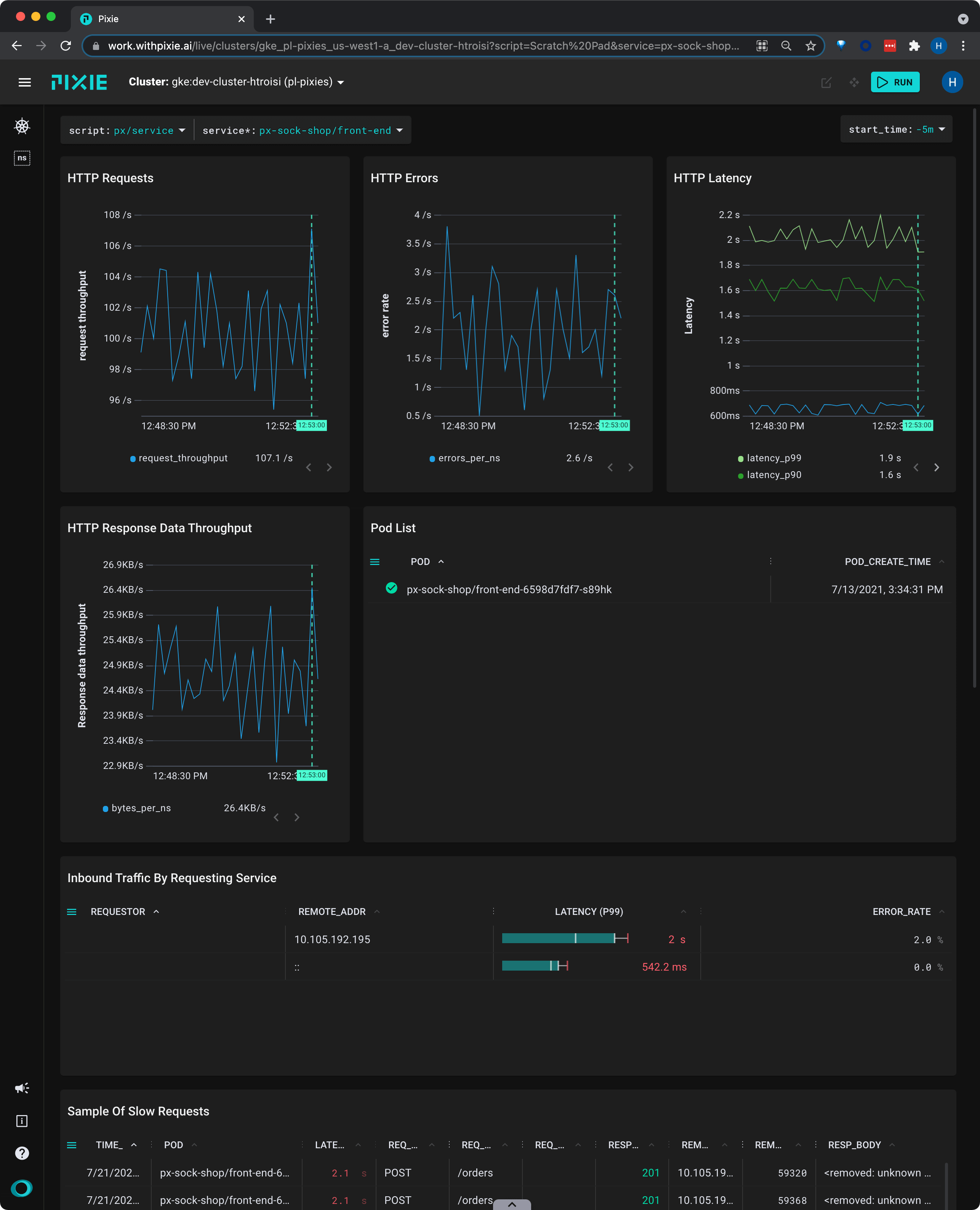
This view shows us that the service's latency values have been consistent over the selected time window.
- Scroll down to the Sample of Slow Requests table and expand the
REQ_PATHcolumn.
If this service handles multiple kinds of requests, this table can help identify if there is a particular request type that is much slower.
This table shows individual requests, so we will see the full path with URL parameters filled in (for example,
/restaurants/123). However, Pixie makes it possible to drill down into individual logical endpoints (for example,/restaurants/*).
Endpoint Performance
Request latency can vary greatly by endpoint, especially if one of the requests is more database intensive. However, when there are wildcards (URL parameters) in your request paths, it can be difficult to drill down into a particular endpoint.
Pixie can cluster HTTP requests by logical endpoint, substituting a * for the parameters in your requests. For example, the following two requests:
/restaurants/0123550/reviews/239487345/author/restaurants/3485799/reviews/394853457/author
would be clustered together into the logical endpoint:
/restaurants/*/reviews/*/author
Let's look at latency by logical service endpoint:
- Select
pxbeta/service_endpointsfrom the script drop-down menu (note: this is a Beta script). - Select the drop-down arrow next to the
serviceargument, typepx-sock-shop/catalogue, and press Enter to re-run the script.
This script shows latency, error and throughput per logical endpoint for the given service.
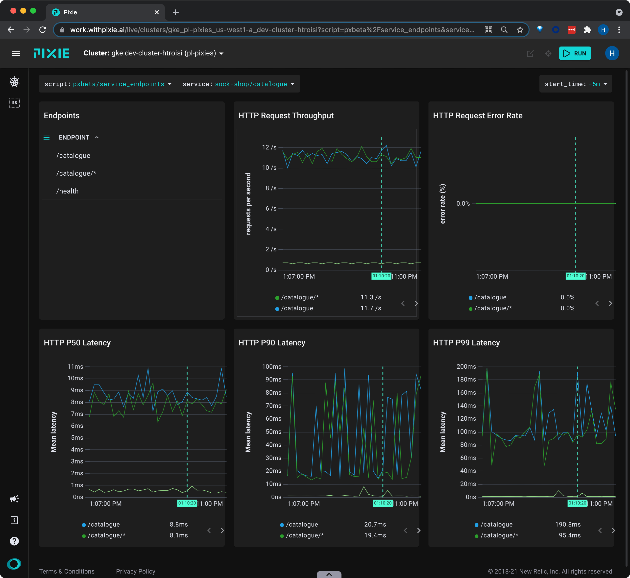
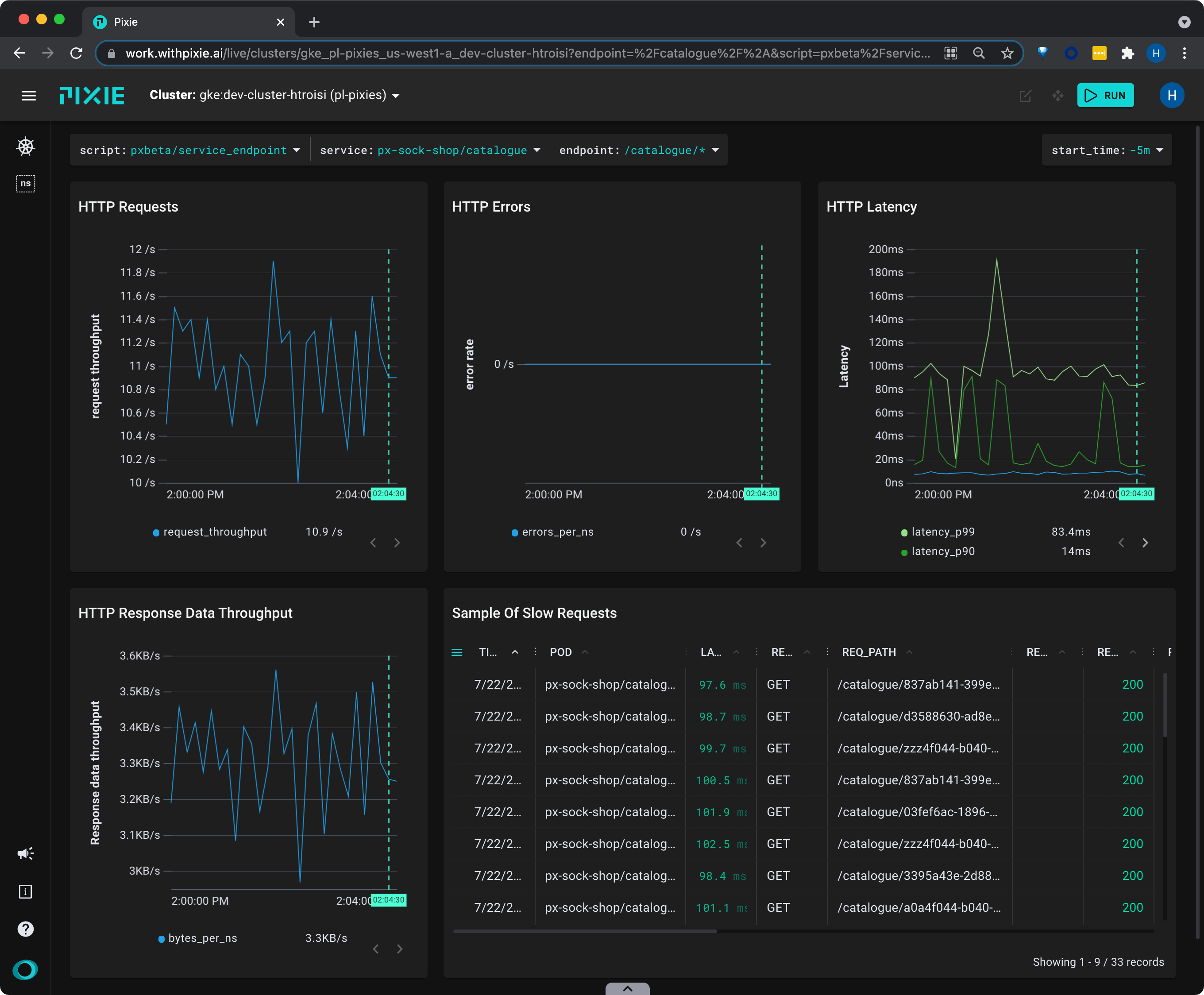
- Click on
catalog/*in the Endpoints table to see an overview of that individual endpoint with a sample of slow requests.
Related Scripts
This tutorial demonstrated a few of Pixie's community scripts. For more insight into the health of your services, check out the following scripts:
- px/pod shows a CPU flamegraph for the pod to see how your Go/C++/Rust applications are spending their time. To learn more about how use Pixie for application profiling, check out the [Profiling with Flamegraphs](/tutorials/pixie-101/profiler) tutorial.
- px/services shows LET over time for all services in the given namespace, along with a service graph.
- px/service_stats shows LET over time for the given service, along with a service graph and summary of incoming and outgoing traffic.
- px/service_edge_stats shows statistics about the traffic between two services.