Python Visualization Tutorial | HolyPython.com (original) (raw)
Python Visualizations & Animations
Python Line Animation
Contents
Python Visualization Tutorials
Data visualization is graphical representation of data.
This technique is used in pretty much every field in business because there is always some type of data or statistic to interpret.
You can see the big picture, as well as smallest details more conveniently with visualization. It transforms numbers and relations to trends, colors, shapes and correlations.
Since programming is so powerful and it brings function and automation capabilities it makes sense that visualization is a big practice in Python also.
Visualization is a term with multiple meanings. Although it refers to the similar phenomenon that stimulates the same visual sensory in the brain, visualization can mean imagining something that’s currently not present. This usage is more common in psychology.
Visualization is often used to mean visualization of data in more technical or business related fields such as coding, research, science, finance etc.
Data Visualization Examples
Visualization can be done in many forms using Python. The range can start from traditional line, bar and scatter charts to more modern charts like hexbin and pcolor and even animated charts!
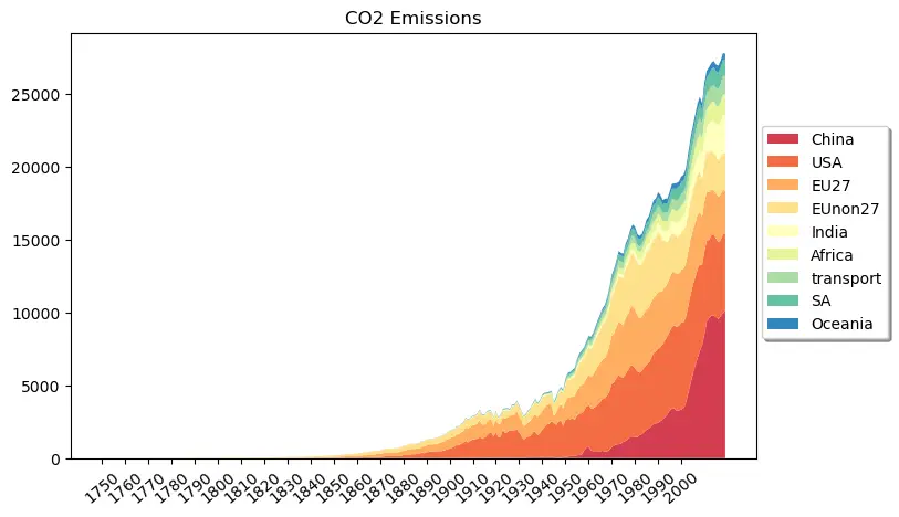
Stacked Chart Visualization Example with Python Matplotlib
You can find interesting tutorials about Python Animations like below in this visualization series.
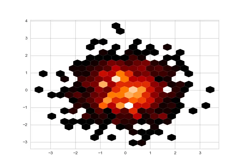
Hexbin Chart created with Matplotlib
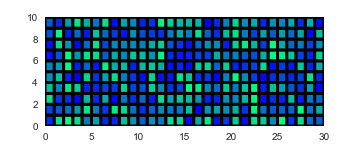
Visualization with Pcolor Chart (Matplotlib)
We will demonstrate the usage of FuncAnimation function from matplotlib.animation module to animate many different charts. Below you can see an animated line chart example.
Plotly Tutorials with Python
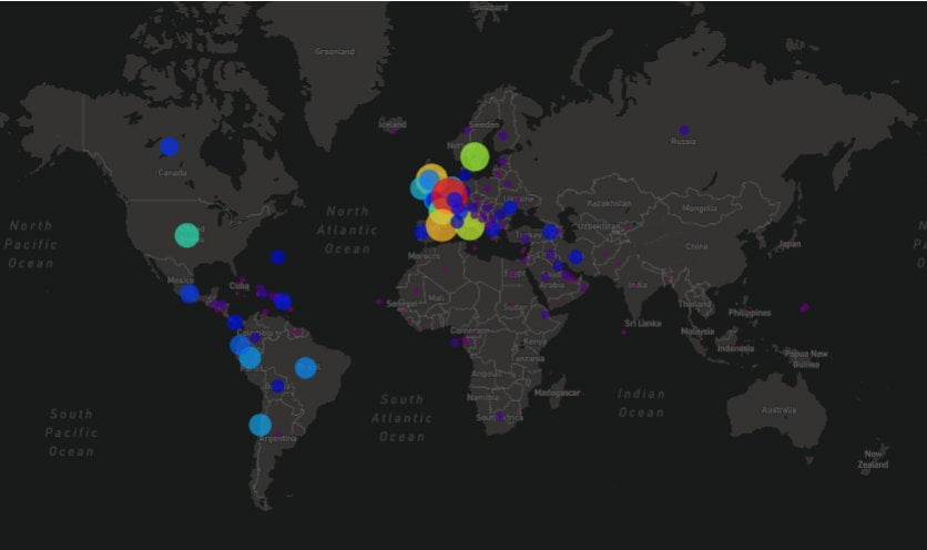
Map Chart Created with Plotly and Mapbox using Python
How to Install Plotly
pip install plotly
or
pip3 install plotly
A simple visualization created with Plotly
Matplotlib Tutorials with Python
How to Install Matplotlib
Matplotlib is a native Python library so it doesn’t require separate installation.
Visualization Resources
For additional resources you can check out websites of main data visualization libraries. Here are a few that come to mind:
Uber published a very interesting presentation on Uber’s Data with lots of Visualization examples which you can watch here:
They seem to use MapBox and React for Visualization which seems like a similar JavaScript alternative to Plotly.
Aside of Matplotlib and Plotly, you can also use Pandas, the powerful data frame library in Python applications, to visualize data through data frames.
Summary
We have introduced quite a few sophisticated Python Visualization libraries and Visualization tutorials.
We have also shared additional resources that can compliment your learning and we made some definitions regarding data visualization.
Using our Python Tutorials you can explore the world of animated charts as well as visualization with traditional still charts.