Making Good Cartoon Icons- Tutorial 2// Starlight, Starbright + ICONS (original) (raw)
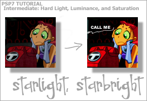
Difficulty: A little bit harder than the previous tutorial, but still pretty easy.
Transferability: It works for sure in PSP7 and PS7, not sure about GIMP, though.
Also, a few icons that need to be posted.
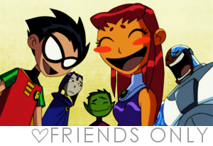
5 Teen Titans + 1 Friends Only banner
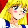
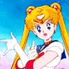
9 Bishoujo Senshi Sailormoon
4 The Breakfast Club
TOTAL: 18 icons + 1 Friends Only banner
xx TEASERS xx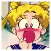
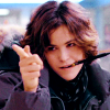
Ok, tutorial first. I love, love, love luminance layers. I'm not even joking. Hey, I've already written a basic usage tutorial featuring them here. But that one was just touching on their usefulness. This one shows you how you can use it to make a very dramatic colouring style.
| Step 1 | 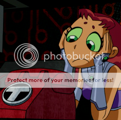 Okay, we start out with our base image, as per usual. This just so happens to be a screencap of Starfire from Teen Titans. It's a DVD cap, so it's really good quality. A general rule of thumb for this tutorial is that the nicer and cleaner the base image is, the better the icon looks. Really, that applies to all techniques. STOP USING CRAPPY QUALITY IMAGES TO MAKE GRAPHICS. It just doesn't work. Okay, we start out with our base image, as per usual. This just so happens to be a screencap of Starfire from Teen Titans. It's a DVD cap, so it's really good quality. A general rule of thumb for this tutorial is that the nicer and cleaner the base image is, the better the icon looks. Really, that applies to all techniques. STOP USING CRAPPY QUALITY IMAGES TO MAKE GRAPHICS. It just doesn't work. |
|---|
| Step 2 | 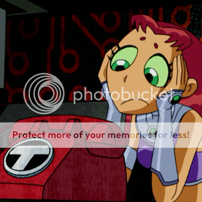 I'm stepping off my soap box now, so you can come back. Anyway, depending on how dark your image is, you might have to duplicate the layer and set it to screen. I had to for this one. The opacity is 50%, if you're using my example image. Flatten the image (Layers > Merge > Merge All). I'm stepping off my soap box now, so you can come back. Anyway, depending on how dark your image is, you might have to duplicate the layer and set it to screen. I had to for this one. The opacity is 50%, if you're using my example image. Flatten the image (Layers > Merge > Merge All). |
|---|
| Step 3 | 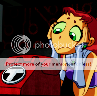 Duplicate your base image layer again. Blur it (Effects > Blur > Blur) and set to Hard Light. Flatten the image. Duplicate your base image layer again. Blur it (Effects > Blur > Blur) and set to Hard Light. Flatten the image. |
|---|
| Step 4 | 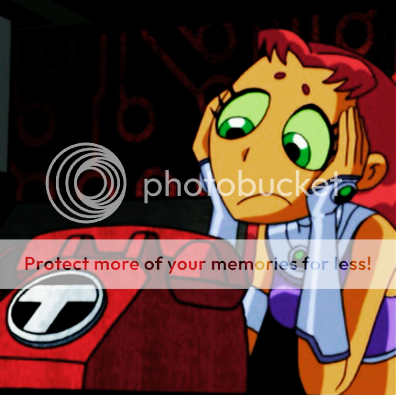 Needs less suck. Now, here's where my baby daddy (aka luminance layer) comes in. Duplicater the base layer, desaturate it (Colors > Adjust > Hue/Saturation/Lightness, Saturation set to -100), and set it to Luminance. For this image, I used an opacity of 65%, but it varies with each image. Do what looks right to you. Then, flatten the image yet again. Almost there, I promise. Needs less suck. Now, here's where my baby daddy (aka luminance layer) comes in. Duplicater the base layer, desaturate it (Colors > Adjust > Hue/Saturation/Lightness, Saturation set to -100), and set it to Luminance. For this image, I used an opacity of 65%, but it varies with each image. Do what looks right to you. Then, flatten the image yet again. Almost there, I promise. |
|---|
| Step 5 |  Now it's time to bump up the saturation (Colors > Adjust > Hue/Saturation/Lightness). I set the saturation to 22 for this image. But seriously guys, please saturate responsibly. I don't wanna see any radioactive cartoon characters. If I do, I'm coming to your house and making you uninstall your graphics program of choice. Now it's time to bump up the saturation (Colors > Adjust > Hue/Saturation/Lightness). I set the saturation to 22 for this image. But seriously guys, please saturate responsibly. I don't wanna see any radioactive cartoon characters. If I do, I'm coming to your house and making you uninstall your graphics program of choice. |
|---|
| Step 6 | 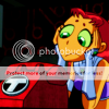 Soften your image (Effects > Blur > Soften). As I said before, this isn't necessary, I just like to do it to make sure my icons are smooth. Resize the image, and you're done! Soften your image (Effects > Blur > Soften). As I said before, this isn't necessary, I just like to do it to make sure my icons are smooth. Resize the image, and you're done! |
|---|
| Step 7 | 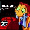 But I felt it needed a little bit of bling, so I went on and added a brush and the text "CALL ME" (Sup Blondie lyrics?) in Arial Black, size 6. But I felt it needed a little bit of bling, so I went on and added a brush and the text "CALL ME" (Sup Blondie lyrics?) in Arial Black, size 6. |
|---|
GRAPHICS MADE USING THIS TUTORIAL
BISHOUJO SENSHI SAILORMOON
001
002
003
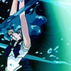
004
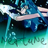
005
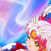
006

007
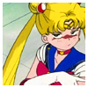
008
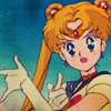
009
THE BREAKFAST CLUB
