Frank Gehry, Millennium Park and the deveopment of the Techno-Baroque/title> (original) (raw)
 Frank Gehry, Millennium Park and the development of the Techno-Baroque
-by Lynn Becker
Although he rarely touches the stuff personally, Frank Gehry uses high-tech to create an architecture that's a vibrant expression of our time.
"We started off with a very simple cover which was a very functional shed," says Gehry partner Craig Webb of the road to the Pritzker Pavilion in Chicago's Millennium Park, and indeed that design - a low, single rise of curving metal - drew directly on the city's Miesian legacy. It died a quick, unlamented death
Taken as a whole, Frank Gehry's work in Millennium Park offers a bracing counterpoint to the traditions of Chicago modernism. Chicago, of course, is the town where Mies van der Rohe came into his own with such glass-skin, steel-boned landmarks as Crown Hall at IIT and the Federal Center at Dearborn and Jackson. Mies's buildings achieve a profound purity by reducing variation to an essential minimum, rhythmically expounded in the same perfect proportion you find in an ancient Greek temple. Although a Mies masterpiece is never simplistic, it always presents the basic concept of its design with an absolute clarity that can often be comprehended in a single glance.
Mies said that it was better to be good than interesting. For the marketplace, however, it was even better to be cheap. When developers discovered that Mies' logical and efficient way of designing also pointed the way to a very economical method of construction, cities everywhere - including Chicago - were overrun with knockoffs of the Miesian glass box that leveraged the economic benefits of standardization while skipping most of the original thought.
"That's how some modernism failed," Gehry says in the book Gehry Talks. "When it started getting used by the developers, it became faceless. . . . What was missing was human scale." To most people, projects like Illinois Center are simple-minded and inhospitable, and as those kind of buildings began to take up more and more of the skylines of cities throughout the world, a counter?reaction was inevitable. At  first, that reaction was post-modernism, the 70's and 80's movement that soon choked on its own simplistic parodies of classical architecture. Percolating on the sidelines during that period, however, was the work of other architects - Frank Gehry, Rem Koolhaas, Peter Eisenman and Zaha Hadid, to name just a few - who, coming from often strikingly different approaches, were rethinking what architecture needed to become in the culture of a new millennium.
Frank Gehry's architecture has been central in creating what could be called a new, techno-Baroque. In the Italian language of the Middle Ages, barocco was a word used by philosophers to describe a roadblock in a logical stream of thought. In similar fashion, the techno-Baroque is a direct assault on the restrictive and linear logic of Mies. All the elements that Mies threw out to create his final language - curves, color, reflection, caprice - are now embraced. A second definition of the word Baroque is "imperfect pearl" - an irregular - and in the writing of critics of the Baroque era this came to refer to a flaunting of the traditional rules of design and proportion. In every structure Gehry builds, he's likewise challenging the Miesian pedagogy.
If Gehry's architecture were simply an embrace of the irrational, however, it would be little more than nonsense. What elevates his work is how it reflects our modern culture's obsession with mobility, speed and change. At a July 23rd symposium sponsored by the Architecture and Design Society of the Art Institute of Chicago, Gehry seemed a bit taken back by a question about whether he saw a relationship between his work and that of the Italian Futurists - like painter Umberto Boccioni- who were determined to portray not just an object, but its energy. "Is there?" Gehry plaintively turned the question back to his audience. "It would take a long time to sort of explain the evolution of this language, but it probably came from similar desire to express movement and feeling through and with inert materials. The Greeks did it. The Indians did it with their sculptures, and it seems like a reasonable way in this century to create a sense of feeling was to use movement." Gehry began as a boy watching the movements of the live carp, which his grandmother kept fresh in the family bathtub before making it into gefilte fish. Much later, when it was time to find a path away from Miesian modernism, Gehry would create a great fish sculpture in Barcelona. "I did it because of the postmodern game," he says in Gehry Talks. "Fish are three hundred thousand years before man, so why don't you go back to fish? So I started drawing fish . . . learning how the scales work. I looked at fish in ponds -the sense of movement fascinated me."
At the symposium, Gehry talked of a 35-foot long wooden fish that he made for a mid-1980's fashion show as "the most awful piece of kitsch I've ever seen in my life, but when you stood beside it, it did have that sense of movement . . . and I got excited about that. I then cut off the tail, cut off the head, cut off the fin, and tried to see how abstract I could go with it and still get that sense of movement. That's started me, when I built those structures, and started working with those kind of curved shapes. . . .I started using metal because it was the only material I could use as a roof and as a wall. I was trying to make a 3-dimensional object. All of the detailing, the crickets and the valleys - all of that stuff has been done for centuries, and I knew I could produce a skin that wouldn't leak, that would be durable, so that's how I got into using a lot of metal. Then over time, I loved the way metal dealt with reflections in the sky and engaged nature."
"Basically that's how that language evolved. But, now I think I'm going to do only square buildings from now on," Gehry teased.
Just as Mies depended on the technology of his time to create his architecture, work like Gehry's couldn't exist without recent innovations in materials and, most importantly, computers, even though Gehry, 74, professes to never touch one himself. He was introduced to the world of computer-aided-design by a then new associate, James Glymph, back in the early 90's when he was having trouble communicating a tricky curved form to a contractor. This set him on the road to what has become an ongoing partnership with Dassault Systemes, a French firm known for its software for designing airplanes and automobiles.
Cost overruns and dysfunctional buildings are twin banes undermining the credibility of modern architecture. Components arriving on-site don't fit together the way they were expected to. They either have to be replaced, or forced to fit together in ways that compromise how well the building works. In all cases there's additional expense and delay, sometimes in the kind of catastrophic proportions that make for unpleasant headlines. Without computer modeling, buildings like Gehry's Disney Hall - made up not of the usual small palette of standard pieces, but of thousands of uniquely shaped parts -would be an impossibility. The pieces would have to be handcrafted on site, at prohibitive cost. The CATIA software program Gehry's firm has developed with Dassault allows all the calculations to be made in the computer, with an intense, automated crosscheck that fishes out errors - such as pieces cut with small but fatal inaccuracies in shape, or even beams in a space already reserved for another architectural element - before a manufacturer faithfully passes them on as costly mistakes. "Because we can figure the cost," the architect says in Gehry Talks, "the subcontractors are starting to trust us . . . we are so accurate with the computer that they don't have any wiggle room, because we give them quantities, to seven decimal points of accuracy"
At the Art Institute symposium, Tribune architecture critic Blair Kamin briefly compared Millennium Park's attractions to the "follies" - such as faux ruins of castles - that wealthy landowners of previous centuries used to add color to their private gardens. In a sense that's exactly what Gehry's bandshell proscenium and BP bridge are - glorious follies, "folly" not in the negative sense of a foolish enterprise, but in the classical one of an element whose principal purpose is to proffer delight. "75% of all that stuff is pretty functional and rational, " Gehry contends of the bandshell's components. Still, its most popular feature - the great mane of billowing stainless steel curls - is less a building than a garnish, architecture mit schlag, a grand flourish supporting the architect's goal of making encounters with the bandshell a joyful and exuberant experience.
That proscenium has become the park's great icon, but Gehry's more interesting work is found elsewhere. Along Randolph Street, the steel structure that supports the proscenium like the bracing for a billboard is deliberately left exposed. "Some 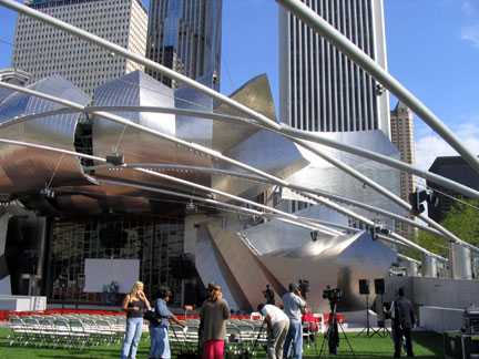
people have objected to the backside," says Webb, "but we always imagined it to 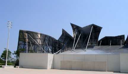
be a structure with a face and a backside, and the pipe and structure that support the proscenium related in a way back to the trellis." Viewing the maze of metalwork is like standing on the inside of the Wizard of Oz's curtain and seeing all the tricks that make the structure actually work. It's an exhilarating essay on structure, although the condo owners on the other side of the street may be excused for not being amused.
The trellis may be Gehry's most arresting contribution. Anyone who's attended concerts at the Petrillo bandshell is familiar with the generally awful sound coming from speakers perched like vultures on an ugly forest of tall poles blocking the view towards the stage. Gehry rejected this approach. "You would have had a yard full 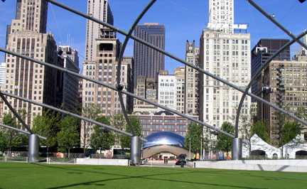
of vertical poles with speakers on them like lollipops," he says, "and that would have been kind of cheesy looking." Instead, he built on a concept he had been working on for the Hollywood Bowl in Los Angeles for a "distributed sound system," with nearly 200 speakers, many mounted on the trellis, to recreate a natural aural soundstage throughout the pavilion and lawn.
The trellis touches lightly on the great lawn - "almost nothing" in the words Mies used to describe his ideal architecture. Using the lightest of structures, Gehry has created the sense of a room that unites listeners spatially just as the distributed sound unites them aurally, all the way to the back of the lawn, nearly 600 feet from the stage. That distance is also one of the ways Gehry justifies the massive 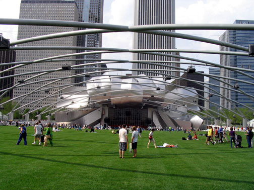 proscenium. "When you're sitting way back there, and the little orchestra is here, you feel very separated and detached. . . . You had to give it a presence so that the people at the back felt part of it, included and when they experience the performance they feel like they're part of the action." The flip side of this equation, however, is that when you're sitting in the pavilion itself, the large billowing elements at the top and sides of the stage that resolve themselves into a graceful whole at a distance appear almost comically oversized close-up.
The trellis offers one other perk that surprised even Gehry. "To be under it and how that frames the skyline - I didn't expect that. That was a little bonus that I think we got." The wall of skyscrapers along Michigan Avenue has long been a city icon, but when you step back far enough to perceive the whole, it's harder to appreciate the parts. Gehry's trellis breaks that view into a mosaic that makes it easier to separate and appreciate the individual buildings.
Gehry's other contribution to park is the BP bridge - the first he's designed - also finished in stainless steel, with hardwood walkways. It snakes 925 feet along and over Columbus Drive, helping shield the Pritzker music pavilion from the noise of 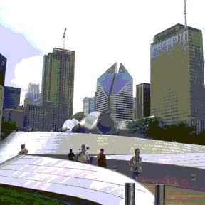 traffic. It's less of a direct route than a promenade. As it turns and loops it offers a shifting array of perspectives of the park and skyline, and it's become a sort of balcony where people stand, watch and listen to the concerts in the pavilion. A downside of the stainless steel is that the dull polished solid balustrade quickly becomes smudged with the day's oily fingerprints. Combined with the shiny stainless steel shingles that cover the sloping berm on which the bridge rests, it also has a tendency to set walkers to broil on days with bright, direct sunlight.
For the moment, the bridge is also a road to nowhere. During the park's opening, 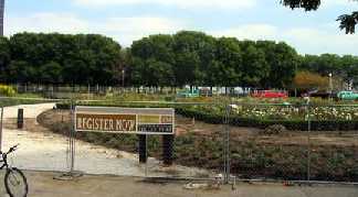 the hordes of people who took the long trek across the bridge could be found milling perplexed confusion as they found that the result of their long journey had been to be unceremoniously dumped next to a seemingly endless expanse of chain link fence, protecting a dirt farm. "There's no place to go over there," laments Gehry.
Now, at the beginning of September, flowers are being planted and walkways laid, but the Berlin Wall of chainlink remains. Project Manager Ed Uhlir responded to Gehry's consternation with talk of a "framework plan" that will fill in the park within the next few years, but the fact that at the opening the area was allowed to be a total dead end - no shrubs, no flowers, no food service trailers, no informational kiosks, no benches, nothing - was an incomprehensible and inexcusable oversight.
Gehry's BP bridge was designed to stitch Millennium Park in with the rest of Grant Park, and to do so, the area just past the bridge's east entrance needs to become the crossroads of two promenades: one running to the east, with a bridge over Lake Shore Drive linking to the lakefront promenade, and a second heading south, linking to Buckingham fountain, which can be seen in the distance but current walkway ends at a cliff before it reaches Monroe, with a miniature golf course below.
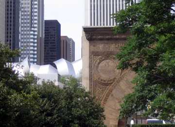
Entry arch from Louis Sullivan's 1895 Chicago Stock Exchange
Building (demolished) with Frank Gehry's Pritzker Pavilion in background.
Millennium Park its architecture and art