What's Wrong/Right with this Picture? Holl in Beijing (original) (raw)
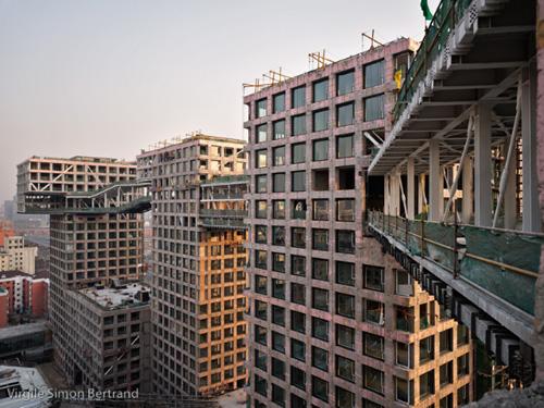
We recently received this construction progress photo, shot by Virgile Simon Bertrand, from Steven Holl's massive Linked Hybrid residential development in Beijing. What caught our eye, what disconcerted our apprehension, was the weirdly unexpected coloration of the towers.
Every other image I've seen of the project, including those on Holl's own website, are sun drenched evocations of whiteness, of light-gray, gridlike boxes, 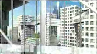 as you can see from this screen grab from an extended talk - as much a promo piece in the Lagrange style as an explication - that Holl gives about his project. It's the patented bleached Corbu-white that has become a hallmark of modernism.
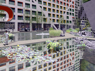
Holl's interposes a counterpoint through bright solid colors applied to areas such as stretches of window openings and the undersides of the bridges tying together the various towers at the 20th floor level. According to Holl, a chart was created from the vibrant colors used in
Image: Steven Holl Architects
 |
|---|
Buddhist temples and other monuments, and the I-Ching used to select shades from the chart to form Linked Hybrid's palette.
The result, of course, is an immediately comprehensible applique of primary color in high contrast against the expected, universal slather of white, a white that's like a disappearing cream ("What elephant?!") dematerializing structure, however massive, into a desaturated antiseptic background.
That's where the top photo comes in. An accident of timing and light, it manages to subvert that canonical modernist dance of negation and accent. At first, I saw in the photo a disconcerting evocation of rust-belt decay, the corroding metal of abandoned factories and giant conveyors, but the image soon opened to multiple interpretations. The surfaces began to look like pink marble, or a sooted granite. Coupled to the photograph's framing of the buildings into an insistent - and unsettling - linear processional, it suggested, not a real estate broker's idyll of shining towers in gleaming gardens, but an ambiguous and unyielding tectonic presence.
Linked Hybrid is an aggressively green project - green roofs replacing every last scrap of asphalt, 600 geothermal wells bringing water from 100 meters down into the slab flooring to cool in the summer and warm in the winter, and earth gathered from parking garage excavations piled into a "Garden of Mounds", five landscaped areas themed Childhood, Adolescence, Middle Age, Old Age, with amenities appropriate to each, and a fifth, the Mound of Infinity, complete with pavilions representing earth, wood, metal, fire and water, the five Chinese elements.
Green, indeed, but as usually the case, green defined as the conservation of energy and resources. The organic side of green, nature's modular, tightly structured lifeline flowing through time within a raiment of infinite variety and mutability, has proven a tougher nut to duplicate. But that was the intimation I found in this wonderfully strange photograph. 
Join a discussion on this story.
© 2008 photos (unless otherwise credited) and text Lynn Becker All rights reserved.
