Evolution of the Dragon Ball Logo: From Z to Super (original) (raw)
From Dragon Ball to GT, Super and beyond, the franchise's title card has seen numerous updates. Let's take a closer look at the differences between the various logos and the evolution of each!
Adapted from Akira Toriyama's popular Dragon Ball manga, the anime franchise covers a lot of ground over the course of five series and 19 movies. Over time, the creators felt that the anime's logo, while iconic in its own right, needed to see some changes as well. Below are some of the most frequently used images and title cards in the Dragon Ball universe.
Dragon Ball (1986)
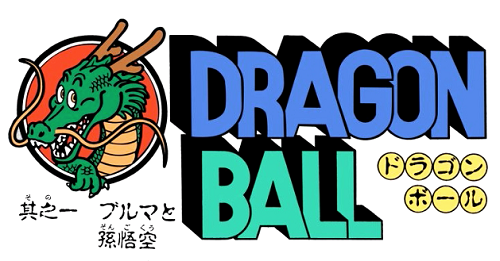
This is the original logo used for the Dragon Ball anime when it debuted in 1986. The image features blocky, cartoonish lettering, as well as a very cartoon-like version of Shenlong. This remained the primary logo throughout the series' run.
Dragon Ball Z (1989)
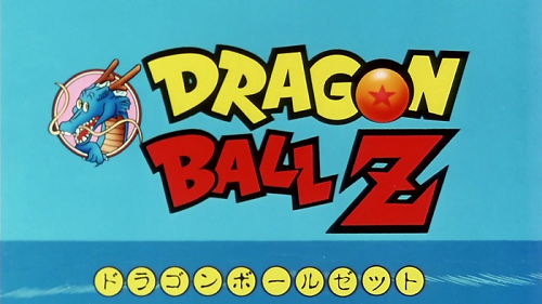
The second series in the franchise, Dragon Ball Z, adapts the second half of Toriyama's manga, following the main character Goku, now an adult with a young son around the same age Goku had been at the beginning of Dragon Ball. The logo for the Japanese release is similar to that used in the prior series, but with more angular, stylized lettering. Additionally, the 'O' in 'Dragon' has been replaced with a dragon ball.
Dragon Ball Z (1996, American Release)
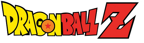
When the series traveled overseas and began American syndication in 1996, the title card saw some considerable revision. The image of Shenlong was removed, and the letters were straightened to give the logo a more serious, "edgy" look, which producers thought might appeal more to western audiences.
Dragon Ball GT (1996)
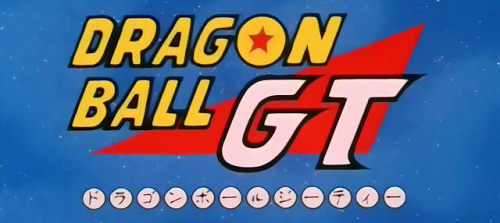
Dragon Ball GT was the first series in the franchise not directly based on the original manga, and picks up with an original story where DBZ left off. The GT logo is similar in layout to earlier Japanese title cards, with Shenlong replaced by a red triangle and the letters 'GT' in the foreground. The font is similar to the original 1986 logo, but has a bit more of a retro-futuristic style.
Dragon Ball Kai (2009)
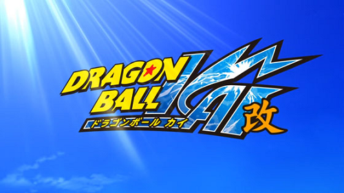
Dragon Ball Kai debuted in 2009 as a revised version of Dragon Ball Z, featuring a high-definition remaster as well as significant recuts, removing much of the filler for which the series was notorious and slashing the run from 291 episodes to 159. The Kai logo has a crisp, 3D appearance, with lightning captured within the highly stylized 'Kai' and what appears to be a more modernized version of the Dragon Ball GT lettering.
Dragon Ball Super (2015)
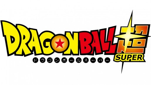
Dragon Ball Super, the first original Dragon Ball series since 1997, debuted earlier this year to widespread excitement, following the continuing adventures of Goku and his friends, as well as welcoming new "godly" enemies. The accompanying logo is similar to the international DBZ logo, but with fresher coloring and stylized kanji characters at the end.