JavaFX CSS Reference Guide (original) (raw)
Contents
- Introduction
- Types
- Stage
- javafx.stage
* PopupWindow
- javafx.stage
- Nodes
- javafx.scene
* Group
* Node
* Parent
* Scene - javafx.scene.image
* ImageView - javafx.scene.layout
* AnchorPane
* BorderPane
* DialogPane
* FlowPane
* GridPane
* HBox
* Pane
* Region
* StackPane
* TilePane
* VBox - javafx.scene.media
* MediaView - javafx.scene.shape
* Shape
* Arc
* Circle
* CubicCurve
* Ellipse
* Line
* Path
* Polygon
* QuadCurve
* Rectangle
* SVGPath - javafx.scene.text
* Text
* TextFlow - javafx.scene.web
* WebView
- javafx.scene
- Controls
- javafx.scene.control
* Accordion
* Button
* ButtonBase
* Cell
* CheckBox
* CheckMenuItem
* ChoiceBox
* ColorPicker
* ComboBox
* ContextMenu
* Control
* DatePicker
* HTMLEditor
* Hyperlink
* IndexedCell
* Label
* Labeled
* ListCell
* ListView
* Menu
* MenuBar
* MenuButton
* MenuItem
* Pagination
* PasswordField
* ProgressBar
* ProgressIndicator
* RadioButton
* RadioMenuItem
* ScrollBar
* ScrollPane
* Separator
* Spinner
* Slider
* SplitMenuButton
* SplitPane
* TabPane
* TableColumnHeader
* TableView
* TextArea
* TextInputControl
* TextField
* TitledPane
* ToggleButton
* ToolBar
* Tooltip
* TreeCell
* TreeTableCell
* TreeTableView
* TreeView
* WebView
- javafx.scene.control
- Charts
- javafx.scene.chart
* AreaChart
* Axis
* BarChart
* BubbleChart
* CategoryAxis
* Chart
* Legend
* LineChart
* NumberAxis
* PieChart
* ScatterChart
* ValueAxis
* XYChart
- javafx.scene.chart
- Incubator Modules
- jfx.incubator.scene.control.richtext
* CodeArea
* RichTextArea
- jfx.incubator.scene.control.richtext
- References
Introduction
Never has styling a Java UI been easier than with JavaFX and Cascading Style Sheets (CSS). Going from one theme to another, or customizing the look of just one control, can all be done through CSS. To the novice, this may be unfamiliar territory; but the learning curve is not that great. Give CSS styling a try and the benefits will soon be apparent. You can also split the design and development workflow, or defer design until later in the project. Up to the last minute changes, and even post-deployment changes, in the UI's look can be achieved through JavaFX CSS.
The structure of this document is as follows. First, there is a description of all value types for JavaFX CSS properties.Where appropriate, this includes a grammar for the syntax of values of that type. Then, for each scene‑graph node that supports CSS styles, a table is given that lists the properties that are supported, along with type and semantic information. The pseudo‑classes for each class are also given. The description of CSS properties continues for the controls. For each control, the substructure of that control's skin is given, along with the style‑class names for the Region objects that implement that substructure.
CSS and the JavaFX Scene Graph
JavaFX Cascading Style Sheets (CSS) is based on the W3C CSS version 2.1 [1] with some additions from current work on version 3 [2]. JavaFX CSS also has some extensions to CSS in support of specific JavaFX features. The goal for JavaFX CSS is to allow web developers already familiar with CSS for HTML to use CSS to customize and develop themes for JavaFX controls and scene‑graph objects in a natural way.
JavaFX has a rich set of extensions to CSS in support of features such as color derivation, property lookup, and multiple background colors and borders for a single node. These features add significant new power for developers and designers and are described in detail in this document.
To the extent possible, JavaFX CSS follows the W3C standards; however, with few exceptions, JavaFX property names have been prefixed with a vendor extension of "-fx-". Even if these properties seem to be compatible with standard HTML CSS, JavaFX CSS processing assumes that the property values make use of JavaFX CSS extensions.
CSS styles are applied to nodes in the JavaFX scene‑graph in a way similar to the way CSS styles are applied to elements in the HTML DOM. Styles are first applied to the parent, then to its children. The code is written such that only those branches of the scene‑graph that might need CSS reapplied are visited. A node is styled after it is added to the scene graph. Styles are reapplied when there is a change to the node's pseudo‑class state, style‑class, id, inline style, or parent, or stylesheets are added to or removed from the scene. Note that the Node must be in the scene‑graph for CSS to be applied. The Node does not have to be shown, but must have a non‑null value for its sceneProperty. SeeapplyCss for more details.
During a normal scene‑graph pulse, CSS styles are applied before the scene‑graph is laid out and painted. Styles for events that trigger a pseudo‑class state change, such as MouseEvent.MOUSE_ENTERED which triggers the "hover" state, are applied on the next pulse following the event.
CSS selectors are used to match styles to scene‑graph nodes. The relationship of a Node to a CSS selector is as follows:
- Node's getTypeSelector method returns a String which is analogous to a CSS Type Selector. By default, this method returns the simple name of the class. Note that the simple name of an inner class or of an anonymous class may not be usable as a type selector. In such a case, this method should be overridden to return a meaningful value.
- Each node in the scene‑graph has a styleClass property. Note that a node may have more than one style‑class. A Node's styleClass is analogous to the class="..." attribute that can appear on HTML elements. See Class Selectors.
- Each node in the scene‑graph has an id variable, a string. This is analogous to the id="..." attribute that can appear HTML elements. See ID Selectors.
JavaFX CSS also supports pseudo‑classes, but does not implement the full range of pseudo‑classes as specified in Pseudo‑classes. The pseudo‑classes supported by each Node type are given in the tables within this reference.
Each node honors a set of properties that depends on the node's JavaFX class (as distinct from its styleClass). The properties honored by each node class are shown in detail in tables later in this document. The property value that is actually applied depends on the precedence of the origin of the rule, as described above, as well as the specificity of the rule's selector as described in CSS 2 [1] . Ultimately, a property value string is converted into a JavaFX value of the appropriate type and is then assigned to an instance variable of the JavaFX object.
Scene, Parent and SubScene Stylesheets
CSS styles can come from style sheets or inline styles. Style sheets are loaded from the URLs specified in thegetStylesheets property of the Scene object. If the scene‑graph contains a Control, a default user agent style sheet is loaded. Inline styles are specified via the Node setStyle API. Inline styles are analogous to the style="..." attribute of an HTML element. Styles loaded from a Scene's style sheets take precedence over selectors from the user agent style sheet. Inline styles take precedence over styles originating elsewhere. The precedence order of style selectors can be modified using "!important" in a style declaration.
Beginning with JavaFX 2.1, the Parent class has agetStylesheets property, allowing style sheets to be set on a container. This allows for one branch of of the scene‑graph to have a distinct set of styles. Any instance of Parent can have style sheets. A child will take its styles from its own inline styles, the style sheets of all its ancestors, and any style sheets from the Scene.
Beginning with JavaFX 8u20, the Scene class has agetUserAgentStylesheet property, allowing a user‑style sheet to be set on a Scene. This allows a Scene to have a set of user‑agent styles distinct from the platform default. When a user‑agent stylesheet is set on a Scene, the user‑agent styles are used instead of the styles from the platform default user‑agent stylesheet.
Beginning with JavaFX 8u20, the SubScene class has agetUserAgentStylesheet property, allowing a user‑style sheet to be set on a SubScene. This allows a SubScene of the scene‑graph to have set of user‑agent styles distinct from the platform default or from the Scene in which the SubScene is contained. When a user‑agent stylesheet is set on a SubScene, the user‑agent styles are used instead of the styles from the platform default user‑agent stylesheet or any user‑agent stylesheet set on the Scene.
It is important to note that styles from a stylesheet added to a Scene or Parent, do not affect a SubScene which is a child or descendent of the Scene or Parent. Unless a user‑agent has been set on the SubScene, the SubScene will get styles from the a Scene's user‑agent stylesheet or the platform user‑agent stylesheet.
The implementation allows designers to style an application by using style sheets to override property values set from code. For example, a call to rectangle.setFill(Color.YELLOW) can be overridden by an inline‑style or a style from an author stylesheet. This has implications for the cascade; particularly, when does a style from a style sheet override a value set from code? The JavaFX CSS implementation applies the following order of precedence: a style from a user agent style sheet has lower priority than a value set from code, which has lower priority than a Scene or Parent style sheet. Inline styles have highest precedence. Style sheets from a Parent instance are considered to be more specific than those styles from Scene style sheets.
Naming Conventions
Naming conventions have been established for deriving CSS style‑class names from JavaFX class names, and for deriving CSS property names from JavaFX variable names. Note that this is only a naming convention; there is no automatic name conversion. Most JavaFX names use "camel case," that is, mixed case names formed from compound words, where the initial letter of each sub-word is capitalized. Most CSS names in the HTML world are all lower case, with compound words separated by hyphens. The convention is therefore to take JavaFX class names and form their corresponding CSS style‑class name by separating the compound words with hyphens and converting the letters to all lower case. For example, the JavaFX ToggleButton class would have a style‑class of "toggle-button". The convention for mapping JavaFX variable names to CSS property names is similar, with the addition of the "-fx-" prefix. For example, the blendMode variable would have a corresponding CSS property name of "-fx-blend-mode".
CSS Public API
Beginning with JavaFX 8, public API is available for developers to create styleable properties and manage pseudo-class state. Refer to javafx.css for details.
Inheritance
CSS also provides for certain properties to be inherited by default, or to be inherited if the property value is 'inherit'. If a value is inherited, it is inherited from the computed value of the element's parent in the document tree. In JavaFX, inheritance is similar, except that instead of elements in the document tree, inheritance occurs from parent nodes in the scene‑graph.
The following properties inherit by default. Any property can be made to inherit by giving it the value "inherit".
Properties that inherit by default
| Class | Property | CSS Property | Initial Value |
|---|---|---|---|
| javafx.scene.Node | cursor | -fx-cursor | javafx.scene.Cursor.DEFAULT |
| javafx.scene.text.Text | textAlignment | -fx-text-alignment | javafx.scene.text.TextAlignment.LEFT |
| javafx.scene.text.Font | font | -fx-font, -fx-font-family, -fx-font-size, -fx-font-weight, -fx-font-style | Font.DEFAULT (12px system) |
Within the hierarchy of JavaFX classes (for example, Rectangle is a subclass of Shape, which in turn is a subclass of Node), the CSS properties of an ancestor are also CSS properties of the descendant. This means that a subclass will respond to the same set of properties as its ancestor classes, and to additional properties it defines itself. So, a Shape supports all the properties of Node plus several more, and Rectangle supports all the properties of Shape plus a couple more. However, because using a JavaFX class name as a type selector is an exact match, providing style declarations for a Shape will not cause a Rectangle to use those values (unless the .css value for the Rectangle's property is "inherit").
For font inheritance, the CSS engine looks only for the styles in the table above. When looking for a font to inherit, the search terminates at any node that has a Font property that was set by the user. The user-set font is inherited provided there is not an author or an inline-style that applies specifically to that node. In this case, the inherited font is created from the user-set font and any parts of the applicable author or in-line style.
Transitions
JavaFX supports implicit transitions for properties that are styled by CSS. When a property value is changed by CSS, it transitions to its new value over a period of time. Implicit transitions are supported for all primitive types, as well as for types that implement javafx.animation.Interpolatable.
Transitions can be defined for any node in the JavaFX scene graph with the following properties:
Transition Properties
| CSS Property | Values | Default | Comments | |||
|---|---|---|---|---|---|---|
| transition‑property | [ none | all | <custom‑ident># ] | all | The name of the CSS property to which the transition is applied. | ||
| transition‑duration | # | 0s | The duration of the transition, not including an optional delay before the transition starts. | |||
| transition‑timing‑function | <easing‑function># | ease | The easing function that is used to calculate the intermediate values. | |||
| transition‑delay | # | 0s | The delay after which the transition starts. If a negative delay is specified, the transition starts as if it had already been running for the specified time. | |||
| transition | # where <single‑transition> = [ none | all | <custom‑ident> ] | <easing‑function> |
A transition is not started (or cancelled if already running) in any of these scenarios:
- The property value is set programmatically
- The property is bound
- The node (or any of its parents) is invisible, as indicated by theNode.visible property
- The node is removed from the scene graph Nodes fire TransitionEvent to signal the creation, beginning, completion and cancellation of transitions.
Example
A button that smoothly changes its opacity on mouse-hover can be defined in a stylesheet like this:
.button {
-fx-opacity: 0.8;
transition-property: -fx-opacity;
transition-duration: 0.5s;
}
.button:hover {
-fx-opacity: 1;
}
@ Rules
Beginning with JavaFX 8u20, the CSS@import is also partially supported. Only unconditional import is supported. In other words, the media‑type qualifier is not supported. Also, the JavaFX CSS parser is non-compliant with regard to where an @import may appear within a stylesheet (see At‑rules). Users are cautioned that this will be fixed in a future release. Adherence to the W3C standard is strongly advised.
Since JavaFX 8, the implementation partially supports the CSS3 syntax to load a font from a URL using the@font‑face rule:
This allows public resources for fonts to be used in a JavaFX application. For example, assume the URL "http://font.samples/web?family=samples" returns the @font‑face rule given above. Then the following code shows how the sample font could be used in a JavaFX application.
Or, the URL could be imported into a stylesheet with the @import rule.
Although the parser will parse the syntax, all @font‑face descriptors are ignored except for the src descriptor. The src descriptor is expected to be a. The format hint is ignored.
Examples
Consider the following simple JavaFX application:
Scene scene = new Scene(new Group());
scene.getStylesheets().add(“test.css”);
Rectangle rect = new Rectangle(100,100);
rect.setLayoutX(50);
rect.setLayoutY(50);
rect.getStyleClass().add("my-rect");
((Group)scene.getRoot()).getChildren().add(rect);
Without any styles, this will display a plain black rectangle. If test.css contains the following:
.my-rect { -fx-fill: red; }
the rectangle will be red instead of black:

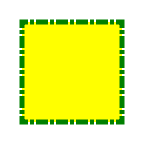
If test.css contains the following:
.my-rect {
-fx-fill: yellow;
-fx-stroke: green;
-fx-stroke-width: 5;
-fx-stroke-dash-array: 12 2 4 2;
-fx-stroke-dash-offset: 6;
-fx-stroke-line-cap: butt;
}
the result will be a yellow rectangle with a nicely dashed green border:
Understanding Parser Warnings
When the JavaFX CSS parser encounters a syntax error, a warning message is emitted which conveys as much information as is available to help resolve the error. For example
WARNING: javafx.css.CssParser declaration Expected '' while parsing '-fx-background-color' at ?[1,49]
The cryptic '?[1,49]' pertains to the location of the error. The format of the location string is
[line, position]
If the error is found while parsing a file, the file URL will be given. If the error is from an inline style (as in the example above), the URL is given as a question mark. The line and position give an offset into the file or string where the token begins. Please note that the line and position may not be accurate in releases prior to JavaFX 2.2.
Applications needing to detect errors from the parser can add a listener to the errors property of javafx.css.CssParser.
Limitations
- While the JavaFX CSS parser will parse valid CSS syntax, it is not a fully compliant CSS parser. One should not expect the parser to handle syntax not specified in this document.
- With the exception of @font‑face and @import, @-keyword statements are ignored.
- The of the @import statement is not parsed.
- The ":active" and ":focus" dynamic pseudo‑classes are not supported. However, Nodes do support the ":pressed" and ":focused" pseudo‑classes, which are similar.
- The ":link" and ":visited" pseudo‑classes are not supported in general. However, Hyperlink objects can be styled, and they support the ":visited" pseudo‑class.
- JavaFX CSS does not support comma-separated series of font family names in the -fx-font-family property. The optional line height parameter when specifying fonts is not supported. There is no equivalent for the font-variant property.
- JavaFX CSS uses the HSB color model instead of the HSL color model.
- If a property of a node is initialized by calling the set method of the property, the CSS implementation will see this as a user set value and the value will not be overwritten by a style from a user agent style sheet.
- When parsing a URI, the parser doesn't handle URI escapes nor \[1,6] code points.
- JavaFX CSS does not combine short-hand and long-hand property notations in a declaration block. Using both notations in a single declaration block may lead to unexpected results.
Types
inherit
Each property has a type, which determines what kind of value and the syntax for specifying those values. In addition, each property may have a specified value of 'inherit', which means that, for a given node, the property takes the same computed value as the property for the node's parent. The 'inherit' value can be used on properties that are not normally inherited.
If the 'inherit' value is set on the root element, the property is assigned its initial value.
Boolean values can either have the string value of "true" or "false", the values are case insensitive as all CSS is case insensitive.
Strings can either be written with double quotes or with single quotes. Double quotes cannot occur inside double quotes, unless escaped (e.g., as '\"' or as '\22'). Analogously for single quotes (e.g., "\'" or "\27").
"this is a 'string'"
"this is a \"string\""
'this is a "string"'
'this is a \'string\''
A string cannot directly contain a newline. To include a newline in a string, use an escape representing the line feed character in ISO-10646 (U+000A), such as "\A" or "\00000a". This character represents the generic notion of "newline" in CSS. See the 'content' property for an example.
&
Some value types may have integer values (denoted by ) or real number values (denoted by ). Real numbers and integers are specified in decimal notation only. An consists of one or more digits "0" to "9". A can either be an , or it can be zero or more digits followed by a dot (.) followed by one or more digits. Both integers and real numbers may be preceded by a "-" or "+" to indicate the sign. -0 is equivalent to 0 and is not a negative number.
[+|-]? [[0-9]+|[0-9]*"."[0-9]+]
Note that many properties that allow an integer or real number as a value actually restrict the value to some range, often to a non-negative value.
A size is a with units of or. If a unit is not specified then 'px' is assumed.
[ px | mm | cm | in | pt | pc | em | ex ]?
No whitespace is allowed between the number and units if provided. Some units are relative and others absolute.
Relative
- px: pixels, relative to the viewing device
- em: the 'font-size' of the relevant font
- ex: the 'x-height' of the relevant font
Absolute
- in: inches — 1 inch is equal to 2.54 centimeters.
- cm: centimeters
- mm: millimeters
- pt: points — the points used by CSS 2.1 are equal to 1/72nd of an inch.
- pc: picas — 1 pica is equal to 12 points.
These are a percentage of some length, typically to the width or height of a node.
An angle is a with one of the following units.
- deg: angle in degrees — all other angle units are converted to degrees.
- rad: angle in radians
- grad: angle in gradians
- turn: angle in turns
A duration is a with second or millisecond units, or the value indefinite.
- s: duration in seconds
- ms: duration in milliseconds. One second is 1000 milliseconds.
- indefinite: See Duration.INDEFINITE
See also W3C time units.
A point is an {x,y} coordinate.
[ [ ] | [ | ] ]
Stops are per W3C color-stop syntax.
In a series of , stop distance values must all be or . Furthermore, if values are used, then the distance value for first and last stop in the series must be specified. This restriction may be removed in a future release.
"red, white 70%, blue" is valid since the distance for red and blue is assumed to be 0% and 100%, respectively.
"red 10, white, blue 90" is valid. Because distance for red and blue is 10 and 90, respectively, the distance for white can be calculated.
"red, white 70, blue" is not valid since distance units do not agree.
"red, white, blue" is valid. The stops are distributed evenly between 0% and 100%.
url ( [\"\']?
[\"\']? ) is a hierarchical URI of the form \[scheme:\]\[//authority\]\[path\] [(see \[2\])](#references). For example: url(http://example.com/images/Duke.png)
url(/com/example/javafx/app/images/Duke.png)
If the
does not have a [scheme:] component, the is considered to be the [path] component only. A leading '/' character indicates that the [path] is relative to the root of the classpath. If the the style appears in a stylesheet and has no leading '/' character, the path is relative to the base URI of the stylesheet. If the style appears in an inline style, the path is relative to the root of the classpath (regardless of whether or not there is a leading '/').Examples of Resolving URLs in Stylesheets
| Stylesheet URL | URL in Style | Resolves to |
|---|---|---|
| file:///some/path/build/classes/com/mycompany/myapp/mystyles.css | url(images/Duke.png) | file:///some/path/build/classes/com/mycompany/myapp/images/Duke.png |
| file:///some/path/build/classes/com/mycompany/myapp/mystyles.css | url(../images/Duke.png) | file:///some/path/build/classes/com/mycompany/images/Duke.png |
| jar:file:/some/path/build/myapp.jar!/com/mycompany/myapp/mystyles.css | url(images/Duke.png) | jar:file:/some/path/build/myapp.jar!/com/mycompany/myapp/images/Duke.png |
Examples of Resolving URLs in Inline Styles
| Classpath | URL in Style | Resolved URL |
|---|---|---|
| file:///some/path/build/classes | url(/com/mycompany/resources/images/Duke.png) | file:///some/path/build/classes/com/mycompany/resources/images/Duke.png |
| file:///some/path/build/myapp.jar | url(/com/mycompany/resources/images/Duke.png) | jar:file:/some/path/build/myapp.jar!/com/mycompany/resources/images/Duke.png |
Note that for inline styles, leading dot-segments (e.g. '..' or '.') do resolve since the path is always anchored at the root of the classpath.
As an example, the code snippet below creates a scene filled with a fictional 'Duke.png' image, located in an 'image' directory:
The same style would work equally as well from a stylesheet.
JavaFX CSS currently supports the DropShadow and InnerShadow effects from the JavaFX platform. See the class documentation in javafx.scene.effect for further details about the semantics of the various effect parameters.
Drop Shadow
A high-level effect that renders a shadow of the given content behind the content.
= [ gaussian | one-pass-box | three-pass-box | two-pass-box ]
The shadow Color.
The radius of the shadow blur kernel. In the range [0.0 ... 127.0], typical value 10.
The spread of the shadow. The spread is the portion of the radius where the contribution of the source material will be 100%. The remaining portion of the radius will have a contribution controlled by the blur kernel. A spread of 0.0 will result in a distribution of the shadow determined entirely by the blur algorithm. A spread of 1.0 will result in a solid growth outward of the source material opacity to the limit of the radius with a very sharp cutoff to transparency at the radius. Values should be in the range [0.0 ... 1.0].
The shadow offset in the x direction, in pixels.
The shadow offset in the y direction, in pixels.
Inner Shadow
A high-level effect that renders a shadow inside the edges of the given content.
= [ gaussian | one-pass-box | three-pass-box | two-pass-box ]
The shadow Color.
The radius of the shadow blur kernel. In the range [0.0 ... 127.0], typical value 10.
The choke of the shadow. The choke is the portion of the radius where the contribution of the source material will be 100%. The remaining portion of the radius will have a contribution controlled by the blur kernel. A choke of 0.0 will result in a distribution of the shadow determined entirely by the blur algorithm. A choke of 1.0 will result in a solid growth inward of the shadow from the edges to the limit of the radius with a very sharp cutoff to transparency inside the radius. Values should be in the range [0.0 ... 1.0].
The shadow offset in the x direction, in pixels.
The shadow offset in the y direction, in pixels.
JavaFX CSS supports the ability to specify fonts using separate family, size, style, and weight properties, as well as the ability to specify a font using a single shorthand property. There are four value types related to fonts plus a shorthand property that encompasses all four properties. The font-related types are as follows.
The string name of the font family. An actual font family name available on the system can be used, or one of the following generic family names can be used:
- 'system'
- 'serif' (e.g., Times)
- 'sans-serif' (e.g., Helvetica)
- 'cursive' (e.g., Zapf-Chancery)
- 'fantasy' (e.g., Western)
- 'monospace' (e.g., Courier)
The size of the font, using the syntax.
The font's style, using the following syntax:
[ normal | italic | oblique ]
The font's weight, using the following syntax:
[ normal | bold | bolder | lighter | 100 | 200 | 300 | 400 | 500 | 600 | 700 | 800 | 900 ]
This font shorthand property can be used in place of the above properties. It uses the following syntax:
[[ || ]? ]
Font Properties
Most classes that use text will support the following font properties. In some cases a similar set of properties will be supported but with a different prefix instead of "-fx-font".
Available CSS Properties
Paint values can either be a solid color specified in one of the color syntaxes, they can be a linear or radial gradient, or an image-pattern.
Linear Gradients
linear-gradient( [ [from to ] | [ to ], ]? [ [ repeat | reflect ], ]? [,]+)
where = [left | right] || [top | bottom]
Linear gradient creates a gradient going though all the stop colors along the line between the "from" and the "to" . If the points are percentages, then they are relative to the size of the area being filled. Percentage and length sizes can not be mixed in a single gradient function.
If neither repeat nor reflect are given, then the CycleMethod defaults "NO_CYCLE".
If neither [from to ] nor [ to ] are given, then the gradient direction defaults to 'to bottom'.
Stops are per W3C color-stop syntax and are normalized accordingly.
This example will create a gradient from top left to bottom right of the filled area with red at the top left corner and black at the bottom right.
linear-gradient(to bottom right, red, black)
This is equivalent to:
linear-gradient(from 0% 0% to 100% 100%, red 0%, black 100%)
This more complex example will create a 50px high bar at the top with a 3 color gradient with white underneath for the rest of the filled area.
linear-gradient(from 0px 0px to 0px 50px, gray, darkgray 50%, dimgray 99%, white)
The following syntax for linear gradient does not conform to the CSS grammar and is deprecated in JavaFX 2.0. The JavaFX 2.0 CSS parser supports the syntax but this support may be removed in later releases.
linear (, ) to (, ) stops [ (,) ]+ [ repeat | reflect ]?
Radial Gradients
radial-gradient([ focus-angle , ]? [ focus-distance , ]? [ center , ]? radius [ | ] [ [ repeat | reflect ], ]? [,]+)
Radial gradient creates a gradient going though all the stop colors radiating outward from the center point to the radius. If the center point is not given, the center defaults to (0,0). Percentage values are relative to the size of the area being filled. Percentage and length sizes can not be mixed in a single gradient function.
If neither repeat nor reflect are given, then the CycleMethod defaults "NO_CYCLE".
Stops are per W3C color-stop syntax and are normalized accordingly.
Following are examples of the use of radial-gradient:
radial-gradient(radius 100%, red, darkgray, black)
radial-gradient(focus-angle 45deg, focus-distance 20%, center 25% 25%, radius 50%, reflect, gray, darkgray 75%, dimgray)
The following syntax for radial gradient does not conform to the CSS grammar and is deprecated in JavaFX 2.0. The JavaFX 2.0 CSS parser supports the syntax but this support may be removed in later releases.
radial [focus-angle | ] ]? [ focus-distance ]? [ center <size,size> ]? stops [ ( , ) ]+ [ repeat | reflect ]?
Image Paint
The parameters, in order, are:
The URL of the image.
The x origin of the anchor rectangle.
The y origin of the anchor rectangle.
The width of the anchor rectangle.
The height of the anchor rectangle.
The proportional flag which indicates whether start and end locations are proportional or absolute
For a full explanation of the parameters, refer to theImagePattern javadoc.
Following are examples of the use of image-pattern:
image-pattern("images/Duke.png")
image-pattern("images/Duke.png", 20%, 20%, 80%, 80%)
image-pattern("images/Duke.png", 20%, 20%, 80%, 80%, true)
image-pattern("images/Duke.png", 20, 20, 80, 80, false)
Related, there is the repeating-image-pattern function which is a shorthand for producing tiled image based fills. It is equivalent to
image-pattern("images/Duke.png", 0, 0, imageWidth, imageHeight, false)
The only parameter is the uri of the image. Following is an example of the use of image-pattern:
repeating-image-pattern("com/mycompany/myapp/images/Duke.png")
| | | |
Named Colors
CSS supports a bunch of named constant colors. Named colors can be specified with just their unquoted name for example:
.button {
-fx-background-color: red;
}
The named colors that are available in CSS are:
aliceblue = #f0f8ff
antiquewhite = #faebd7
aqua = #00ffff
aquamarine = #7fffd4
azure = #f0ffff
beige = #f5f5dc
bisque = #ffe4c4
black = #000000
blanchedalmond = #ffebcd
blue = #0000ff
blueviolet = #8a2be2
brown = #a52a2a
burlywood = #deb887
cadetblue = #5f9ea0
chartreuse = #7fff00
chocolate = #d2691e
coral = #ff7f50
cornflowerblue = #6495ed
cornsilk = #fff8dc
crimson = #dc143c
cyan = #00ffff
darkblue = #00008b
darkcyan = #008b8b
darkgoldenrod = #b8860b
darkgray = #a9a9a9
darkgreen = #006400
darkgrey = #a9a9a9
darkkhaki = #bdb76b
darkmagenta = #8b008b
darkolivegreen = #556b2f
darkorange = #ff8c00
darkorchid = #9932cc
darkred = #8b0000
darksalmon = #e9967a
darkseagreen = #8fbc8f
darkslateblue = #483d8b
darkslategray = #2f4f4f
darkslategrey = #2f4f4f
darkturquoise = #00ced1
darkviolet = #9400d3
deeppink = #ff1493
deepskyblue = #00bfff
dimgray = #696969
dimgrey = #696969
dodgerblue = #1e90ff
firebrick = #b22222
floralwhite = #fffaf0
forestgreen = #228b22
fuchsia = #ff00ff
gainsboro = #dcdcdc
ghostwhite = #f8f8ff
gold = #ffd700
goldenrod = #daa520
gray = #808080
green = #008000
greenyellow = #adff2f
grey = #808080
honeydew = #f0fff0
hotpink = #ff69b4
indianred = #cd5c5c
indigo = #4b0082
ivory = #fffff0
khaki = #f0e68c
lavender = #e6e6fa
lavenderblush = #fff0f5
lawngreen = #7cfc00
lemonchiffon = #fffacd
lightblue = #add8e6
lightcoral = #f08080
lightcyan = #e0ffff
lightgoldenrodyellow = #fafad2
lightgray = #d3d3d3
lightgreen = #90ee90
lightgrey = #d3d3d3
lightpink = #ffb6c1
lightsalmon = #ffa07a
lightseagreen = #20b2aa
lightskyblue = #87cefa
lightslategray = #778899
lightslategrey = #778899
lightsteelblue = #b0c4de
lightyellow = #ffffe0
lime = #00ff00
limegreen = #32cd32
linen = #faf0e6
magenta = #ff00ff
maroon = #800000
mediumaquamarine = #66cdaa
mediumblue = #0000cd
mediumorchid = #ba55d3
mediumpurple = #9370db
mediumseagreen = #3cb371
mediumslateblue = #7b68ee
mediumspringgreen = #00fa9a
mediumturquoise = #48d1cc
mediumvioletred = #c71585
midnightblue = #191970
mintcream = #f5fffa
mistyrose = #ffe4e1
moccasin = #ffe4b5
navajowhite = #ffdead
navy = #000080
oldlace = #fdf5e6
olive = #808000
olivedrab = #6b8e23
orange = #ffa500
orangered = #ff4500
orchid = #da70d6
palegoldenrod = #eee8aa
palegreen = #98fb98
paleturquoise = #afeeee
palevioletred = #db7093
papayawhip = #ffefd5
peachpuff = #ffdab9
peru = #cd853f
pink = #ffc0cb
plum = #dda0dd
powderblue = #b0e0e6
purple = #800080
red = #ff0000
rosybrown = #bc8f8f
royalblue = #4169e1
saddlebrown = #8b4513
salmon = #fa8072
sandybrown = #f4a460
seagreen = #2e8b57
seashell = #fff5ee
sienna = #a0522d
silver = #c0c0c0
skyblue = #87ceeb
slateblue = #6a5acd
slategray = #708090
slategrey = #708090
snow = #fffafa
springgreen = #00ff7f
steelblue = #4682b4
tan = #d2b48c
teal = #008080
thistle = #d8bfd8
tomato = #ff6347
turquoise = #40e0d0
violet = #ee82ee
wheat = #f5deb3
white = #ffffff
whitesmoke = #f5f5f5
yellow = #ffff00
yellowgreen = #9acd32
transparent = rgba(0,0,0,0)
Looked-up Colors
With looked-up colors you can refer to any other color property that is set on the current node or any of its parents. This is a very powerful feature, as it allows a generic palette of colors to be specified on the scene then used throughout the application. If you want to change one of those palette colors you can do so at any level in the scene tree and it will affect that node and all its decendents. Looked-up colors are not looked up until they are applied, so they are live and react to any style changes that might occur, such as replacing a palette color at runtime with the "style" property on a node.
In the following example, all background color of all buttons uses the looked up color "abc".
:root { abc: #f00 }
.button { -fx-background-color: abc }
RGB Colors
The RGB color model is used in numerical color specifications. It has a number of different supported forms.
#
| #
| rgb( , , )
| rgb( %, % , % )
| rgba( , , , )
| rgba( % , % , %, )
These examples all specify the same color for the text fill of a Label:
- .label { -fx-text-fill: #f00 } /* #rgb */
- .label { -fx-text-fill: #ff0000 } /* #rrggbb */
- .label { -fx-text-fill: rgb(255,0,0) }
- .label { -fx-text-fill: rgb(100%, 0%, 0%) }
- .label { -fx-text-fill: rgba(255,0,0,1) }
RGB Hex: The format of an RGB value in hexadecimal notation is a ‘#’ immediately followed by either three or six hexadecimal characters. The three-digit RGB notation (#rgb) is converted into six-digit form (#rrggbb) by replicating digits, not by adding zeros. For example, #fb0 expands to #ffbb00. This ensures that white (#ffffff) can be specified with the short notation (#fff) and removes any dependencies on the color depth of the display.
RGB Decimal or Percent: The format of an RGB value in the functional notation is ‘rgb(’ followed by a comma-separated list of three numerical values (either three decimal integer values or three percentage values) followed by ‘)’. The integer value 255 corresponds to 100%, and to F or FF in the hexadecimal notation: rgb(255,255,255) = rgb(100%,100%,100%) = #FFF. White space characters are allowed around the numerical values.
RGB + Alpha: This is an extension of the RGB color model to include an ‘alpha’ value that specifies the opacity of a color. This is accomplished via a functional syntax of the form rgba(...) form that takes a fourth parameter which is the alpha value. The alpha value must be a number in the range 0.0 (representing completely transparent) and 1.0 (completely opaque). As with the rgb() function, the red, green, and blue values may be decimal integers or percentages. The following examples all specify the same color:
- .label { -fx-text-fill: rgb(255,0,0) } /* integer range 0 — 255*/
- .label { -fx-text-fill: rgba(255,0,0,1) /* the same, with explicit opacity of 1 */
- .label { -fx-text-fill: rgb(100%,0%,0%) } /* float range 0.0% — 100.0% */
- .label { -fx-text-fill: rgba(100%,0%,0%,1) } /* the same, with explicit opacity of 1 */
HSB Colors
Colors can be specified using the HSB (sometimes called HSV) color model, as follows:
hsb( , % , % ) | hsba( , % , % , )
The first number is hue, a number in the range 0 to 360 degrees. The second number is saturation, a percentage in the range 0% to 100%. The third number is brightness, also a percentage in the range 0% to 100%. The hsba(...) form takes a fourth parameter at the end which is a alpha value in the range 0.0 to 1.0, specifying completely transparent and completely opaque, respectively.
Color Functions
JavaFX supports some color computation functions. These compute new colors from input colors at the time the color style is applied. This enables a color theme to be specified using a single base color and to have variant colors computed from that base color. There are two color functions: derive() and ladder().
|
Derive
The derive function takes a color and computes a brighter or darker version of that color. The second parameter is the brightness offset, representing how much brighter or darker the derived color should be. Positive percentages indicate brighter colors and negative percentages indicate darker colors. A value of -100% means completely black, 0% means no change in brightness, and 100% means completely white.
Ladder
The ladder function interpolates between colors. The effect is as if a gradient is created using the stops provided, and then the brightness of the provided is used to index a color value within that gradient. At 0% brightness, the color at the 0.0 end of the gradient is used; at 100% brightness, the color at the 1.0 end of the gradient is used; and at 50% brightness, the color at 0.5, the midway point of the gradient, is used. Note that no gradient is actually rendered. This is merely an interpolation function that results in a single color.
Stops are per W3C color-stop syntax and are normalized accordingly.
For example, you could use the following if you want the text color to be black or white depending upon the brightness of the background.
background: white;
-fx-text-fill: ladder(background, white 49%, black 50%);
The resulting -fx-text-fill value will be black, because the background (white) has a brightness of 100%, and the color at 1.0 on the gradient is black. If we were to change the background color to black or dark grey, the brightness would be less than 50%, giving an -fx-text-fill value of white.
The following syntax for ladder does not conform to the CSS grammar and is deprecated in JavaFX 2.0. The JavaFX 2.0 CSS parser supports the syntax but this support may be removed in later releases.
linear | | |
Linear linear
The linear easing function is a simple linear mapping from the input progress value to the output progress value.

Cubic Bézier Easing Functions
ease | ease-in | ease-out | ease-in-out | cubic-bezier(<number [0,1]>, , <number [0,1]>, )
The values have the following meaning:
| ease | equivalent to cubic-bezier(0.25, 0.1, 0.25, 1) |
|---|---|
| ease-in | equivalent to cubic-bezier(0.42, 0, 1, 1) |
| ease-out | equivalent to cubic-bezier(0, 0, 0.58, 1) |
| ease-in-out | equivalent to cubic-bezier(0.42, 0, 0.58, 1) |
| cubic-bezier | defines the control points P1 and P2 using four real numbers: (xP1, yP1, xP2, yP2) |
A cubic Bézier function is defined by four control points, where P0 is fixed at (0,0) and P3 is fixed at (1,1). P1 and P2 are restricted to the interval [0,1] on the input progress axis:

Step Easing Functions
step-start | step-end | steps([,]?)
where = jump-start | jump-end | jump-none | jump-both | start | end
The values have the following meaning:
Examples of step easing functions:

steps(3, jump-start)

steps(3, jump-end)

steps(3, jump-none)

steps(3, jump-both)
SMIL 3.0 Easing Functions
-fx-ease-in | -fx-ease-out | -fx-ease-both
The values have the following meaning:
| -fx-ease-in | SMIL 3.0 ease-in function with an acceleration factor of 0.2 |
|---|---|
| -fx-ease-out | SMIL 3.0 ease-out function with a deceleration factor of 0.2 |
| -fx-ease-both | SMIL 3.0 ease-in/out function with an acceleration and decelaration factor of 0.2 |
These functions are provided for compatibility with javafx.animation.Interpolator implementations of SMIL 3.0 cubic bezier easing functions.
The geometry of text can be measured either in terms of the bounds of the particular text to be rendered - visual bounds, or as properties of the font and the characters to be rendered - logical bounds. Visual bounds are more useful for positioning text as graphics, and for obtaining tight enclosing bounds around the text.
Logical bounds are important for laying out text relative to other text and other components, particularly those which also contain text. The bounds aren't specific to the text being rendered, and so will report heights which account for the potential ascent and descent of text using the font at its specified size. Also leading and trailing spaces are part of the logical advance width of the text.
[ logical | visual | logical-vertical-center ]
- logical: The logical bounds are based on font metrics information. The width is based on the glyph advances and the height of the ascent, descent, and line gap, except for the last line which does not include the line gap. This is usually the fastest option.
- visual: Use visual bounds as the basis for calculating the bounds. This is likely to be slower than using logical bounds.
- logical-vertical-center: Use logical vertical centered bounds as the basis for calculating the bounds. This bounds type is typically used to center Text nodes vertically within the bounds of its parent.
Stage
Group
Style class: :root.popup
PopupWindow does not have any properties that can be styled by CSS, but a PopupWindow does have its own Scene. Scene's root gets the :root pseudo-class by default. If the Scene is the root scene of a PopupWindow, then the .popup style-class is also added. This allows the root scene of a PopupWindow to have distinct styles via the CSS rule :root.popup { /* declarations */ }
Nodes
Group
Style class: empty by default
Available CSS Properties
| CSS Property | Values | Default | Comments |
|---|---|---|---|
| Group extends Parent. Group does not add any additional CSS properties. | |||
| Also has all properties of Parent |
Node
Style class: empty by default
Available CSS Properties | CSS Property | Values | Default | Range | Comments | | | | | | | | | | | | | | | | | | | ---------------------- | ------------------------- | ---------- | --------------- | --------------------------------------------------------------------------------------------------------------------------------------------------------------------------------------------------------------------------------------------------------------------------------- | ---------- | ------------------------------------------------------------------------------------------------------- | --------- | ---------- | -------- | --------- | --------- | -------- | -------- | ---------- | -------- | ------- | ----------------- | ----------- | ---- | -------- | | | -fx-blend-mode | [ add | blue | color-burn | color-dodge | darken | difference | exclusion | green | hard-light | lighten | multiply | overlay | red | screen | soft-light | src-atop | src-in | src-out | src-over ] | null | | | | -fx-cursor | [ null | crosshair | default | hand | move | e-resize | h-resize | ne-resize | nw-resize | n-resize | se-resize | sw-resize | s-resize | w-resize | v-resize | text | wait ] | | null | | inherits | | | -fx-effect | | null | | | | | | | | | | | | | | | | | | | | | -fx-focus-traversable | | false | | The default value for controls is true, although there are some exceptions. See Control for details. | | | | | | | | | | | | | | | | | | | -fx-view-order | | 0 | | This property is used to alter the rendering and picking order of a node within its parent without reordering the parent's children list. The parent traverses its children in decreasing viewOrder order. | | | | | | | | | | | | | | | | | | | -fx-opacity | | 1 | [0.0 ... 1.0] | Opacity can be thought of conceptually as a postprocessing operation. Conceptually, after the node (including its descendants) is rendered into an RGBA offscreen image, the opacity setting specifies how to blend the offscreen rendering into the current composite rendering. | | | | | | | | | | | | | | | | | | | -fx-rotate | | 0 | | This is the angle of the rotation in degrees. Zero degrees is at 3 o'clock (directly to the right). Angle values are positive clockwise. Rotation is about the center. | | | | | | | | | | | | | | | | | | | -fx-scale-x | | 1 | | scale about the center | | | | | | | | | | | | | | | | | | | -fx-scale-y | | 1 | | scale about the center | | | | | | | | | | | | | | | | | | | -fx-scale-z | | 1 | | scale about the center | | | | | | | | | | | | | | | | | | | -fx-translate-x | | 0 | | | | | | | | | | | | | | | | | | | | | -fx-translate-y | | 0 | | | | | | | | | | | | | | | | | | | | | -fx-translate-z | | 0 | | | | | | | | | | | | | | | | | | | | | visibility | [ visible | hidden | collapse | inherit ] | true (i.e, visible) | | See W3C visibility property | | | | | | | | | | | | | | | | | -fx-managed | | true | | Defines whether this node's layout will be managed by its parent | | | | | | | | | | | | | | | | | |
Pseudo-classes
Available CSS Pseudo-classes
| User Action Pseudo-classes | Comments |
|---|---|
| focused | applies when the focused variable is true |
| focus-visible | applies when the focusVisible variable is true |
| focus-within | applies when the focusWithin variable is true |
| hover | applies when the hover variable is true |
| pressed | applies when the pressed variable is true |
| Input Pseudo-classes | Comments |
| disabled | applies when the disabled variable is true |
| show-mnemonic | applies when the mnemonic affordance (typically an underscore) should be shown |
| Tree-Structural Pseudo-classes | Comments |
| first-child | applies when the node is the first child in its Parent container |
| last-child | applies when the node is the last child in its Parent container |
| only-child | applies when the node is the only child in its Parent container |
| nth-child(even | odd) | applies when the node is the n-th child in its Parent container (the first child at index 0 matches "odd", the second child at index 1 matches "even", etc.) |
Parent
Style class: empty by default
Available CSS Properties
| CSS Property | Values | Default | Comments |
|---|---|---|---|
| Parent extends Node. Parent does not add any additional CSS properties. | |||
| Also has all properties of Node |
Pseudo-classes
Available CSS Pseudo-classes
| CSS Pseudo-class | Comments |
|---|---|
| root | applies when the Parent is the root node of a Scene or SubScene |
| Also has all pseudo‑classes of Node |
Scene
Style class: not applicable
The Scene object has no settable CSS properties, nor does it have any pseudo‑classes. However, the root node of the scene matches the structural pseudo-class :root, as well as the legacy style class "root" (in addition to style classes already assigned to the node). This is useful because the root node of Scene is the root container for all active scene‑graph nodes. Thus, it can serve as a container for properties that are inherited or looked up.
ImageView
Style class: image-view
Available CSS Properties
| CSS Property | Values | Default | Comments |
|---|---|---|---|
| -fx-fit-height | 0 | The height of the bounding box within which the source image is resized as necessary to fit. | |
| -fx-fit-width | 0 | The width of the bounding box within which the source image is resized as necessary to fit. | |
| -fx-image | null | Relative URLs are resolved against the URL of the stylesheet. | |
| -fx-preserve-ratio | false | Indicates whether to preserve the aspect ratio of the source image when scaling to fit the image within the fitting bounding box. | |
| -fx-smooth | Platform-specific | Indicates whether to use a better quality filtering algorithm or a faster one when transforming or scaling the source image to fit. | |
| Also has all properties of Node |
AnchorPane
Style class: empty by default
Available CSS Properties
| CSS Property | Values | Default | Comments |
|---|---|---|---|
| AnchorPane extends Pane and does not add any additional CSS properties. | |||
| Also has all properties of Pane |
BorderPane
Style class: empty by default
Available CSS Properties
| CSS Property | Values | Default | Comments |
|---|---|---|---|
| BorderPane extends Pane and does not add any additional CSS properties. | |||
| Also has all properties of Pane |
DialogPane
Style class: dialog-pane
Available CSS Properties
| CSS Property | Values | Default | Comments |
|---|---|---|---|
| -fx-graphic | null | ||
| Also has all properties of Pane |
Substructure
- header-panel — BoderPane
- graphic-container — StackPane
- content — Label
- button-bar — ButtonBar
FlowPane
Style class: empty by default
Available CSS Properties | CSS Property | Values | Default | Comments | | | | | | | | | | | ---------------------------------------- | ---------------------------- | ---------- | ----------- | ------ | ------------------------ | ------------- | ------------ | ------------- | --------------- | ----------------- | -------- | | | -fx-hgap | | 0 | | | | | | | | | | | | -fx-vgap | | 0 | | | | | | | | | | | | -fx-alignment | [ top-left | top-center | top-right | center-left | center | center-right bottom-left | bottom-center | bottom-right | baseline-left | baseline-center | baseline-right ] | top-left | | | -fx-column-halignment | [ left | center | right ] | left | | | | | | | | | | | -fx-row-valignment | [ top | center | baseline | bottom ] | center | | | | | | | | | | -fx-orientation | [ horizontal | vertical ] | horizontal | | | | | | | | | | | | Also has all properties of Pane | | | | | | | | | | | | |
GridPane
Style class: empty by default
Available CSS Properties | CSS Property | Values | Default | Comments | | | | | | | | | | | | ---------------------------------------- | ------------------------- | --------- | ----------- | ------ | ------------------------ | ------------- | ------------ | ------------- | --------------- | ----------------- | -------- | | | | -fx-hgap | | 0 | | | | | | | | | | | | | -fx-vgap | | 0 | | | | | | | | | | | | | -fx-alignment | [ top-left | top-center | top-right | center-left | center | center-right bottom-left | bottom-center | bottom-right | baseline-left | baseline-center | baseline-right ] | top-left | | | | -fx-grid-lines-visible | | false | | | | | | | | | | | | | Also has all properties of Pane | | | | | | | | | | | | | |
HBox
Style class: empty by default
Available CSS Properties | CSS Property | Values | Default | Comments | | | | | | | | | | | ---------------------------------------- | ------------------------- | --------- | ----------- | ------ | ------------------------ | ------------- | ------------ | ------------- | --------------- | ----------------- | -------- | | | -fx-spacing | | 0 | | | | | | | | | | | | -fx-alignment | [ top-left | top-center | top-right | center-left | center | center-right bottom-left | bottom-center | bottom-right | baseline-left | baseline-center | baseline-right ] | top-left | | | -fx-fill-height | | true | | | | | | | | | | | | Also has all properties of Pane | | | | | | | | | | | | |
Pane
Style class: empty by default
Available CSS Properties
| CSS Property | Values | Default | Comments |
|---|---|---|---|
| Pane extends Region to expose Region's children. Pane does not add any additional CSS properties. | |||
| Also has all properties of Region |
Region
Style class: empty by default
A Region is a Node (extending from Parent) with backgrounds and borders that are styleable via CSS. A Region is typically a rounded rectangle, though this can be modified through CSS to be an arbitrary shape. Regions can contain other Region objects (sub-regions) or they can contain sub-controls. All Regions have the same set of CSS properties as described below.
Each Region consists of several layers, painted from bottom to top, in this order:
- background fills
- background images
- border strokes
- border images
- contents
The background and border mechanisms are patterned after the CSS 3 draft backgrounds and borders module. See [4] for a detailed description.
Background fills are specified with the properties -fx-background-color,-fx-background-radius and -fx-background-insets. The -fx-background-color property is a series of one or more comma-separated values. The number of values in the series determines the number of background rectangles that are painted. Background rectangles are painted in the order specified using the given value. Each background rectangle can have different radii and insets. The -fx-background-radius and -fx-background-insets properties are series of comma-separated values (or sets of values). The radius and insets values used for a particular background are the found in the corresponding position in the -fx-background-radius and -fx-background-insets series. For example, suppose a series of three values is given for the -fx-background-color property. A series of three values should also be specified for the -fx-background-radius and -fx-background-insets properties. The first background will be painted using the first radius value and first insets value, the second background will be painted with the second radius value and second insets value, and so forth.
Note also that properties such as -fx-background-radius and -fx-background-insets can contain a series of values or sets of four values. A set of values is separated by whitespace, whereas the values or sets-of-values in a series are separated by commas. For -fx-background-radius, a single value indicates that the value should be used for the radius of all four corners of the background rectangle. A set of four values indicates that different radius values are to be used for the top-left, top-right, bottom-right, and bottom-left corners, in that order. Similarly, the -fx-background-insets property can also contain a series of values or sets of values. A set of four values for -fx-background-insets indicates that different insets are to be used for the top, right, bottom, and left edges of the rectangle, in that order.
Background images are specified with the properties -fx-background-image,-fx-background-repeat, -fx-background-position and -fx-background-size. The number of images in the series of -fx-background-image values determines the number of background images that are painted. The -fx-background-repeat, -fx-background-position, and -fx-background-size properties each can contain a series of values. For each item in the -fx-background-image series, the corresponding items in the -fx-background-repeat, -fx-background-position, and -fx-background-size properties are applied to that background image.
Stroked borders are specified with the properties -fx-border-color,-fx-border-style, -fx-border-width,-fx-border-radius and -fx-border-insets. Each property contains a series of items. The maximum number of items in the -fx- border-color or -fx-border-style property determines the number of border layers that are painted.. Each border in the series is painted using information from the corresponding series item of the -fx-border-color, -fx-border-style, -fx-border-width, -fx-border-radius, and -fx-border-insets properties. If there is no -fx-border-color, the default color is black. if there is no -fx-border-style, the default style is solid.
Image borders are specified with the properties -fx-border-image-source,-fx-border-image-repeat, -fx-border-image-slice,-fx-border-image-width and -fx-border-image-insets. Each property contains a series of items. The number of items in the -fx-border-image-source property determines the number of images that are painted. Each image in the series is painted using information from the corresponding series items of the -fx-border-image-repeat, -fx-border-image-slice, -fx-border-image-width, and -fx-border-image-insets properties.
The region's contents are a sequence of nodes, like any other container. The contents are set programmatically and cannot be set via CSS.
Available CSS Properties
| CSS Property | Values | Default | Comments | |||||||||||
|---|---|---|---|---|---|---|---|---|---|---|---|---|---|---|
| BACKGROUND FILLS (see CSS Backgrounds and Borders Module Level 3: Backgrounds) | ||||||||||||||
| -fx-region-background | javafx.scene.layout.Background | null | This cannot be set directly from CSS but is created from the property values of -fx-background-color, -fx-background-image, -fx-background-insets, -fx-background-position, -fx-background-radius, -fx-background-repeat, -fx-background-size | |||||||||||
| -fx-background-color | [ , ]* | transparent | A series of paint values separated by commas. | |||||||||||
| -fx-background-insets | | [ , [ | ] ]* | 0 0 0 0 | A series of size values or sets of four size values, separated by commas. A single size value means all insets are the same. Otherwise, the four values for each inset are given in the order top, right, bottom, left. Each comma-separated value or set of values in the series applies to the corresponding background color. | ||||||||||
| -fx-background-radius | []{1,4} [ / []{1,4} ]? [ , []{1,4} [ / []{1,4} ]? ]* | 0 0 0 0 | The same syntax and semantics as CSS Backgrounds and Borders Module Level 3: Curve Radii applies to -fx-background-radius. Note that JavaFX supports only the short-hand syntax. Each comma-separated value or set of values in the series applies to the corresponding background color. | |||||||||||
| BACKGROUND IMAGES (see CSS Backgrounds and Borders Module Level 3: Background Image) | ||||||||||||||
| -fx-background-image | [ , ]* | null | A series of image URIs separated by commas. | |||||||||||
| -fx-background-position | [ , ]* where = [ [ [ | left | center | right ] [ | top | center | bottom ]? ] | [ [ center | [ left | right ] ? ] | [ center | [ top | bottom ] ? ] ] | 0% 0% | |
| -fx-background-repeat | [ , ]* where = repeat-x | repeat-y | [repeat | space | round | stretch | no-repeat]{1,2} | repeat repeat | A series of values separated by commas. Each repeat-style item in the series applies to the corresponding image in the background-image series. | ||||||
| -fx-background-size | [ , ]* = [ | auto ]{1,2} | cover | contain | stretch | auto auto | A series of values separated by commas. Each bg-size item in the series applies to the corresponding image in the background-image series. | ||||||||
| STROKED BORDERS (see CSS Backgrounds and Borders Module Level 3: Borders)BORDER IMAGES (see CSS Backgrounds and Borders Module Level 3: Border Images) | ||||||||||||||
| -fx-region-border | javafx.scene.layout.Border | null | This cannot be set directly from CSS but is created from the property values of -fx-border-color, -fx-border-insets, -fx-border-radius, -fx-border-style, -fx-border-width, -fx-border-image-insets, -fx-border-image-repeat, -fx-border-image-slice, -fx-border-image-source, -fx-border-image-width | |||||||||||
| -fx-border-color | | [ , [ | ] ]* | null | A series of paint values or sets of four paint values, separated by commas. For each item in the series, if a single paint value is specified, then that paint is used as the border for all sides of the region; and if a set of four paints is specified, they are used for the top, right, bottom, and left borders of the region, in that order. If the border is not rectangular, only the first paint value in the set is used. | ||||||||||
| -fx-border-insets | | [ , [ | ] ]* | null | A series of inset or sets of four inset values, separated by commas. For each item in the series, a single inset value means that all insets are the same; and if a set of four inset values is specified, they are used for the top, right, bottom, and left edges of the region, in that order. Each item in the series of insets applies to the corresponding item in the series of border colors. | ||||||||||
| -fx-border-radius | []{1,4} [ / []{1,4} ]? [ , []{1,4} [ / []{1,4} ]? ]* | null | Refer to CSS Backgrounds and Borders Module Level 3: Curve Radii. JavaFX supports only the short-hand syntax. Each comma-separated value or set of values in the series applies to the corresponding border color. | |||||||||||
| -fx-border-style | [ , ]* where = [phase ]? [centered | inside | outside]? [line-join [miter | bevel | round]]? [line-cap [square | butt | round]]? where = [ none | solid | dotted | dashed | segments( , [, ]*) ] | null | A series of border style values, separated by commas. Each item in the series applies to the corresponding item in the series of border colors. The segments dash-style defines a sequence representing the lengths of the dash segments. Alternate entries in the sequence represent the lengths of the opaque and transparent segments of the dashes. This corresponds to the strokeDashArray variable of Shape. The optional phase parameter defines the point in the dashing pattern that will correspond to the beginning of the stroke. This corresponds to the strokeDashOffset variable of Shape. | ||
| -fx-border-width | | [ , [ | ] ]* | null | A series of width or sets of four width values, separated by commas. For each item in the series, a single width value means that all border widths are the same; and if a set of four width values is specified, they are used for the top, right, bottom, and left border widths, in that order. If the border is not rectangular, only the first width value is used. Each item in the series of widths applies to the corresponding item in the series of border colors. | ||||||||||
| -fx-border-image-source | [ , ]* | null | A series of image URIs, separated by commas. | |||||||||||
| -fx-border-image-insets | | [ , [ | ] ]* | 0 0 0 0 | A series of inset or sets of four inset values, separated by commas. For each item in the series, a single inset value means that all insets are the same; and if a set of four inset values is specified, they are used for the top, right, bottom, and left edges of the region, in that order. Each item in the series of insets applies to the corresponding image in the series of border images. | ||||||||||
| -fx-border-image-repeat | [ , ]* where = repeat-x | repeat-y | [repeat | space | round | no-repeat]{1,2} | repeat repeat | A series of repeat-style values, separated by commas. Each item in the series applies to the corresponding image in the series of border images. | |||||||
| -fx-border-image-slice | [ | ] fill? [ , [ | ] fill? ]* | 100% | A series of image slice values or sets of four values, separated by commas. Each item in the series applies to the corresponding image in the series of border images. For each item in the series, if four values are given, they specify the size of the top, right, bottom, and left slices. This effectively divides the image into nine regions: an upper left corner, a top edge, an upper right corner, a right edge, a lower right corner, a bottom edge, a lower left corner, a left edge and a middle. If one value is specified, this value is used for the slice values for all four edges. If 'fill' is present, the middle slice is preserved, otherwise it is discarded. Percentage values may be used here, in which case the values are considered proportional to the source image. | ||||||||||
| -fx-border-image-width | | [ , [ | ] ]* | 1 1 1 1 | A series of width or sets of four width values, separated by commas. For each item in the series, a single width value means that all border widths are the same; and if a set of four width values is specified, they are used for the top, right, bottom, and left border widths, in that order. If the border is not rectangular, only the first width value is used. Each item in the series of widths applies to the corresponding item in the series of border images. Percentage values may be used here, in which case the values are considered proportional to the border image area. | ||||||||||
| OTHER | ||||||||||||||
| -fx-padding | | | 0 0 0 0 | A sets of four padding values, separated by commas. For each item in the series, a single padding value means that all padding are the same; and if a set of four padding values is specified, they are used for the top, right, bottom, and left edges of the region, in that order. | |||||||||||
| -fx-position-shape | true | If true means the shape centered within the region's width and height, otherwise the shape is positioned at its source position. Has no effect if a shape string is not specified. | ||||||||||||
| -fx-scale-shape | true | If true means the shape is scaled to fit the size of the region, otherwise the shape is at its source size, and its position depends on the value of the position-shape property. Has no effect if a shape string is not specified. | ||||||||||||
| -fx-shape | "" | null | An SVG path string. By specifying a shape here the region takes on that shape instead of a rectangle or rounded rectangle. The syntax of this path string is specified in [3]. | |||||||||||
| -fx-snap-to-pixel | true | Defines whether this region rounds position/spacing and ceils size values to pixel boundaries when laying out its children. | ||||||||||||
| -fx-region-background | null | This property is set by specifying -fx-background-color and/or -fx-background-image. Optionally, the properties -fx-background-insets, -fx-background-radius, -fx-background-position, -fx-background-repeat, and -fx-background-size may also be set. In order to set the Region background to null, specify the style "-fx-background-color: null; -fx-background-image: null;". There is no shorthand notation for -fx-region-background at this time. | ||||||||||||
| -fx-region-border | null | This property is set by specifying -fx-border-color and/or -fx-border-image. Optionally -fx-border-insets, -fx-border-radius, -fx-border-style, -fx-border-width, -fx-border-image-insets, -fx-border-image-repeat, -fx-border-image-slice and -fx-border-image-width may be specified. In order to set the Region background to null, specify the style "-fx-border-color: null; -fx-border-image: null;". There is no shorthand notation for -fx-region-border at this time. | ||||||||||||
| -fx-min-height, -fx-pref-height, -fx-max-height | -1 | Percentage values are not useful since the actual value would be computed from the width and/or height of the Region's parent before the parent is laid out. | ||||||||||||
| -fx-min-width, -fx-pref-width, -fx-max-width | -1 | Percentage values are not useful since the actual value would be computed from the width and/or height of the Region's parent before the parent is laid out. | ||||||||||||
| Also has all properties of Parent |
StackPane
Style class: empty by default
Available CSS Properties | CSS Property | Values | Default | Comments | | | | | | | | | | | ---------------------------------------- | ------------------------- | --------- | ----------- | ------ | ------------------------ | ------------- | ------------ | ------------- | --------------- | ----------------- | -------- | | | -fx-alignment | [ top-left | top-center | top-right | center-left | center | center-right bottom-left | bottom-center | bottom-right | baseline-left | baseline-center | baseline-right ] | top-left | | | Also has all properties of Pane | | | | | | | | | | | | |
TilePane
Style class: empty by default
Available CSS Properties | CSS Property | Values | Default | Comments | | | | | | | | | | | ---------------------------------------- | ---------------------------- | ---------- | ----------- | ------ | ------------------------ | ------------- | ------------ | ------------- | --------------- | ----------------- | -------- | | | -fx-orientation | [ horizontal | vertical ] | horizontal | | | | | | | | | | | | -fx-pref-rows | | 5 | | | | | | | | | | | | -fx-pref-columns | | 5 | | | | | | | | | | | | -fx-pref-tile-width | | -1 | | | | | | | | | | | | -fx-pref-tile-height | | -1 | | | | | | | | | | | | -fx-hgap | | 0 | | | | | | | | | | | | -fx-vgap | | 0 | | | | | | | | | | | | -fx-alignment | [ top-left | top-center | top-right | center-left | center | center-right bottom-left | bottom-center | bottom-right | baseline-left | baseline-center | baseline-right ] | top-left | | | -fx-tile-alignment | [ top-left | top-center | top-right | center-left | center | center-right bottom-left | bottom-center | bottom-right | baseline-left | baseline-center | baseline-right ] | center | | | Also has all properties of Pane | | | | | | | | | | | | |
VBox
Style class: empty by default
Available CSS Properties | CSS Property | Values | Default | Comments | | | | | | | | | | | ---------------------------------------- | ------------------------- | --------- | ----------- | ------ | ------------------------ | ------------- | ------------ | ------------- | --------------- | ----------------- | -------- | | | -fx-spacing | | 0 | | | | | | | | | | | | -fx-alignment | [ top-left | top-center | top-right | center-left | center | center-right bottom-left | bottom-center | bottom-right | baseline-left | baseline-center | baseline-right ] | top-left | | | -fx-fill-width | | true | | | | | | | | | | | | Also has all properties of Pane | | | | | | | | | | | | |
MediaView
Style class: media-view
Shape
Style class: empty by default
Available CSS Properties | CSS Property | Values | Default | Comments | | | ---------------------------------------- | ------------------------------------------- | ----------- | ---------------------------------------------------------------------- | | | -fx-fill | | BLACK | | | | -fx-smooth | | true | | | | -fx-stroke | | null | | | | -fx-stroke-type | [ inside | outside | centered ] | centered | | | -fx-stroke-dash-array | []+ | see comment | The initial value is that of an empty array, effectively a solid line. | | | -fx-stroke-dash-offset | | 0 | | | | -fx-stroke-line-cap | [ square | butt | round ] | square | | | -fx-stroke-line-join | [ miter | bevel | round ] | miter | | | -fx-stroke-miter-limit | | 10 | | | | -fx-stroke-width | | 1 | | | | Also has all properties of Node | | | | |
Arc
Style class: empty by default
The Arc node has all the properties of Shape and Node.
Circle
Style class: empty by default
The Circle node has all the properties of Shape andNode.
CubicCurve
Style class: empty by default
The CubicCurve node has all the properties of Shape and Node.
Ellipse
Style class: empty by default
The Ellipse node has all the properties of Shape and Node.
Line
Style class: empty by default
Available CSS Properties
| CSS Property | Values | Default | Comments |
|---|---|---|---|
| -fx-fill | null | ||
| -fx-stroke | black | ||
| Also has all properties of Shape |
Path
Style class: empty by default
Available CSS Properties
| CSS Property | Values | Default | Comments |
|---|---|---|---|
| -fx-fill | null | ||
| -fx-stroke | black | ||
| Also has all properties of Shape |
Polygon
Style class: empty by default
The Polygon node has all the properties of Shape and Node.
QuadCurve
Style class: empty by default
The QuadCurve node has all the properties of Shape and Node.
Rectangle
Style class: empty by default
Available CSS Properties
| CSS Property | Values | Default | Comments |
|---|---|---|---|
| -fx-arc-height | 0 | ||
| -fx-arc-width | 0 | ||
| Also has all properties of Shape |
SVGPath
Style class: empty by default
The SVGPath node has all the properties of Shape and Node.
Text
Style class: empty by default
Available CSS Properties
| CSS Property | Values | Default | Comments | ||
|---|---|---|---|---|---|
| -fx-bounds-type | logical | ||||
| -fx-line-spacing | 0 | ||||
| -fx-fill | BLACK | text color | |||
| -fx-font | Font.DEFAULT | inherits | |||
| -fx-font-smoothing-type | [ gray | lcd ] | gray | |||
| -fx-strikethrough | false | ||||
| -fx-tab-size | 8 | ||||
| -fx-text-alignment | [ left | center | right | justify ] | left | inherits |
| -fx-text-origin | [ baseline | top | bottom ] | baseline | ||
| -fx-underline | false | ||||
| Also has font properties and all properties of Shape |
TextFlow
Style class: empty by default
Available CSS Properties
| CSS Property | Values | Default | Comments | ||
|---|---|---|---|---|---|
| -fx-line-spacing | 0 | ||||
| -fx-tab-size | 8 | ||||
| -fx-text-alignment | [ left | center | right | justify ] | left | inherits |
| Also has font properties and all properties of Pane |
WebView
Style class: web-view
Available CSS Properties
| CSS Property | Values | Default | Comments |
|---|---|---|---|
| -fx-context-menu-enabled | true | ||
| -fx-font-smoothing-type | [ gray | lcd ] | lcd | |
| -fx-page-fill | white | ||
| -fx-font-scale | 1 | ||
| -fx-min-width | 0 | ||
| -fx-min-height | 0 | ||
| -fx-pref-width | 800 | ||
| -fx-pref-height | 600 | ||
| -fx-max-width | Double.MAX_VALUE | ||
| -fx-max-height | Double.MAX_VALUE | ||
| Also has all properties of Parent |
Controls
Since JavaFX 2.0, the default skins for all controls support styling from CSS. This is accomplished by building the skins from layout objects called Regions. Most of the style properties for a control are provided by the Region objects that comprise the control's skin. Each Region object of the skin's substructure has its own style‑class so that it can be styled specifically. The control itself will sometimes provide CSS properties in addition to those provided by its Regions. Finally, controls may also define pseudo‑classes such as "vertical" and "horizontal" in addition to those defined by Node.
With the following exceptions, controls are focus traversable. This means that Control sets the initial value of the focusTraversable property true; whereas in Node, the initial value of the focusTraversable property is false. The following controls are not focus traversable by default: Accordion, Cell, Label, MenuBar, ProgressBar, ProgressIndicator, ScrollBar, ScrollPane, Separator, SplitPane, ToolBar.
Accordion
Style class: accordion
The Accordion control has all the properties and pseudo‑classes of Control
Substructure
- first-titled-pane — the first TitledPane
Button
Style class: button
The Button control has all the properties of ButtonBase
Pseudo-classes
Available CSS Pseudo-classes
| CSS Pseudo-class | Comments |
|---|---|
| cancel | applies if this Button receives VK_ESC if the event is not otherwise consumed |
| default | applies if this Button receives VK_ENTER if the event is not otherwise consumed |
| Also has all pseudo‑classes of ButtonBase |
ButtonBase
The ButtonBase control has all the properties of Labeled
Pseudo-classes
Available CSS Pseudo-classes
| CSS Pseudo-class | Comments |
|---|---|
| armed | applies when the armed variable is true |
| Also has all pseudo‑classes of Labeled |
Cell
Style class: cell
Available CSS Properties
| CSS Property | Values | Default | Comments |
|---|---|---|---|
| -fx-cell-size | 24 | The cell size. For vertical ListView or a TreeView or TableView this is the height, for a horizontal ListView this is the width. | |
| The Cell control has all the properties of Labeled |
Pseudo-classes
Available CSS Pseudo-classes
| CSS Pseudo-class | Comments |
|---|---|
| empty | applies when the empty variable is true |
| filled | applies when the empty variable is false |
| selected | applies when the selected variable is true |
| Also has all pseudo‑classes of Labeled |
Substructure
- text — a Labeled
CheckBox
Style class: check-box
The CheckBox control has all the properties of ButtonBase
Pseudo-classes
Available CSS Pseudo-classes
| CSS Pseudo-class | Comments |
|---|---|
| selected | applies when the selected variable is true |
| determinate | applies when the indeterminate variable is false |
| indeterminate | applies when the indeterminate variable is true |
| Also has all pseudo‑classes of ButtonBase |
Substructure
- box — a StackPane
- mark — a StackPane
CheckMenuItem
Pseudo-classes
Available CSS Pseudo-classes
| CSS Pseudo-class | Comments |
|---|---|
| selected | applies if this item is selected |
ChoiceBox
Style class: choice-box
The ChoiceBox control has all the properties and pseudo‑classes of Control
Substructure
- open-button — Region
- arrow — Region
ColorPicker
Style class: color-picker
The ColorPicker control has all the properties and pseudo‑classes of ComboBoxBase
Available CSS Properties
| CSS Property | Values | Default | Comments |
|---|---|---|---|
| -fx-color-label-visible | true | ||
| Also has all properties of Control |
Substructure
- color display node — Label
- arrow-button — StackPane
- arrow — StackPane
ComboBox
Style class: combo-box
The ComboBox control has all the properties and pseudo‑classes of ComboBoxBase
Substructure
- list-cell — a ListCell instance used to show the selection in the button area of a non-editable ComboBox
- text-input — a TextField instance used to show the selection and allow input in the button area of an editable ComboBox
- combo-box-popup — a PopupControl that is displayed when the button is pressed
- list-view — a ListView
* list-cell — a ListCell
- list-view — a ListView
ComboBoxBase
Style class: combo-box-base
The ComboBoxBase control has all the properties of Control
Substructure
- arrow-button — a StackPane
- arrow — a StackPane
Available CSS Pseudo-classes
| CSS Pseudo-class | Comments |
|---|---|
| editable | applies when the editable variable is true |
| showing | applies when the showing variable is true |
| armed | applies when the armed variable is true |
ContextMenu
Style class: context-menu
The ContextMenu class has all the properties of PopupControl.
The selector for a ContextMenu may be made more specific by using the selector for the control from which the ContextMenu was shown. For example,
.choice-box > .context-menu { ... }
Substructure
- context-menu — a Region
- scroll-arrow — a StackPane
* menu-up-arrow — a StackPane - scroll-arrow — a StackPane
* menu-down-arrow — a StackPane - * — a VBox
* menu-item — a Region
* label — a Label
* left-container — a StackPane (for radio buttons and check boxes)
* right-container — a StackPane (for pull-right menus)
* arrow — a Region
* graphic-container — a StackPane (for MenuItem graphic)
- scroll-arrow — a StackPane
Control
The Control class has all the properties of Region
Available CSS Properties
DatePicker
Style class: date-picker
The DatePicker control has all the properties and pseudo‑classes of ComboBoxBase
Available CSS Properties
| CSS Property | Values | Default | Comments |
|---|---|---|---|
| -fx-show-week-numbers | true if the resource bundle property "DatePicker.showWeekNumbers" contains the country code. | ||
| Also has all properties of Control |
Substructure
- date-picker-display-node — TextField
HTMLEditor
Style class: html-editor
The Hyperlink control has all the properties of Control.
Substructure
- grid — GridPane (contains WebView)
- top-toolbar — ToolBar
* html-editor-cut — ToggleButton
* html-editor-copy — ToggleButton
* html-editor-paste — ToggleButton
* html-editor-align-left — ToggleButton
* html-editor-align-right — ToggleButton
* html-editor-align-center — ToggleButton
* html-editor-align-justify — ToggleButton
* html-editor-outdent — ToggleButton
* html-editor-indent — ToggleButton
* html-editor-bullets — ToggleButton
* html-editor-numbers — ToggleButton - web-view — WebView
- bottom-toolbar — ToolBar
* format-menu-button — ComboBox
* font-family-menu-button — ComboBox
* font-size-menu-button — ComboBox
* html-editor-bold — ToggleButton
* html-editor-italic — ToggleButton
* html-editor-underline — ToggleButton
* html-editor-strike — ToggleButton
* html-editor-hr — ToggleButton
* html-editor-foreground — ColorPicker
* html-editor-background — ColorPicker
- top-toolbar — ToolBar
Hyperlink
Style class: hyperlink
The Hyperlink control has all the properties of ButtonBase.
Available CSS Properties
Pseudo-classes
Available CSS Pseudo-classes
| CSS Pseudo-class | Comments |
|---|---|
| visited | applies when the visited variable is true |
| Also has all pseudo‑classes of ButtonBase |
Substructure
- label — Label
IndexedCell
Style class: indexed-cell
The IndexedCell control has all the properties of Cell.
Pseudo-classes
Available CSS Pseudo-classes
| CSS Pseudo-class | Comments |
|---|---|
| even | applies if this cell's index is even |
| odd | applies if this cell's index is odd |
| Also has all pseudo‑classes of Cell |
Label
Style class: label
Label has all the properties and pseudo‑class state of Labeled
Labeled
Available CSS Properties | CSS Property | Values | Default | Comments | | | | | | | | | | | ------------------------------------------ | ------------------------------------------------------------------------------------------------------ | ------------------ | ------------------------------------------------------ | ---------------- | -------------------------------------------------------- | ---------------- | ------------ | ------------- | --------------- | ----------------- | ----------- | | | -fx-alignment | [ top-left | top-center | top-right | center-left | center | center-right bottom-left | bottom-center | bottom-right | baseline-left | baseline-center | baseline-right ] | center-left | | | -fx-text-alignment | [ left | center | right | justify ] | left | text-align from CSS spec maps to textAlignment in JavaFX | | | | | | | | | -fx-text-overrun | [ center-ellipsis | center-word-ellipsis | clip | ellipsis | leading-ellipsis | leading-word-ellipsis | word-ellipsis ] | ellipsis | | | | | | | -fx-wrap-text | | false | | | | | | | | | | | | -fx-font | | platform dependent | inheritsThe initial value is that of Font.getDefault() | | | | | | | | | | | -fx-underline | | false | | | | | | | | | | | | -fx-graphic | | null | | | | | | | | | | | | -fx-content-display | [ top | right | bottom | left | center | right | graphic-only | text-only ] | left | | | | | | -fx-graphic-text-gap | | 4 | | | | | | | | | | | | -fx-label-padding | | | [0,0,0,0] | | | | | | | | | | | | -fx-text-fill | | black | | | | | | | | | | | | -fx-ellipsis-string | | ... | | | | | | | | | | | | Also has properties of Control | | | | | | | | | | | | |
ListCell
Style class: list-cell
The ListCell control has all the settable properties and pseudo‑classes of IndexedCell.
ListView
Style class: list-view
Available CSS Properties
| CSS Property | Values | Default | Comments |
|---|---|---|---|
| -fx-orientation | [ horizontal | vertical ] | vertical |
Pseudo-classes
Available CSS Pseudo-classes
| CSS Pseudo-class | Comments |
|---|---|
| horizontal | applies if this ListView is horizontal |
| vertical | applies if this ListView is vertical |
Substructure
- .list-view — the ListView
Menu
Style class: menu
Pseudo-classes
Available CSS Pseudo-classes
| CSS Pseudo-class | Comments |
|---|---|
| showing | applies if this Menu is showing |
| Also has all pseudo‑classes of Control |
MenuBar
Style class: menu-bar
Available CSS Properties
| CSS Property | Values | Default | Comments |
|---|---|---|---|
| -fx-use-system-menu-bar | false | ||
| Also has all properties of Control |
MenuBar has all the pseudo‑class states of Control
Substructure
- menu
MenuButton
Style class: menu-button
The MenuButton control has all the properties of ButtonBase
Pseudo-classes
Available CSS Pseudo-classes
| CSS Pseudo-class | Comments |
|---|---|
| openvertically | applies if the openVertically variable is true |
| showing | applies if the showing variable is true |
| Also has all pseudo‑classes of Node |
MenuItem
Style class: menu-item
Pagination
Style class: pagination
Pagination has all the pseudo‑class states of Control
Available CSS Properties | CSS Property | Values | Default | Comments | | | | ---------------------------------------------- | ---------------------- | ------- | --------------------------------------------------------------------------------------------------------------------------------------------------------------------------------------------------------------------------------------------------------------------------------- | ------ | | | -fx-max-page-indicator-count | | 10 | | | | | -fx-arrows-visible | | true | | | | | -fx-tooltip-visible | | false | When set to true, a tooltip which shows the page number is set on the page indicators. This property controls whether or not the tooltip is visible on the page indicators and does not affect the visibility of the tooltip set or installed on the Pagination control itself. | | | | -fx-page-information-visible | | true | | | | | -fx-page-information-alignment | [ top | bottom | left | right ] | bottom | | | Also has all properties of Control | | | | | |
Substructure
- page — StackPane
- pagination-control — StackPane
- leftArrowButton — Button
* leftArrow — StackPane - rightArrowButton — Button
* rightArrow — StackPane - bullet-button — ToggleButton
- number-button — ToogleButton
- page-information — Label
- leftArrowButton — Button
PasswordField
Style class: password-field
The PasswordField control has all the properties of TextField
PopupControl
PopupControl is also a PopupWindow and as such, its root node has the style-class :root.popup
ProgressBar
Style class: progress-bar
Available CSS Properties
| CSS Property | Values | Default | Comments |
|---|---|---|---|
| -fx-indeterminate-bar-length | 60 | ||
| -fx-indeterminate-bar-escape | true | ||
| -fx-indeterminate-bar-flip | true | ||
| -fx-indeterminate-bar-animation-time | 2.0 | ||
| Also has all properties of Control |
Pseudo-classes
Available CSS Pseudo-classes
| CSS Pseudo-class | Comments |
|---|---|
| determinate | applies if the indeterminate variable is false |
| indeterminate | applies if the indeterminate variable is true |
| Also has all pseudo‑classes of Control |
Substructure
- track — StackPane
- bar — Region
ProgressIndicator
Style class: progress-indicator
Available CSS Properties
| CSS Property | Values | Default | Comments |
|---|---|---|---|
| -fx-indeterminate-segment-count | 8 | ||
| -fx-progress-color | null | ||
| -fx-spin-enabled | false | ||
| Also has all properties of Control |
Pseudo-classes
Available CSS Pseudo-classes
| CSS Pseudo-class | Comments |
|---|---|
| determinate | applies if the indeterminate variable is false |
| indeterminate | applies if the indeterminate variable is true |
| Also has all pseudo‑classes of Control |
Substructure
- indicator — StackPane
- progress — StackPane
- percentage — Text
- tick — StackPane
RadioButton
Style class: radio-button
The RadioButton control has all the properties of ToggleButton
Substructure
- radio — Region
- dot — Region
- label — Label
RadioMenuItem
Pseudo-classes
Available CSS Pseudo-classes
| CSS Pseudo-class | Comments |
|---|---|
| selected | applies if this item is selected |
ScrollBar
Style class: scroll-bar
Available CSS Properties
| CSS Property | Values | Default | Comments |
|---|---|---|---|
| -fx-orientation | [ horizontal | vertical ] | horizontal | |
| -fx-block-increment | 10 | ||
| -fx-unit-increment | 1 |
Pseudo-classes
Available CSS Pseudo-classes
| CSS Pseudo-class | Comments |
|---|---|
| vertical | applies if this ScrollBar is vertical |
| horizontal | applies if this ScrollBar is horizontal |
| Also has all pseudo‑classes of Control |
Substructure
- decrement-button — StackPane
- decrement-arrow — StackPane
- track — StackPane
- thumb — StackPane
- increment-button — StackPane
- increment-arrow — StackPane
ScrollPane
Style class: scroll-pane
Available CSS Properties | CSS Property | Values | Default | Comments | | | ---------------------------------------------- | ---------------------- | ------------ | --------- | | | -fx-fit-to-width | | false | | | | -fx-fit-to-height | | false | | | | -fx-pannable | | false | | | | -fx-hbar-policy | [ never | always | as-needed ] | as-needed | | | -fx-vbar-policy | [ never | always | as-needed ] | as-needed | | | Also has all properties of Control | | | | |
Pseudo-classes
Available CSS Pseudo-classes
| CSS Pseudo-class | Comments |
|---|---|
| pannable | applies if this ScrollPane is pannable |
| fitToWidth | applies if this ScrollPane is fitToWidth |
| fitToHeight | applies if this ScrollPane is fitToHeight |
| Also has all pseudo‑classes of Control |
Substructure
- viewport — StackPane
- * — StackPane
- The ScrollPane's content
- scroll-bar:vertical — ScrollBar
- scroll-bar:horizontal — ScrollBar
- corner — StackPane
Separator
Style class: separator
Available CSS Properties | CSS Property | Values | Default | Comments | | | | ---------------------------------------------- | ---------------------------- | ---------- | --------- | ------ | | | -fx-orientation | [ horizontal | vertical ] | horizontal | | | | | -fx-halignment | [ left | center | right ] | center | | | | -fx-valignment | [ top | center | baseline | bottom ] | center | | | Also has all properties of Control | | | | | |
Pseudo-classes
Available CSS Pseudo-classes
| CSS Pseudo-class | Comments |
|---|---|
| horizontal | applies if this Separator is horizontal |
| vertical | applies if this Separator is vertical |
| Also has all pseudo‑classes of Control |
Substructure
- line — Region
Spinner
Style class: spinner
Note that the default style class, "spinner", puts arrows on right, stacked vertically. The following style classes can also be used in combination with the default style class in order to control the layout of the Spinner.
Available Style Classes
| Style Class | Comment |
|---|---|
| arrows-on-right-horizontal | The arrows are placed on the right of the Spinner, pointing horizontally (i.e. left and right) |
| arrows-on-left-vertical | The arrows are placed on the left of the Spinner, pointing vertically (i.e. up and down) |
| arrows-on-left-horizontal | The arrows are placed on the left of the Spinner, pointing horizontally (i.e. left and right) |
| split-arrows-vertical | The arrows are placed above and beneath the spinner, stretching to take the entire width |
| split-arrows-horizontal | The decrement arrow is placed on the left of the Spinner, and the increment on the right |
Available CSS Properties
| CSS Property | Values | Default | Comments |
|---|---|---|---|
| -fx-initial-delay | 300ms | ||
| -fx-repeat-delay | 60ms | ||
| Also has all properties of Control |
Pseudo-classes
Available CSS Pseudo-classes
| CSS Pseudo-class | Comments |
|---|---|
| Also has all pseudo‑classes of Control |
Substructure
- text-field — TextField
- increment-arrow-button — StackPane
- increment-arrow — Region
- decrement-arrow-button — StackPane
- decrement-arrow — Region
Slider
Style class: slider
Available CSS Properties
| CSS Property | Values | Default | Comments |
|---|---|---|---|
| -fx-orientation | [ horizontal | vertical ] | horizontal | |
| -fx-show-tick-labels | false | ||
| -fx-show-tick-marks | false | ||
| -fx-major-tick-unit | 25 | ||
| -fx-minor-tick-count | 3 | ||
| -fx-show-tick-labels | false | ||
| -fx-snap-to-ticks | false | ||
| -fx-block-increment | 10 | ||
| Also has all properties of Control |
Pseudo-classes
Available CSS Pseudo-classes
| CSS Pseudo-class | Comments |
|---|---|
| horizontal | applies if this Slider is horizontal |
| vertical | applies if this Slider is vertical |
| Also has all pseudo‑classes of Control |
Substructure
- axis — NumberAxis
- track — Region
- thumb — Region
SplitMenuButton
Style class: split-menu-button
Available CSS Properties
| CSS Property | Values | Default | Comments |
|---|---|---|---|
| Also has all properties of MenuButton |
SplitPane
Style class: split-pane
Available CSS Properties
| CSS Property | Values | Default | Comments |
|---|---|---|---|
| -fx-orientation | [ horizontal | vertical ] | horizontal | |
| Also has all properties of Control |
Pseudo-classes
Available CSS Pseudo-classes
| CSS Pseudo-class | Comments |
|---|---|
| horizontal | applies if this Slider is horizontal |
| vertical | applies if this Slider is vertical |
| Also has all pseudo‑classes of Control |
Substructure
- split-pane-divider — StackPane
- vertical-grabber — StackPane
- horizontal-grabber — StackPane
TabPane
Style class: tab-pane
Note: The styleclass is "tab-pane floating" if the TabPane is floating.
Available CSS Properties
| CSS Property | Values | Default | Comments |
|---|---|---|---|
| -fx-tab-min-width | 0 | ||
| -fx-tab-max-width | Double.MAX_VALUE | ||
| -fx-tab-min-height | 0 | ||
| -fx-tab-max-height | Double.MAX_VALUE | ||
| -fx-open-tab-animation | [ grow | none ] | grow | 'none' disables Tab opening animation |
| -fx-close-tab-animation | [ grow | none ] | grow | 'none' disables Tab closing animation |
| Also has all properties of Control |
Pseudo-classes
Available CSS Pseudo-classes
| CSS Pseudo-class | Comments |
|---|---|
| top | applies if the side is top |
| right | applies if the side is rght |
| bottom | applies if the side is bottom |
| left | applies if the side is left |
| Also has all pseudo‑classes of Control |
Substructure
- tab-header-area — StackPane
- headers-region — StackPane
- tab-header-background — StackPane
- control-buttons-tab — StackPane
* tab-down-button — Pane
* arrow — StackPane - tab — Tab
* tab-label — Label
* tab-close-button — StackPane
- tab-content-area — StackPane
TableColumnHeader
Style class: column-header
Available CSS Properties
| CSS Property | Values | Default | Comments |
|---|---|---|---|
| -fx-size | 20 | The table column header size. | |
| Also has all properties of Region |
Pseudo-classes
Available CSS Pseudo-classes
| CSS Pseudo-class | Comments |
|---|---|
| last-visible | applies if this is the last visible column in the table. |
| Also has all pseudo‑classes of Node |
Substructure
- column-resize-line — Region
- column-overlay — Region
- placeholder — StackPane
- column-header-background — StackPane
- nested-column-header
* column-header - filler — Region
- show-hide-columns-button — StackPane
* show-hide-column-image — StackPane - column-drag-header — StackPane
* label — Label
- nested-column-header
TableView
Style class: table-view
Available CSS Properties
| CSS Property | Values | Default | Comments |
|---|---|---|---|
| -fx-fixed-cell-size | -1 | A value greater than zero sets the fixed cell size of the table. A value of zero or less disables fixed cell size. | |
| Also has all properties of Control |
Pseudo-classes
Available CSS Pseudo-classes
| CSS Pseudo-class | Comments |
|---|---|
| cell-selection | applies if this TableView's selection model is cell selection |
| row-selection | applies if this TableView's selection model is row selection |
| Also has all pseudo‑classes of Node |
Substructure
- column-resize-line — Region
- column-overlay — Region
- placeholder — StackPane
- column-header-background — StackPane
- nested-column-header
* column-header - filler — Region
- show-hide-columns-button — StackPane
* show-hide-column-image — StackPane - column-drag-header — StackPane
* label — Label
- nested-column-header
- table-column — TableColumn
TextArea
Style class: text-area
Available CSS Properties
| CSS Property | Values | Default | Comments |
|---|---|---|---|
| -fx-pref-column-count | number | 40 | |
| -fx-pref-row-count | number | 10 | |
| -fx-wrap-text | boolean | false | |
| Also has all properties of TextInputControl |
Substructure
- scroll-pane — ScrollPane
- content — Region
TextInputControl
Available CSS Properties
| CSS Property | Values | Default | Comments |
|---|---|---|---|
| -fx-font | null | inherits | |
| -fx-text-fill | black | ||
| -fx-prompt-text-fill | gray | ||
| -fx-highlight-fill | dodgerblue | ||
| -fx-highlight-text-fill | white | ||
| -fx-display-caret | true | ||
| Also has Font Properties and all properties of Control |
Pseudo-classes
Available CSS Pseudo-classes
| CSS Pseudo-class | Comments |
|---|---|
| readonly | applies if this TextInputControl is not editable |
| Also has all pseudo‑classes of Control |
TextField
Style class: text-field
Available CSS Properties | CSS Property | Values | Default | Comments | | | | | | | | | | | ---------------------------------------------------------------- | ------------------------- | --------- | ----------- | ------ | ------------------------ | ------------- | ------------ | ------------- | --------------- | ----------------- | ----------- | | | -fx-alignment | [ top-left | top-center | top-right | center-left | center | center-right bottom-left | bottom-center | bottom-right | baseline-left | baseline-center | baseline-right ] | center-left | | | -fx-pref-column-count | number | 12 | | | | | | | | | | | | Also has all properties of TextInputControl | | | | | | | | | | | | |
TextField has all the pseudo‑class states of TextInputControl
TitledPane
Available CSS Properties
| CSS Property | Values | Default | Comments |
|---|---|---|---|
| -fx-animated | true | ||
| -fx-collapsible | true | ||
| Also has Font Properties and all properties of Labeled |
Pseudo-classes
Available CSS Pseudo-classes
| CSS Pseudo-class | Comments |
|---|---|
| expanded | applies if this TitledPane is expanded |
| collapsed | applies if this TitledPane is collapsed |
| Also has all pseudo‑classes of Labeled |
Substructure
- title — HBox
- text — Label/li>
- arrow-button — StackPane/li>
* arrow — StackPane
- content — StackPane/li>
ToggleButton
Style class: toggle-button
The ToggleButton control has all the properties of ButtonBase.
Pseudo-classes
Available CSS Pseudo-classes
| CSS Pseudo-class | Comments |
|---|---|
| selected | applies if this ToggleButton is selected |
| Also has all pseudo‑classes of ButtonBase |
ToolBar
Style class: tool-bar
Available CSS Properties
| CSS Property | Values | Default | Comments |
|---|---|---|---|
| -fx-orientation | [ horizontal | vertical ] | horizontal | |
| Also has all properties of Control |
Pseudo-classes
Available CSS Pseudo-classes
| CSS Pseudo-class | Comments |
|---|---|
| horizontal | applies if this ToolBar is horizontal |
| vertical | applies if this ToolBar is vertical |
| Also has all pseudo‑classes of Control |
Substructure
- tool-bar-overflow-button — StackPane
- arrow — StackPane
Tooltip
Style class: tooltip
Available CSS Properties | CSS Property | Values | Default | Comments | | | | | | | | --------------------- | ------------------------------------------ | ------------ | ---------- | ---------------- | --------------------- | ---------------- | ------------ | ---- | | | -fx-text-alignment | [ left | center | right | justify ] | left | | | | | | | -fx-text-overrun | [ center-ellipsis | center-word-ellipsis | clip | ellipsis | leading-ellipsis | leading-word-ellipsis | word-ellipsis ] | ellipsis | | | | -fx-wrap-text | | false | | | | | | | | | -fx-graphic | | null | | | | | | | | | -fx-content-display | [ top | right | bottom | left | center | right | graphic-only | text-only ] | left | | | -fx-graphic-text-gap | | 4 | | | | | | | | | -fx-font | | Font.DEFAULT | inherits | | | | | | | | -fx-show-delay | | 1000ms | | | | | | | | | -fx-show-duration | | 5000ms | | | | | | | | | -fx-hide-delay | | 200ms | | | | | | | |
Substructure
- label — Label
- page-corner — StackPane
TreeCell
Style class: tree-cell
Available CSS Properties
| CSS Property | Values | Default | Comments |
|---|---|---|---|
| -fx-indent | 10 | The amount of space to multiply by the treeItem.level to get the left margin | |
| Also has all properties of IndexedCell |
Pseudo-classes
Available CSS Pseudo-classes
| CSS Pseudo-class | Comments |
|---|---|
| expanded | applies if this cell is expanded |
| collapsed | applies if this cell is not expanded |
| Also has all pseudo‑classes of IndexedCell |
TreeTableCell
Style class: tree-table-cell
Available CSS Properties
| CSS Property | Values | Default | Comments |
|---|---|---|---|
| Also has all properties of IndexedCell |
Pseudo-classes
Available CSS Pseudo-classes
| CSS Pseudo-class | Comments |
|---|---|
| last-visible | true if this is the last visible cell, typically the right-most cell in the TreeTableView |
| Also has all pseudo‑classes of IndexedCell |
TreeView
Style class: tree-table-view
Available CSS Properties
| CSS Property | Values | Default | Comments |
|---|---|---|---|
| -fx-fixed-cell-size | Region.USE_COMPUTED_SIZE | If both -fx-cell-size and -fx-fixed-cell-size properties are specified in CSS, -fx-fixed-cell-size takes precedence. | |
| Also has all properties and pseudo‑class state of Control |
TreeView
Style class: tree-view
Available CSS Properties
| CSS Property | Values | Default | Comments |
|---|---|---|---|
| -fx-fixed-cell-size | Region.USE_COMPUTED_SIZE | If both -fx-cell-size and -fx-fixed-cell-size properties are specified in CSS, -fx-fixed-cell-size takes precedence. | |
| Also has all properties and pseudo‑class state of Control |
Charts
AreaChart
Available Style Classes
| Style class | Comments | Properties |
|---|---|---|
| "chart-series-area-line series default-color" | Where is the index of the series and is the series’ color index. | Node |
| "chart-series-area-fill series default-color" | Where is the index of the series and is the series’ color index. | Path |
| "chart-area-symbol series data default-color" | Where is the index of the series, is the index of the data within the series, and is the series’ color index | Path |
| "chart-area-symbol series area-legend-symbol default-color" | Where is the index of the series and is the series’ color index | LegendItem |
Available CSS Properties
| CSS Property | Values | Default | Comments |
|---|---|---|---|
| Has all properties of XYChart |
Axis
Style class: axis
Available CSS Properties
| CSS Property | Values | Default | Comments |
|---|---|---|---|
| -fx-side | Side | null | |
| -fx-tick-length | 8 | ||
| -fx-tick-label-font | 8 system | ||
| -fx-tick-label-fill | black | ||
| -fx-tick-label-gap | 3 | ||
| -fx-tick-mark-visible | true | ||
| -fx-tick-labels-visible | true | ||
| Has all properties of Region |
Substructure
- axis-label — Text
- axis-tick-mark — Path
BarChart
Available Style Classes
| Style class | Comments | Properties |
|---|---|---|
| "bar-chart" | ||
| "chart-bar series data default-color" | Where is the index of the series, is the index of the data within the series, and is the series’ color index. If the data value is negative, the "negative" style class is added; e.g., .negative.chart-bar. | Node |
| "chart-bar series bar-legend-symbol default-color" | Where is the index of the series and is the series’ color index | LegendItem |
Available CSS Properties
| CSS Property | Values | Default | Comments |
|---|---|---|---|
| -fx-bar-gap | 4 | ||
| -fx-category-gap | 10 | ||
| Has all properties of XYChart |
BubbleChart
Available Style Classes
| Style class | Comments | Properties |
|---|---|---|
| "chart-bubble series data default-color" | Where is the index of the series, is the index of the data within the series, and is the series’ color index | Node |
| "chart-bubble series bubble-legend-symbol default-color" | Where is the index of the series and is the series’ color index | LegendItem |
Available CSS Properties
| CSS Property | Values | Default | Comments |
|---|---|---|---|
| Has all properties of XYChart |
CategoryAxis
Style class: axis
Available CSS Properties
| CSS Property | Values | Default | Comments |
|---|---|---|---|
| -fx-start-margin | 5 | The margin between the axis start and the first tick-mark | |
| -fx-end-margin | 5 | The margin between the axis start and the first tick-mark | |
| -fx-gap-start-and-end | true | If this is true then half the space between ticks is left at the start and end | |
| Has all properties of Axis |
Chart
Style class: chart
Available CSS Properties
| CSS Property | Values | Default | Comments |
|---|---|---|---|
| -fx-legend-side | Side | bottom | |
| -fx-legend-visible | true | ||
| -fx-title-side | Side | top | |
| Has all properties of Region |
Substructure
- chart-title — Label
- chart-content — Pane
Legend
Style class: chart-legend
Available CSS Properties
| CSS Property | Values | Default | Comments |
|---|---|---|---|
| Has all properties of Region |
Substructure
- chart-legend-item — Label
- chart-legend-item-symbol — Node (the Label's graphic)
LineChart
Available Style Classes
| Style class | Comments | Properties |
|---|---|---|
| "chart-series-line series default-color" | Where is the index of the series and is the series’ color index | Node |
| "chart-line-symbol series data default-color" | Where is the index of the series, is the index of the data within the series, and is the series’ color index | Node |
| "chart-line-symbol series default-color" | Where is the index of the series and is the series’ color index | LegendItem |
Available CSS Properties
| CSS Property | Values | Default | Comments |
|---|---|---|---|
| -fx-create-symbols | true | ||
| Has all properties of XYChart |
NumberAxis
Style class: axis
Available CSS Properties
| CSS Property | Values | Default | Comments |
|---|---|---|---|
| -fx-tick-unit | 5 | The value between each major tick mark in data units. | |
| Has all properties of ValueAxis |
PieChart
Available Style Classes
| Style class | Comments | Properties |
|---|---|---|
| "chart-pie data default-color" | Where is the index of the data and is the series’ color index. If the data value is negative, the "negative" style‑class is added; e.g., .negative.chart-pie. | Node |
| "chart-pie-label-line;" | Path | |
| "chart-pie-label;" | Text | |
| "pie-legend-symbol <_i–th_ data item’s style‑class>" | Each item in the legend has the style‑class "pie-legend-symbol" plus the style‑class of the corresponding data item | LegendItem |
Available CSS Properties
| CSS Property | Values | Default | Comments |
|---|---|---|---|
| -fx-clockwise | true | ||
| -fx-pie-label-visible | true | ||
| -fx-label-line-length | 20 | ||
| -fx-start-angle | 0 | ||
| Has all properties of Chart |
ScatterChart
Available Style Classes
| Style class | Comments | Properties |
|---|---|---|
| "chart-symbol series data default-color" | Where is the index of the series, is the index of the data within the series, and is the series’ color index | Node |
| "chart-symbol series data0 default-color0" | The LegendItem symbols are assigned the style‑class of the first symbol of the series. | LegendItem |
Available CSS Properties
| CSS Property | Values | Default | Comments |
|---|---|---|---|
| Has all properties of XYChart |
ValueAxis
Style class: axis
Available CSS Properties
| CSS Property | Values | Default | Comments |
|---|---|---|---|
| -fx-minor-tick-length | 5 | ||
| -fx-minor-tick-count | 5 | ||
| -fx-minor-tick-visible | true | ||
| Has all properties of Axis |
Substructure
- axis-minor-tick-mark — Path
XYChart
Style class: set by sub-type
Available CSS Properties
| CSS Property | Values | Default | Comments |
|---|---|---|---|
| -fx-alternative-column-fill-visible | true | ||
| -fx-alternative-row-fill-visible | true | ||
| -fx-horizontal-grid-lines-visible | true | ||
| -fx-horizontal-zero-line-visible | true | ||
| -fx-vertical-grid-lines-visible | true | ||
| -fx-vertical-zero-line-visible | true | ||
| Has all properties of Chart |
Substructure
- plot-content — Group
- chart-plot-background — Region
- chart-alternative-column-fill — Path
- chart-alternative-row-fill — Path
- chart-vertical-grid-lines — Path
- chart-horizontal-grid-lines — Path
- chart-vertical-zero-line — Line
- chart-horizontal-zero-line — Line
Incubator Modules
jfx.incubator.scene.control.richtext
RichTextArea
Style class: rich-text-area
Available CSS Properties
| CSS Property | Values | Default | Comments |
|---|---|---|---|
| -fx-caret-blink-period | 1000 ms | Determines the caret blink period. | |
| -fx-content-padding | | | 0 0 0 0 | Amount of padding in the content area. |
| -fx-display-caret | true | Determines whether the caret is displayed. | |
| -fx-highlight-current-paragraph | false | Determines whether the current paragraph is highlighted. | |
| -fx-use-content-height | false | Determines whether the preferred height is the same as the content height. | |
| -fx-use-content-width | false | Determines whether the preferred width is the same as the content width. | |
| -fx-wrap-text | false | Determines whether text should be wrapped. | |
| Also has all properties of Control |
Pseudo-classes
Available CSS Pseudo-classes
| CSS Pseudo-class | Comments |
|---|---|
| Also has all pseudo‑classes of Control |
Substructure
- main-pane — Pane
- vflow — Pane
- content — Pane
- caret-line — Path
- selection-highlight — Path
- flow — Pane
- caret — Path
- left-side — Pane
- right-side — Pane
- content — Pane
- scroll-bar:vertical — ScrollBar
- scroll-bar:horizontal — ScrollBar
- vflow — Pane
CodeArea
The CodeArea control has all the properties of RichTextArea
Style class: code-area
Available CSS Properties
| CSS Property | Values | Default | Comments |
|---|---|---|---|
| -fx-font | Monospaced 12px | Determines the font to use for text. | |
| -fx-line-spacing | 0 | ||
| -fx-tab-size | 8 | ||
| Also has all properties of RichTextArea |
Pseudo-classes
Available CSS Pseudo-classes
| CSS Pseudo-class | Comments |
|---|---|
| Also has all pseudo‑classes of RichTextArea |
References
[1] CSS 2.1: http://www.w3.org/TR/CSS21/
[2] CSS 3 work in progress http://www.w3.org/Style/CSS/current-work (May 2010).
[3] SVG Paths: http://www.w3.org/TR/SVG/paths.html
[4] CSS Backgrounds and Borders Module Level 3: http://www.w3.org/TR/css3-background/
[5] Uniform Resource Identifier (URI): Generic Syntax RFC-3986
Report a bug or suggest an enhancement
Copyright © 2008, 2025, Oracle and/or its affiliates. All rights reserved.