How Excel Calculates Automatic Chart Axis Limits - Peltier Tech (original) (raw)
Monday, February 27, 2012
Peltier Technical Services, Inc., Copyright © 2025, All rights reserved.
Excel’s automatic axis scaling often seems somewhat mysterious, and it’s not easy to find information about it. Microsoft has a couple articles in the MSDN knowledge base, How Chart Axis Limits Are Determined and XL2000: How Chart Axis Limits Are Determined, but the most recent of these was directed at Excel 2000. The algorithms described in these articles are unchanged in Excel 2002 and 2003, and seem to be the same in Excel 2007 and 2010 as well.
The Automatic Axis Scaling Rules
I won’t go into all scenarios, but will discuss cases where the minimum and maximum values are both greater than zero. The behavior is the same for Y values in line, column, bar, area, bubble, and XY charts, and for X values in XY and bubble charts (substitute X for Y in this discussion for X axes). Y axes in other chart types (particularly 3-D charts, which you should avoid anyway) may behave slightly differently.
The automatic maximum Y axis scale value is the first major unit above Ymax + (Ymax – Ymin)/20, where Ymax is the maximum Y value, and Ymin is the minimum Y value or the minimum Y axis setting if it has been fixed.
If Ymin is less than 5/6 of the Ymax, the automatic minimum Y axis scale value is zero. If Ymin is 5/6 of Ymax or greater, then the automatic minimum Y axis scale value is the first major unit less than or equal to Ymin – (Ymax – Ymin)/20 (the two MSDN articles have an unfortunate typographical error, showing the divisor equal to 2, not 20).
The automatic axis maximum value is not particularly confusing, but the automatic minimum certainly can be.
The automatic minimum of zero persists for Ymin up to nearly 5/6 of Ymax, which means the bottom nearly 5/6 of the chart will have no data. This is a lot of blank space for a line or XY chart.

However, for Ymin greater than 5/6 of Ymax, the automatic minimum is greater than zero, which is a no-no for column, bar, and area charts. Read Bar Chart Value Axis Scale Must Include Zero if you don’t remember why.

Given these algorithms, one can determine how Excel is likely to scale their axes, with one glaring exception. There is no information anywhere about how Excel calculates the automatic axis major unit spacing. It seems to be an intricate function of overall chart area size, plot area size and position within the chart area, tick label font and font size as well as bold and italic settings, tick label number format, window zoom setting, and probably more parameters I can’t think of.
Demonstration
The following data will be used to show this behavior in Excel 2010. The XY charts used will use column A as X values, and one of the columns B, C, or D as Y values.
The values in column B are generic positive Y values, with the maximum substantially greater than the minimum. The values in columns C and D are very similar. In column C, the minimum is just under 5/6 of the maximum (the maximum is just over 1.2 times the minimum), while in column D, the minimum is exactly 5/6 of the maximum (the maximum is exactly 1.2 times the minimum). These ratios are calculated in C5:D6.

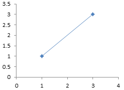
This XY chart shows the general behavior. Ymax + (Ymax – Ymin)/20 = 3.1, so the automatic maximum is the first major unit greater than this, or 3.5. Ymin is much lower than 5/6 of Ymax, so the automatic minimum is 0.
If we fix the axis major unit at 1, the automatic maximum is the first major unit greater than 3.1, or 4. The minimum is unchanged.

If we fix the axis major unit at 0.25, the automatic maximum is the first major unit greater than 3.1, or 3.25. The minimum is unchanged.

If we fix the axis major unit at 0.1, the automatic maximum is the first major unit greater than 3.1, or 3.2. The minimum is unchanged.
If we fix the axis minimum at 2, Ymax + (Ymax – Ymin)/20 changes to 3.05. If we keep the axis major unit at 0.1, so the automatic maximum is the first major unit greater than 3.05, or 3.1.

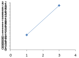
If Ymin is less than 5/6 of Ymax, the automatic minimum is zero. I carried this to the extreme of 2.49999999999999, the maximum digits used by Excel, just to test the accuracy of the stated percentage in the MSDN articles.

If Ymin is exactly 5/6 of Ymax, the automatic minimum is not longer zero, but is instead the first major unit below Ymin – (Ymax – Ymin)/20. The difference between this minimum and the minimum in the above chart is drastic, given the minor change in Ymin.

It’s useful to understand Excel’s automatic axis scaling rules. It also is good to know how to compute your own axis scale parameters. Upcoming posts will show user defined functions in VBA and worksheet formulas to compute axis scale parameters.
More Axis Scale Articles
- Calculate Nice Axis Scales with LET and LAMBDA
- Calculate Nice Axis Scales in Your Excel Worksheet
- Calculate Nice Axis Scales in Excel VBA
- Chart UDF to Control Axis Scale
- How Excel Calculates Automatic Chart Axis Limits
- Reciprocal Chart Axis Scale
- Custom Axis Labels and Gridlines in an Excel Chart
- Custom Axis, Y = 1, 2, 4, 8, 16
- Logarithmic Axis Scales
- Link Excel Chart Axis Scale to Values in Cells
- Consistent Axis Scales Across Multiple Charts
- Gantt Chart with Nice Date Axis
- Select Meaningful Axis Scales
- Bar Chart Value Axis Scale Must Include Zero