Text Labels on a Horizontal Bar Chart in Excel - Peltier Tech (original) (raw)
Tuesday, December 21, 2010
Peltier Technical Services, Inc., Copyright © 2025, All rights reserved.
When analyzing survey results, for example, there may be a numerical scale that has associated text labels. This may be a scale of 1 to 5 where 1 means “Completely Dissatisfied” and 5 means “Completely Satisfied”, with other labels in between. The data can be plotted by value, but it’s not obvious how to place the text labels on the chart in place of the numerical labels on the horizontal axis.

There are several ways to accomplish this task. In this tutorial I’ll show how to use a combination bar-column chart, in which the bars show the survey results and the columns provide the text labels for the horizontal axis. The steps are essentially the same in Excel 2007 and in Excel 2003. I’ll show the charts from Excel 2007, and the different dialogs for both where applicable.
Let’s assume the following dummy survey results. I’ve sorted the list in reverse order to work around the phenomenon described in Why Are My Excel Bar Chart Categories Backwards?
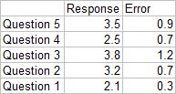
Plot the responses for each question (the first two columns of the data) in a clustered bar chart, and use the Error column as custom error bar values.

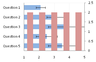
So far so good, except that the end cap of the Question 3 upper error bar is apparently hidden by the plot area border (it appears properly in 2003). Note that I’ve violated the first rule of bar chart value axis scales, which is that The Axis Scale Must Include Zero. However, the minimum possible score here is 1, and we’ll be using text labels. In our chart, fixing the scale at 1 to 5 makes sense.
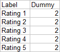
Here is the data for the text labels. Rating 1 may stand for “Totally Lame” and Rating 5 for “Totally Awesome”. I chose the Dummy values of 2 just so the data would show up in the chart.
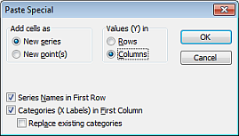
Copy this table above, select the chart, and use Paste Special to add the data to the chart using the settings below (the Excel 2007 dialog is very much like this Excel 2003 dialog).
We now have two sets of bars in the chart.
Right click on the new series, choose “Change Chart Type” (“Chart Type” in 2003), and select the clustered column style.
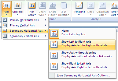
In Excel 2003 the chart has a Ratings labels at the top of the chart, because it has secondary horizontal axis. Excel 2007 has no Ratings labels or secondary horizontal axis, so we have to add the axis by hand. On the Excel 2007 Chart Tools > Layout tab, click Axes, then Secondary Horizontal Axis, then Show Left to Right Axis.
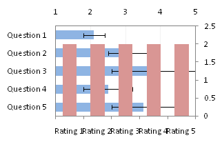
Now the chart has four axes.
We want the Rating labels at the bottom of the chart, and we’ll place the numerical axis at the top before we hide it. In turn, select the left and right vertical axes.
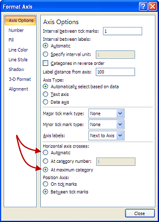
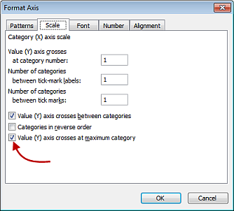
In the Excel 2007 Format Axis dialog, the left axis will be set so the horizontal axis crosses at the automatic setting, and the right axis so the horizontal axis crosses at the maximum category. Switch the settings of the left and right axes.
In the Excel 2003 Format Axis dialog, the maximum category checkbox checked for the right axis and unchecked for the left axis. Change the setting for each vertical axis.
Now we have the axes where we want them.
Hide the dummy series by setting its fill color to no fill.
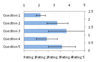
Hide the top and right axes by selecting “None” for axis tick marks and tick labels, and “No Line” for the axis line itself.
The Rating labels are not properly aligned, but this is easy to fix.
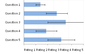
Format the horizontal axis, and in Excel 2007 change the Position Axis setting of the vertical axis from “Between Tick Marks” to “On Tick Marks”.

In the Excel 2003 Format Axis dialog, uncheck the “Value Axis Crosses Between Categories” checkbox.

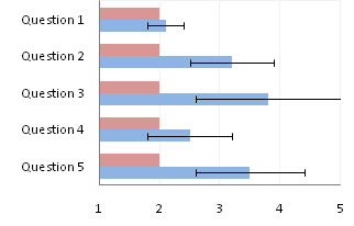
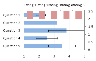
Finally we have our chart with text labels along the survey response (horizontal) axis.
I noted before that the error bar cap is not obscured in Excel 2003, and here’s proof.

See Text Labels on a Vertical Column Chart in Excel to see how to get the text labels onto the vertical axis of a column chart.
