⚓ T216032 Adjust new article invite for out of beta graduation (original) (raw)
Adjust new article invite for out of beta graduation
- Edit Task
- Edit Related Tasks...
- Create Subtask
- Edit Parent Tasks
- Edit Subtasks
- Merge Duplicates In
- Close As Duplicate
- Edit Related Objects...
- Edit Commits
- Edit Mocks
- Mute Notifications
- Protect as security issue
- Award Token
- Flag For Later
Currently an invite is shown for users trying to create an article. The invite lets them know that Content translation beta feature exists, and encourages to try it.
As Content translation graduates out of beta we want to still let editors know that translating is an alternative available for them. We want also to update the approach to, while still informing users, make the experience less distracting for users not interested in the tool.
Proposed solution
In order to achieve this, we want the updated invite to follow these considerations:
- Not getting in the way of the default action. The invite is shown at the bottom of the viewport to avoid covering the main information of the page. It provides an alternative displayed after the UI for the default path (starting from scratch) is shown. In addition, as the user starts typing, the invite becomes more compact (understanding that the user preferred to start from scratch).
- Shown only once. Now that Global preferences are available, we can make sure that once the user replied once (accepting or closing), the user will not see the invite again for any other language.
- Shown only to multilingual users. Compact language links allow us to know if a user has navigated across languages. That can be used to show the invite only to users that have accessed more than one language.
- Don't show to existing Content translation users. If the user has ever started a translation they already know the tool and we don't need to show the invite.
- Don't show if it is the very first time for the user in the editor. The first time the user access the editor other welcome messages and tutorials appear and we don't want to interfere with those.
This interactive user flow illustrates the proposal.
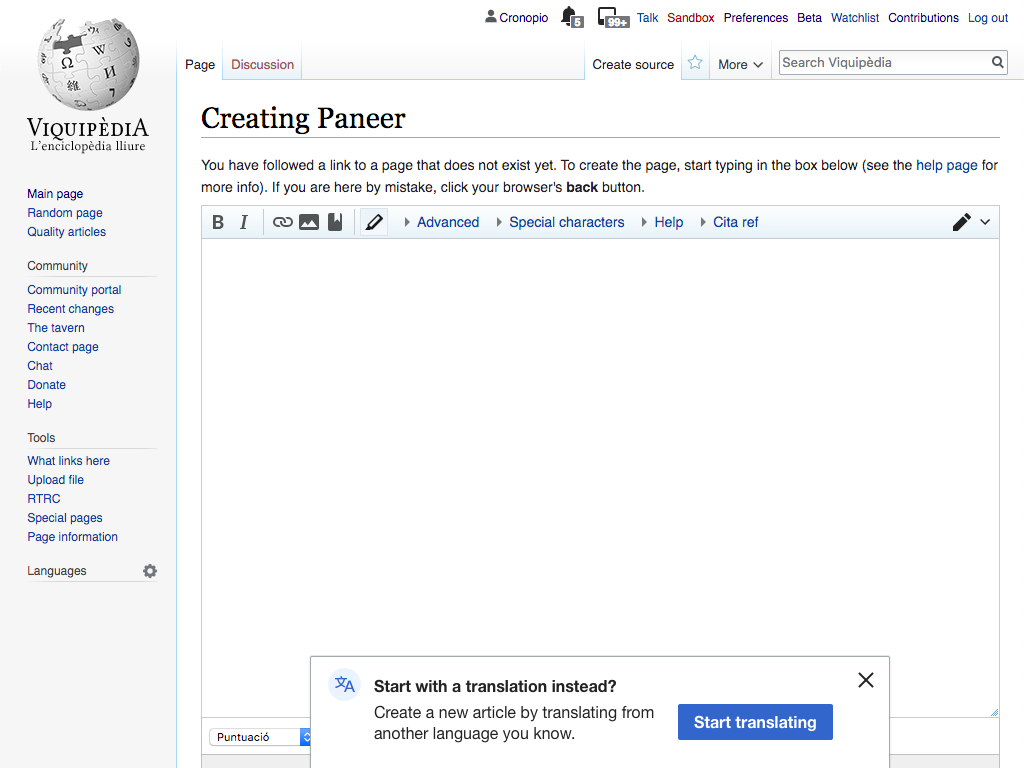
Invite at the bottom of the new article page
When users start to create a new page, if the above considerations are met, a non-blocking dialog appears at the bottom of the viewport.
| Invite | Translation dashboard |
|---|---|
 |
 |
The dialog shows the following text:
Start with a translation instead?
Create a new article by translating from another language you know.
[Start translating]
- The dialog will appear with a transition for both opacity (going from transparent to opaque), and vertical position (moving 40px from the bottom with an ease-out acceleration). The transition will take 0.25s and will start with a 0.5s of delay.
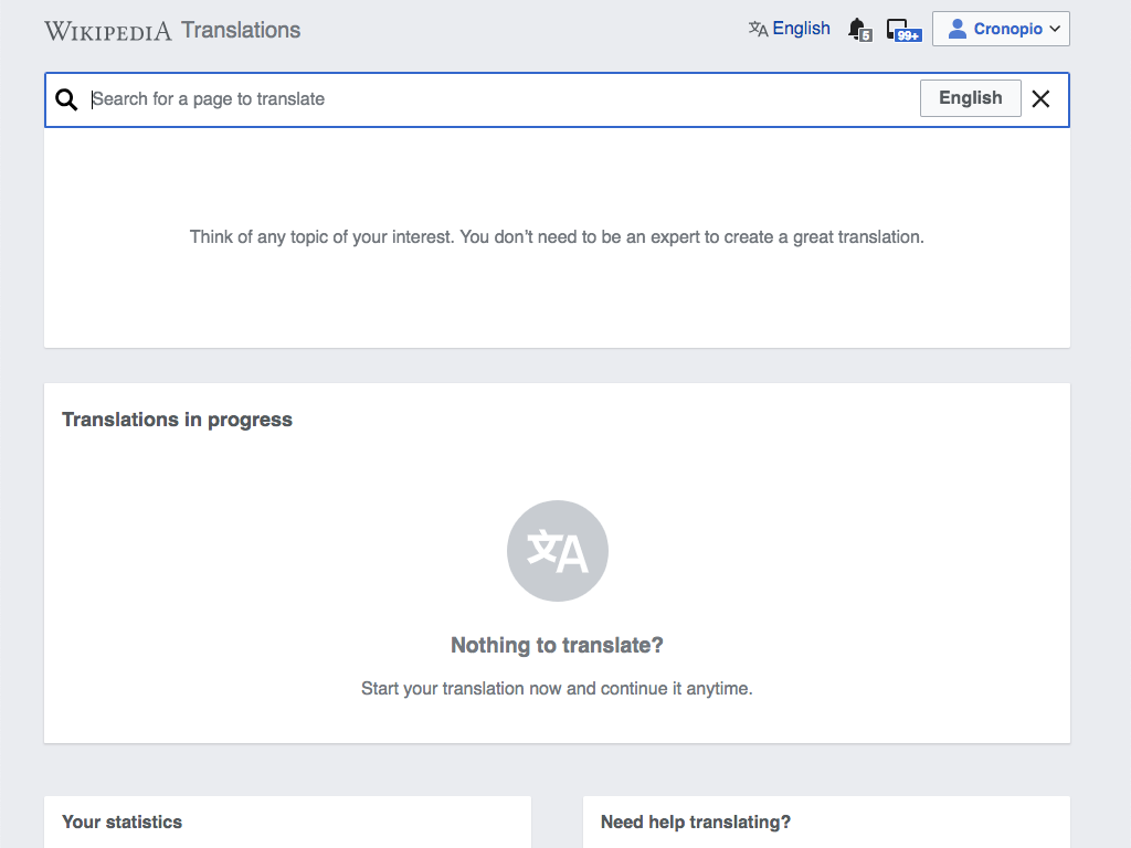
- The "Start translating" action will lead the user to the Content translation dashboard with the search box ready to start a new translation.
- The "Start translating" action will also activate the future invite to the "Contributions" page (which is covered in a separate ticket: T216498).
- The "X" close icon will discard the dialog.
- Either of the above options (accept or close) will make the dialog not to appear again for the user in the future, on any language.
Compact when typing
If users starts typing, the invite will become compact to (a) show only the first line of text, and (b) make the button frameless. Supporting the change with a transition will make it more fluent.
| Expanded version (default) | Compact version (when the user types) |
|---|---|
 |
 |
Follow-ups
This ticket captures the basic approach. There are two follow-up improvements that are supported by separate tickets:
T216500: Surface the specific article for the translation if we can guess it.
T216498: Show an invite for users to discover the contributions page.
T229419: The "Start translating" action will lead the user to the Content translation dashboard with the search box ready to start a new translation
Event Timeline
Note that we may need to also hint that users can start a translation anytime from the Contributions page (e.g., a welcome screen may be needed when users land in Content translation)
and using that, I get
Reusing is great, but I'm not sure I understand all the implications. Can you detail a bit more which are the aspects from the spec above that cannot be supported with the approach you propose? From the example it is not completely clear where do you propose the Popup to appear, how does it appear, which contents does it accept and what happens when scrolling.
Some thoughts that may help:
- Making the panel less prominent as the user types can be skipped initially, and reconsider for future iterations if needed.
- The layout of the information and the illustration inside the panel is important to keep. From the link and example it is not clear if the PopupWidget supports more than plain text.
- the transition used for the element to appear plays also an important role in catching the user attention.
- A panel appearing at the bottom is a useful pattern that we plan to use again in future designs. Maybe contributing it to OOUI could be considered.
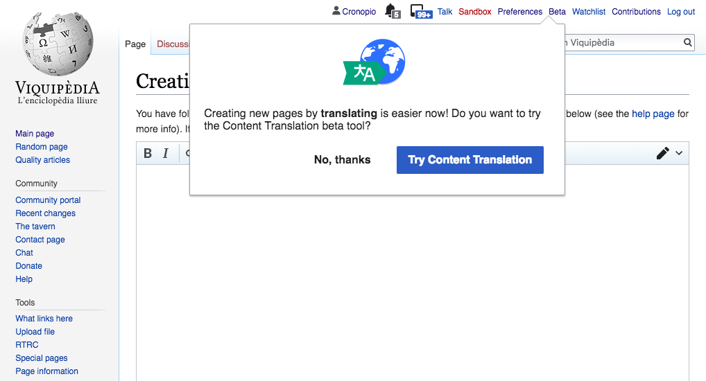
Screenshots from above patch:
| After page load | On any keypress in the screen |
|---|---|
 |
 |
TODO:
- Shown only for multilingual users - Need to find out this , preferably from server side so that we don't send unwanted code to browser
- Don't show to existing Content translation users. - Need to find out this , from server side
- Don't show if it is the very first time for the user in the editor. - No idea how to find out this.
Also:
The dialog will appear with a transition for both opacity (going from transparent to opaque), and vertical position (moving 40px from the bottom with an ease-out acceleration). The transition will take 0.25s and will start with a 0.5s of delay.
There is a non customizable transition for OOUI widget(https://doc.wikimedia.org/oojs-ui/master/js/source/PopupWidget.html#OO-ui-PopupWidget-method-setSize) - I did not bother to change that to the specification above.
@Pginer-WMF, can you confirm this is fine to leave out? 510710 does not implement the transitions specified in the description.
There is another spec not completed, but that is better to be done in a follow up, since dashboard needs to be updated to support the usecase (having search box open when landing on CX dashboard):
The "Start translating" action will lead the user to the Content translation dashboard with the search box ready to start a new translation.
Thanks for pinging, @Petar.petkovic. Comments below:
Also:
The dialog will appear with a transition for both opacity (going from transparent to opaque), and vertical position (moving 40px from the bottom with an ease-out acceleration). The transition will take 0.25s and will start with a 0.5s of delay.
There is a non customizable transition for OOUI widget(https://doc.wikimedia.org/oojs-ui/master/js/source/PopupWidget.html#OO-ui-PopupWidget-method-setSize) - I did not bother to change that to the specification above.
@Pginer-WMF, can you confirm this is fine to leave out? 510710 does not implement the transitions specified in the description.
Yes. It is ok, to use the component default transition. I'll review when it is available and create a follow-up ticket if needed.
There is another spec not completed, but that is better to be done in a follow up, since dashboard needs to be updated to support the usecase (having search box open when landing on CX dashboard):
The "Start translating" action will lead the user to the Content translation dashboard with the search box ready to start a new translation.
Also makes sense. Let's see how the workflow feels in practice and create follow-up tickets as needed.
Content licensed under Creative Commons Attribution-ShareAlike (CC BY-SA) 4.0 unless otherwise noted; code licensed under GNU General Public License (GPL) 2.0 or later and other open source licenses. By using this site, you agree to the Terms of Use, Privacy Policy, and Code of Conduct. · Wikimedia Foundation · Privacy Policy · Code of Conduct · Terms of Use · Disclaimer · CC-BY-SA · GPL · Credits

