Plotly (original) (raw)
Read more about plotly.js features
Sophisticated chart types
plotly.js abstracts the types of statistical and scientific charts that you would find in packages like matplotlib, ggplot2, or MATLAB.
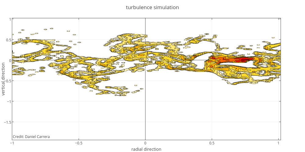
d3.json('https://plotly.com/~DanielCarrera/13.json', function(figure){
                  var trace = {
                    x: figure.data[0].x, y: figure.data[0].y, z: figure.data[0].z,
                    type: 'contour', autocolorscale: false,
                    colorscale: [[0,"rgb(  0,  0,  0)"],[0.3,"rgb(230,  0,  0)"],[0.6,"rgb(255,210,  0)"],[1,"rgb(255,255,255)"]],
                    reversescale: true, zmax: 2.5, zmin: -2.5
                  };
                  var layout = {
                    title: 'turbulence simulation',
                    xaxis: {title: 'radial direction', showline: true, mirror: 'allticks', ticks: 'inside'},
                    yaxis: {title: 'vertical direction', showline: true, mirror: 'allticks', ticks: 'inside'},
                    margin: {l: 40, b: 40, t: 60},
                    annotations: [{
                      showarrow: false,
                      text: 'Credit: Daniel Carrera',
                      x: 0, y: 0, xref: 'paper', yref: 'paper'
                    }]
                  }
                  Plotly.newPlot(document.getElementById('contour-plot'), [trace], layout, {showLink: false});
                });
Fully customizable
plotly.js charts are described declaratively as JSON objects. Every aspect of the charts, such as colors, grid lines, and the legend, has a corresponding set of JSON attributes.
d3.csv('https://raw.githubusercontent.com/plotly/datasets/master/wind_speed_laurel_nebraska.csv', function(rows){
                    var trace = {
                      type: 'scatter',                    // set the chart type
                      mode: 'lines',                      // connect points with lines
                      x: rows.map(function(row){          // set the x-data
                        return row['Time'];
                      }),
                      y: rows.map(function(row){          // set the x-data
                        return row['10 Min Sampled Avg'];
                      }),
                      line: {                             // set the width of the line.
                        width: 1
                      },
                      error_y: {
                        array: rows.map(function(row){    // set the height of the error bars
                          return row['10 Min Std Dev'];
                        }),
                        thickness: 0.5,                   // set the thickness of the error bars
                        width: 0
                      }
                    };

                    var layout = {
                      yaxis: {title: "Wind Speed"},       // set the y axis title
                      xaxis: {
                        showgrid: false,                  // remove the x-axis grid lines
                        tickformat: "%B, %Y"              // customize the date format to "month, day"
                      },
                      margin: {                           // update the left, bottom, right, top margin
                        l: 40, b: 10, r: 10, t: 20
                      }
                    };

                    Plotly.newPlot(document.getElementById('wind-speed'), [trace], layout, {showLink: false});
                });
High performance
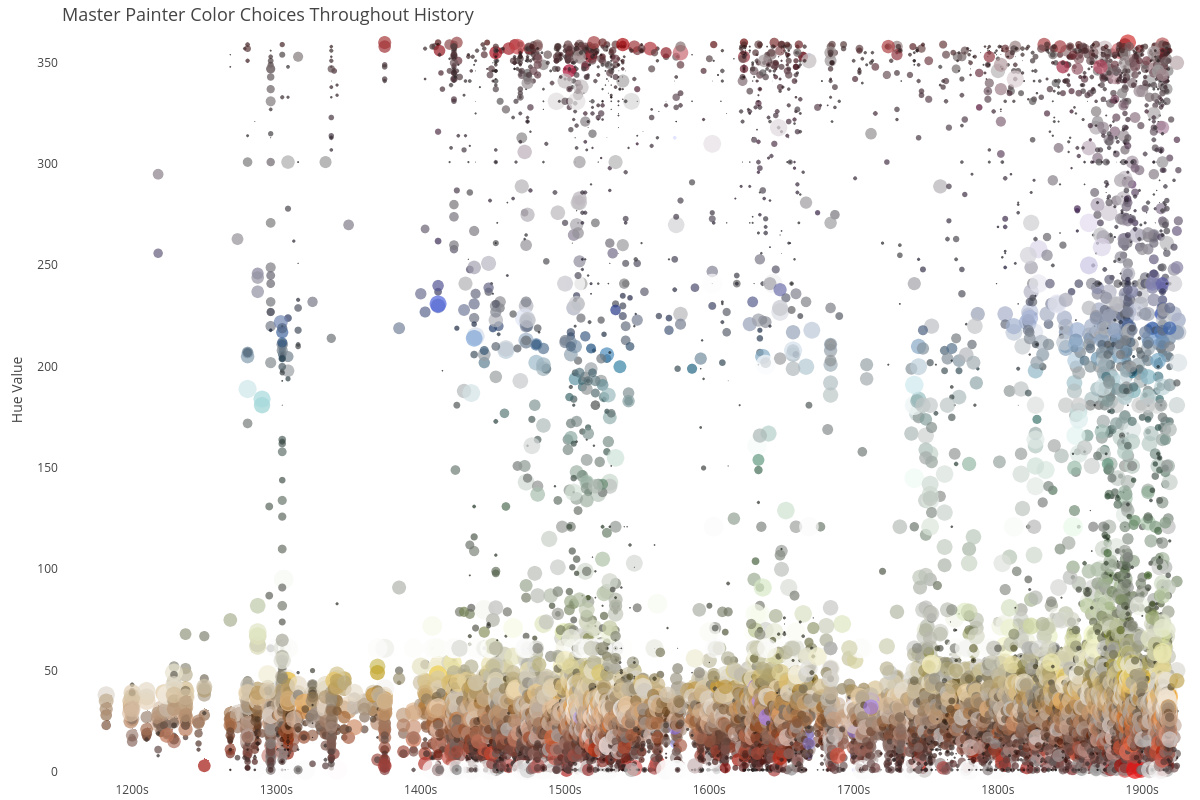
This chart was drawn with the plotly.js chart type scattergl. scattergl charts render an order of magnitude faster than their SVG counterparts.
Universal
By abstracting charts to a declarative JSON structure, plotly.js is used as a browser-based charting library for Python, R, MATLAB.

