The spatial pattern of exocytosis and post-exocytic mobility of synaptopHluorin in mouse motor nerve terminals - PubMed (original) (raw)
The spatial pattern of exocytosis and post-exocytic mobility of synaptopHluorin in mouse motor nerve terminals
Michael A Gaffield et al. J Physiol. 2009.
Abstract
We monitored the spatial distribution of exo- and endocytosis at 37 degrees C in mouse motor nerve terminals expressing synaptopHluorin (spH), confirming and extending earlier work at room temperature, which had revealed fluorescent 'hot spots' appearing in repeatable locations during tetanic stimulation. We also tested whether hot spots appeared during mild stimulation. Averaged responses from single shocks showed a clear fluorescence jump, but revealed no sign of hot spots; instead, fluorescence rose uniformly across the terminal. Only after 5-25 stimuli given at high frequency did hot spots appear, suggesting a novel initiation mechanism. Experiments showed that about half of the surface spH molecules were mobile, and that spH movement occurred out of hot spots, demonstrating their origin as exocytic sources, not endocytic sinks. Taken together, our results suggest that synaptic vesicles exocytose equally throughout the terminal with mild stimulation, but preferentially exocytose at specific, repeatable locations during tetanic stimulation.
Figures
Figure 3. Locations of spH added during mild stimulation are not predicted by high frequency trains
A, raw fluorescence intensity (a.u.) for a single trial is plotted for each frame before photobleaching correction. B, boxed region shown in panel A corrected for photobleaching (see Methods) and plotted. Sixty frames are shown with each stimulation frame indicated by a filled circle. Shocks were delivered at points indicated by vertical grey lines. C, average fluorescence change (a.u.) is plotted versus time for a single shock. The six repeated frames were averaged for the 100 repeats in a trial. The shock was delivered at the arrow. Data represent an average of 8 trials. D, left: average fluorescence change in response to one shock (100 repeats at 0.67 Hz). Note the even colour distribution of mostly greens and yellows. Right: average fluorescence change in response to 3000 shocks at 100 Hz. Colour bar indicates fluorescence in a.u. Here the hot spots are clearly identifiable by the dark red colour. Scale bar = 3 μm. E, pixels were separated into deciles based on spH fluorescence changes after a 30 s, 100 Hz stimulation as in Fig. 1_D_ (train 1). Those same locations were followed during a second stimulation of 100 shocks at 0.67 Hz. Filled circles indicate the average response to a single shock in each of the deciles. Open circles indicate the response in a control frame where no stimulation was delivered. The dashed lines are the terminal averages for either control or stimulation frames. The top nine deciles (or top 90% of spH increase in the terminal) showed a significant increase in fluorescence compared to controls (P < 0.05, Student's t test) while none of these nine deciles showed a significant difference from one another. n = 13 trials. F and G, similar plots to Fig. 2, but for one and five shocks, respectively. The deciles were determined as before. Train 2 is now an average of 100 trains of either one or five shocks (100 Hz) with each train separated by 1.5 s. Data are plotted as filled circles. The grey lines indicate the expected train 2 responses if 100 or 500 shocks were delivered at 100 Hz, then scaled down to match average intensity levels for either one or five shocks (dotted lines). n = 13 trials for 1 shock and 11 trials for 5 shocks. H, hot spot (HS) prediction factor is plotted for each of the stimulation durations shown in Fig. 2 and panels F and G. HS prediction factor was calculated by comparing the observed result to both an equal distribution (E in panel F) and to that predicted by train 1 (P in panel F) for each decile. These differences were then squared, and summed for the top nine deciles using the equation shown. Note the number of shocks axis is plotted on a logarithmic scale.
Figure 5. spH exocytosed during stimulation is mobile on the surface before being endocytosed
A, resting terminal FRAP. Average fluorescence as a fraction of initial level is plotted versus time. After 8 control images, a resting terminal was bleached then allowed to recover. The continuous line shows the single exponential best fit. The mobile fraction was 41.2 ± 5.3%. n = 16 trials. B, average fluorescence levels (arbitrary units, a.u.) are plotted over time. A 10 s, 100 Hz train (horizontal bar) was delivered after collecting control frames. A single, small (∼2.25 μm diameter) circle in the terminal was bleached at the end of stimulation (region plotted as open circles) while the rest of the terminal was used as a control (filled circles). The expected recovery curve based on control data (panel A, see Methods) predicts the observed data with reasonable accuracy. Three parameters from eqn (1) (used to model recovery, see Methods) are also shown: _F_s, fluorescence at end of stimulation; _F_o, fluorescence in bleached region after bleach; _F_e, fluorescence in unbleached region after completion of endocytosis and reacidification. n = 11 trials. C, data from panel B are plotted (open circles and grey line). A somewhat better fit (black line) is obtained by assuming that 60% of the added spH was mobile (as opposed to 41% from panel A). The dashed lines show the limits of the model. D, data from panel B (open circles) are plotted. The continuous line is the prediction based on 60% of added spH being mobile (cf. panel C), and 53% of the retrieved spH being from the mobile pool. While these modest changes improved slightly the quality of fit, the simplest assumptions of equal behaviour of surface and added spH, and indiscriminate retrieval of mobile and immobile spH seem probable. The dashed lines show the limits of the model.
Figure 6. spH recovery is faster at hot spots and slower in surrounding areas
A, left: difference image showing the fluorescence change after a 30 s, 100 Hz stimulation. Right: hot spots are outlined with continuous lines, which enclose all pixels at least 75% as bright as the brightest pixel in the hot spot. Surrounds (dotted lines) outline regions three pixels from the edge of a hot spot yet still contained within the terminal. Scale bar = 2 μm. B, average fluorescence change as a percentage of initial fluorescence levels during a 30 s stimulus train (at 100 Hz) beginning at t = 0. For this and subsequent panels, filled circles mark hot spots and open circles mark surrounds. n = 28 spots from 5 terminals. C, raw fluorescence recovery (arbitrary units, a.u.) after stimulation for hot spots and surround are plotted versus time with stimulation ending at time = 0 and initial fluorescence levels set to 0. D, same as panel C except relative recovery is plotted as a fraction of total fluorescence added during the stimulation. E, triangles show excellent linear relation between fluorescence recovery half times of whole terminals as a function of fluorescence change after different amounts of stimulation (50, 100, 200, 500 and 3000 shocks, from left to right, all at 100 Hz; n > 5 trials per duration). Data for hot spots (filled circle) show a faster recovery rate, while data from surrounds (open circle) show a slower recovery rate than predicted from whole terminal data (grey line).
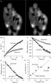
Figure 1. spH hot spots appear during prolonged stimulation
A, left, middle: masked intensity images showing spH difference levels after the end of a first and second 30 s, 100 Hz stimulation, respectively. Right: overlay for the two trials with train 1 pseudocoloured as red and train 2 pseudocoloured as green. Scale bar = 2 μm. B, correlation plot of fluorescence changes (in arbitrary units, a.u.). Train 1 (left panel in A) is plotted versus train 2 (middle panel in A) delivered 15 min later. The red line is a linear best fit with the intercept set to zero and a slope of 1.04; the black line is identity. C, same response to a train as shown in the left panel in A, but now coloured according to each pixel's relative spH intensity change. The top 10% of responding pixels are coloured in dark red (100), the next 10% in red, and so on for each decile down to 10 (indicated by colour bar). D, change in fluorescence is plotted for each decile. Fluorescence changed the most in the 100% decile, corresponding to the dark red pixels in panel C. n = 12 trials.
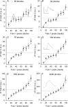
Figure 2. spH accumulates in predictable locations throughout high frequency trains
Pixels were separated into deciles based on spH fluorescence changes after a 30 s, 100 Hz stimulation (train 1). Those same locations were followed during a second, identical stimulation delivered 15 min later. Each plot shows the average change in spH fluorescence (arbitrary units, a.u.) in response to the second stimulation (train 2) after 25, 50, 75, 100, 500 and 3000 shocks (filled circles in A–F, respectively). For comparison, the fluorescence changes in response to train 1 for the same number of shocks are also plotted (grey lines), after normalizing to the overall slight difference in average fluorescence change in train 2 (dotted lines). n = 16 trials. Insets in B, D and F: examples of raw fluorescence traces averaged for a whole terminal stimulated just for the number of shocks listed. Vertical and horizontal scale lines indicate 10 a.u. and 5 s, respectively.
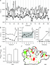
Figure 4. Locations of spH release from single shocks are not predictable
A, fluorescence (a.u.) is plotted for two different pixels for a subset of the total frames (4 Hz imaging rate). A single shock was delivered immediately before every sixth frame (vertical grey lines). Control frames are shown as circles and stimulation frames as squares. The filled symbol trace has been offset for clarity. B, fluorescence (a.u.) plotted for the same two pixels shown in panel A. The average response to the single shock (indicated by arrow) is apparent in frame 6. The filled symbol trace has been offset for clarity. C, the fraction of positive slopes to total trials is plotted for each frame for the two pixels in panel A. The grey area represents the space occupied by 3 standard deviations from the mean fraction of positive slopes. Only the frame immediately after the stimulation (arrow) lies outside of this region. These pixels were defined as hot pixels. Note that Frame 1 is the step from frame 6 to frame 1. D, number of hot pixels per terminal was averaged per trial and plotted for three different stimulation durations for hot pixels identified by either control (filled circles) or by stimulation frames (open circles). A significant number of hot pixels was found in the stimulation frames as compared to controls for 1 and 2 shocks (P < 0.05; Student's t test). Considerable variation prevented significance in the 5 shock data. n = 11, 7 and 8 trials for 1, 2 and 5 shocks, respectively. E, the fluorescence change during a 30 s, 100 Hz train was monitored in two different regions of interest (ROIs): hot pixels (identified as in panel D), and hot spots (as identified using the 100% decile from a prior 30 s, 100 Hz train). Results are plotted as a fraction of the average fluorescence change for the whole terminal (Δ_F_Total). The average fluorescence change in identified hot pixels was slightly, but not significantly more than the terminal average (ratio = 1.11 ± 0.12; P = 0.198, Student's t test). In contrast, the pixels identified as the 100% decile showed a significantly larger fluorescence change compared to the hot pixels (82.2 ± 25.9% more fluorescence; P < 0.05, Student's t test). n = 6 trials. F, terminal representative of typical hot spot and hot pixel locations. The terminal is outlined in black. Red pixels represent locations of the 100% decile (hot spots) and the green pixels represent hot pixel locations (collected from two runs each of 100 × 1, 100 × 2, and 100 × 5 shocks). Note the lack of overlay between hot spots and hot pixels (just a few yellow pixels). Scale bar = 2 μm.
Similar articles
- Preferred sites of exocytosis and endocytosis colocalize during high- but not lower-frequency stimulation in mouse motor nerve terminals.
Gaffield MA, Tabares L, Betz WJ. Gaffield MA, et al. J Neurosci. 2009 Dec 2;29(48):15308-16. doi: 10.1523/JNEUROSCI.4646-09.2009. J Neurosci. 2009. PMID: 19955383 Free PMC article. - Monitoring synaptic function at the neuromuscular junction of a mouse expressing synaptopHluorin.
Tabares L, Ruiz R, Linares-Clemente P, Gaffield MA, Alvarez de Toledo G, Fernandez-Chacón R, Betz WJ. Tabares L, et al. J Neurosci. 2007 May 16;27(20):5422-30. doi: 10.1523/JNEUROSCI.0670-07.2007. J Neurosci. 2007. PMID: 17507564 Free PMC article. - [Vesicle cycle in the presynaptic nerve terminal].
Zefirov AL. Zefirov AL. Ross Fiziol Zh Im I M Sechenova. 2007 May;93(5):544-62. Ross Fiziol Zh Im I M Sechenova. 2007. PMID: 17650622 Russian. - A pre-synaptic to-do list for coupling exocytosis to endocytosis.
Ryan TA. Ryan TA. Curr Opin Cell Biol. 2006 Aug;18(4):416-21. doi: 10.1016/j.ceb.2006.06.013. Epub 2006 Jun 27. Curr Opin Cell Biol. 2006. PMID: 16806881 Review. - Molecular mechanisms of presynaptic membrane retrieval and synaptic vesicle reformation.
Kononenko NL, Haucke V. Kononenko NL, et al. Neuron. 2015 Feb 4;85(3):484-96. doi: 10.1016/j.neuron.2014.12.016. Neuron. 2015. PMID: 25654254 Review.
Cited by
- Different dynamin blockers interfere with distinct phases of synaptic endocytosis during stimulation in motoneurones.
Linares-Clemente P, Rozas JL, Mircheski J, García-Junco-Clemente P, Martínez-López JA, Nieto-González JL, Vázquez ME, Pintado CO, Fernández-Chacón R. Linares-Clemente P, et al. J Physiol. 2015 Jul 1;593(13):2867-88. doi: 10.1113/JP270112. Epub 2015 Jun 10. J Physiol. 2015. PMID: 25981717 Free PMC article. - Presynaptic mechanisms controlling calcium-triggered transmitter release at the neuromuscular junction.
Dittrich M, Homan AE, Meriney SD. Dittrich M, et al. Curr Opin Physiol. 2018 Aug;4:15-24. doi: 10.1016/j.cophys.2018.03.004. Epub 2018 Mar 17. Curr Opin Physiol. 2018. PMID: 30272045 Free PMC article. - Presynaptic Mitochondria Communicate With Release Sites for Spatio-Temporal Regulation of Exocytosis at the Motor Nerve Terminal.
Lopez-Manzaneda M, Fuentes-Moliz A, Tabares L. Lopez-Manzaneda M, et al. Front Synaptic Neurosci. 2022 May 12;14:858340. doi: 10.3389/fnsyn.2022.858340. eCollection 2022. Front Synaptic Neurosci. 2022. PMID: 35645766 Free PMC article. - Evaluation of a novel calcium channel agonist for therapeutic potential in Lambert-Eaton myasthenic syndrome.
Tarr TB, Malick W, Liang M, Valdomir G, Frasso M, Lacomis D, Reddel SW, Garcia-Ocano A, Wipf P, Meriney SD. Tarr TB, et al. J Neurosci. 2013 Jun 19;33(25):10559-67. doi: 10.1523/JNEUROSCI.4629-12.2013. J Neurosci. 2013. PMID: 23785168 Free PMC article. - Coupling the Structural and Functional Assembly of Synaptic Release Sites.
Ghelani T, Sigrist SJ. Ghelani T, et al. Front Neuroanat. 2018 Oct 16;12:81. doi: 10.3389/fnana.2018.00081. eCollection 2018. Front Neuroanat. 2018. PMID: 30386217 Free PMC article. Review.
References
- Angaut-Petit D, Molgo J, Connold AL, Faille L. The levator auris longus muscle of the mouse: a convenient preparation for studies of short- and long-term presynaptic effects of drugs or toxins. Neurosci Lett. 1987;82:83–88. - PubMed
Publication types
MeSH terms
Substances
Grants and funding
- R01 NS023466/NS/NINDS NIH HHS/United States
- T32 NS007083/NS/NINDS NIH HHS/United States
- 5 T32 NS007083/NS/NINDS NIH HHS/United States
- 5 RO1 NS023466/NS/NINDS NIH HHS/United States
LinkOut - more resources
Full Text Sources
Molecular Biology Databases


