A global genetic interaction network maps a wiring diagram of cellular function - PubMed (original) (raw)
. 2016 Sep 23;353(6306):aaf1420.
doi: 10.1126/science.aaf1420.
Benjamin VanderSluis 2, Elizabeth N Koch 3, Anastasia Baryshnikova 4, Carles Pons 3, Guihong Tan 1, Wen Wang 3, Matej Usaj 1, Julia Hanchard 5, Susan D Lee 6, Vicent Pelechano 7, Erin B Styles 5, Maximilian Billmann 8, Jolanda van Leeuwen 1, Nydia van Dyk 1, Zhen-Yuan Lin 9, Elena Kuzmin 5, Justin Nelson 10, Jeff S Piotrowski 11, Tharan Srikumar 12, Sondra Bahr 1, Yiqun Chen 1, Raamesh Deshpande 3, Christoph F Kurat 1, Sheena C Li 11, Zhijian Li 1, Mojca Mattiazzi Usaj 1, Hiroki Okada 13, Natasha Pascoe 5, Bryan-Joseph San Luis 1, Sara Sharifpoor 1, Emira Shuteriqi 1, Scott W Simpkins 10, Jamie Snider 1, Harsha Garadi Suresh 1, Yizhao Tan 1, Hongwei Zhu 1, Noel Malod-Dognin 14, Vuk Janjic 15, Natasa Przulj 16, Olga G Troyanskaya 17, Igor Stagljar 18, Tian Xia 19, Yoshikazu Ohya 13, Anne-Claude Gingras 20, Brian Raught 12, Michael Boutros 8, Lars M Steinmetz 21, Claire L Moore 6, Adam P Rosebrock 5, Amy A Caudy 5, Chad L Myers 22, Brenda Andrews 23, Charles Boone 24
Affiliations
- PMID: 27708008
- PMCID: PMC5661885
- DOI: 10.1126/science.aaf1420
A global genetic interaction network maps a wiring diagram of cellular function
Michael Costanzo et al. Science. 2016.
Abstract
We generated a global genetic interaction network for Saccharomyces cerevisiae, constructing more than 23 million double mutants, identifying about 550,000 negative and about 350,000 positive genetic interactions. This comprehensive network maps genetic interactions for essential gene pairs, highlighting essential genes as densely connected hubs. Genetic interaction profiles enabled assembly of a hierarchical model of cell function, including modules corresponding to protein complexes and pathways, biological processes, and cellular compartments. Negative interactions connected functionally related genes, mapped core bioprocesses, and identified pleiotropic genes, whereas positive interactions often mapped general regulatory connections among gene pairs, rather than shared functionality. The global network illustrates how coherent sets of genetic interactions connect protein complex and pathway modules to map a functional wiring diagram of the cell.
Copyright © 2016, American Association for the Advancement of Science.
Figures
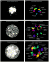
Figure 1. A global network of genetic interaction profile similarities
(A) The essential similarity network was constructed by computing Pearson correlation coefficients (PCCs) for genetic interaction profiles (edges) of all pairs of genes (nodes) in the essential genetic interaction matrix (ExE). Gene pairs whose profile similarity exceeded a PCC > 0.2 were connected and graphed using a spring-embedded layout algorithm. Genes sharing similar genetic interactions profiles map proximal to each other, whereas genes with less similar genetic interaction profiles are positioned further apart. (B) A genetic profile similarity network for the nonessential genetic interaction matrix (NxN). (C) A global genetic profile similarity network encompassing all nonessential and essential genes was constructed from the combined NxN, ExE and NxE genetic interaction matrices. (D) The essential similarity network was annotated using the Spatial Analysis of Functional Enrichment (SAFE), identifying network regions enriched for similar GO biological process terms, which are color-coded. (E) The nonessential similarity network annotated using SAFE. (F) The global similarity network annotated using SAFE.
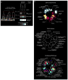
Figure 2. The global genetic interaction profile similarity network reveals a hierarchy of cellular function
(A) A schematic representation of a genetic interaction profile-derived hierarchy. Genes with highly correlated genetic interaction profiles (PCC > 0.4) form small, densely connected clusters representing specific pathways or protein complexes. At an intermediate range of profile similarity (0.2 < PCC < 0.4), sibling clusters representing distinct pathway or complexes combine together into larger biological process enriched clusters. At a lower range of profile similarity (0.05 < PCC < 0.2), bioprocess-enriched clusters, in turn, combine together to form larger clusters corresponding to different cell compartments. The grey-white scale bar illustrates enrichment of sibling clusters for the same set of terms from the indicated functional standard. See also fig. S7. (B) The genetic network hierarchy visualized using SAFE analysis, which identified regions in the global similarity network enriched for specific cellular compartments, biological processes or protein complexes.
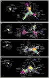
Figure 3. Genetic interaction profile similarity sub-networks
Genes belonging to the indicated biological process-enriched clusters were extracted from the global network and laid out using a spring-embedded layout algorithm. Sub-networks were annotated using SAFE to identify network regions enriched for specific protein complexes. (A) Protein complexes localized within the Protein Degradation, Mitosis & Chromosome Segregation, and DNA Replication & Repair, enriched bioprocess clusters shown in Fig. 1F. (B) Protein complexes localized within the Transcription & Chromatin Organization and mRNA Processing-enriched bioprocess clusters shown in Fig. 1F. (C) Protein complexes localized within the Glycosylation, Protein folding/Targeting, Cell Wall Biosynthesis and Vesicle Traffic-enriched bioprocess clusters shown in Fig. 1F. (D) Protein complexes localized within the MVB Sorting & pH-dependent Signaling, Cell Polarity & Morphogenesis, and Cytokinesis enriched bioprocess clusters shown in Fig. 1F.
Figure 4. Using network connectivity to explore gene function
(A) Highly connected hub genes identified either as pleiotropic (blue nodes), or functionally specific (yellow nodes), are highlighted on a schematic representation of the global similarity network. Examples of high (blue text) and low (yellow text) pleiotropy genes, grouped based on their general function, are shown. (B) Poorly characterized genes that localize within, or in the vicinity of, a specific biological process-enriched cluster on the global similarity network. For genes whose genetic interaction profile similarity to other genes does not exceed a PCC > 0.2 and would otherwise not appear on the global similarity network, an estimated position based on the most similar genes appearing in the network is indicated (*). (C) A genetic interaction profile similarity subnetwork for the uncharacterized essential gene, IPA1 (yellow node), extracted from the Transcription & Chromatin Organization enriched biological process cluster. (D) Polyadenylation profiles for a representative gene, RTG2, generated from genome-wide sequencing of mRNA purified from a wild-type strain (WT) and strains carrying TS mutations of PCF11, CFT2 or IPA1. The horizontal arrow indicates the orientation of the RTG2 open reading frame, the vertical arrows indicate the mutant, increased aberrant, 3′ mRNA cleavage and polyadenylation. (E) A genetic interaction profile similarity sub-network for MTC2, MTC4, MTC6, CSF1, DLT1 and MAY24 genes (yellow nodes) extracted from the network region in the vicinity of the Cell Polarity & Morphogenesis biological process cluster. (F) The MTC pathway genetic interaction network. Nodes are grouped according to genetic interaction profile similarity and edges represent negative (blue) and positive (yellow) interactions (genetic interaction score, |ε| > 0.08, P < 0.05). **(G)** Distribution of _ARO1_ negative (blue) and positive (yellow) genetic interactions (|ε| > 0.08, P < 0.05; gene pairs that failed to meet threshold for interactions are colored grey). Functions enriched among genes that displayed an extreme negative interaction with ARO1 are indicated and a subset of these genes is shown. Closed circles indicate members of the MTC pathway and arrows indicate amino acid permease encoding genes. (H) Representative cell images illustrating Bap2-GFP localization in wild type, _mtc2_Δ and _may24_Δ deletion mutant strains (Top panel). Vacuolar intensity (total GFP signal in the vacuole/vacuolar area) and percent of total cellular GFP present at the cell periphery (cell periphery GFP/total cellular GFP signal) were quantified for wild type cells and MTC pathway mutants (Bottom panel). Error bars indicate standard deviation from three replicate experiments. (I) Cellular uptake of 14C-labeled phenylalanine in wild type and deletion mutant strains. Error bars indicate standard deviation from three replicate experiments. (J) Metabolite levels for the indicated mutants were analyzed by full scan LC-MS (Top panel). The levels of selected metabolites are presented as log2 ratios relative to wild type cells. Schematic diagram illustrating aromatic amino acid and de novo NAD+ biosynthesis pathways (bottom panel).
Figure 5. Negative and positive genetic interactions connecting nonessential and essential genes
(A) The network density of negative (blue) and positive (yellow) genetic interactions, expressed as a fraction of all tested gene pairs, associated with nonessential and essential genes, at a defined threshold (genetic interaction score, |ε| >0.08, P < 0.05). Error bars indicate the standard deviation across multiple samplings of the alleles for essential genes, where each gene is represented by a single, randomly selected allele in each sampling. **(B)** Plots of precision versus recall (number of true positives (TP)) for negative (blue) and positive (yellow) interactions for nonessential and essential genes, as determined by our genetic interaction score (|ε| >0.08, P < 0.05). True positive interactions were defined as those involving gene pairs co-annotated to a gold standard set of GO terms. The precision and recall values were calculated as described (8). **(C)** Fold enrichment for negative (blue) and positive (yellow) genetic interactions among co-localized, co-expressed, or physically interacting, gene pairs were calculated for either nonessential or essential gene pairs. **(D)** Network density of genetic interactions within and across biological processes. The fraction of screened nonessential and essential gene pairs exhibiting negative or positive interactions, as determined by our genetic interaction score (|ε| >0.08, P < 0.05), was measured for the 17 gene sets enriched for specific biological processes, as defined in Fig. 1F. Node size reflects the fraction of interacting gene pairs observed for a given pair of biological processes. Dark blue and dark yellow nodes indicate that the frequency of interaction is significantly above random expectation. Light blue and light yellow nodes represent a frequency of interaction that is not significantly higher than random expectation. Nodes on the diagonal represent the frequency of interactions among genes belonging to the same biological process. Nodes off the diagonal represent the frequency of interactions between different biological processes.
Figure 6. Mapping negative and positive interactions across the genetic network based functional hierarchy
(A) Schematic representation of the genetic network-based functional hierarchy illustrating interactions between genes within the same complex, biological process, or cellular compartment, as well as distant interactions that span different cellular compartments. (B) The network density of genetic interactions between genes in the same cluster, at a given level of profile similarity (PCC) in the genetic network hierarchy for negative (blue) or positive (yellow) genetic interactions (genetic interaction score, |ε| > 0.08, P < 0.05). Dashed lines indicate the PCC range within which clusters in the genetic network hierarchy were enriched for cell compartments, bioprocesses, and protein complexes. **(C)** The functional distribution of all negative (blue) and all positive (yellow) interactions (|ε| > 0.08, P < 0.05) among genes in the genetic network hierarchy. The percentage of all interactions connecting nonessential gene pairs and essential gene pairs in the same clusters corresponding to a cell compartment, bioprocess or complex/pathway is shown. The combined fraction of functionally related interactions (i.e. interactions connecting genes in the same compartment, bioprocess, complex or pathway) is also indicated (*). (D) The percentage of negative (blue) and positive (yellow) interactions within a specified genetic interaction score (ε) range that connects genes belonging to the same cluster at the indicated level of the genetic network-based hierarchy. Different shades of blue and yellow correspond to levels of functional relatedness shown in (C). The white area corresponds to the fraction of interactions that connect genes in different cellular compartments (i.e. Distant).
Figure 7. Genetic interactions within and between protein complexes
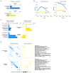
(A) The percentage of nonessential and essential complexes whose members were enriched for genetic interactions with each other and biased (i.e. coherent) for either mostly negative (blue) or mostly positive (yellow) interactions. (B) The percentage of nonessential-nonessential, essential-essential or essential-nonessential complex-complex pairs found to be enriched for genetic interactions and biased (i.e. coherent) for either mostly negative (blue) or mostly positive (yellow) interactions. Black dashed lines indicate the background rate of coherent genetic interaction enrichment within individual complexes or between pairs of protein complexes. Error bars indicate the standard deviation across multiple samplings of the alleles for essential genes, where each gene is represented by a single, randomly selected allele in each sampling.
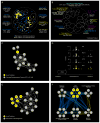
Figure 8. Functional wiring diagrams for specific protein complexes
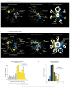
(A) Genetic interaction map for the ORC (Origin Recognition Complex) (i) Regions of the global similarity network significantly enriched for genes exhibiting negative (blue) or positive (yellow) genetic interactions with ORC members were mapped using SAFE. (ii) Protein complexes that showed coherent negative or positive genetic interactions with ORC were placed on a schematic representation of the global similarity network based on the average genetic interaction profile similarity of the complex and connected with blue or yellow edges, respectively. (iii) A subset of protein complexes from (ii) that showed coherent negative (blue) or positive (yellow) genetic interactions with genes encoding the ORC are shown. (B) Genetic interaction map for the 19S proteasome. The 19S proteasome networks shown in (i–iii) were constructed are as described in (A). (C) Distribution of positive genetic interaction enrichment for protein complexes screened against the essential gene array (TSA). Protein complexes enriched for positive interactions with essential genes (yellow bars) tend to be associated with proteostasis-related functions (2.3X, P < 10−7, Fisher’s Exact Test), including the 19S and 20S proteasome subunits as well as the chaperonin-containing T-complex (CCT) and prefoldin chaperone complexes (indicated on the graph). (D) Distribution of positive vs. negative genetic interactions for protein complexes enriched for positive interactions shown in (C). Essential protein complexes that show a bias towards positive interactions, such as the ORC, RFC, and GINS, are often required for normal cell cycle progression (2X, P < 7×10⁻⁴, Fisher’s Exact Test).
Similar articles
- The genetic landscape of a cell.
Costanzo M, Baryshnikova A, Bellay J, Kim Y, Spear ED, Sevier CS, Ding H, Koh JL, Toufighi K, Mostafavi S, Prinz J, St Onge RP, VanderSluis B, Makhnevych T, Vizeacoumar FJ, Alizadeh S, Bahr S, Brost RL, Chen Y, Cokol M, Deshpande R, Li Z, Lin ZY, Liang W, Marback M, Paw J, San Luis BJ, Shuteriqi E, Tong AH, van Dyk N, Wallace IM, Whitney JA, Weirauch MT, Zhong G, Zhu H, Houry WA, Brudno M, Ragibizadeh S, Papp B, Pál C, Roth FP, Giaever G, Nislow C, Troyanskaya OG, Bussey H, Bader GD, Gingras AC, Morris QD, Kim PM, Kaiser CA, Myers CL, Andrews BJ, Boone C. Costanzo M, et al. Science. 2010 Jan 22;327(5964):425-31. doi: 10.1126/science.1180823. Science. 2010. PMID: 20093466 Free PMC article. - Integrating genetic and protein-protein interaction networks maps a functional wiring diagram of a cell.
VanderSluis B, Costanzo M, Billmann M, Ward HN, Myers CL, Andrews BJ, Boone C. VanderSluis B, et al. Curr Opin Microbiol. 2018 Oct;45:170-179. doi: 10.1016/j.mib.2018.06.004. Epub 2018 Jul 28. Curr Opin Microbiol. 2018. PMID: 30059827 Free PMC article. Review. - Systematic analysis of complex genetic interactions.
Kuzmin E, VanderSluis B, Wang W, Tan G, Deshpande R, Chen Y, Usaj M, Balint A, Mattiazzi Usaj M, van Leeuwen J, Koch EN, Pons C, Dagilis AJ, Pryszlak M, Wang ZY, Hanchard J, Riggi M, Xu K, Heydari H, San Luis BJ, Shuteriqi E, Zhu H, Van Dyk N, Sharifpoor S, Costanzo M, Loewith R, Caudy A, Bolnick D, Brown GW, Andrews BJ, Boone C, Myers CL. Kuzmin E, et al. Science. 2018 Apr 20;360(6386):eaao1729. doi: 10.1126/science.aao1729. Science. 2018. PMID: 29674565 Free PMC article. - Protein complexes are central in the yeast genetic landscape.
Michaut M, Baryshnikova A, Costanzo M, Myers CL, Andrews BJ, Boone C, Bader GD. Michaut M, et al. PLoS Comput Biol. 2011 Feb;7(2):e1001092. doi: 10.1371/journal.pcbi.1001092. Epub 2011 Feb 24. PLoS Comput Biol. 2011. PMID: 21390331 Free PMC article. - A systems-biology approach to modular genetic complexity.
Carter GW, Rush CG, Uygun F, Sakhanenko NA, Galas DJ, Galitski T. Carter GW, et al. Chaos. 2010 Jun;20(2):026102. doi: 10.1063/1.3455183. Chaos. 2010. PMID: 20590331 Free PMC article. Review.
Cited by
- Genome-wide imaging screen uncovers molecular determinants of arsenite-induced protein aggregation and toxicity.
Andersson S, Romero A, Rodrigues JI, Hua S, Hao X, Jacobson T, Karl V, Becker N, Ashouri A, Rauch S, Nyström T, Liu B, Tamás MJ. Andersson S, et al. J Cell Sci. 2021 Jun 1;134(11):jcs258338. doi: 10.1242/jcs.258338. Epub 2021 Jun 4. J Cell Sci. 2021. PMID: 34085697 Free PMC article. - DEAD-box RNA helicase Dbp4/DDX10 is an enhancer of α-synuclein toxicity and oligomerization.
Popova B, Wang D, Pätz C, Akkermann D, Lázaro DF, Galka D, Kolog Gulko M, Bohnsack MT, Möbius W, Bohnsack KE, Outeiro TF, Braus GH. Popova B, et al. PLoS Genet. 2021 Mar 3;17(3):e1009407. doi: 10.1371/journal.pgen.1009407. eCollection 2021 Mar. PLoS Genet. 2021. PMID: 33657088 Free PMC article. - The BioGRID database: A comprehensive biomedical resource of curated protein, genetic, and chemical interactions.
Oughtred R, Rust J, Chang C, Breitkreutz BJ, Stark C, Willems A, Boucher L, Leung G, Kolas N, Zhang F, Dolma S, Coulombe-Huntington J, Chatr-Aryamontri A, Dolinski K, Tyers M. Oughtred R, et al. Protein Sci. 2021 Jan;30(1):187-200. doi: 10.1002/pro.3978. Epub 2020 Nov 23. Protein Sci. 2021. PMID: 33070389 Free PMC article. - Systematic analysis of bypass suppression of essential genes.
van Leeuwen J, Pons C, Tan G, Wang ZY, Hou J, Weile J, Gebbia M, Liang W, Shuteriqi E, Li Z, Lopes M, Ušaj M, Dos Santos Lopes A, van Lieshout N, Myers CL, Roth FP, Aloy P, Andrews BJ, Boone C. van Leeuwen J, et al. Mol Syst Biol. 2020 Sep;16(9):e9828. doi: 10.15252/msb.20209828. Mol Syst Biol. 2020. PMID: 32939983 Free PMC article. - Multi-locus interactions and the build-up of reproductive isolation.
Satokangas I, Martin SH, Helanterä H, Saramäki J, Kulmuni J. Satokangas I, et al. Philos Trans R Soc Lond B Biol Sci. 2020 Aug 31;375(1806):20190543. doi: 10.1098/rstb.2019.0543. Epub 2020 Jul 13. Philos Trans R Soc Lond B Biol Sci. 2020. PMID: 32654649 Free PMC article. Review.
References
- Hartman JLt, Garvik B, Hartwell L. Principles for the buffering of genetic variation. Science. 2001;291:1001. - PubMed
Publication types
MeSH terms
Substances
Grants and funding
- R01 HG005853/HG/NHGRI NIH HHS/United States
- FDN-143265/CIHR/Canada
- FDN-143264/CIHR/Canada
- R01 GM104975/GM/NIGMS NIH HHS/United States
- R01 HG005084/HG/NHGRI NIH HHS/United States
- 294542/ERC_/European Research Council/International
LinkOut - more resources
Full Text Sources
Other Literature Sources
Molecular Biology Databases
