Global, regional, and national life expectancy, all-cause mortality, and cause-specific mortality for 249 causes of death, 1980-2015: a systematic analysis for the Global Burden of Disease Study 2015 - PubMed (original) (raw)
Comment
Global, regional, and national life expectancy, all-cause mortality, and cause-specific mortality for 249 causes of death, 1980-2015: a systematic analysis for the Global Burden of Disease Study 2015
GBD 2015 Mortality and Causes of Death Collaborators. Lancet. 2016.
Erratum in
- Department of Error.
[No authors listed] [No authors listed] Lancet. 2017 Jan 7;389(10064):e1. doi: 10.1016/S0140-6736(16)32605-8. Epub 2017 Jan 6. Lancet. 2017. PMID: 28091379 Free PMC article. No abstract available.
Abstract
Background: Improving survival and extending the longevity of life for all populations requires timely, robust evidence on local mortality levels and trends. The Global Burden of Disease 2015 Study (GBD 2015) provides a comprehensive assessment of all-cause and cause-specific mortality for 249 causes in 195 countries and territories from 1980 to 2015. These results informed an in-depth investigation of observed and expected mortality patterns based on sociodemographic measures.
Methods: We estimated all-cause mortality by age, sex, geography, and year using an improved analytical approach originally developed for GBD 2013 and GBD 2010. Improvements included refinements to the estimation of child and adult mortality and corresponding uncertainty, parameter selection for under-5 mortality synthesis by spatiotemporal Gaussian process regression, and sibling history data processing. We also expanded the database of vital registration, survey, and census data to 14 294 geography-year datapoints. For GBD 2015, eight causes, including Ebola virus disease, were added to the previous GBD cause list for mortality. We used six modelling approaches to assess cause-specific mortality, with the Cause of Death Ensemble Model (CODEm) generating estimates for most causes. We used a series of novel analyses to systematically quantify the drivers of trends in mortality across geographies. First, we assessed observed and expected levels and trends of cause-specific mortality as they relate to the Socio-demographic Index (SDI), a summary indicator derived from measures of income per capita, educational attainment, and fertility. Second, we examined factors affecting total mortality patterns through a series of counterfactual scenarios, testing the magnitude by which population growth, population age structures, and epidemiological changes contributed to shifts in mortality. Finally, we attributed changes in life expectancy to changes in cause of death. We documented each step of the GBD 2015 estimation processes, as well as data sources, in accordance with Guidelines for Accurate and Transparent Health Estimates Reporting (GATHER).
Findings: Globally, life expectancy from birth increased from 61·7 years (95% uncertainty interval 61·4-61·9) in 1980 to 71·8 years (71·5-72·2) in 2015. Several countries in sub-Saharan Africa had very large gains in life expectancy from 2005 to 2015, rebounding from an era of exceedingly high loss of life due to HIV/AIDS. At the same time, many geographies saw life expectancy stagnate or decline, particularly for men and in countries with rising mortality from war or interpersonal violence. From 2005 to 2015, male life expectancy in Syria dropped by 11·3 years (3·7-17·4), to 62·6 years (56·5-70·2). Total deaths increased by 4·1% (2·6-5·6) from 2005 to 2015, rising to 55·8 million (54·9 million to 56·6 million) in 2015, but age-standardised death rates fell by 17·0% (15·8-18·1) during this time, underscoring changes in population growth and shifts in global age structures. The result was similar for non-communicable diseases (NCDs), with total deaths from these causes increasing by 14·1% (12·6-16·0) to 39·8 million (39·2 million to 40·5 million) in 2015, whereas age-standardised rates decreased by 13·1% (11·9-14·3). Globally, this mortality pattern emerged for several NCDs, including several types of cancer, ischaemic heart disease, cirrhosis, and Alzheimer's disease and other dementias. By contrast, both total deaths and age-standardised death rates due to communicable, maternal, neonatal, and nutritional conditions significantly declined from 2005 to 2015, gains largely attributable to decreases in mortality rates due to HIV/AIDS (42·1%, 39·1-44·6), malaria (43·1%, 34·7-51·8), neonatal preterm birth complications (29·8%, 24·8-34·9), and maternal disorders (29·1%, 19·3-37·1). Progress was slower for several causes, such as lower respiratory infections and nutritional deficiencies, whereas deaths increased for others, including dengue and drug use disorders. Age-standardised death rates due to injuries significantly declined from 2005 to 2015, yet interpersonal violence and war claimed increasingly more lives in some regions, particularly in the Middle East. In 2015, rotaviral enteritis (rotavirus) was the leading cause of under-5 deaths due to diarrhoea (146 000 deaths, 118 000-183 000) and pneumococcal pneumonia was the leading cause of under-5 deaths due to lower respiratory infections (393 000 deaths, 228 000-532 000), although pathogen-specific mortality varied by region. Globally, the effects of population growth, ageing, and changes in age-standardised death rates substantially differed by cause. Our analyses on the expected associations between cause-specific mortality and SDI show the regular shifts in cause of death composition and population age structure with rising SDI. Country patterns of premature mortality (measured as years of life lost [YLLs]) and how they differ from the level expected on the basis of SDI alone revealed distinct but highly heterogeneous patterns by region and country or territory. Ischaemic heart disease, stroke, and diabetes were among the leading causes of YLLs in most regions, but in many cases, intraregional results sharply diverged for ratios of observed and expected YLLs based on SDI. Communicable, maternal, neonatal, and nutritional diseases caused the most YLLs throughout sub-Saharan Africa, with observed YLLs far exceeding expected YLLs for countries in which malaria or HIV/AIDS remained the leading causes of early death.
Interpretation: At the global scale, age-specific mortality has steadily improved over the past 35 years; this pattern of general progress continued in the past decade. Progress has been faster in most countries than expected on the basis of development measured by the SDI. Against this background of progress, some countries have seen falls in life expectancy, and age-standardised death rates for some causes are increasing. Despite progress in reducing age-standardised death rates, population growth and ageing mean that the number of deaths from most non-communicable causes are increasing in most countries, putting increased demands on health systems.
Funding: Bill & Melinda Gates Foundation.
Copyright © 2016 The Author(s). Published by Elsevier Ltd. This is an Open Access article under the CC BY license. Published by Elsevier Ltd.. All rights reserved.
Figures
Figure 1
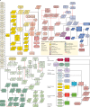
Estimation of all-cause mortality by age and sex and HIV/AIDS incidence, prevalence, and mortality for GBD 2015 Data and analyses are indicated by shape and the flow chart is colour coded by major estimation component. The process depicted is performed twice to bring in updated under-5 population estimates and crude death rates due to HIV/AIDS. The inputs that are updated in the second run of the process are shown by patterned boxes in this flow chart. Because of the very large and changing effects of HIV/AIDS on all-cause mortality in several countries with large HIV epidemics and limited data on all-cause mortality, the estimation of HIV/AIDS and all-cause mortality are closely linked and are presented jointly here. GBD=Global Burden of Disease. 5q0=probability of death from birth to age 5 years. 45q15=probability of death from age 15 to 60 years. ART=antiretroviral therapy. CBH=complete birth histories. CDR=crude death rate. COD=causes of death. DSP=disease surveillance points. ED=educational attainment in years per capita above age 15 years and mother's educational attainment in years per capita for children younger than 5 years. EPP=Estimation and Projection Package. HIV CDR=crude death rate due to HIV/AIDS. LDI=lagged distributed income per capita. SBH=summary birth history. SRS=Sample Registration System. VR=vital registration.
Figure 2
Development of the GBD 2015 cause of death database Figure shows (A) different strategies used to model different causes and to (B) combine them into a consistent set of cause-specific deaths for each location, age, sex, and year. Data and analytical processes are indicated by shape and the flow chart is colour coded by major estimation component. GBD=Global Burden of Disease. BTL=basic tabulation list. CDC=Center for Disease Control and Prevention. COD=cause of death. CODEm=Cause Of Death Ensemble model. CR=cancer registry. CRS=civil registration system. DSP=disease surveillance points. ICD=International Classification of Diseases. MI=mortality/incidence ratio. MCCD=medical certification of causes of death. MM=maternal mortality. MMR=maternal mortality ratio. MMS=maternal mortality surveillance. PAF=population-attributable fraction. SCD=survey of causes of death. SEER=Surveillance, Epidemiology, and End Results Program. SRS=Sample Registration System. SR MAD=super-region median average deviation. ST-GPR=spatiotemporal Gaussian process regression. VA=verbal autopsy. VR=vital registration. YLL=years of life lost.
Figure 3
Examples of under-5 mortality data availability and estimation (A) Percentage of global under-5 population covered by under-5 mortality data for each year, 1980–2015. The percentage of under-5 population covered was calculated by dividing the population of children aged 0–4 years in locations covered by available under-5 mortality data by the total global under-5 population. Because of lags in reporting of both vital registration data and the release of household survey or census data, the availability of data was much lower for 2014 and 2015 than for previous years. (B) Country-specific example of data and under-5 mortality estimates in Zambia, 1980–2015. The black line shows Gaussian process regression fit with 95% uncertainty interval shown in grey. Black circles denote reference data. Triangles denote complete birth history data. Inverted triangles denote summary birth history data. Transparent symbols are the data post-adjustment for non-sampling error. Hollow shapes represent data identified as outliers. (C) Percentage of global under-5 population covered by under-5 age-specific and sex-specific data for each year, 1980–2015. The percentage of under-5 population covered was calculated by dividing the population of children aged 0–4 years in locations covered by available under-5 age-specific and sex-specific data by the total global under-5 population. Because of lags in reporting both vital registration data and the release of household survey or census data, the availability of data was much lower for 2014 than for previous years, and no data existed for 2015. (D) Country-specific example of probability of female post-neonatal mortality in Bangladesh, 1980–2015. Standard Demographic and Health Surveys generally include large population samples and standard sets of questions. Special Demographic and Health Surveys can survey smaller, more targeted populations, such as women who have given birth. The black line shows probability of death, with 95% uncertainty interval shown in grey. Solid circles represent data sources. Hollow circles represent outliers. The post-neonatal period is 28–364 days.
Figure 4
Examples of adult mortality data availability and estimation (A) Percentage of global adult population covered by adult mortality data from vital registration systems, sibling survival surveys, sample registration systems, or censuses, 1980–2015. The percentage of available data was calculated by dividing the population of adults aged 15–59 years in locations covered by available adult mortality data by the total global population aged 15–49 years. Because of lags in reporting both vital registration data and the release of household survey or census data, the availability of data was much lower for 2014 than for previous years, and no data existed for 2015. Country-specific examples of (B) vital registration data and adult male mortality (45q15) estimation for a country with complete vital registration and large population (USA), 1980–2015; (C) vital registration data and adult male mortality (45q15) estimation for a country with complete vital registration and small population (Iceland), 1980–2015; and (D) sibling survival data and adult female mortality (45q15) estimation (Malawi), 1980–2015. Black line shows final estimates of adult mortality among males or females in each country, with 95% uncertainty interval shown in grey. Squares show sibling survival histories. 45q15=probability of death from age 15 years to 60 years.
Figure 5
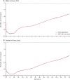
Age-specific mortality estimation with GBD life table method versus observed data excluded from the model Country-specific examples for (A) males and (B) females in France, 2011. The red line shows the GBD 2015 life table system estimates of age-specific mortality rates from birth through age 75 years in log space, compared with observed age-specific mortality (blue line). Year 2011 selected for illustration purposes. GBD=Global Burden of Disease.
Figure 6
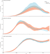
Comparisons of GBD 2015 estimates and UNAIDS 2014 estimates for Zimbabwe Country-specific example comparing estimates of deaths due to HIV/AIDS (A), new HIV infections (B), and people living with HIV/AIDS (C) in Zimbabwe from GBD 2015 and UNAIDS 2014. Curves show the estimation process of a particular country and highlight the differences in results from the GBD and UNAIDS analysis of the same prevalence data. Numbers are reported in thousands. Uncertainty intervals are shown in red and blue shading. GBD=Global Burden of Disease. UNAIDS=The Joint United Nations Programme on HIV and AIDS.
Figure 7
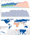
Availability and quality of cause of death data in the GBD 2015 database (A) Total deaths with a WHO-standard death certificate available in the GBD 2015 cause of death database classified by the variant of the International Classification of Diseases used for reporting. Cause of death data have been reported in national variants of ICD-8, ICD-9, and ICD-10 during the interval 1980–2015. Because of lags in reporting of both vital registration data and the release of household survey or census data, the availability of data was much lower for 2014 than for previous years and no data existed for 2015. (B) Percentage of global population covered by cause-specific data in the cause of death database for GBD 2015, 1980–2015; the percentage of available data was calculated by dividing the population of locations covered by available cause-specific data by the total global population. This figure is computed using vital registration, verbal autopsy, maternal, cancer, and injury sources. (C) Overall classification of each GBD subnational level 1 geography by availability and quality of cause of death data for the period 1980 to 2015. Countries have been assigned on the basis of the available time series of data into one of six categories. The figure uses GBD subnational level 1 geographies because subnational level 2 cannot be easily seen on a map. Extensive complete representative vital registration was defined as 25 total years or more of vital registration data with an estimated 95% completeness or above. All geographies that do not meet the threshold for extensive complete representative vital registration are classified as one of the following: limited years of complete representative vital registration, defined as 5 years or more of vital registration data with an estimated 95% completeness or above; incomplete representative vital registration, defined as at least 1 year of vital registration data with an estimated 70% completeness or above; more than 200 cause-years VA or non-representative VR, defined as more than 200 cause-years of verbal autopsy or at least 1 year of vital registration with an estimated 50% completeness or above; less than 200 cause-years of VA; or no data. Cause-years are defined as the number of years for each cause for which data are available. GBD=Global Burden of Disease. ICD=International Classification of Diseases. BTL=basic tabulation list. VA=verbal autopsy. VR=vital registration. ATG=Antigua and Barbuda. VCT=Saint Vincent and the Grenadines. LCA=Saint Lucia. TTO=Trinidad and Tobago. TLS=Timor-Leste. FSM=Federated States of Micronesia.
Figure 8
Distribution of out-of-sample model performance for CODEm models used for GBD 2015 Model performance was assessed by use of the root mean square error of the ensemble model predictions of the log of the age-specific death rates for a cause assessed with 15% of the data held out from the statistical model building. The figure shows the distribution of root mean square error across the set all models for all causes. Model performance varies substantially across causes. GBD=Global Burden of Disease. CODEm=cause of death ensemble modelling.
Figure 9
SDI quintiles by GBD subnational level 1 geography, 2015 SDI is calculated for each geography as a function of lag-dependent income per capita, average educational attainment in the population older than age 15 years, and the total fertility rate. SDI units are interpretable; a zero represents the lowest level of income per capita and educational attainment and highest total fertility rate observed during 1980–2015, whereas a one represents the highest income per capita and educational attainment and lowest total fertility rate observed in the same period. Cutoffs on the SDI scale for the quintiles have been selected on the basis of examination of the entire distribution of geographies 1980–2015. GBD=Global Burden of Disease. SDI=Socio-demographic Index. ATG=Antigua and Barbuda. VCT=Saint Vincent and the Grenadines. LCA=Saint Lucia. TTO=Trinidad and Tobago. TLS=Timor-Leste. FSM=Federated States of Micronesia.
Figure 10
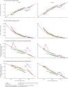
Co-evolution of life expectancy and probabilities of death with SDI globally and for GBD super-regions, 1980 to 2015 (A) Life expectancy at birth and SDI; (B) under-5 death rate (5q0) and SDI; (C) probability of death between 15 and 50 years of age (35q15) and SDI; and (D) probability of death between 50 and 70 years of age (20q50) and SDI. Coloured lines show global and super-region values. Each point in a line represents 1 year, starting at 1980 and ending at 2015. In all super-regions, SDI has increased year on year so progress in SDI is associated with later years for a given super-region. Black lines show trajectories expected for each geography on the basis of SDI alone. GBD=Global Burden of Disease. SDI=Socio-demographic Index. 5q0=probability of death from birth to age 5 years. 35q15=probability of death from age 15 years to 50 years. 20q50=probability of death from age 50 years to 70 years.
Figure 11
Global deaths due to fatal discontinuities by cause group for each year, 1980–2015 Numbers shown are total deaths. Fatal discontinuities are events that lead to abrupt changes in deaths in a geography. The causes for these fatal discontinuities include wars, natural disasters, industrial accidents, large transport accidents, epidemics, famines, or other injuries.
Figure 12
Global age-standardised death rates for males versus females, by GBD cause Level 3, 1990 and 2015 The y-axis and x-axis are shown on a log scale to enable comparisons between males and females spanning a wide range of values. Black lines show where death rates are identical for males and females. Causes that only affect one sex, including maternal disorders, chlamydia, cervical, uterine, ovarian, prostate, testicular cancers, and gynaecological diseases are not shown. GBD=Global Burden of Disease. COPD=chronic obstructive pulmonary disease. C=cancer.
Figure 13
Global decomposition of changes in leading 30 causes of death, 2005 to 2015 Changes due to population growth, population ageing, and changes in age-specific mortality rates are shown. Causes are reported in descending order by total number of deaths for all ages and both sexes combined in 2015. The black circle shows the overall median percentage change in global deaths from 2005 to 2015. Causes with increases in overall death rates have a circle to the right of the zero, whereas a circle to the left of the zero denotes causes with decreases in overall death rates. The contributions of population growth, ageing, and change in age-specific death rates sum to the total change in numbers of deaths.
Figure 14
Leading 30 Level 3 causes of global YLLs for both sexes combined for 1990, 2005, and 2015, with percent change in number of YLLs, and all-age and age-standardised rates Causes are connected by lines between time periods. For the time periods 1990 to 2005 and 2005 to 2015, three measures of change are shown: percent change in the number of YLLs, percent change in the all-age YLL rate, and percent change in the age-standardised YLL rate. Statistically significant changes are shown in bold. YLLs=years of life lost. COPD=chronic obstructive pulmonary disease. STDs=sexually transmitted diseases excluding HIV. An interactive version of this figure is available online at
http://vizhub.healthdata.org/gbd-compare
.
Figure 15
Expected relationship between age-standardised YLL rates per 100 000 people for the 21 GBD Level 2 causes and SDI (A), the expected relationship between population and SDI (B), and the expected relationship between all-age YLL rates per 100 000 people for the 21 GBD Level 2 causes and SDI (C), by sex The stacked curves in A and C represent the average relationship between SDI and each cause of YLLs observed across all geographies over the time period 1980 to 2015. In each figure, the y-axis spans from the lowest SDI up to the highest SDI. To the left of the midline are male rates, and the female rates are to the right; higher rates are further from the midline. GBD=Global Burden of Disease. SDI=Socio-demographic Index. YLL=years of life lost.
Figure 16
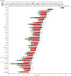
Attribution of changes in life expectancy at birth to changes in major groups of causes of death, 2005 to 2015 Changes are shown for countries and territories (and subnational units in the UK) for females (A) and males (B). Locations are ordered by decreasing life expectancy at birth in 2015. Blue lines show life expectancy at birth in 2005 and black lines show life expectancy at birth in 2015. Causes to the left of the 2005 life expectancy values reflect causes that contributed to reductions in life expectancy from 2005 to 2015. Causes to the right of the 2005 life expectancy values contributed to increases in life expectancy from 2005 to 2015.
Figure 17
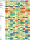
Leading ten causes of YLLs with the ratio of observed YLLs to YLLs expected on the basis of SDI in 2015, by location The ratio of observed YLLs to YLLs expected based on SDI is provided in parentheses for each cause, and cells are colour coded by ratio ranges (calculated to place a roughly equal number of cells into each bin). Shades of blue represent much lower observed YLLs than expected levels based on SDI, whereas red shows that observed YLLs exceed expected levels. SDI=Socio-demographic Index. YLL=years of life lost. IHD=ischaemic heart disease. LRI=lower respiratory infection. NN enceph=neonatal encephalitis. COPD=chronic obstructive pulmonary disease. Congenital=congenital disorders. C=cancer. Alzheimer=Alzheimer's disease and other dementias. HTN HD=hypertensive heart disease. Cirr hepB=cirrhosis due to hepatitis B. NN preterm=neonatal preterm birth complications. CKD=chronic kidney disease. TB=tuberculosis. Intestinal infect=intestinal infectious disease. NN sepsis=neonatal sepsis. Endocrine=endocrine, metabolic, blood, and immune disorders. Other cardio=other cardiovascular diseases. CMP=cardiomyopathies. Haemog=haemoglobinopathies and haemolytic anaemias. Cirr alcohol=cirrhosis due to alcohol use. Violence=interpersonal violence. Alcohol=alcohol use disorders. Other cirr=cirrhosis due to other causes. Cirr hepC=cirrhosis due to hepatitis C. Drugs=drug use disorders. F Body=pulmonary aspiration and foreign body in airway. PEM=protein-energy malnutrition. Mech=exposure to mechanical forces. Other transport=other transport injuries. Med treat=adverse effects of medical treatment. Leish=leishmaniasis. Other NN=other neonatal disorders. Iron=iron-deficiency anaemia. Whooping=whooping cough.
Comment in
- Expanding GBD collaboration-call for experts in health financing and health systems.
Murray CJL, Lim SS, Dieleman JL. Murray CJL, et al. Lancet. 2017 Jan 7;389(10064):18-19. doi: 10.1016/S0140-6736(16)32569-7. Epub 2016 Dec 16. Lancet. 2017. PMID: 27989559 No abstract available.
Comment on
- Global Burden of Disease Study 2015 provides GPS for global health 2030.
Reddy KS. Reddy KS. Lancet. 2016 Oct 8;388(10053):1448-1449. doi: 10.1016/S0140-6736(16)31743-3. Lancet. 2016. PMID: 27733278 No abstract available. - Longer lives and unfinished agendas on child survival.
Watkins K. Watkins K. Lancet. 2016 Oct 8;388(10053):1450-1452. doi: 10.1016/S0140-6736(16)31744-5. Lancet. 2016. PMID: 27733279 No abstract available.
Similar articles
- Global, regional, and national age-sex specific mortality for 264 causes of death, 1980-2016: a systematic analysis for the Global Burden of Disease Study 2016.
GBD 2016 Causes of Death Collaborators. GBD 2016 Causes of Death Collaborators. Lancet. 2017 Sep 16;390(10100):1151-1210. doi: 10.1016/S0140-6736(17)32152-9. Lancet. 2017. PMID: 28919116 Free PMC article. - Forecasting life expectancy, years of life lost, and all-cause and cause-specific mortality for 250 causes of death: reference and alternative scenarios for 2016-40 for 195 countries and territories.
Foreman KJ, Marquez N, Dolgert A, Fukutaki K, Fullman N, McGaughey M, Pletcher MA, Smith AE, Tang K, Yuan CW, Brown JC, Friedman J, He J, Heuton KR, Holmberg M, Patel DJ, Reidy P, Carter A, Cercy K, Chapin A, Douwes-Schultz D, Frank T, Goettsch F, Liu PY, Nandakumar V, Reitsma MB, Reuter V, Sadat N, Sorensen RJD, Srinivasan V, Updike RL, York H, Lopez AD, Lozano R, Lim SS, Mokdad AH, Vollset SE, Murray CJL. Foreman KJ, et al. Lancet. 2018 Nov 10;392(10159):2052-2090. doi: 10.1016/S0140-6736(18)31694-5. Epub 2018 Oct 16. Lancet. 2018. PMID: 30340847 Free PMC article. - Global, regional, and national age-sex-specific mortality for 282 causes of death in 195 countries and territories, 1980-2017: a systematic analysis for the Global Burden of Disease Study 2017.
GBD 2017 Causes of Death Collaborators. GBD 2017 Causes of Death Collaborators. Lancet. 2018 Nov 10;392(10159):1736-1788. doi: 10.1016/S0140-6736(18)32203-7. Epub 2018 Nov 8. Lancet. 2018. PMID: 30496103 Free PMC article. - Global, regional, and national burden of 12 mental disorders in 204 countries and territories, 1990-2019: a systematic analysis for the Global Burden of Disease Study 2019.
GBD 2019 Mental Disorders Collaborators. GBD 2019 Mental Disorders Collaborators. Lancet Psychiatry. 2022 Feb;9(2):137-150. doi: 10.1016/S2215-0366(21)00395-3. Epub 2022 Jan 10. Lancet Psychiatry. 2022. PMID: 35026139 Free PMC article. - Global, regional, and national burden of respiratory tract cancers and associated risk factors from 1990 to 2019: a systematic analysis for the Global Burden of Disease Study 2019.
GBD 2019 Respiratory Tract Cancers Collaborators. GBD 2019 Respiratory Tract Cancers Collaborators. Lancet Respir Med. 2021 Sep;9(9):1030-1049. doi: 10.1016/S2213-2600(21)00164-8. Epub 2021 Aug 16. Lancet Respir Med. 2021. PMID: 34411511 Free PMC article.
Cited by
- Impact of cooperative or competitive dynamics between the yeast Saccharomyces cerevisiae and lactobacilli on the immune response of the host.
Nenciarini S, Rivero D, Ciccione A, Amoriello R, Cerasuolo B, Pallecchi M, Bartolucci GL, Ballerini C, Cavalieri D. Nenciarini S, et al. Front Immunol. 2024 Oct 10;15:1399842. doi: 10.3389/fimmu.2024.1399842. eCollection 2024. Front Immunol. 2024. PMID: 39450162 Free PMC article. Review. - A pilot case-control study using a one health approach to evaluate behavioral, environmental, and occupational risk factors for chronic kidney disease of unknown etiology in Sri Lanka.
M Pry J, Jackson W, Rupasinghe R, Lishanthe G, Badurdeen Z, Abeysekara T, Chandrajith R, Smith W, Wickramasinghe S. M Pry J, et al. One Health Outlook. 2021 Feb 23;3:4. doi: 10.1186/s42522-020-00034-3. eCollection 2021. One Health Outlook. 2021. PMID: 33829142 Free PMC article. - Association of changes in waist circumference with cardiovascular disease and all-cause mortality among the elderly Chinese population: a retrospective cohort study.
Zhang XN, Zhao H, Shi Z, Yin L, Zhao XY, Yin CY, Yang YL, Shi SH. Zhang XN, et al. J Geriatr Cardiol. 2021 Mar 28;18(3):185-195. doi: 10.11909/j.issn.1671-5411.2021.03.001. J Geriatr Cardiol. 2021. PMID: 33907548 Free PMC article. - Mental health status and quality of life in elderly patients with coronary heart disease.
Tang M, Wang SH, Li HL, Chen H, Sun XY, Bian WW, Sheng J, Ma SJ. Tang M, et al. PeerJ. 2021 Feb 17;9:e10903. doi: 10.7717/peerj.10903. eCollection 2021. PeerJ. 2021. PMID: 33643714 Free PMC article. - Detection and Molecular Characterization of Enteric Viruses in Bivalve Mollusks Collected in Arraial do Cabo, Rio de Janeiro, Brazil.
do Nascimento LG, Sarmento SK, Leonardo R, Gutierrez MB, Malta FC, de Oliveira JM, Guerra CR, Coutinho R, Miagostovich MP, Fumian TM. do Nascimento LG, et al. Viruses. 2022 Oct 26;14(11):2359. doi: 10.3390/v14112359. Viruses. 2022. PMID: 36366459 Free PMC article.
References
- Roulson J, Benbow EW, Hasleton PS. Discrepancies between clinical and autopsy diagnosis and the value of post mortem histology; a meta-analysis and review. Histopathology. 2005;47:551–559. - PubMed
Publication types
MeSH terms
Grants and funding
- welcome trust/International
- MC_U137686858/MRC_/Medical Research Council/United Kingdom
- MC_U147585819/MRC_/Medical Research Council/United Kingdom
- 201900/WT_/Wellcome Trust/United Kingdom
- R43 FD006302/FD/FDA HHS/United States
- RP-PG-0407-10184/DH_/Department of Health/United Kingdom
- MC_UU_12011/1/MRC_/Medical Research Council/United Kingdom
- MR/K006525/1/MRC_/Medical Research Council/United Kingdom
- G0400491/MRC_/Medical Research Council/United Kingdom
- NIHR/CS/010/014/DH_/Department of Health/United Kingdom
- MC_U147585827/MRC_/Medical Research Council/United Kingdom
- L30 CA130678/CA/NCI NIH HHS/United States
- 095066/WT_/Wellcome Trust/United Kingdom
- P30 AG047845/AG/NIA NIH HHS/United States
- MC_PC_13043/MRC_/Medical Research Council/United Kingdom
- K99 CA201542/CA/NCI NIH HHS/United States
- MC_UP_A620_1014/MRC_/Medical Research Council/United Kingdom
- MR/K00669X/1/MRC_/Medical Research Council/United Kingdom
- MC_U147585824/MRC_/Medical Research Council/United Kingdom
LinkOut - more resources
Full Text Sources
Other Literature Sources
Miscellaneous

