Getting Started with Bootstrap 3 (original) (raw)
Despite labeling myself a backend developer, I’ve been dabbling more and more with front-end design, namely because JavaScript has blurred the lines between the two. On my last project I hacked a bit with HTML and CSS to develop responsive styles - which can be a pain.
Thankfully, frameworks such as Bootstrap (formerly known as Twitter Bootstrap) make such design requests fairly simple—and even simpler with the new release of Bootstrap 3.
Let’s take a look.
This is a 3-part series. In the first part, we’ll only be looking at Bootstrap 3 and how to customize it using HTML and CSS. In the second part, we’ll look at how to set up an effective sales landing page. Check it out here. Finally, in the last part, we’ll add Python into the mix to build a landing page using Flask + Bootstrap 3.
You can grab the final styles/pages from this repo.
Create a Minimal Website Layout
Start by downloading Bootstrap from the official site. Unpack the zip and grab the dist directory. This will be our root folder for this little project. Be sure to add jquery.js from assets/js to dist/js.
. ├── css │ ├── bootstrap-theme.css │ ├── bootstrap-theme.min.css │ ├── bootstrap.css │ └── bootstrap.min.css ├── fonts │ ├── glyphicons-halflings-regular.eot │ ├── glyphicons-halflings-regular.svg │ ├── glyphicons-halflings-regular.ttf │ └── glyphicons-halflings-regular.woff ├── index.html └── js ├── bootstrap.js ├── bootstrap.min.js └── jquery.js
Add an index.html file with the following content:
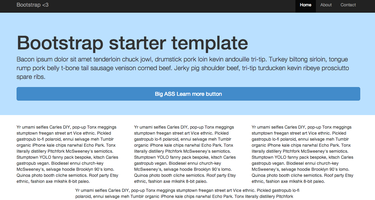
Add a nav bar (which is now ALWAYS responsive), a container, Jumbotron, some ipsum text, and a button:
Add the following style to the head:
Finally, to add the full responsiveness, add the following scripts just before the </body> tag:
At first glance, you can see that all components are flat. And if you’re not a fan of flat design there is an alternative theme. Play around with the responsiveness by resizing your browser. Looks pretty good. Responsiveness is now a default in Bootstrap 3 - so now you don’t have a choice: You must develop for mobile first.
Grid System
The grid system is now much easier to use. It scales up to 12 columns by default, which can be altered for four devices—large desktops, desktops, tablets, and phones. It’s also fluid by default as you will soon see.
Add a row, a basic grid system, and more ipsum text after the closing jumbotron div:
Since each row has 12 units, we made three columns that are 4 units each. Just remember that all columns must add up to 12. Experiment a bit: Try changing the first column to 2 units and the last column to 8 units, or add a new row altogether with another set of columns (or just wait until the next step).
Add a new row beneath the old row with the following grid (make sure it goes inside the container element):
Here, we used
offset, which shifted the column to the right to center it. Essentially, we shifted over 2 units, then used an 8 unit column, leaving another 2 units after, equaling 12: 2 + 8 + 2 = 12.
Since the grid system in Bootstrap 3 is responsive, you can nest a row within another row (another new feature). The inner row - e.g., the row within a row - will have 12 columns. It may help to draw this out. Try this on your own before looking at my example.
So, we took the first column, with a span of 4, and nested it so that it has four boxes of equal size. Also, you probably noticed the list within the far right column. This is another new feature in Bootstrap 3, called List Groups.
You can also replace the unordered list with <div class="list-group"> and then use anchor tags to display links instead of the list items:
Test that out. Have some fun with it. Try toying with the background color of the Jumbotron by adding an image, a gradient, or even a basic color: <div class="jumbotron" style="background-color: #BAE0FF;">.
Such little changes can make a big difference. Make sure your page looks like mine.
An example: Narrow Marketing Bootstrap 3
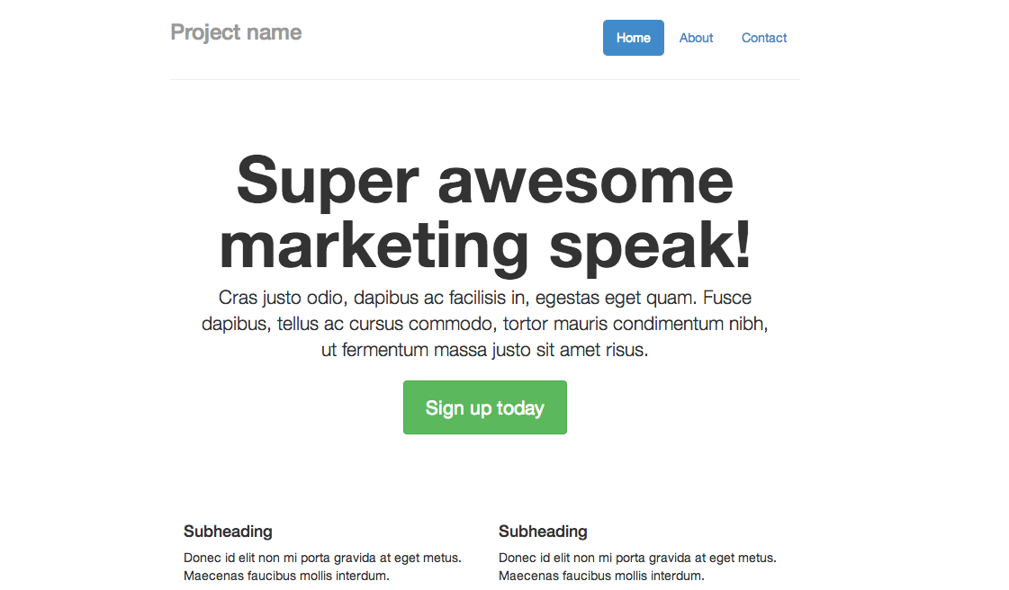
Let’s take this a step further and create a working example. One of my favorite examples from Bootstrap 2 is the Narrow Marketing Template, which, sadly, isn’t part of the examples included with Bootstrap 3. So let’s create it ourselves from scratch.
Start with a basic page.
Add the nav bar and update the styles:
Jumbotron. Add the styles first, and then add the Jumbotron below the <hr>.
Marketing Section. Again, add the styles first, then remove the <container></container> element and add in the marketing row.
Footer. Notice the extra </div>. This should close <div class="container-narrow">.
That’s it. Compare this version to the Bootstrap 2 version. Similar. But flat.
Make it your own
Let’s look at some quick ways that you can customize this example to make it look less “Bootstrappy”.
First, add a new stylesheet called main.css and add the embedded styles to it. Don’t forget to add the new stylesheet to the head, just beneath the first stylesheet. Also, add the following Google fonts as well as a link to the font awesome styles:
Let’s put those new fonts to use:
As you can probably tell, it’s difficult to find two fonts that look good together. Fortunately, there are a lot of good resources - like here and here.
Textures can make a big difference, which is why I love Subtle Patterns. Update the body class with the following code. Make sure to make the Jumbotron transparent as well.
Update the Marketing section so that there is just one row with three columns (each spanning 4 units). Let’s also put the new Glyphicons to use. Or you can use Font Awesome since we added the stylesheet.
Above the marketing section let’s add a new row with two videos, which hopefully have something to do with your products or services (or at least explains why your site exists).
By the way, I recorded those videos a few months ago which detail how to get started with a Django Project. Check them out, create a basic project, and then add some styles. :)
Update the Jumbotron with some social sharing buttons and a few more icons. <3
Finally, remove the text-mute class from the nav bar and add one more icon:
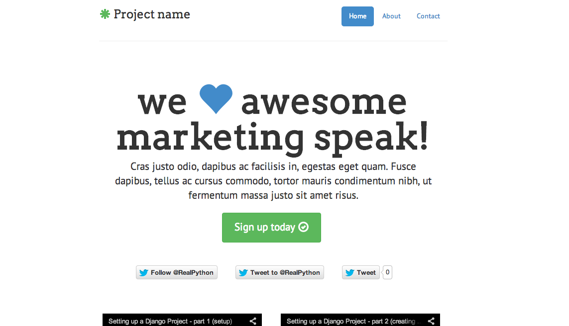
And here’s the final version.
Good? At the very least, with these basic changes—which took a good five minutes—you are now well underway to taking a generic theme and making it a bit more professional. Cheers.
Ready for more? View the second part in this three part series. Oh—and check out these starter templates to get a quick start. Just add new fonts, colors, and a few textures…


