MUSTANG: Noise-Spectrogram: Docs: v. 1: Help (original) (raw)
Description
The noise-spectrogram web service returns spectrograms for seismic channels based on PDF daily mode values.
Contents
Introduction
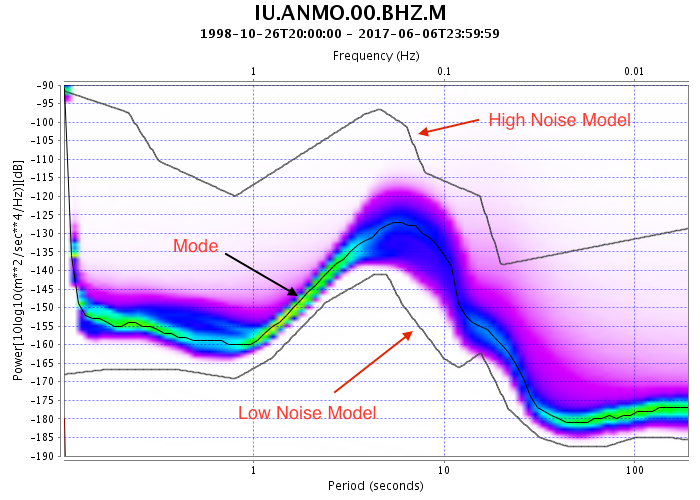
The Power Density Function (PDF) represents the distribution of noise power as a function of frequency. The PDF mode function represents the most commonly occurring (most likely) noise power level as a function of frequency.
The following plot, from the noise-pdf webservice, shows a computed PDF from 19 years of data from one seismometer along with the computed mode function.
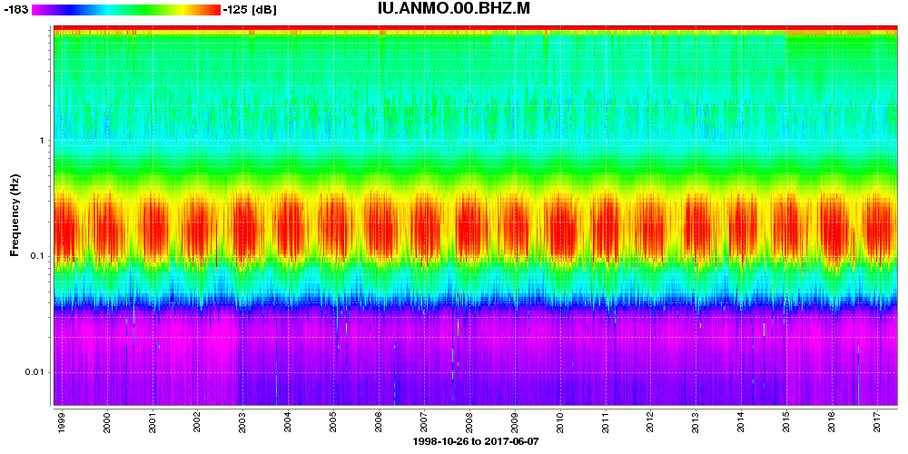
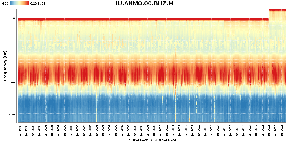
The noise-spectrogram web service reveals how the daily values of the PDF mode function vary over time in a color coded format. It is complimentary to the noise-mode-timeseries which returns the same information in a time-series plot format or in numerical formats.
The following plot, from the noise-spectorgram web service, shows the daily PDF mode variations from the same data used to make the previous plot.
The web service provides an output option that allows the PDF modes to be displayed relative to the Peterson noise models or relative to user defined noise models. See “Noise Model Comparison” for details.
Range Selection
The date range, frequency range and power range may all be individually specified via the following parameters:
Parameter Discussion Example
start Start date. Defaults to earliest available data. start=2010-02-04
end End date. Defaults to latest available data. end=2010-02-04
plot.time.matchrequest Determines the behavior of what date range is plotted. plot.time.matchrequest=false
plot.frequency.range Sets the range of the frequency axis. plot.frequency.range=0.001,100
plot.powerscale.autorange Determine power color scale mapping based on percentile plot.powerscale.autorange=0.9
plot.powerscale.range Manually set power color scale mapping plot.powerscale.range=-170,-100
Date Range
By default, all available data is displayed. Setting start and end will limit the date range of displayed data. The plot.time.matchrequest parameter sets the behavior of what is plotted when start and/or end are specified. By default, the plot will match given start and end parameters. However, if plot.time.matchrequest=false is specified, the plot will match the available data.
Default behavior: plot.time.matchrequest=true&start=1970-01-01&end=2030-02-01
Match data: plot.time.matchrequest=false&start=1970-01-01&end=2030-02-01
Frequency Range
By default, the frequency axis will default to range of the available data. The plot.frequency.range parameter makes it possible to make this range fixed. This can be useful when comparing plots between channels that have differing sample rates.
Example: plot.frequency.range=0.001,100
Power Range
The power levels of the data are mapped into a color rainbow. The process of power range selection determine how this is done. Powers which are outside of the power range are ‘clipped’ to the extreme values of the range.
There are two ways to determine the power range represented by the color rainbow.
plot.powerscale.rangeplot.powerscale.autorange
plot.powerscale.range allows the user to manually determine the mapped color range. This can be useful when comparing plots from different channels.
Example: plot.powerscale.range=-185,-115
plot.powerscale.autorange chooses minimum and maximum power levels based on percentile occurrences.
For example, if plot.powerscale.autorange=0.9 is selected, the minimum power will be the lowest 5% power and the maximum power will be the highest 95% power. Another way of thinking about this is that 90% of the power data will map one-to-one to a color values while 10% will saturate to the end of the color scale; 5% will saturate to the bottom of the scale and 5% will saturate to the top of the scale.
Example: plot.powerscale.autorange=0.9
Using plot.powerscale.autorange=1.0 will cause the full range of the data to be displayed. However, because there are often outliers (often caused by anomalous instrument response near the Nyquist frequency) using a value of 1 will usually result in a washed out appearance.
Compare the previous plot with the full range: plot.powerscale.autorange=1
If neither plot.powerscale.range or plot.powerscale.autorange are specified, plot.powerscale.autorange=0.95 is automatically selected.
Plot Customization
26 options allow for customizing plot appearance.
Orientation and Size
plot.horzaxis controls the plot orientation while plot.height and plot.width control the plot size. By default the horizontal axis is time and the width and height are 1000 and 500 pixels respectively. If plot.horzaxis=freq is selected the horizontal axis will be frequency and, if height and width are not selected, they will default to 500 and 1000 pixels respectively.
Example: Horizontal Axis Frequency – plot.horzaxis=freq
Example: Horizontal Axis Time – plot.horzaxis=time
By default, there is a 2:1 or 1:2 ratio between height and width depending on orientation. So, for example, if the horizontal axis is time, and a width of 1500 is specified and the height is unspecified, the height will be 750 pixels. Example plot.width=1500
plot.time.invert and plot.frequency.invert parameters control direction of the time and frequency axes. Normally, time and frequency increase bottom to top and left to right. Setting plot.time.invert=true or plot.frequency.invert=true will reverse this order.
Example: plot.time.invert=true&plot.frequency.invert=true
Title and Axis Label Customization
plot.title, plot.subtitle, plot.time.label and plot.frequency.label options allow for customizing the plot titles and labels.
All of these options will accept the string ‘hide’ which will hide the label or title. They also accept predefined substitution string listed in the table below.
Parameters and defaults:
Parameter: Description: Default:
plot.title Title at top of plot TARGET
plot.subtitle Title under subtitle hide
plot.time.label Title of time axis DATERANGE
plot.frequency.label Title of frequency axis "Frequency (Hz)"
String substitutions:
String: Example Outputs:
TARGET IU.ANMO.00.BHZ.M
NETWORK IU
STATION ANMO
LOCATION 00
CHANNEL BHZ
STARTDATE 2010-01-02
ENDDATE 2010-08-23
DATERANGE 2010-01-02 to 2010-08-23
FREQMIN 0.001
FREQMAX 5.5
FREQRANGE 0.001 to 5.5
POWMIN -180
POWMAX -110
POWRANGE -180 to -110
The substitution strings can be combined with regular strings as illustrated in the following example.
Tip: When setting the titles and labels, the + character or the sequence %20 can be used for white spaces. The sequence %0A can be used for carriage-return. See Percent-encoding: Wikipedia for more information.
Date Format Customization
plot.time.format and plot.time.tickunit parameters control the display of dates and tickunit spacing. If these parameters are not specified, the underlying plotting library will choose how to space the tick marks and how to display the dates corresponding to tick marks. This mostly yields plots with good appearance, but sometimes directly controlling the appearance is better.
This is illustrated in the following example.
plot.time.tickunit=month&plot.time.format=yyyy-MMM
Date Format Patterns
Letter Date Component Example y Year yyyy: 2016 M Month in year MM: 07, MMM: Jul, MMMM: July d Day in month dd: 21 D Day in year DDD: 026
Font Sizes
plot.titlefont.size, plot.subtitlefont.size, plot.axisfont.size and plot.labelfont.size can be used to manually set the font sizes of the labels and titles.
Example: &plot.titlefont.size=15&plot.axisfont.size=12&plot.labelfont.size=18
Color Mapping
The color coded format used to display the data from the daily PDF mode values can be specified with plot.color.palette option. This parameter defines the range and scale of colors used in the colormap to which power levels are rendered.
7 different color palettes are offered:rainbow cpt-city|ds9|rainbow (David Ljung Madison Stellar))
RdYlBu, BrBG, RdBu, YlGnBu, OrRd (ColorBrewer 2.0 (Brewer, et al))
viridis (Matplotlib Colormaps (Smith, et al.))
Palette: Color Range: Color scale: Colorblind-friendly? Printer-friendly? Grayscale-compatible?
rainbow spectral diverging no no no
RdYlBu red-yellow-blue diverging yes yes no
BrBG brown-bluegreen diverging yes yes no
RdBu red-blue diverging yes yes no
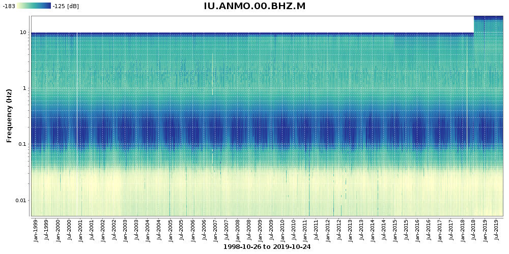
YlGnBu yellow-green-blue sequential yes yes no
viridis blue-green-yellow sequential yes no yes
(high-chroma)
OrRd orange-red sequential yes yes yes
By default, plot.color.palette=rainbow is used. Colorblind-safe, grayscale-compatible, and printer-friendly options are also available.
plot.color.invert=true will reverse the color order of the palette.
Example: plot.color.palette=RdYlBu
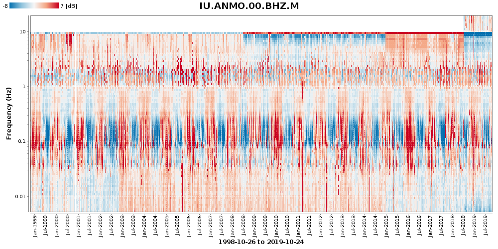
Diverging palettes put equal emphasis on mid-range critical values and the extremes of the power scale; these colors are interpolated across the range with a light color in the middle.
Example: plot.color.palette=RdBu&output=powermedian
Sequential palettes are interpolated across the range of colors from light to dark and are suited for highlighting ordered data that follow a gradient.
Example: plot.color.palette=YlGnBu
Power Scale Placement
The position and size of the power scale is controlled with the following parameters
plot.powerscale.heightheight of the power scaleplot.powerscale.widthwidth of the power scale including textplot.powerscale.xhorizontal position of power scaleplot.powerscale.yvertical position of power scaleplot.powerscale.orientationeither vertical or horizontalplot.powerscale.showcontrols whether the power scale is drawn
The default width and height of the power scale are 150 × 12. As the width is increased, the font size of the power scale also increases.
Example: plot.powerscale.width=300&plot.powerscale.height=20
The x and y offsets are relative to the left and top image edges. If negative values are used the offsets are relative to the right and bottom image edges. The default values are 5 and 5.
Example: plot.powerscale.x=-5&plot.powerscale.y=7
plot.powerscale.orientation determines whether the power scale is drawn horizontally (default) or vertically.
Example: plot.powerscale.orientation=vert
Noise Model Comparison
The output and noisemodel.byperiod and noisemodel.byfrequency options allow the mode power levels to be compared to noise models as well as channel median daily mode values for the selected time ranges.
The web service contains default high and low noise models derived from tables 3 and 4 in Observations and Modeling of Seismic Background Noise by Jon Peterson, 1993.
The default noise models can be view from the link /defaultnoisemodel. Noise models are interpolated using a piecewise log, linear relationship given by:
Noise = A + B Log10(Period)
Noise model levels are interpreted as constant above and below model specifications.
output option
The output option accepts the following three values: power, powerdhnm, powerdlnm and powerdnm
output=power is the default. Output values are simply the mode power levels. (example)
output=powerdmedian Output values are differenced to median values over the time interval. (example)
output=powerdhnm: power values are differenced against the high-noise model. (example)
output=powerdlnm: power values are differenced against the low-noise model. (example)
output=powerdnm: power values are compared to both the high and low noise models. (example)
With output=powerdnm power levels are returned with the following logic:
if( power > HNM )
   return (power - HNM)
else if ( power < LNM )
   return (power - LNM)
else
   return 0
output=powerdmedian is especially useful for spotting changes in instrument behavior.
noisemodel.byperiod and noisemodel.byfrequency Options
The noisemodel.byperiod and noisemodel.byfrequency options allow for the input of custom noise models.
The noise model parameters accept both high and low noise models or a single noise model. If a single noise model is specified
the output options powerdhnm, powerdlnm, powerdnm will all return the same values.
The noise models should be in the format
High and low models by period:
noisemodel.byperiod=period1,valueA1,valueB1|period2,valueA2,valueB2|period3,valueA3,valueB3...
Single model by period:
noisemodel.byperiod=period1,value1|period2,value2|period3,value3...
High and low models by frequency:
noisemodel.byfrequency=frequency1,valueA1,valueB1|frequency2,valueA2,valueB2|frequency3,valueA3,valueB3...
Single model by frequency:
noisemodel.byfrequency=frequency1,value1|frequency2,value2|frequency3,value3...
For high/low models (two values per frequency or period) the order of the value pairs is not important; greater values are assigned to the high noise model and lower values are assigned to the low noise model. The order of frequencies (or periods) is not important; however, there should be no duplicates.
The character sequence %7C can be used in place of the | (pipe) character in URLs.
Example
References
Ambient Noise levels in the Continental United States by Daniel E. McNamara and Raymond P. Buland
Observations and Modeling of Seismic Background Noise by Jon Peterson, 1993.
ColorBrewer 2.0 by Cynthia Brewer, et al.
Matplotlib Colormaps by Nathaniel J. Smith, Stefan van der Walt, and Eric Firing
cpt-city|ds9|rainbow by David Ljung Madison Stellar
Technical Note: Colour Schemes by Paul Tol, 28 September 2018.
Problems with this service?
Please send an email report of which service you were using, your URL query, and any error feedback to:
data-help@earthscope.org
We will address your issue as soon as possible.