unusualgeek's Journal (original) (raw)

**Please remember that you may need to vary the tutorial depending on the images used.
**Please comment, and if possible, post your results. I'd like to see how they work for you.
**A couple of refrence notes in regards to tools,opacity, and blend layer mode are at the bottom of the tutorials for those who need them.
Icon #1:

First, I took the original image, and cropped it using the crop tool.

Then, I took the paint bucket tool, and filled it with a dark blue color, and set that to exclusion.
 ->
->
Then I went to [layer->new adjustment layer->Gradient map] and chose the following, set at hard light. It *will* look ugly, but that will soon be fixed...:
 ->
->
Then I duplicated the background image (layer->duplicate layer) and brought it to the front; layer->arrange-> bring to front, or SHFT+CTRL+[
Once it was out front, I erased The parts I didn't want, until the following was all that was left:
 ->
->
I left that layer at Normal.
Next, I added the following gradient map, set to screen:
 ->
->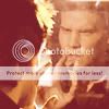
I then duplicated the base again, and erased all but Angel himself. I left the layer to normal, but changed the opacity to 61%, and brought it up to the front.
 ->
->
After that, I used the line tool to make a 1px border, typed self and reflection using the following fonts:
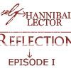
Then I went to [filter->sharpen->sharpen]
And that's it!
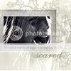
Icon #2:

First, I opened up a new document.[file->new]
Then I created a new layer, and added the following brush:
Then I took a picture of Nancy Calloway as a young girl, and pasted it as a new layer. I set it to screen, on top of the brush layer, and deleted everything outside of that
black box.
 ->
->
I wasn't happy with it like that, so i pasted another image of nancy on top of the last layer.
I set this new image to screen, and erased everything covering the last layer.
 ->
->
I thought that it still looked alittle dull, so i chose the following color, set at color, opacity 64.
I chose to make the color faint, because I did not want to add a lot of color, because Sin City
was completely b&w, with the exception of the odd thing which added color to. I chose this
opacity because I wanted a look like from old fairytales...
 ->
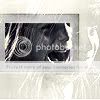
->
Then I added ".Scared." in a scripty looking font (forget which, but it depend on what pictures you are
using on which font to choose).
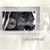
There still seemed to be *something* missing, so I added the following brush, set at normal, opacity 72%:

and that's it!
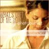
Icon #3:

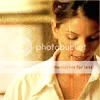
First, I took the original image, and cropped it into the following:
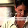
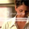
Then I added the following gradient map:
 ->
->
After that, I went to [layer->new adjustment layer->selective color]. When the window opened,
I clicked okay, then selected reds from the menu. I chose the following settings:
cyan: 100
Magenta: -3
Yellow: 0
Black: 7
**these settings may vary, depending on your images.
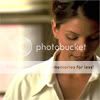
Next, I added the following texture to overlay, 100%:
 ->
->
Then I added "what's left of me now" in sterofidelic, size 18.
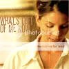
For the last step, I took the line tool and made a 1px border.

***Refrence: tools used-> 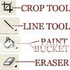
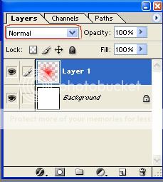
opacity->how visable the layer is: 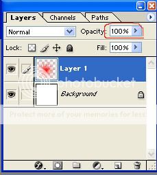
when I say change the layer/image to ____ ("color","screen",etc.):