How to Reduce Screen Complexity and Improve User Experience in SaaS (original) (raw)
Summary of how to reduce screen complexity
- Screen complexity describes the difficulty of navigating a UI, considering factors like how intuitive it is, how time-consuming it is and how much confusion it causes.
- Reducing complexity is essential for improving conversion rates from potential visitors to buyers, boosting product engagement amongst existing customers, and driving more retention and loyalty.
- It improves conversions of potential visitors to paying customers by making the trial experience frictionless and easy to navigate. People need to experience value fast and with little effort to be motivated to buy.
- It boosts engagement because an efficient, well-designed screen will naturally guide the users to complete the intended action. When users feel like they’ve achieved success, they’re encouraged to keep going.
- Improving screen complexity also increases retention and loyalty. Since an excellent UI design leads to improved customer satisfaction, more and more customers will become brand advocates, sharing their positive experiences with their peers. That sparks growth through word-of-mouth marketing.
- One way to minimize perceived complexity is by personalizing the product experience. Divide your customers into segments based on shared characteristics, and then only show relevant screens to the right customers.
- Use progress bars and multiple screens that focus on one task at a time to avoid overwhelming new users. They’re also great to gamify the product experience, which psychologically motivates people to push through difficulty or confusion.
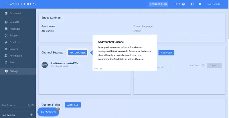
- Blank states are the empty areas in your product dashboard that usually appear when someone uses your product for the first time and hasn’t completed any actions yet. Fill blank states with helpful in-app guidance to maximize screen real estate and help customers achieve value faster.
- Minimize unnecessary complexity by adding tooltips to show people around the product. They also help to reiterate the benefits of certain features, improving product adoption.
- Reduce visual noise by balancing tooltips with hotspots, which are less invasive on the screen. People can choose to hover over them to see additional content.
- Maintain brand consistency across your entire UI design by using differentiating elements with shared colors, such as one color for notifications and another for product guidance.
- Declutter the UI with progressive disclosure, meaning you reveal one key piece of information at a time. This reduces overwhelm and makes it easier to learn how to use new features.
- Minimize actual complexity by completely scrapping features that don’t deliver enough value. Track your behavioral data to recognize which features are well-loved and which ones wouldn’t be missed if they left.
- Ditch the expensive, time-consuming development projects to implement in-app guidance. Instead, use a no-code like Userpilot to easily build and trigger contextual experiences, such as welcome flows, checklists, in-app surveys, and more.
What is screen complexity?
Screen complexity describes how difficult it is to navigate a user interface (UI). It’s influenced by factors such as size, grouping, alignment, and element repetition.
Why is reducing complexity important in UI design?
Reducing screen complexity is an essential part of UI design because a complexity issue affects everything from product adoption to customer satisfaction, churn, and revenue.
User-friendly design converts potential visitors into buyers
Minimizing complexity leads to higher revenue since a user-friendly design is more likely to convert potential visitors into buyers.
If potential customers are testing out a free trial of your product, but are disappointed with a complex interface, they’ll quit trying and won’t upgrade.
It’s not just limited to the in-app experience either. Build a user-friendly website and a user-friendly customer support experience to improve your conversion rates even more.
Simplifying design means more engagement
Simplifying design improves engagement because it reduces friction. When users can navigate through a clear product experience, they’ll stay engaged for longer.
Overly complex designs are time-consuming and frustrating to navigate. In this digital age, customers have high expectations and minimal patience for any friction. They’ll move on fast if you can’t provide a seamless experience.
Consistent experience that drives retention and loyalty
In the long term, delivering a more consistent experience will keep customers around for longer and improve loyalty – both of which contribute to higher customer lifetime value (LTV), reduced churn, and more word-of-mouth growth.
If customers consistently have a positive experience with your product, both specifically with the UI design and the experience as a whole, they’ll keep their subscription and spread the word to their network.
10 Strategies to reduce screen complexity in SaaS
Here are 10 strategies to reduce unnecessary complexity in your SaaS business.
Personalize the user interface based on customer needs
Personalize interfaces for the user based on the actual goals they want to achieve from your product. Your customer segments have different challenges and goals that they want to resolve with your SaaS. Reveal features based on the user’s Jobs To Be Done and where they are in their journey.
That way, they’ll experience a more useful and interactive user interface that suits their needs.
Users see the most relevant information for their specific goals if you personalize the user interface based on Jobs To Be Done.
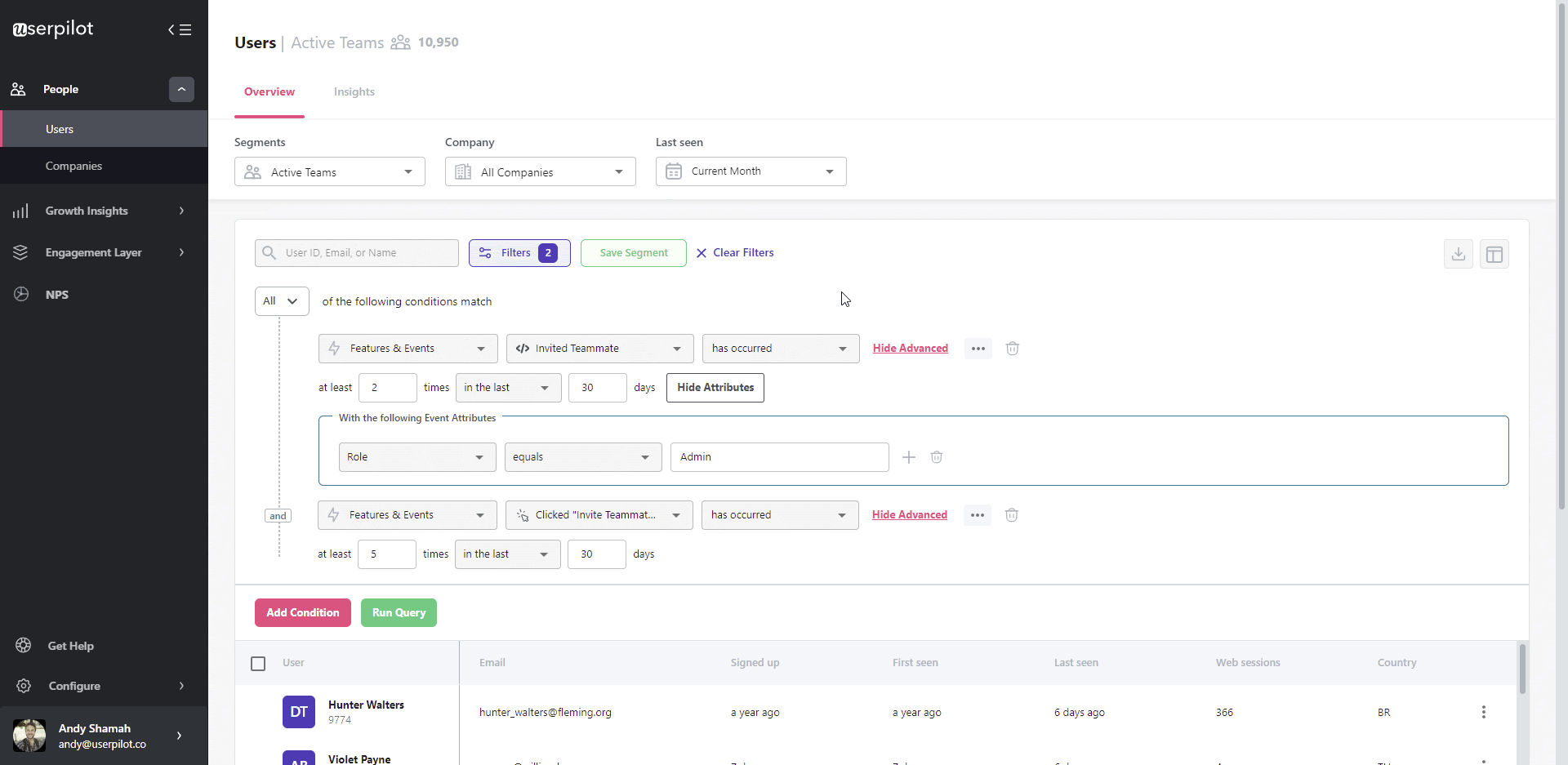
Break users into cohorts and personalize the product experience with Userpilot.
Use progress bars and multiple screens to reduce complexity
Break down long and complicated processes into multiple stages that feel easy. Taking users through one task at a time using progress bars and multiple screens helps reduce perceived complexity.
For example, instead of overwhelming users with a complex and friction-based sign-up flow, Airtable uses multiple user-friendly screens to guide users through the process.
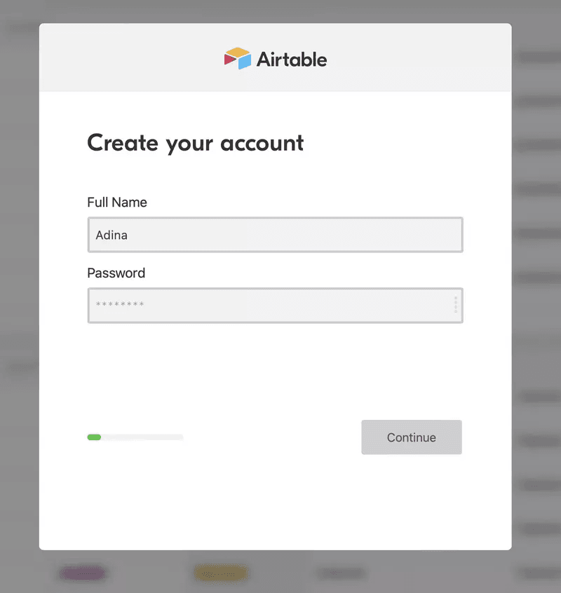
Airtable uses multiple screens in its sign-up flow.
The Airtable team also uses progress bars to set users’ expectations and motivate them to move forward.
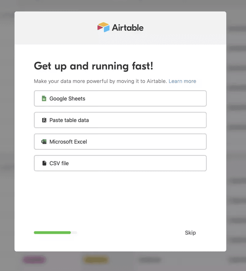
Airtable uses a progress bar in their sign-up flow.
Use the blank state to help orient users
Blank states are moments in a user’s experience with a product where there is nothing to yet display. This can happen when the user is using the application for the first time.
The empty state is the first impression the user will get from your product. That’s why you must use this opportunity to help users experience value faster.
Do this by filling in the blank states with call-to-actions and checklists to help users get started. That way, they’re not overwhelmed by the white space of a blank screen.
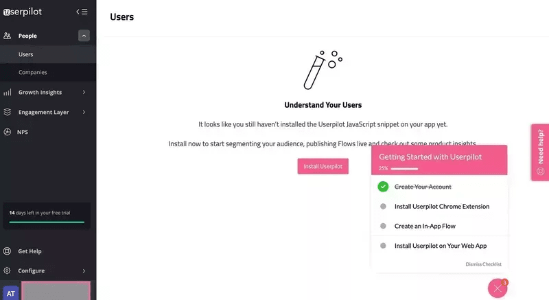
Userpilot adds clear CTAs and checklists to its empty states to orient users.
Minimize perceived complexity with tooltips
Perceived complexity is how difficult or easy a user perceives a product experience to be.
Help users overcome uncertainty and reduce perceived complexity by helping them find their way around the product with in-app guidance.
For example, use tooltips to highlight features and explain how to use and get value from them. The user learns the benefits of the features on top of how to use them, increasing motivation and feature adoption.
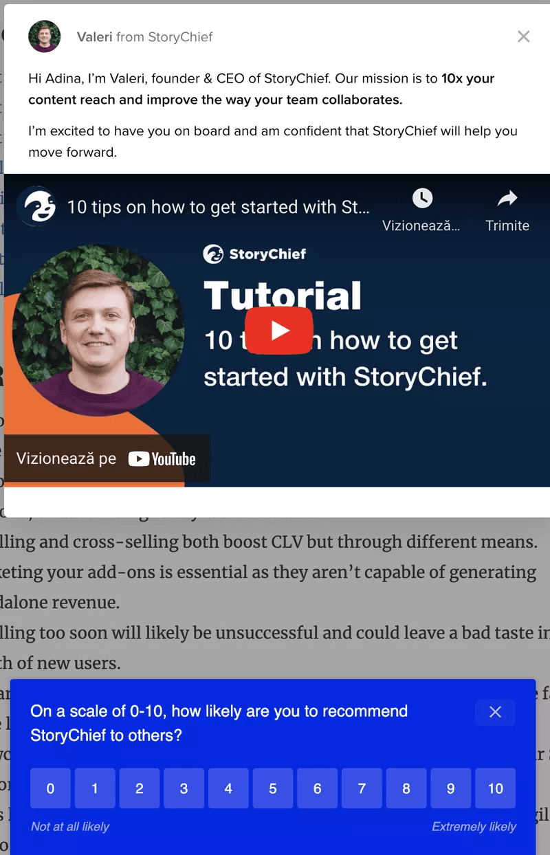
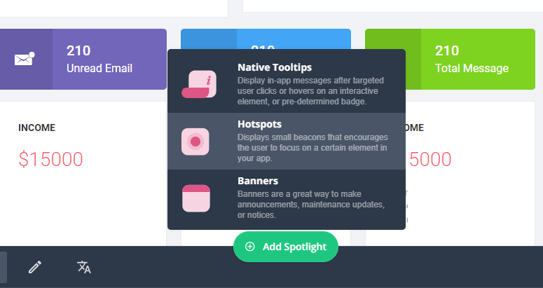
Reduce visual noise with hotspots
In the previous section, we encouraged you to trigger in-app experiences and guidance to help users. That being said, overdoing it is a common UX design mistake. In this example, StoryChief goes overboard with its in-app guidance by displaying a modal and survey popping up at the same time. It clutters the UI and causes friction.
Consider using hotspots instead. These are small icons, usually in the form of animated, pulsing circles that invite users inward to learn more.
They can be strategically placed on certain elements to indicate that more information is available. Users then have to click on the hotspots if they want to learn more.
Maintain brand consistency across the user journey
Consistent design is a CX trend that improves the usability and learnability of a product and simplifies the user experience.
For example, Asana has prioritized brand consistency across its in-app communication. Each UI element has the same color, text, and button, so anyone who sees them immediately recognizes them.
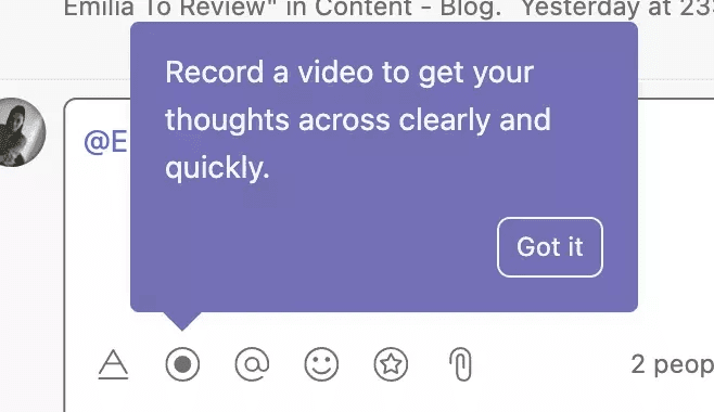
Example of brand consistency in Asana with purple tooltips.
The purple tooltips are reserved for product tips, while the white ones are reserved for notifications.
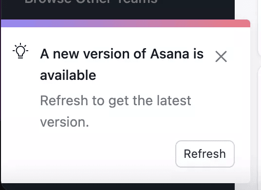
Example of a white notification in Asana.
Declutter the user interface with progressive disclosure
Minimize visual noise by disclosing information gradually as the user needs it. Not only will it make the UI design more friendly for mobile devices, but it will also give customers the ability to quickly scan and capture the heart of the content easily.
Once customers have completed one step, you can move them forward to the second step.
Reduce actual complexity by eliminating unnecessary features
Track product usage data to determine which parts of your product users engage with the most vs. the least. This helps you identify features that don’t bring any value to users.
How does this reduce actual complexity?
You can simplify the user interface by sunsetting features that don’t bring value. Leave more screen real estate for the ones that do.
![]()
Track product usage in Userpilot.
Less development time – use a tool for tips and hints
Spend less time and money on expensive development projects to code your in-app help. Instead, use a no-code in-app experience builder like Userpilot.
Create contextual flows with a range of UI patterns such as modals, tooltips, hotspots, and more.
Then, set them to trigger based on user actions with advanced personalization options.
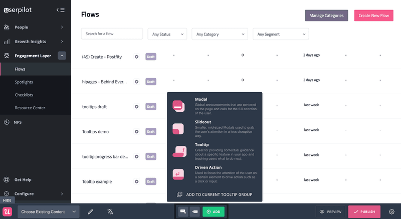
Choose from a variety of UI patterns and build flows with Userpilot.
Conclusion
Reducing screen complexity is the bare minimum for achieving an excellent UI design. Minimize visual noise, maximize screen real estate and eliminate anything that doesn’t add value.
Prioritizing this will transform your customer’s success with your product.
Want to build product experiences that reduce complexity code-free? Book a demo call with our team by clicking the button below and get started!