How to Use Userpilot Custom Analytics Dashboards to Extract Actionable Insights (original) (raw)
What is the Userpilot custom analytics dashboards feature?
Until recently, Userpilot customers had access to 4 pre-built analytics dashboards: Product Usage, New User Activation, Core Feature Engagement, and User Retention.
They were an excellent aid to product teams trying to optimize these metrics.
And now things have gotten so much better.
You can create your custom dashboards, populate them with data of interest, customize how it’s visualized, and filter them to zero in on specific events or user segments.
Userpilot is a robust analytics tool so you can use its own data. Or leverage integrations to import it from 3rd party apps, like Google Analytics 4 or Google Tag Manager.
How do Userpilot custom analytics dashboards solve the problem of data silos between teams?
They force every department to use the exact same static report
They allow you to build bespoke views tailored to specific stakeholders (e.g., Product vs. CS)
They restrict data access so only leadership can see metrics
What is the fastest way to set up a new dashboard if you don’t want to build from scratch?
Use a pre-built template like “Feature Engagement” or “Expansion Revenue”
Write custom SQL queries to extract the data
Wait for the engineering team to hard-code a new view
How can these dashboards specifically assist in churn prevention?
By hiding negative feedback metrics from the main view
By visualizing retention reports alongside friction points to predict drop-offs
By automatically refunding users who haven’t logged in
Visualize your success with Userpilot custom analytics dashboards.
See all your key metrics in one place and foster data democratization across your organization.
Why use Userpilot custom analytics dashboards?
Let’s unpack 3 main reasons why you might need the new custom analytics dashboards.
View all important product analytics metrics in one place
Picture this: you want to optimize your customer expansion initiatives to grow revenue. To do so, you head to a dashboard where you can see all relevant metrics. No switching between tools or reports. Everything in one place.
Wouldn’t it be handy?
The new custom analytics dashboards allow you to do just that. So that you can monitor the data in real-time and never miss important insights.
Customize the dashboards for different stakeholders
Teams across your organization focus on different aspects of product performance. This means they need different data to make informed decisions. For example, the product team needs access to the product usage data, while the customer success team may be interested in the onboarding stats.
Senior leadership, on the other hand, may not need detailed breakdowns but a high-level overview of key metrics.
Guess what?
With the custom dashboard functionality, you can create bespoke dashboards for all of them. And easily share them with relevant stakeholders to foster data democratization, break up silos, and improve cross-functional alignment.
Tailor the dashboard to align with evolving business goals
As your business and product goals change, so does the data you need to track.
With custom dashboards, you can remove irrelevant data so that it doesn’t distract you from what matters.
And you can add new metrics and reports by dropping them onto the dashboard and moving them wherever it suits you best.
How to create a custom dashboard in Userpilot?
Convinced the custom dashboards are a valuable addition to Userpilot capabilities?
Great!
Let me show you how to build them in two ways.
Create from a template
One option is to build a dashboard from a template.
Currently, there are 3 templates to choose from:
- Free trial to paid conversion.
- Feature engagement.
- Expansion revenue & upgrades.
Step 1. Log into your Userpilot account.
Step 2. Navigate to Dashboards in the sidebar menu and click the Create New button at the bottom.
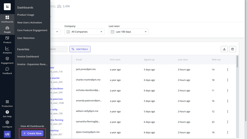
Choose Create New from the Dashboards menu.
Step 3. On the screen, choose Start From A Template.
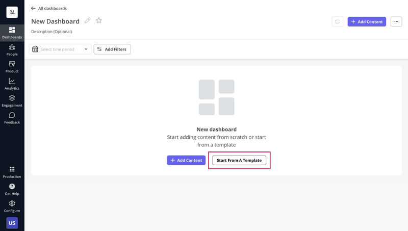
Click Start From a Template.
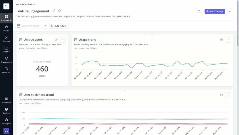
Step 4. From the box, pick one of the 3 templates. I chose the Feature Engagement template for this article.
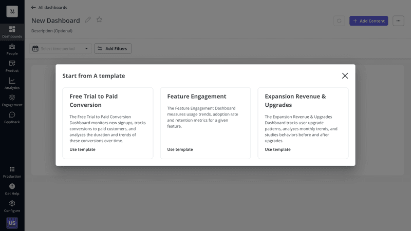
Pick the template.
Step 5. Select the Feature event to track, so that Userpilot can visualize the right data for you. For example, Invoices.
In the Free Trial to Paid Conversion template, you have to choose the Sign-up and Trial Conversion events, and for the Expansion Revenue one – the Upgrade Event.
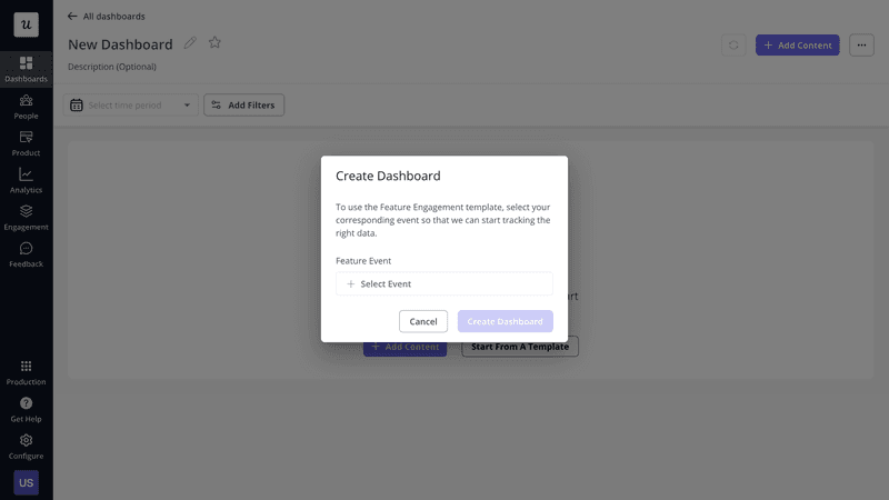
Add an event.
Step 6. The dashboard is ready. Customize it by changing the size of the widgets, grouping related metrics, or adding and removing reports.
You can also filter the data by User and Company properties or Segments, and timeframe.

Customize your dashboard.
Create from scratch
If none of the 3 templates fits your needs, you can create a new dashboard from scratch.
Here’s how:
Step 1. Follow steps 1 and 2 above.
Step 2. Instead of Start From a Template, click + Add Content.
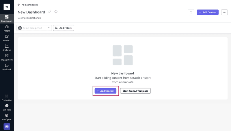
Click + Add Content.
Step 3. Choose the reports you want to add to the dashboard.
There are 6 options here:
- Existing report: one of the analytics reports you’ve saved before (Trends, Funnels, Paths, Retention).
- Text block: a text field, for instance, to explain the purpose of the dashboard.
- Trends: a report visualizing data sets as graphs. It allows you to monitor changes over time, spot seasonal trends, or identify correlations between metrics.
- Funnel: this report enables you to analyze conversion rates at key user journey stages. For example, you can use it to identify friction or drop-off points.
- Paths: this report allows you to visualize all user interactions with the product. The insights can help you find happy paths or diagnose why users fail to convert.
- Retention: a report visualizing how many users continue using the product over a period of time, cohort by cohort. It helps you understand how long users stay active so you can engage them proactively to prevent churn.
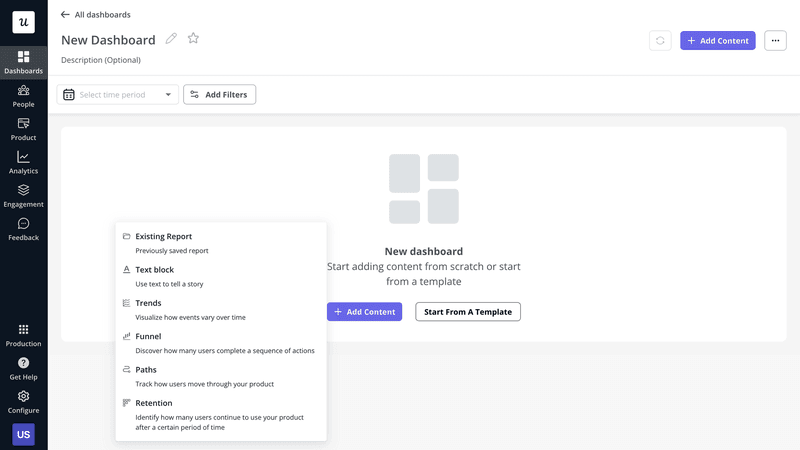
Choose the report type for your dashboard.
Step 4. If you want to populate the dashboard with an existing report, pick one from the list.
If it’s a brand new report, set it up as if it were a standalone report by choosing events, setting filters, etc. Repeat the process until you have all the reports in place – up to 30 of them.
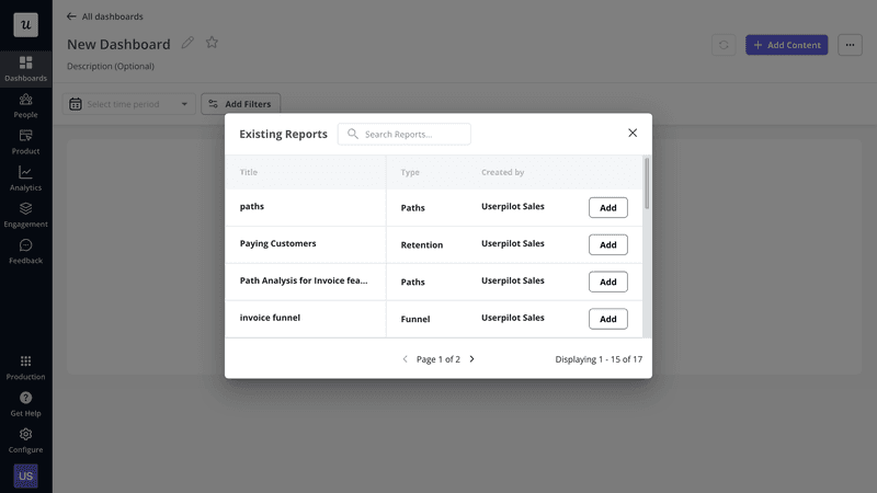
Add content to the dashboard.
Step 5. Customize the appearance of your reports, just like in Step 6 above.

Customize the dashboard.
How can companies leverage Userpilot’s custom analytics dashboard feature?
Let’s wrap up by looking at a few use cases of the custom analytics dashboards in Userpilot.
Optimize the free trial to paid conversion rate
Free trial conversions are essential for product-led companies. That’s when the money starts coming in.
Thanks to Userpilot’s advanced analytics capabilities, you can track custom events linked to conversions. And display such metrics as signup and conversion event count, the conversion rate, and time to convert in one dashboard.
You can also visualize trends in the data sets over time to evaluate the impact of changes.
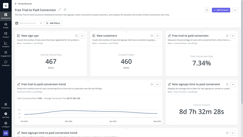
Userpilot custom analytics dashboards: free trial to paid conversions.
Monitor the performance of the onboarding process
One way to improve your free-to-paid conversions is by streamlining the user onboarding process. A dashboard displaying onboarding-related data can help.
For example, adding a funnel report to the dashboard can help identify the steps in the process where users tend to drop off, while path analysis will shed light on what they do before it happens.
Once you optimize a specific touchpoint, you can track the onboarding completion rate to evaluate the impact.
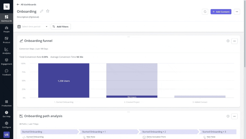
Userpilot custom analytics dashboards: onboarding.
Observe the user behavior of different segments
As mentioned, you can filter the data feeding into your dashboard by user segment. Thanks to that, you can analyze data about their behavior in more depth.
For example, you could create a dedicated dashboard for your NPS detractors to identify the reasons for their dissatisfaction and opportunities to improve their experience.
Userpilot custom analytics dashboards: segmentation in the dashboard.
Monitor user interactions that lead to churn
A custom dashboard can also help you predict user churn.
By adding a retention report to the dashboard, you can analyze when users tend to churn and measure the impact of your retention strategies. You can then slice and dice the data further with path and funnel reports to identify user behaviors leading to user churn.
You could then create a custom event that combines all these actions, and track it as one in a graph.
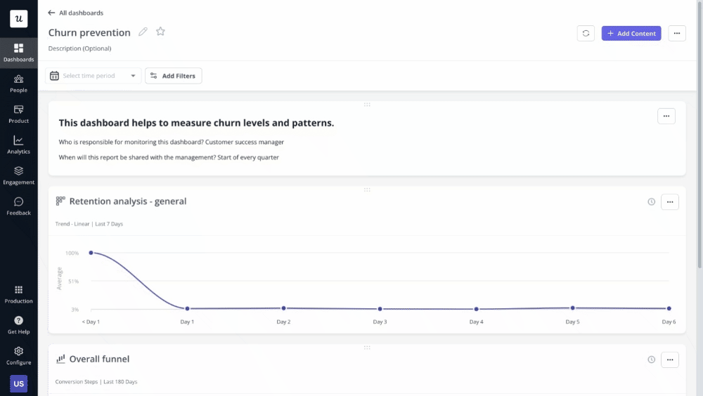
Userpilot custom analytics dashboards: churn prevention.
Track expansion revenue over time
Expansion revenue, for example from upsells and cross-sells, is an indication of how successfully you satisfy customer needs and how compelling your value proposition is. And it has a massive impact on your cash flow and profitability. No wonder it’s a priority for SaaS teams.
In your dashboard, you can track upgrade trends and analyze user behavior before and after the upgrades to optimize your account expansion efforts.
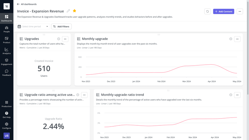
Userpilot custom analytics dashboards: Expansion revenue.
Conclusion
The Userpilot custom analytics dashboards make its analytics features even more powerful. Thanks to them, you can analyze the key metrics from one place, create custom reports for different stakeholders, and easily adjust them for greater flexibility.
If you’d like to learn more about this functionality and its use cases, book the demo!