[#18] tutorial #2 minami haruka artwork (original) (raw)
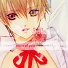
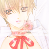
Time for another tutorial, I'm kind of bored tonight and wanted to post something here since it's been pretty much dead for a while. Anyway, it's an easy but effective tutorial today, using some pretty artwork by BL mangaka Minami Haruka.
 >>
>> 
In nine steps. Easy level of difficulty, involving gradient map, colour layers and textures. Done in PS7, and should be transferable.

01. Crop and prepare your image to 100x100, or whatever size below this you want. The colours are nice and all, but they definitely need pepping up, which is what we're going to do.
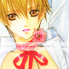
02. Start by duplicating your image and set the layer to Overlay, 100% opacity. This gives an immediate result, ridding the image of the washed out look. But of course, we're not going to stop there (or it wouldn't be much of a tutorial.
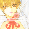
03. Create a new layer (Layers >> New >> Layer) and flood fill it with the paint bucket tool. Select the colour #F8DAB2. Set this layer to Hard Light, 50% opacity.

04. Add another new layer, this time filling with #876BAF, and this layer is also set to Hard Light, but this time, reduce the opacity to 35%.
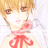
05. Duplicate the base layer and bring it to the top of the layer pallette. We're going to desaturate it by using a Gradient Map. Go to Image >> Adjustments >> Gradient Map, select the black and white gradient option and click OK. Set the desaturated image to Overlay, and you can fiddle around with the opacity, I like to use between 70-100%. You may want to change it after completing the other layers first though (you'll see why soon).
06. Using this light texture (by 


07. Now this is where we can add some more definition into the image. Add this Brown gradient (by  _ravenwing), and set to Soft Light, 100% opacity.


08. Now a Pink/blue gradient (unknown creator, sorry), set to Colour Burn, 100% opacity. After this step, you may want to fiddle with the opacity of the Gradient Map layer you made in step 5.


09. To finish off, using this navy blue gradient (by  nocturnlorelei), set it Exclusion, at 40% opacity. It's not entirely necessary, but it stops the whites in this image from becoming overwhelmingly white. Plus I'm an exclusion layer whore *grins*.
Now you can add text or whatever extra you want~ And it's done!
Other icons made using this tutorial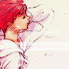
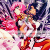
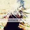
I tried to make this tutorial not so complicated, but if you have questions, please feel free to ask. And I would love to see your examples!
If you like what you see, please friend this community for more updates.