Neill vs. Herring, Part 3: We’ve Got Thompson Covered (original) (raw)
When writing my recent post on video game cover art, I remembered I was doing something similar with the Oz books six years ago, but never finished. I suppose it’s better late than never, so in hopes that you won’t find me Ruthless, here are the cover comparisons for the Ruth Plumly Thompson Oz books.
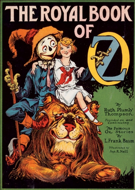

Everyone looks so happy on that Neill cover! I assume this isn’t the original cover, since it credits Thompson as author, but the picture is the same. As for the Herring, that’s a good depiction of the Scarecrow, probably based on some of the Neill drawings inside the book. And while I’m not sure how an insect grows facial hair, that Wogglebug has a lot of personality and some colorful clothing. I also like how he’s holding on to the framing banner. I guess that’s supposed to be the Magic Picture behind them, but I never imagined it touching the floor like that.
Overall preference: Herring


While there were some Neill illustrations of Kabumpo on his hind legs, it was usually for the sake of a joke, like when he was depicted wearing boxing gloves. I don’t really think it works for the cover. I appreciate that Herring caught Peg Amy in mid-transformation, as Neill wasn’t big on middle-of-the-action illustrations. I guess that DOES kind of give away a plot point, though. Peg looks a little young to be getting married, but Thompson never really specifies her age. There’s less to say about Neill’s typically old-fashioned drawing, but I think it’s a more attractive take on the characters.
Overall preference: Neill


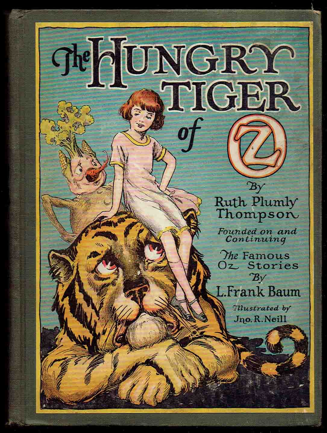
I suppose the Neill cover is set at a circus, what with all the balls in the background. Of course, the Cowardly Lion isn’t in the part of this story with the circus. And if this is one of the circuses Notta Bit More is described as putting on after having settled in Oz, why would the Lion be crying? The Herring is based on an internal Neill illustration, but with much more detail on the Flyaboutabus and the Lion. Notta is also modernized a bit, but not that much. I do wonder where Nickadoodle is in both versions of this picture. He’s supposed to be holding the lever at this point, so maybe he’s lower on the floor so he can’t be seen in the side view.
Overall preference: Herring


Since Herring’s drawings are usually more colorful, it’s a little strange that he used so much green on Urtha. In neither version does she really look like her features are made of flowers, but Neill’s is more appealing. I remember bringing the Del Rey edition to high school and someone commented on how Urtha (not that they knew her name) looked like she was dressed up as a tree. Neill’s Grampa looks friendlier as well, although Herring did get the color right; he’s described in-text as wearing a red uniform. I’m also not sure why Neill would have chosen NOT to include Grampa’s game leg, easily his most interesting physical feature.
Overall preference: Neill


Finally, a blonde Dorothy from Herring! Not that she really looks much like I imagine Dorothy, but she’s better than the ones on the Baum covers. Herring did a good job of capturing what a live dummy might look like, and included the flying ears. Neill’s appears to show a disenchanted Pastoria with a still-enchanted Pajuka, despite the fact that they were disenchanted at the same time. Then again, he’s probably more interesting as a goose than as a person. With the angle of his head, he appears to be looking right at Ozma’s chest. I assume that Snip, being a Gillikin, would wear purple, so Herring is a little closer in that respect. I think I’d say Herring’s is the technically better picture, but Neill’s more charming.
Overall preference: Neill

I give credit to Neill for making everyone look so cute. Then again, since Betsy Bobbin is scared when she first meets Carter Green, maybe he’s not supposed to be cute. Herring captures a moment of intense action, with the Tiger falling down the fire fall and everyone appearing appropriately terrified. Neill’s own illustration of this scene is much less detailed. I think his Betsy, who’s supposed to be a little older than Dorothy and Trot, is rather too young-looking; and Prince Reddy really should be all in pink. Still, these are minor complaints.
Overall preference: Herring


As usual, Herring captures a moment of more action, but I’m not that big on his take on either the Nome or the Emerald City. Besides, shouldn’t Ruggedo be invisible at this point? I can’t really complain about that, though, as Neill did the same thing. Herring’s DOES look to have grayer skin, which is a plus; but I think Neill’s Nome King is a more representative look at the character.
Overall preference: Neill


Neill’s is a very cartoony take on the characters, and I have to give him some demerits for making Benny not look even remotely like a statue. But then, Herring didn’t include Benny at all, so there’s no point of comparison there. While I appreciate the more realistic take on High Boy and his expanding legs, I still prefer Neill’s design. And I know High Boy lives in the mountains, but why waste a detailed background on nothing but rocks? Neill’s has a few houses, and while I’m not sure they’re to scale, they still give more of a sense of just how long the horse’s legs can be.
Overall preference: Neill


Jack Pumpkinhead does not sword-fight at any point in this book, but I still like the look of the awkward wooden character brandishing the sword. Also, in the scene Herring depicts, Jack really should be holding on to the bottom of Belfaygor’s beard instead of tightrope walking across. Nice picture of the tiny Iffin, though.
Overall preference: Neill


Why did Neill choose to include so many characters who were in the story very little if at all? I guess he was making it more obvious this was an Oz book. And should the titular character still have the mustache when he’s wearing the golden armor? Herring’s take on the Yellow Knight has too much of a Ken doll appearance for my taste, but you can’t really say that isn’t accurate to the book. His cover is also just so appealingly shiny, and Marygolden is cute. Who are the characters on the stairs supposed to be, though? If I had to guess, I’d say Peter Pun and the Queen of Corumbia; but maybe they aren’t significant players in the story at all. You can see more detail of the Herring picture on this page. Interestingly, this is one of the few Thompson Oz books for which I don’t own the Del Rey edition. It might behoove me to get one, though, as the hardcover I do have is old and falling apart.
Overall preference: Herring

Neither one of these is among the better work of either illustrator, but there are things I like about both. Neill’s is as rough as the seas he depicts, with Captain Salt shown as a truly intimidating character. I like the sense of depth on Herring’s picture, but you don’t get a good look at anyone’s face. It’s one of the unusual cases where I think Neill had the upper hand in terms of detail.
Overall preference: Neill


As with Kabumpo’s own book, I prefer Neill’s take on the Elegant Elephant. I suppose the castle shown is that of Regalia, which Kabumpo never visits during the course of the book, but he does promise he will later on. I’m not sure why Randy’s legs are spread so widely, though. Herring’s cover is colorful and shows more action, but I just don’t find the characters as appealing there. Also, the Neill drawing of the same scene actually shows a little more action. I do, however, give Herring credit for a better depiction of the Deadly Desert than Neill usually provided.
Overall preference: Neill


Neill does a better job at showing the main characters, as Herring focuses on the minor character X. Pando and leaves out Realbad. Not that Realbad was present for this part of the story, and Pando makes for an interesting cover image even if he’s hardly in the book. I also appreciate the blue Munchkin hills in the background. I don’t much care for Herring’s take on Ojo himself, however. Even though all of Neill’s children look kind of alike, they come across as much more full of life than how Herring draws them.
Overall preference: Herring


I’ve heard that one of the main reasons Del Rey commissioned new covers for the Oz books was that they wanted to appeal more to teenage fantasy readers than to young children, and that definitely applies here. Neill gives us people in pajamas cheerfully holding on to umbrellas, while Herring provides a dinosaur skeleton at night. What’s more, there are people inside of him. Of course, if you’ve read the book, you know the skeleton is an endearing and non-threatening character; but the cover is often the first thing a person sees. It is perhaps worth noting that, even though Terrybubble was likely the most interesting character in the story to draw, Neill didn’t include him at all on the cover or the endpapers. He’s in the front matter, but in silly poses. Herring also reflects the text in giving Gureeda dark hair. Granted, I believe Thompson only says that Umbrellians in general have dark hair; the Princess presumably could be an exception.
Overall preference: Herring

Apparently Thompson, who was an equestrian, didn’t much care for Neill’s depiction of a horse on this cover. This is noted in David L. Greene’s afterword for the International Wizard of Oz Club’s edition of the book. Greene also mentions Neill’s drawing of Chalk landing on the throne of Oz with King Skamperoo on his back as a favorite, pointing out that it reflects how the horse is really the one in charge. Herring takes on this same scene from a different direction, and comes up with a cover much more reflective of what the story is about. And this is the last one Del Rey printed, which means no more Herring illustrations.
Overall preference: Herring