Visual Design Guide: 6 Principles to Keep in Mind (original) (raw)
Visual design has to do with how a website looks and how well its design matches its function. Although visual perception is largely subjective, a natural and pleasing aesthetic can only be achieved if elements are strategically placed according to certain principles and rules.
Successful visual design shouldn’t interfere with the functions of the website or the content published on it. Instead, it should enhance everything that the website is by convincing users to spend more time on it and to interact with it.
In short, building interest in a website and providing the best user experience hinges on how everything is visually presented. Branding and design can’t work one without the other, making them inseparable. Thus, the basic fundamentals of visual perception and aesthetic graphic design must be understood by anyone who wants to create quality work.
Web designers need to possess not only knowledge but also experience in applying design rules to their projects. This article created by our team at Amelia (probably the best WordPress reservation plugin) is here to help you focus on the practical principles that matter the most in web design.
Understanding the basic elements used in visual design
Visual design is based on fundamental elements that can’t be ignored by any web designer. These are:
Lines connect two different points and can be used for all sorts of purposes: to define shapes, to make divisions on the website, to create texture.
Shapes are separated spatial areas on a website that graphic designers create to differentiate a part of the website from the rest. They usually differ in color or texture.
Color palettes. A color palette is a combination of colors that are used for differentiating one element from another, to create more depth, and to emphasize and organize content. Color psychology refers to how different colors can influence the emotional response that a user has when exposed to them.
Texture represents the way a certain visual design element is perceived to feel. If one texture is repeated throughout a visual design process, it forms a pattern. Texture can be used to direct attention towards a certain element.
In visual design, the typeface used to transmit a message can add a different tone to it. The shape, size, alignment, spacing, and color of a font can influence how the message is ultimately perceived.
This only applies if the visual design is based on 3D objects. The form can be created by using multiple shapes, textures, colors, and other differentiating elements.
White space. Negative space represents the area that is purposefully left blank around an area with positive space. This element is also called a figure/ground. The existent content (positive space) is the figure, and the white space around it is called ground. When designing positive space, web designers must keep in mind that ground space keeps the visual design uncluttered and brings balance to the entire composition.
This refers to how light or dark an element is. Using contrast is a common practice in visual design because it helps with creating a sense of precision. A website without contrast elements is one of subtlety, and perhaps ambiguity. Value is mostly used in 2D and 3D design.
A list of the most important principles of design
Now that you know some of the basic elements of visual design, it’s time to delve into the principles of design that all design artists should know about. The visual design elements listed above can’t be used recklessly, without balancing them out. The principles of design describe how these elements can be composed, combined, and complemented to achieve the best results.
Unity

All the visual design elements on a page have to be placed in a careful, harmonic manner. A good site design is important for conversion optimization as well as delivering a consistent brand image for your clients, both of which might require a professional website design agency or one capable landing page designer.
The elements on a page can be high-quality ones, but if they are not arranged in a pleasing visual manner as well, they won’t have the desired impact.
This is where unity steps in.
Visual designers try to step away from chaos by creating a sense of unity in their projects. Because eyes are the governors of judgment, projects will only turn out great if they follow the unity principle. It tells visual designers how to orderly arrange the elements on a layout.
Gestalt

The Gestalt principles is a little bit more complex in visual projects. Gestalt basically refers to how a person perceives the sum of all parts, instead of focusing on individual elements only.
The brain processes information as a mass structure first, based on what the eyes see. The first aspect that is perceived in a design is the unified shape, composed of all the elements included in it. Before focusing on separated sections of the design, a user will look at the image they create as a whole.
The Gestalt principle involves carefully picking out the parts of a website, to make them look good together. To do this, visual designers need to match all the elements together based on aspects such as dimension, distance, shape, and others. If these elements are not conceptually similar, the result won’t look aesthetically pleasing.
Gridding
In order to place elements properly and accurately, visual designers make use of grids. Grids help with placing the visual elements evenly on a page. Coming up with a good grid system takes some effort and experience because it has to be flexible enough to fit all sorts of layouts. If the website layout changes, the grid system shouldn’t lose its consistency.
Scale
Scale refers to how elements are sized before placing them in a layout. Without scaling elements, the attention of the visitors will be directed into multiple sides, which can end up not being effective.
If one element has to be accentuated, it can be emphasized by using a different size for it. This is what scale does – it uses the size of the elements in visual design to direct the attention of the visitor towards a certain item. The scale is also used for creating a sense of depth.
Contrast
Another way to change the point of interest in visual design is by making use of contrast. This is, in fact, one of the basic design principles that people work with when they start putting layouts together. All visual designers use the contrast principle in one way or another. Contrast can be obtained by putting two elements that are visibly different next to each other. Opposite colors are often used to highlight an element (e.g. the black-red contrast).
Balance
Even though this might be similar to other principles mentioned above, balance is a concept that refers to distributing the elements of a design consistently. Not following the balance principle can lead to a design that makes visitors feel uneasy. A balanced design will look clean and natural. Balance goes hand in hand with symmetry, but it is not a necessary condition of it. Asymmetrical balance exists in visual design and it is often used to direct the interest of the user towards a center point.
Other tips to keep in mind
Combining more principles into one project
Typically, you won’t be able to use all these principles at once in your design, but it’s best to combine more than a couple of them when you are working on a project. Visual designers should select the principles based on what the website’s purpose is, rather than thumbsucking them from thin air.
One general rule is to keep the visual weight correct and to be consistent with what color palette you use. The user’s eyes will follow a pattern that you set using visual design elements, so take your time to decide what principles to apply for any given scenario.
Keep the website simple
Trying to use all the principles of graphic design even if they don’t fit the website will make it look cluttered and unaesthetic. Instead, use the principles that fit your needs best. Visual design is not all about being perfectly technical, but about making the experience pleasurable for the visitors.
Make it inclusive
Following graphic design principles doesn’t guarantee that the website will turn out good. The designer’s experience, creativity, and style will impact the final result tremendously. Technical proficiency is important, but adding your personal touch is the core element of great visual design.
Use the right software
Any visual designer worth their salt should know basic designing principles, but not all software is appropriate for all designers. Choose the software program that is the most appealing to you, that has the features that you need, and that suits your working style.
Highlight the most important elements
Always focus on the elements that should be emphasized on a website. Build your design around these elements to give visitors a consistent pattern that they can follow once they access the website.
Take notes from Google’s homepage
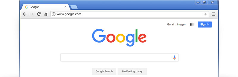
The Google homepage is accessed by millions of people each day. As you may already know, the page is rather simple. This is why so many people appreciate it. The list of design principles that are respected on Google’s homepage is:
- Dominance: visitors focus on the large Google logo and the search box.
- Contrast: the colors used for each letter are bright primary colors and they are contrasting nicely against the white background.
- Shape: the form of the search box is rectangular and wide enough to fit even rather long search queries.
- Negative space: Google’s homepage makes plenty of use of white space; the search box is the only element that stands out.
- Balance: the page is symmetrical, as the logo and search box sit in the middle, while other elements are carefully placed on the sides.
If you enjoyed reading this article on visual design, you should check out this one on the best 404 page ever.
We also wrote about a few related subjects like modern web design, layout design, bad websites, button design, web design trends, dark background, website layouts and loading animation.


Read Inspiring Customer Stories
Check out how our user set Amelia for his business