Research on Color Luminance Ratio Design of Architectural Accessible Signs (original) (raw)
2017, Proceedings of the 2017 2nd International Conference on Civil, Transportation and Environmental Engineering (ICCTE 2017)
Abstract
Luminance ratio or contrast is a key indicator for accessible signs' color design. Existing researches had different results due to inadequate consideration of influencing factors. This project designed a subjective evaluation experiment within normal illumination environment, the minimum luminance ratio to identify an architectural accessible sign was statistically analyzed under different hue scheme, sight distance and visual acuity.
Figures (4)

Fig. 1 signs in gradient LR (designed and drawn by the author) Statistical analysis of experimental data

The minimum LR valueof 3 color schemes at different SD (the author’s statistics)

It also can be drew that in the medium and short SD situation commonly used in architectural design, the longer the SD, the bigger LR value required for signs to be recognizable. The regression analysis of the experimental data between the minimum LR and SD (Fig. 2) resulted in a better fitting degree (R’). The results are as follows: Note: The signs were all international standard barrier-free symbol, with size of 200mmx200mm, surface illuminance 310Ix.
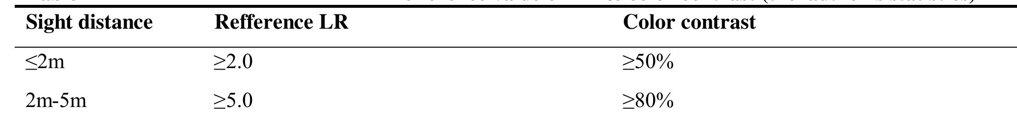
China's specifications and codes lack quantitative standards for the accessible signs’ color design, but the legibility of color is of great significance for promoting the quality and function of the accessible building environment. The research of this subject has put forward some color contrast and scheme design strategies for accessible signs, to provide reference for standard revision and design practice, with better scientificity and practicality, in order to improve the living environment for the elderly, the disabled and the whole society. Architectural accessible signs in medium and close sight distance with surface illumination conforming to the specification, should be designed with high contrast color scheme, better with white graphics and deep color background. In practice, the minimum LR value between the graphics and background should be determined by SD as the following Table 2 to ensure legibility:

Loading Preview
Sorry, preview is currently unavailable. You can download the paper by clicking the button above.
References (8)
- Information on http://www.mca.gov.cn/article/zwgk/mzyw/201607/20160700001136.shtml.
- Information on http://www.cdpf.org.cn/sytj/content/2012-06/26/content\_30399867.htm.
- Georgia Institute of technology. Signage for low vision and blind persons:A multimedisciplinary assessment of the state of the art. ATBCB,1985.
- Yoshida Mai. Changes of the elderly's yellow visibility (2) Luminance ratio analysis of interior finishing material color. Summary Proceedings of Japan Architecture Academy E-1 Architecture & Plan Volume 1: 763-764.
- BRIGHT, K. T. and COOK, G. K. Project Rainbow, a research project to provide colour and contrast design guidance for internal built environments. Occasional Paper 57. ascot: the Chartered institute of Building, 1999.
- Brabyn, J., Co-director. Rehabilitation Enginerring Center, the Smith-Kettlewell Research Institute. Letter dated March 11,1991, to the office of the General Counsel,ATBCB.
- Bentzen, B. L., T. L. Nolin, R. D. Easton, and L. Desmarais. Detectable warning surfaces: Detectable by individuals with visual impairments, and safety and negotiability for individuals with physical impairment. Volpe National Transportation Systems Center:1993.
- Zhou Xiaodong, Wang Fangrun. Comparison of binocular and monocular visual acuity. Chinese School Health,1999,20(1):69