Blog (original) (raw)
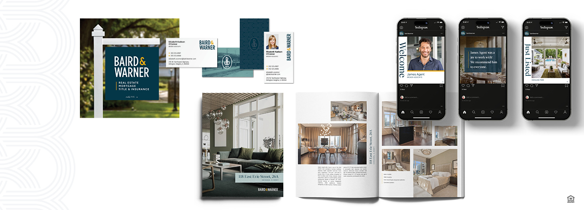
We're thrilled to announce that after nearly 40 years, we have a new look. Our new brand identity is part of our 170th anniversary celebration — we're paying homage to our past while looking ahead to the future.

"Throughout our 169-year history, Baird & Warner has always been about reinvention and reinvestment with the goal of transforming the brokerage for the future while staying committed to our values," says Steve Baird, president and CEO.
With that in mind, every element of the new brand is closely tied to our history, our community and the brokerage we hope to be for the next 170 years.
Our palette shifted from black to Deep Lake blue, a nod to Lake Michigan and a reference to our deep history. Amber Wheat elevates the previous yellow color and symbolizes our resilience, culture of empowerment, and — of course — our strong Midwest values.
We visited the archives to revive a classic brand element and give it a modern update, taking our 1855 founding date to design a unique, modern icon. Using the Baird & Warner initials, we created two more patterns that harken to prestigious heritage brands.

Combined with aspirational, lifestyle photography and a custom-designed typeface (named BW Bow Tie after the iconic fashion accessory of the late John W. Baird), the look evokes a sophisticated, elevated identity.

"Today's agents, buyers and sellers are more sophisticated than ever, so the changes we have made both externally and internally represent our dedication to meet them where they are in the marketplace and reinforce Baird & Warner's position as a sophisticated lifestyle brand."