Angular Material Menu (original) (raw)
Last Updated : 24 Apr, 2025
Angular Material is a UI component library developed by Google so that Angular developers can develop modern applications in a structured and responsive way. By using this library, we can significantly increase an end-users user experience, thereby gaining popularity for our application. This library contains modern ready-to-use elements which can be directly used with minimum or no extra code. In this article, we will see the Angular Material Menu.
To create a menu, we can use , which is a floating panel containing the option lists. The element does not display anything by itself. The matMenuTriggerFor directive is used with the menu to list the options.
Syntax:
<mat-menu #menu="matMenu"> Item 1 Item 2
Installation Syntax: The basic pre-requisite is that we must have Angular CLI installed on the system in order to add and configure the Angular material library. The following command is executed on the Angular CLI to install the angular material library:
ng add @angular/material
Make sure the path should be opened in the terminal before executing the above command.
Please refer to the Adding Angular Material Component to Angular Application article for the detailed installation procedure.
Adding Menu Component: To use the Menu Component, we need to import the below modules into the app.module.ts file:
import { MatMenuModule} from '@angular/material/menu';
To use the Menu component in our code we have to import MatMenuModule into the imports array.
To use the icon, we need to import the below modules into the app.module.ts file:
import {MatIconModule} from '@angular/material/icon';
To use the icon module in our code we have to import MatIconModule into the imports array.
Project Structure: After successful installation, the project structure will look like the following image:
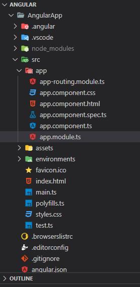
Project Structure
Example 1: The below example illustrates the implementation of the Angular Material Menu
- app.component.html HTML `
GeeksforGeeks
Angular Material Menu
CSS Menu Material UI Tailwind Css Bootstrap`
- app.component.ts JavaScript `
import { Component } from '@angular/core'; @Component({ selector: 'app-root', templateUrl: './app.component.html', styleUrls: ['./app.component.css'] }) export class AppComponent { title = 'AngularApp'; }
`
- app.module.ts JavaScript `
import { NgModule } from '@angular/core'; import { BrowserModule } from '@angular/platform-browser'; import { AppComponent } from './app.component'; import { BrowserAnimationsModule } from '@angular/platform-browser/animations'; import { MatMenuModule } from '@angular/material/menu'; import { MatIconModule } from '@angular/material/icon';
@NgModule({ declarations: [ AppComponent ], imports: [ BrowserModule, MatMenuModule, MatIconModule, BrowserAnimationsModule, ], providers: [], bootstrap: [AppComponent] }) export class AppModule { }
`
Output:
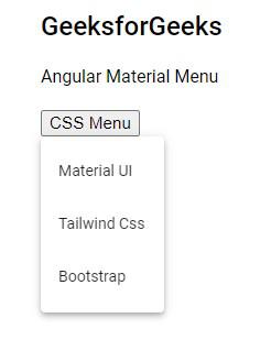
Angular Material Menu
Example 2: The below example illustrates the implementation of the Angular Material Menu with Icons
- app.component.html HTML `
GeeksforGeeks
Angular Material Icon Menu
list thumb_up Thumbs up thumb_down Thumbs down info Info`
- app.component.ts JavaScript `
import { Component } from '@angular/core'; @Component({ selector: 'app-root', templateUrl: './app.component.html', styleUrls: ['./app.component.css'] }) export class AppComponent { title = 'AngularApp'; }
`
- app.module.ts JavaScript `
import { NgModule } from "@angular/core"; import { BrowserModule } from "@angular/platform-browser"; import { AppComponent } from "./app.component"; import { BrowserAnimationsModule } from "@angular/platform-browser/animations"; import { MatMenuModule } from "@angular/material/menu"; import { MatIconModule } from "@angular/material/icon";
@NgModule({ declarations: [AppComponent], imports: [ BrowserModule, MatMenuModule, MatIconModule, BrowserAnimationsModule, ], providers: [], bootstrap: [AppComponent], }) export class AppModule {}
`
Output:

Angular Material Icon Menu
Reference: https://material.angular.io/components/menu/overview