Bootstrap 4 | Tables (original) (raw)
Last Updated : 28 Apr, 2022
Bootstrap provides a series of classes that can be used to apply various styling to the tables such as changing the heading appearance, making the rows stripped, adding or removing borders, making rows hoverable, etc. Bootstrap also provides classes for making tables responsive.
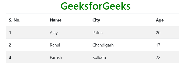
Simple Table: The .table class is used to create a simple Bootstrap table. This class name is used with the
| S. No. | Name | City | Age |
|---|---|---|---|
| 1 | Ajay | Patna | 20 |
| 2 | Rahul | Chandigarh | 17 |
| 3 | Parush | Kolkata | 22 |
`
Output:

Stripped rows: The .table-stripped class is used to create an alternate dark and light rows. Use the combination of table and table-stripped classes within the
| S. No. | Name | City | Age |
|---|---|---|---|
| 1 | Ajay | Patna | 20 |
| 2 | Rahul | Chandigarh | 17 |
| 3 | Parush | Kolkata | 22 |
`
Output:
Bordered Table: The .table-bordered class is used to add borders on all sides of the table and cell. Use the combination of table and table-bordered classes within the
| S. No. | Name | City | Age |
|---|---|---|---|
| 1 | Ajay | Patna | 20 |
| 2 | Rahul | Chandigarh | 17 |
| 3 | Parush | Kolkata | 22 |
`
Output:

Hover Rows Table: The .table-hover class is used to add the hover effect (change background color to gray when the mouse moves over) on table rows. Use the combination of table and table-hover classes within the
| S. No. | Name | City | Age |
|---|---|---|---|
| 1 | Ajay | Patna | 20 |
| 2 | Rahul | Chandigarh | 17 |
| 3 | Parush | Kolkata | 22 |
`
Output:

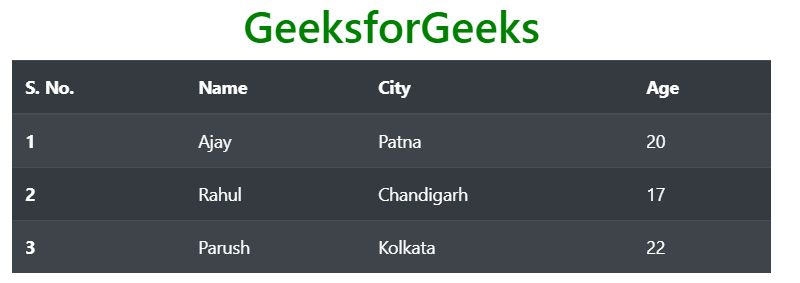
Black/Dark Table: The .table-dark class is used to add the black background color of a table. Use the combination of table and table-dark classes within the
| S. No. | Name | City | Age |
|---|---|---|---|
| 1 | Ajay | Patna | 20 |
| 2 | Rahul | Chandigarh | 17 |
| 3 | Parush | Kolkata | 22 |
`
Output:

Dark Stripped Table: The .table-dark and .table-stripped classes are used to create a dark striped table. Use the combination of table, table-dark, and table-stripped classes within the
| S. No. | Name | City | Age |
|---|---|---|---|
| 1 | Ajay | Patna | 20 |
| 2 | Rahul | Chandigarh | 17 |
| 3 | Parush | Kolkata | 22 |
`
Output:
Dark Hoverable Table: The .table-dark and .table-hover classes are used to add the hover effect (change background color to dark gray when the mouse moves over) on table rows. Use the combination of table, table-dark, and table-hover classes within the
| S. No. | Name | City | Age |
|---|---|---|---|
| 1 | Ajay | Patna | 20 |
| 2 | Rahul | Chandigarh | 17 |
| 3 | Parush | Kolkata | 22 |
`
Output:

Borderless Table: The .table-borderless is used to remove the border from the table. Use the combination of table and table-borderless classes within the
| S. No. | Name | City | Age |
|---|---|---|---|
| 1 | Ajay | Patna | 20 |
| 2 | Rahul | Chandigarh | 17 |
| 3 | Parush | Kolkata | 22 |
`
Output:

Colored table: Bootstrap provides a number of contextual classes that can be used to color the entire row or a single cell of a table. These classes should be used with a light table and not with a dark table for a better appearance. The list of contextual classes is given below.
| table-primary | table-secondary | table-success |
|---|---|---|
| table-danger | table-warning | table-info |
| table-light | table-dark | table-active |
Example:
HTML `
Bootstrap TablesGeeksforGeeks
| S. No. | Name | City | Age |
|---|---|---|---|
| 1 | Ajay | Patna | 20 |
| 2 | Rahul | Chandigarh | 17 |
| 3 | Parush | Kolkata | 22 |
`
Output:

Dark Colored Table: To color the dark tables, background-color classes of Bootstrap will use.
Example:
HTML `
Bootstrap TablesGeeksforGeeks
| S. No. | Name | City | Age |
|---|---|---|---|
| 1 | Ajay | Patna | 20 |
| 2 | Rahul | Chandigarh | 17 |
| 3 | Parush | Kolkata | 22 |
`
Output:

Small Table: The .table-sm class is used to create a small table by reducing the cell padding. Use the combination of table, table-bordered, and table-sm classes within the
| S. No. | Name | City | Age |
|---|---|---|---|
| 1 | Ajay | Patna | 20 |
| 2 | Rahul | Chandigarh | 17 |
| 3 | Parush | Kolkata | 22 |
`
Output:

Responsive Tables: The .table-responsive class is used to create a responsive table. To make the table responsive on all viewport sizes, wrap the table within an opening and closing
In case of viewport specific responsive table, the table will become responsive if the viewport size is less than the viewport specified by the class table-responsive{-sm|-md|-lg|-xl}. The list of responsive table viewports size are given below:
| Responsive Table Class | Screen Width |
|---|---|
| table-responsive-sm | < 576px |
| table-responsive-md | < 768px |
| table-responsive-lg | < 992px |
| table-responsive-xl | < 1200px |
Syntax:
Example:
HTML `
Bootstrap TablesGeeksforGeeks
| S. No. | First Name | Last Name | Contact No. | Gender | City | Country | Pin Code | |
|---|---|---|---|---|---|---|---|---|
| 1 | Ajit | Singh | ajt@gfg.com | XXXXXXXXXX | Male | Noida | India | 201301 |
`
Output:

Supported Browser:
- Google Chrome
- Internet Explorer
- Firefox
- Opera
- Safari