Box Plot in Python using Matplotlib (original) (raw)
Last Updated : 14 Apr, 2025
A ****Box Plot (**or **Whisker plot) display the summary of a data set, including minimum, first quartile, median, third quartile and maximum. it consists of a box from the first quartile to the third quartile, with a vertical line at the median. the x-axis denotes the data to be plotted while the y-axis shows the frequency distribution. The matplotlib.pyplot module of matplotlib library provides boxplot() function with the help of which we can create box plots.
**Syntax
matplotlib.pyplot.boxplot(data)
The data values given to the ax.boxplot() method can be a Numpy array or Python list or Tuple of arrays. Let us create the box plot by using numpy.random.normal() to create some random data, it takes mean, standard deviation, and the desired number of values as arguments.
**Example:
Python `
import matplotlib.pyplot as plt import numpy as np
np.random.seed(10) d = np.random.normal(100, 20, 200)
fig = plt.figure(figsize =(10, 7))
plt.boxplot(d) plt.show()
`
**Output:
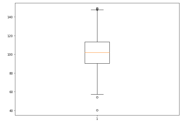
The basic box plot that displays the distribution of the randomly generated data.
Customizing Box Plot
The matplotlib.pyplot.boxplot() provides endless customization possibilities to the box plot. some of the key customization parameters include:
- **The notch: True attribute creates the notch format to the box plot
- **patch_artist: True fills the boxplot with colors, we can set different colors to different boxes.
- **vert: 0 attribute creates horizontal box plot.
- **labels: specifies custom labels for the boxes.
**Example 1: Multiple Datasets Box Plot
Python `
import matplotlib.pyplot as plt import numpy as np
np.random.seed(10)
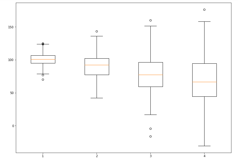
d_1 = np.random.normal(100, 10, 200) d_2 = np.random.normal(90, 20, 200) d_3 = np.random.normal(80, 30, 200) d_4 = np.random.normal(70, 40, 200) d = [d_1, d_2, d_3, d_4]
fig = plt.figure(figsize =(10, 7)) ax = fig.add_axes([0, 0, 1, 1]) bp = ax.boxplot(d)
plt.show()
`
**Output:
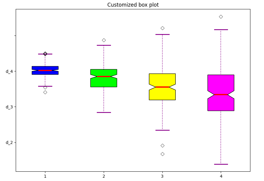
**Example 2: Let’s try to modify the above plot with some of the customizations:
We will customize the plot by adding a notch, filling the boxes with colors, and modifying the whisker and median styles.
Python `
import matplotlib.pyplot as plt import numpy as np
np.random.seed(10) d_1 = np.random.normal(100, 10, 200) d_2 = np.random.normal(90, 20, 200) d_3 = np.random.normal(80, 30, 200) d_4 = np.random.normal(70, 40, 200) d = [d_1, d_2, d_3, d_4]
fig = plt.figure(figsize =(10, 7)) ax = fig.add_subplot(111)
bp = ax.boxplot(d, patch_artist = True, notch ='True', vert = 0)
colors = ['#0000FF', '#00FF00', '#FFFF00', '#FF00FF']
for patch, color in zip(bp['boxes'], colors): patch.set_facecolor(color)
for whisker in bp['whiskers']: whisker.set(color ='#8B008B', linewidth = 1.5, linestyle =":")
changing color and linewidth of
for cap in bp['caps']: cap.set(color ='#8B008B', linewidth = 2)
for median in bp['medians']: median.set(color ='red', linewidth = 3)
changing style of fliers
for flier in bp['fliers']: flier.set(marker ='D', color ='#e7298a', alpha = 0.5)
ax.set_yticklabels(['d_1', 'd_2', 'd_3', 'd_4'])
plt.title("Customized box plot")
ax.get_xaxis().tick_bottom() ax.get_yaxis().tick_left()
plt.show()
`
**Output:
customizes box plot
A highly customized box plot with different colors for each dataset, enhanced whiskers, and a styled median.
**Related Article: