Create a stacked bar plot in Matplotlib (original) (raw)
Last Updated : 24 Aug, 2022
In this article, we will learn how to Create a stacked bar plot in Matplotlib. Let’s discuss some concepts:
- Matplotlib is a tremendous visualization library in Python for 2D plots of arrays. Matplotlib may be a multi-platform data visualization library built on NumPy arrays and designed to figure with the broader SciPy stack.
- A bar plot or bar graph may be a graph that represents the category of knowledge with rectangular bars with lengths and heights that’s proportional to the values which they represent. The bar plots are often plotted horizontally or vertically.
- Stacked bar plots represent different groups on the highest of 1 another. The peak of the bar depends on the resulting height of the mixture of the results of the groups. It goes from rock bottom to the worth rather than going from zero to value.
Approach:
- Import Library (Matplotlib)
- Import / create data.
- Plot the bars in the stack manner.
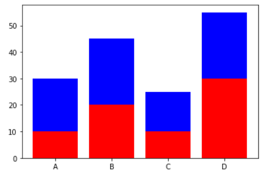
Example 1: (Simple stacked bar plot)
Python3
import matplotlib.pyplot as plt
x = [ 'A' , 'B' , 'C' , 'D' ]
y1 = [ 10 , 20 , 10 , 30 ]
y2 = [ 20 , 25 , 15 , 25 ]
plt.bar(x, y1, color = 'r' )
plt.bar(x, y2, bottom = y1, color = 'b' )
plt.show()
Output :
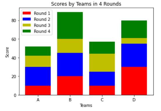
Example 2: (Stacked bar chart with more than 2 data)
Python3
import matplotlib.pyplot as plt
import numpy as np
x = [ 'A' , 'B' , 'C' , 'D' ]
y1 = np.array([ 10 , 20 , 10 , 30 ])
y2 = np.array([ 20 , 25 , 15 , 25 ])
y3 = np.array([ 12 , 15 , 19 , 6 ])
y4 = np.array([ 10 , 29 , 13 , 19 ])
plt.bar(x, y1, color = 'r' )
plt.bar(x, y2, bottom = y1, color = 'b' )
plt.bar(x, y3, bottom = y1 + y2, color = 'y' )
plt.bar(x, y4, bottom = y1 + y2 + y3, color = 'g' )
plt.xlabel( "Teams" )
plt.ylabel( "Score" )
plt.legend([ "Round 1" , "Round 2" , "Round 3" , "Round 4" ])
plt.title( "Scores by Teams in 4 Rounds" )
plt.show()
Output :
Example 3: (Stacked Bar chart using dataframe plot)
Python3
import matplotlib.pyplot as plt
import numpy as np
import pandas as pd
df = pd.DataFrame([[ 'A' , 10 , 20 , 10 , 26 ], [ 'B' , 20 , 25 , 15 , 21 ], [ 'C' , 12 , 15 , 19 , 6 ],
`` [ 'D' , 10 , 18 , 11 , 19 ]],
`` columns = [ 'Team' , 'Round 1' , 'Round 2' , 'Round 3' , 'Round 4' ])
print (df)
df.plot(x = 'Team' , kind = 'bar' , stacked = True ,
`` title = 'Stacked Bar Graph by dataframe' )
plt.show()
Output :
Team Round 1 Round 2 Round 3 Round 4 0 A 10 20 10 26 1 B 20 25 15 21 2 C 12 15 19 6 3 D 10 18 11 19
