CSSinJS Next JS (original) (raw)
CSS-in-JS Next JS
Last Updated : 31 Jul, 2024
CSS-in-JS in Next.js enables you to write CSS styles directly within your JavaScript or TypeScript files. This approach allows you to scope styles to components and leverage JavaScript features, improving maintainability and modularity.
In this article learn how to use CSS-in-JS in NextJS its syntax, project setup and its example.
Prerequisites:
CSS-in-JS
CSS-in-JS integrates styles directly into your JavaScript files, providing dynamic styling capabilities and component-level scoping. In Next.js, several libraries can facilitate this, such as styled-components, @emotion/styled, and @mui/system.
The following libraries are supported in Next.js Client Components in the app directory (alphabetical):
- chakra-ui
- kuma-ui
- @mui/material
- @mui/joy
- pandacss
- styled-jsx
- styled-components
- stylex
- tamagui
- tss-react
- vanilla-extract
Let's understand how to integrate CSS Libraries in Next.js app with an example of styled-components.
Steps to Create the Project
**Step 1: Install NodeJS.
**Step 2: Install NextJS globally using npm or yarn.
npm install -g next or yarn global add next
**Step 3: Create a new NextJS project.
npx create-next-app my-app
**Step 4: Navigate into your project directory.
cd my-app
**Step 5: Install your preferred CSS in JS library.
npm install styled-components or yarn add styled-components
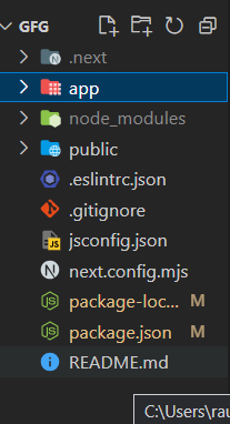
Project Structure:
The updated dependencies in package.json file will look like:
"dependencies": {
"next": "14.1.0",
"react": "^18",
"react-dom": "^18",
"styled-component": "^2.8.0"
}
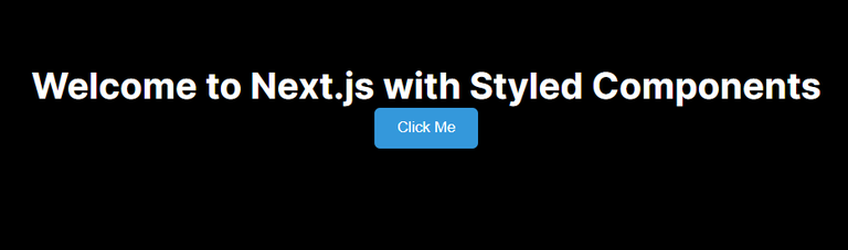
**Example 1: In this example, we import styled from styled-components to create a styled button component. We define its styles using backticks and CSS syntax. Then, we use StyledButton within our JSX to render the styled button.
JavaScript ``
"use client"; import React from "react"; import styled from "styled-components";
const CenteredContainer = styled.div display: flex; flex-direction: column; align-items: center; justify-content: center; height: 100vh;;
const StyledButton = styled.button background-color: #3498db; color: white; padding: 10px 20px; border: none; border-radius: 5px; cursor: pointer;;
export default function Home() { return (
Welcome to Next.js with Styled Components
Click Me ); }``
**Start the development server:
npm run dev or yarn dev
**Output:
**Example 2: In this example, we create a StyledHeading component using styled-components. We utilize dynamic props to adjust the font size and color based on the provided props. We then render multiple StyledHeading components with different variations.
JavaScript ``
"use client"; import React from "react"; import styled from "styled-components";
const CenteredContainer = styled.div display: flex; flex-direction: column; align-items: center; justify-content: center; height: 100vh;;
const StyledHeading = styled.h1 font-size: ${(props) => (props.large ? "3rem" : "2rem")}; color: ${(props) => (props.primary ? "blue" : "darkblue")}; text-align: center;;
export default function About() { return ( This is a Large Heading This is a Regular Heading This is a Primary Heading ); }
``
**Start the development server:
npm run dev or yarn dev
**Output :