CSS rotateZ() Function (original) (raw)
Last Updated : 07 Jun, 2023
The rotateZ() function is an inbuilt function which is used to rotate an element around the z-axis.
Syntax:
rotateZ( angle )
Parameters: This function accepts single parameter angle which represents the angle of rotations. The positive and negative angles rotate the elements in clockwise and counter-clockwise respectively.
Below examples illustrate the rotateZ() function in CSS:
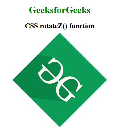
Example 1:
html `
CSS rotateZ() function<style>
body {
text-align: center;
}
h1 {
color: green;
}
.rotateZ_image {
transform: rotateZ(45deg);
}
</style>GeeksforGeeks
CSS rotateZ() function
<br><br>

<img class="rotateZ_image" src="https://media.geeksforgeeks.org/wp-content/cdn-uploads/20190710102234/download3.png" alt="GeeksforGeeks logo">
`
Output:
Example 2:
html `
CSS rotateZ() function<style>
body {
text-align: center;
}
h1 {
color: green;
}
.GFG {
font-size: 35px;
font-weight: bold;
color: green;
transform: rotateZ(45deg);
}
</style>GeeksforGeeks
CSS rotateZ() function
<br><br>

<div class="GFG">Welcome to GeeksforGeeks</div>
`
Output:

Supported Browsers: The browsers supported by rotateZ() function are listed below:
- Google Chrome 12 and above
- Edge 12 and above
- Internet Explorer 10 and above
- Firefox 10 and above
- Opera 15 and above
- Safari 4 and above