SVG Properties In CSS (original) (raw)
Last Updated : 23 Jul, 2025
SVGs are XML-based vector images that are widely used on the web. It is not made of pixels. SVGs are composed of paths defined by mathematical equations. This allows them to scale infinitely without losing quality.
We will learn What are SVG properties in CSS and how to work with SVG properties in CSS. SVG (Scalable Vector Graphics) is a powerful tool for creating images that can scale to any size without losing quality. By learning how to manipulate SVG properties with CSS, we can create dynamic, responsive designs that enhance the visual look of our web pages.
These are the following types of properties that we are going to discuss:
Table of Content
- SVG Properties In CSS
- Properties Shared Between CSS and SVG
- Table of SVG Properties in CSS
- Element-specific Properties
SVG Properties In CSS
We can use CSS to style SVGs in many ways, helping us to change their appearance dynamically. We can alter colors, add animations, or adjust shapes, CSS provides us with the tools to make our SVGs more interactive and visually engaging.
Below the table contains two columns named 'Presentation Attribute' and 'Supported Elements'. Presentation Attributes can be used as CSS properties and supported elements for them are mentioned in the next column.
SVG Elements by Category:
The elements present in SVG categorized based on their functionality are mentioned below in the table.
| Type of Element | Elements |
|---|---|
| Container elements | , , , , , , |
| Filter primitive elements | , , , , , |
| Gradient elements | , , |
| Graphics elements | |
| Text content elements | , , |
| Shape elements |
Below are the properties that are shared between CSS and SVG both, we can use them to style our SVGs.
| Property type | Presentation Attribute | Elements Supported |
|---|---|---|
| Font | font | Text content Elements |
| font-family | Text content Elements | |
| font-size | Text content Elements | |
| font-style | Text content Elements | |
| font-weight | Text content Elements | |
| font-stretch | Text content Elements | |
| Text | direction | , |
| letter-spacing | Text content Elements | |
| text-decoration | Text content Elements | |
| writing-mode | , | |
| word-spacing | Text content elements | |
| Masking | overflow | , , |
| mask | Container and graphic elements | |
| Interactivity | cursor | Container and graphic elements |
| pointer-events | Graphics elements | |
| Color | fill, stroke | Shape and text elements |
| stop-color | (gradient stop points) | |
| Visibility | display | Graphics elements, Text content elements, , , , |
| visibility | Graphic elements, Text content Elements |
Table of SVG Properties in CSS
These are SVG properties that are available in CSS to style them. Below is the table showing 'Category' , 'Property' and 'Supported Elements'.
| Category | Property | Supported Elements |
|---|---|---|
| Text Properties | alignment-baseline | , |
| baseline-shift | , | |
| dominant-baseline | Text content elements | |
| glyph-orientation-horizontal | same | |
| glyph-orientation-vertical | same | |
| kerning | same | |
| text-anchor | same | |
| Clip Properties | clip | , , , , |
| clip-path | Container elements, Graphics elements | |
| clip-rule | ||
| Masking Properties | mask | Container elements, Graphics elements |
| opacity | Graphics elements | |
| Filter Effects | enable-background | Container elements |
| filter | Container elements, Graphics elements | |
| flood-color | ||
| flood-opacity | ||
| lighting-color | , | |
| Gradient Properties | stop-color | |
| stop-opacity | ||
| Interactivity Properties | pointer-events | Graphics elements |
| Color Properties | color-profile | (referring to raster image) |
| Painting Properties | color-interpolation | Container elements, Graphics elements |
| color-interpolation-filters | Filter primitive elements | |
| color-rendering | Container elements, Graphics elements | |
| fill | Shape elements, Text content elements | |
| fill-rule | Shape elements, Text content elements | |
| fill-opacity | Shape elements, Text content elements |
SVG 2
When we want more control over positioning (co-ordinates) and dimentions then we can use SVG 2. SVG 2 has more styling capabilities which we can use to control element dimentions with CSS. There are new Geometric properties like "rx", "ry", "x" and "y" allow precise element positioning. SVG 2 also has presentation attributes which can be used to style the properties.
| Properties having a presentation attribute | Elements which Support them |
|---|---|
| cx, cy | Circle, Eclipse |
| height, width, x, y | Foreign Object, image, rect, svg, symbol, use |
| r | circle |
| rx, ry | eclipse, rect |
| d | path |
Element-specific Properties
Keep in mind that Some properties apply only to specific SVG elements. SVG Element and Geometric Properties are mentioned in the table below.
Geometry Properties
In SVG 2, some properties such as 'rx' and 'ry' are defined as geometry properties. Geometry properties are used as CSS properties. Below are the properties which are Geomtry properties and SVG Element where they can be used.
| SVG Element | Geometry Properties |
|---|---|
| cxcyr | |
| cxcyrxry | |
| rect | rxryheightwidthxy |
| path | |
| heightwidthxy | |
| heightwidthxy | |
| heightwidthxy |
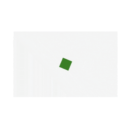
Positing SVG Elements
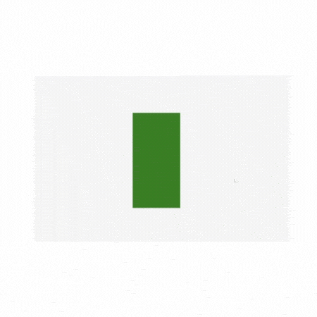
SVG 2 offers positioning elements using CSS. Now, we will create a green colored rectangle and learn how we can change the position of the SVGs.
**Example: In First example, the rectangle is positioned in center then in example 2 it is aligned to top left. In example 2 we have defined the properties of SVG in side css file.
HTML `
Positioning SVG ElementsCSS
rect { fill: #2db05f; }
body { align-items: center; display: flex; height: 100vh; justify-content: center; }
`
**Output:

example1
SVG Shape Morphing
We can change the shape of SVGs by changine the css. First we will draw a rectangle of green color using rect properties then rx and ry properties of the rect element will be changed to make a circle. On hover we added the rx and ry properties are set to 50%, creating rounded corners that turn the rectangle into a circle. We also used transition property for smooth transition.
**Example: On hovering transforming of rectangle into a circle
HTML `
Rectangle to Circle on HoverCSS
body, html { height: 100%; margin: 0; display: flex; justify-content: center; align-items: center; background-color: #f4f4f4; }
.center { display: flex; justify-content: center; align-items: center; height: 100%; }
svg { display: block; }
.shape { fill: green; transition: all 0.5s ease; }
.shape:hover { rx: 50%; /* Rounded corners to make it a circle */ ry: 50%; width: 300px; height: 300px; x: 50; y: 50; }
`
**Output:
svg shape morphing example
Animating SVG Properties
SVG properties can be animated using CSS properties.
**Example: Here we will draw a square and make it rotate infinitely. The green rectangle is centered using Flexbox. The rectangle continuously rotates using the spin animation defined with @keyframes.
HTML `
Animating SVG Properties - Rotating Green RectangleCSS
body, html { height: 100%; margin: 0; display: flex; justify-content: center; align-items: center; background-color: #f4f4f4; }
.center { display: flex; justify-content: center; align-items: center; height: 100%; }
svg { animation: spin 4s infinite linear; }
@keyframes spin { from { transform: rotate(0deg); }
to {
    transform: rotate(360deg);
}
}
rect { fill: green; }
`
**Output:
svg animation example
Conclusion
We explored how to change SVG properties using CSS. From basic to advanced animations and shape morphing, CSS offers great tools to modify and enhance the SVGs in web design. Currently SVG 1.1 is the standard, since very few browsers support SVG2 features so it is not recommended to use until its a need.